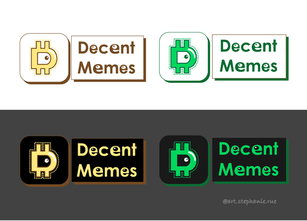
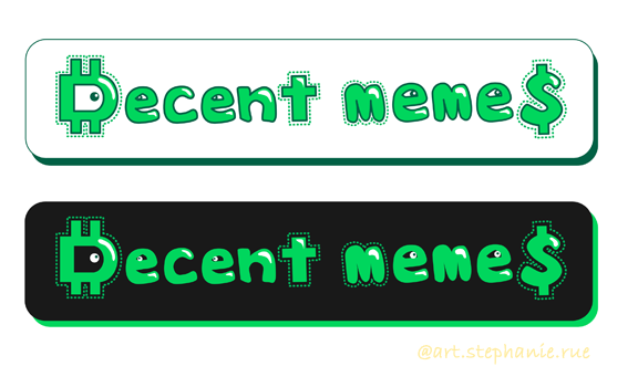
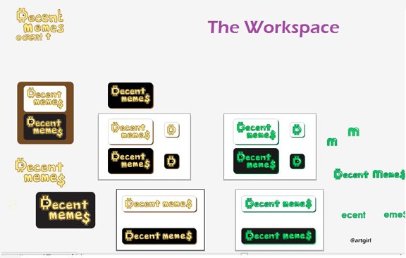
First I did this design...
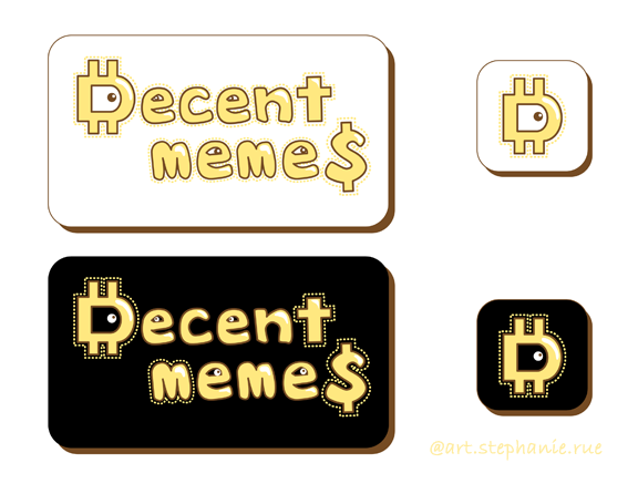
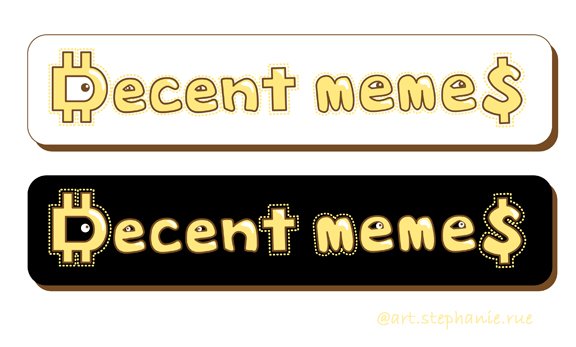
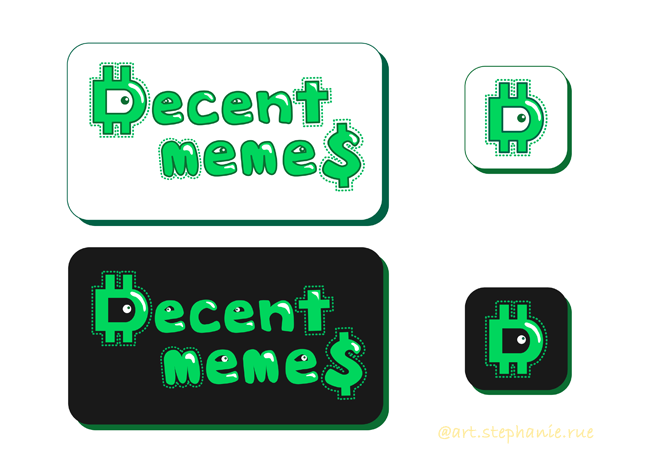
Then I did a color variation.
The Process
I started with a pen drawing of course. It's my favorite thing to do. Lol.
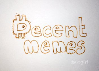
And then I took a pic and made a digital version in Adobe Illustrator by kind of tracing it first with the pen tool.
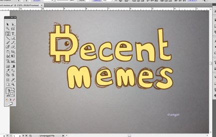
Then I decided to improve the letter shapes and I put dashed outlines. Because oooh, it's supposedly shining or something. Lol.
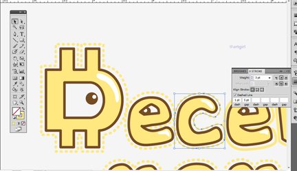
After making outlines and such I decided to have another color variation.
Thus the green one.
Check out the workspace. Lol.
I'm not really a fan of making logos but it was fun to make a design for decentmemes.com. 😉
"Dollar" D stands for cryptos and the $ at the end meaning we earn money from the memes we make because of Steemit, since Decent Memes are mostly posted on Steemit, right? 😄
It looks cartoony because it's supposed to be cartoony. Hey I like comics.
Version 2
Anyway, I did another one. I used 3 fonts and added some eyes so this is a bit more formal looking than above.
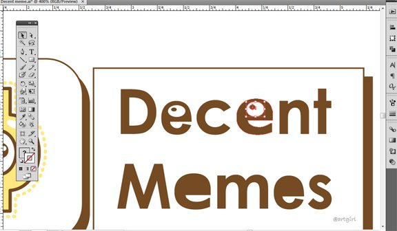
Final look. Tadaaaa!

So if I put it on the current website right now it's gonna look like this.
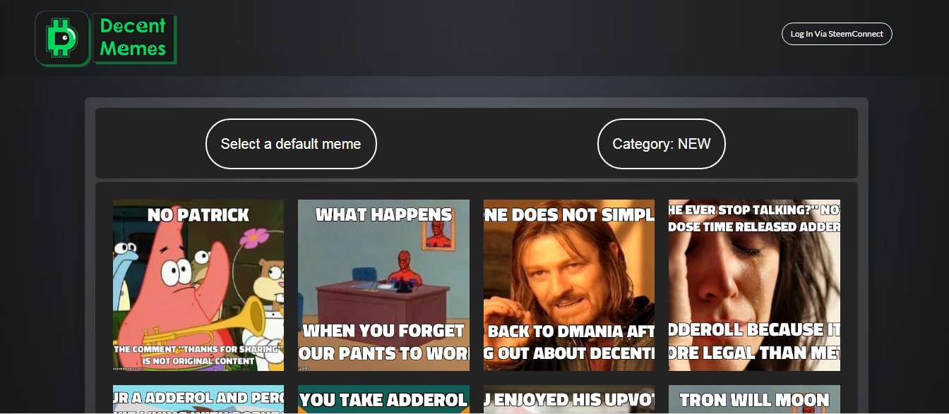
But of course they can revamp the website if they want, or not. That's all I have for the logo design.
Oh which reminds me I haven't done the comic strip for the other contest. Ahehe... Ciao.
XOXO,
@artgirl

WARNING:
Spam comments will be FLAGGED / DOWNVOTED if it is not revised upon warning.
All rights reserved.
Written by @artgirl for Steemit.
© Art x Stephanie Rue
Want some more art post? Check my latest one still within 7 days here:
♥ The Dark Side of Hikaru Shidou
For my writings, Steemit newbie tips and other posts, feel free to check my blog page.
