Are you ready to be challenged?
Grab your coffee, pencil, and field notes and get ready to jot this down!
I will take more landscapes in portrait orientation!
Great! Now that we got that out of the way, feel free to keep reading. Below you will find three photographs I made during a midsummer visit to Glacier National Park in Montana. You'll notice that each photo is in a vertical orientation. However, as I scroll through my Lightroom catalog, I notice that image after image is shot in landscape orientation. Far too often I find myself subconsciously limiting myself to compositions in the landscape orientation. In this article I've given an explanation underneath each photo as to why I believe it works best in a vertical format. Hopefully this information can be useful to you to go out and shoot more landscapes in vertical format, and perhaps bring home a winning photo as a result!

What are you trying to show?
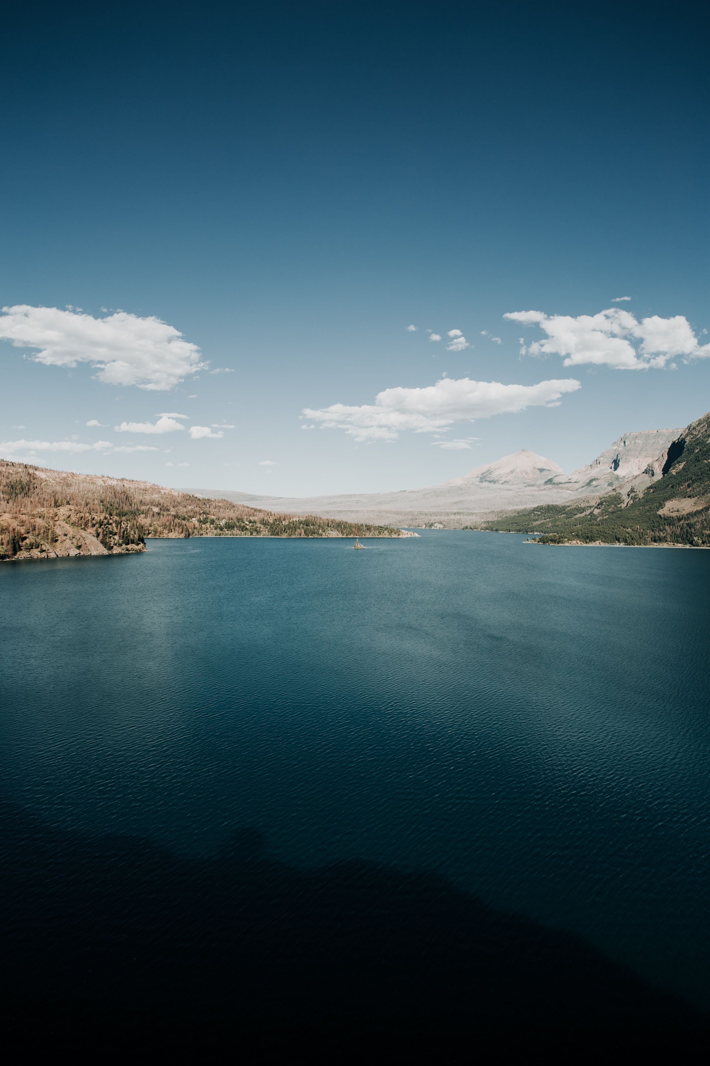
If you're on a desktop browser and you can zoom way out to see this entire photograph as a thumbnail what do you see? The first thing I noticed was the strong gradient from the water and the lowest part of the frame to the horizon, and then a reverse gradient from the horizon back up to the deep blue sky at the top of the frame. Knowing when to shoot in portrait isn't always as much about what you're including in your photograph, but about the things you are leaving out. In this case my goal was to showcase the rich blue gradients in the scene. If I had shot this in landscape orientation, I would've included much more of the rocky mountains that form the horizon. Also, if I wouldn't have changed lenses to a wider focal length I would have missed out on the darkest water, and the deepest sky color. For this shot, vertical format was superior and allowed me to more efficiently display the impact of this scene!

What has the most impact?
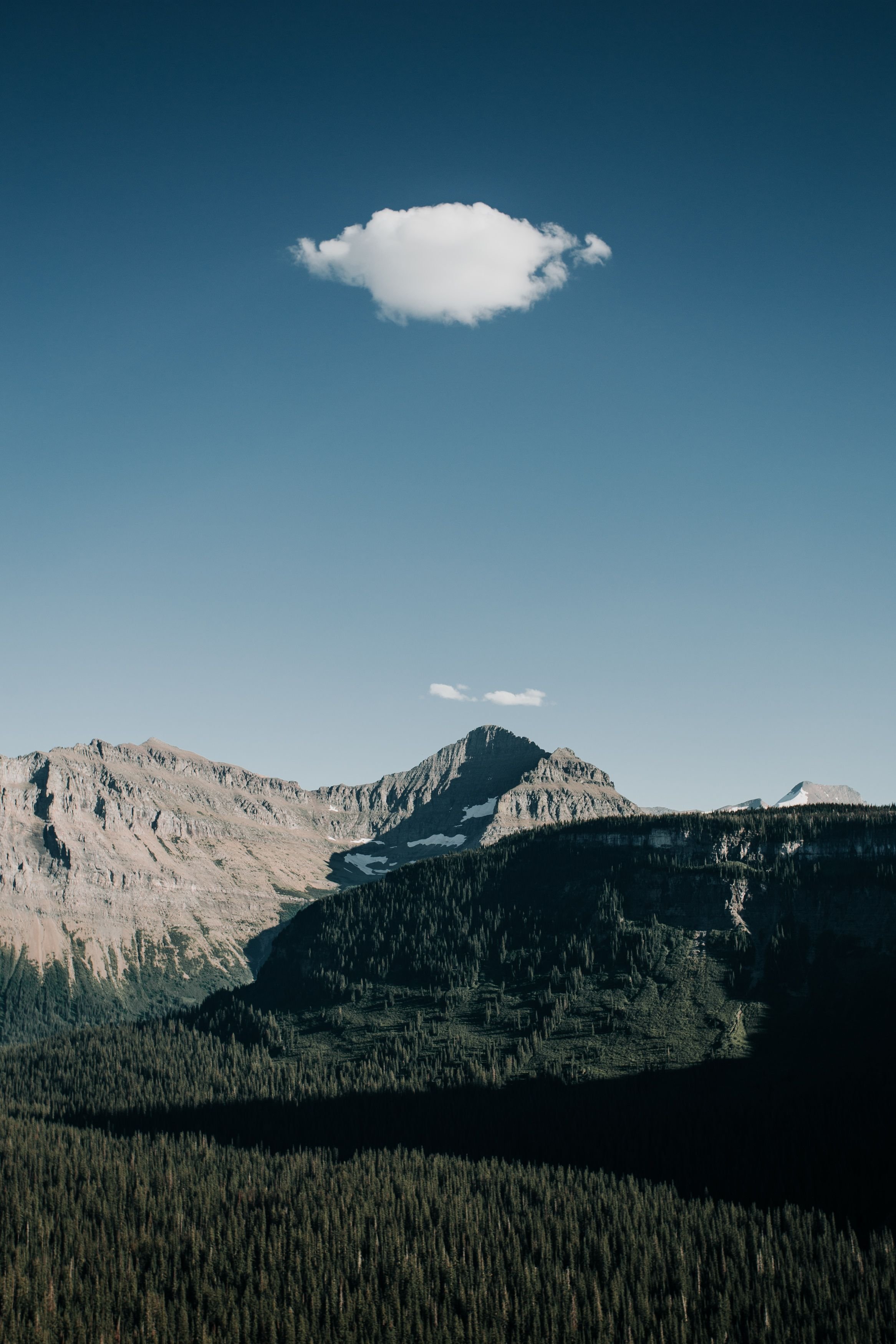
What is the first thing you noticed about this photo? I'm legitimately curious and would love if you'd drop a comment below letting me know. But back to the question. Most of you likely said the single cloud in the top third of the frame. The vertical composition in this example plays a huge role in directing our eye in a vertical direction between the mountain peak and the lone cloud in the otherwise empty sky. If I had shot this in landscape it's easy to imagine that any additional data on the left and right of this composition would detract from its impact.

Is your composition balanced?
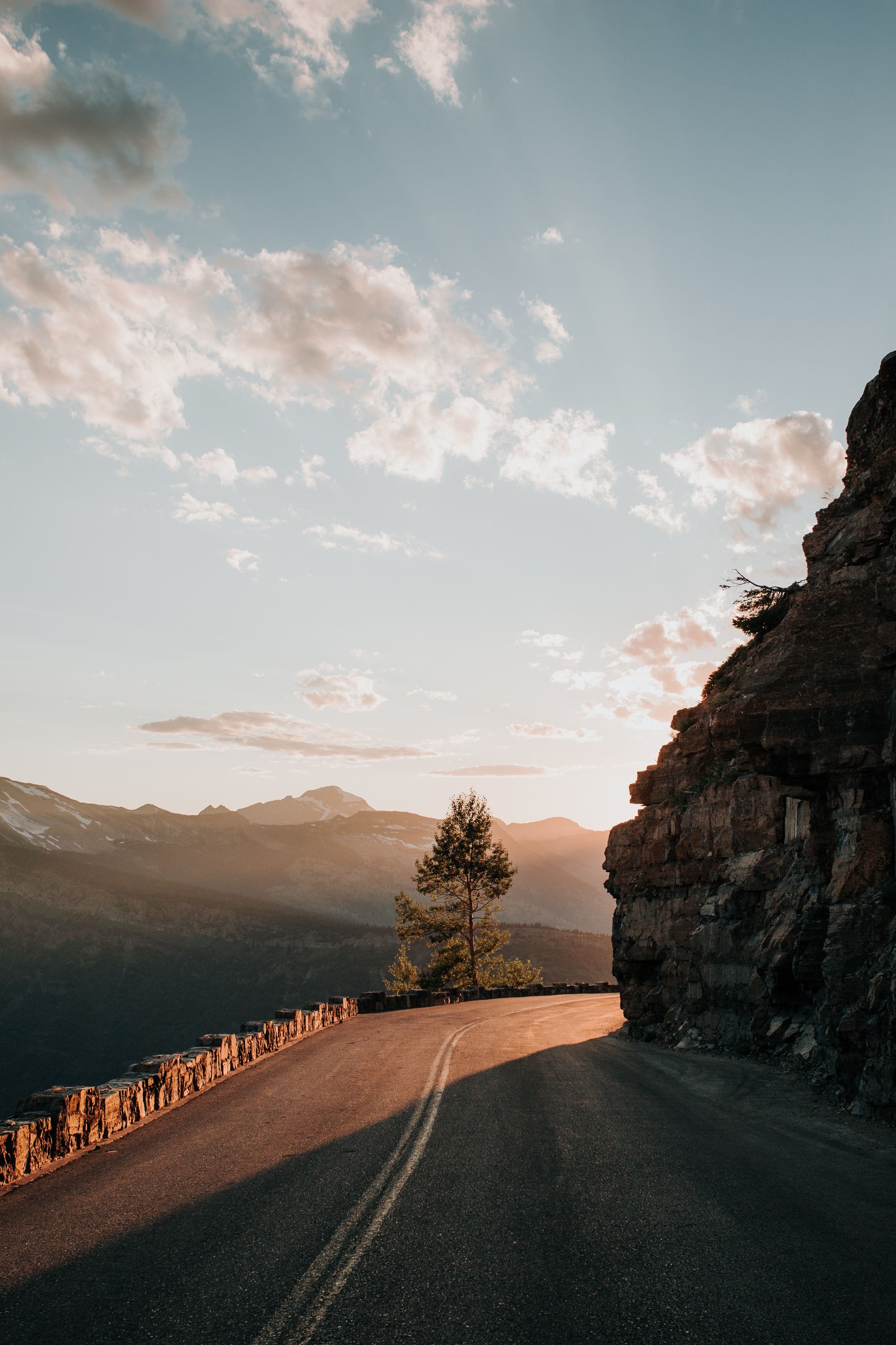
I assume most of us are familiar with leading lines, rule of thirds, and balance. Each of these elements play an important part in a solid, impactful composition. In this photo there are some strong leading lines pointing to the center of the photo where we have the brightest light and a tree that is centered in the scene. The edges of the road, the line of light and shadow from the sun, the top edge of the cliff, and the rays of sunlight in the sky all lead us to the center of the image. If you divide the image into thirds vertically you will find the guard rail on the left, and the cliff on the right balance each other out. If you divide the image into thirds horizontally you will find the road placed in the bottom third, and top of the cliff on the line separating the top third. Because I shot this scene vertically each of the elements in the image help to create a balance. In addition, this image also fulfills my two prior rules in efficiently showing the subject (tree + bright sunlight) in a way that gives that subject the greatest final impact.
Your Challenge!
Comment below with a photograph you've taken or a link to a post with photos where you have used a vertical composition to make a balanced, impactful and meaningful image. Next, go pick up your camera, head outside, and start finding some vertical landscapes. Also, feel free to disagree with me in the comments below. I'm always eager to improve my own compositions!
