Avoid these common technical mistakes that beginners often make in photography, and your photographs could turn out to be real winners!
- Over saturating your images
- Too much HDR
- Using Desaturate to convert a color image to black and white
- Over sharpening
- Shots are not sharp enough
- Main subject matter not in focus
- Image shows evidence of camera shake
- Exposure and contrast are not correct
- Too much noise
Of course, as I have pointed out in my other lessons, beauty is in the eye of the beholder. So I am giving you this information today, not as a rule to follow, but as a guide to making better pictures. In this lesson, I am going to cover only the first mistake, Over saturating your images, and I will cover the other points in subsequent lessons. Remember too, that the use of color can be quite subjective, so I'm not so much against the brightness of the colors in an image, as I am against the bad technical mistakes that are made when you try to create that brightness of color digitally without enough knowledge about what you are doing.
There is a trend today to have images that are highly saturated, and that has led to many beginners thinking that all they have to do to create this effect is to slide the Saturation slider all the way to the right in Adobe® Photoshop, Lightroom or other software. Instead, what they end up with are images that draw attention to the saturation levels, and not to the subject matter of the photograph! You'll know that has happened in your shots when people comment on the beautiful vibrant colors instead of about what is intended to be the subject matter!
Here's what can happen if you over saturate your images.
- Color clipping – That's when an area in the photo has little or no pixel detail and shows up as just a clump of color.
- Color banding (especially visible in clear blue skies) – That's when there is not a smooth transition between shades of a color resulting in what looks like blocks of color.
- Fringing – a fringe of color around certain parts of an image. Although chromatic aberration as it is techically called is initially caused by a defect in the lens being used, it is not often visible in an image until you over saturate it in one of the editing programs.
I have exaggerated the saturation levels in my sample images, so that you can better see what I am talking about in the examples.
So, how do you avoid the over saturation problem? By far the best way, is to shoot in Camera RAW format if you have the ability to do so. Camera RAW keeps all the pixels you have shot in your image so that you can make decisions later in the software about where you want color or detail to show more prominently. If you are using a cellphone or a point and shoot camera though, you are stuck with jpeg images. That means that the camera has made the decision for you about which pixels to keep and which ones to through away. Your images will be lacking in some color detail and no amount of fiddling around in software can bring those pixels back.
But all is not lost. A simple rule if you are using Adobe® Photoshop or Lightroom is to use the Vibrance slider instead of the Saturation one. Adobe® explains it this way:
Vibrance adjusts the saturation so that clipping is minimized as colors approach full saturation. This adjustment increases the saturation of less-saturated colors more than the colors that are already saturated. Vibrance also prevents skintones from becoming over saturated.
In other words, using the Vibrance slider is kind of like doing safe Saturation
In this image of Urquhart Castle on Loch Ness, Scotland, I have used only the Vibrance slider in Adobe® Photoshop. Notice that you can still see detail in the hill tops and in the mown grass in the foreground.
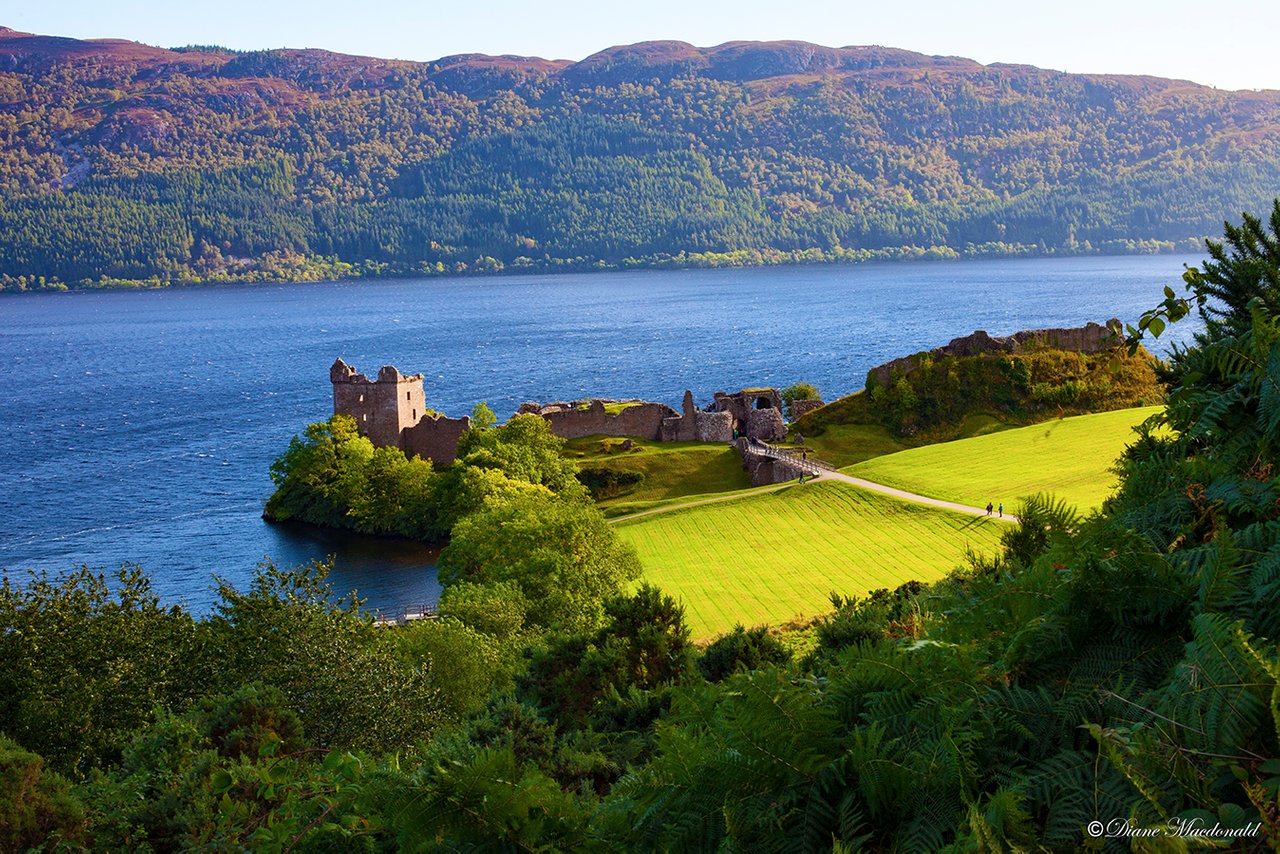
Image © Diane Macdonald. All Rights Reserved.
An example of Color clipping:
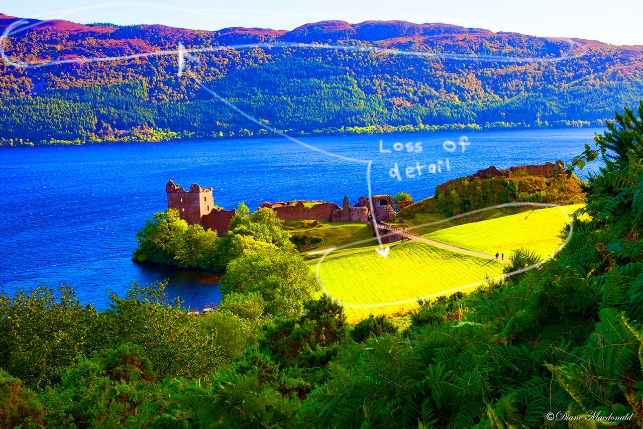
Image © Diane Macdonald. All Rights Reserved.
Notice what has happened when I used the Saturation slider to bump up the saturation. You may like the increase in color that you see, but look closely at the hill tops and the mown grass. Detail has been lost, ans in its place are just blobs of color.
I do use the Saturation slider sparingly, so normally I will not not saturate the Master (the whole image), but rather I will select a specific color that I would like to saturate a little bit to give it a some more punch.
An example of Color banding:

Image © Diane Macdonald. All Rights Reserved.
An example of Fringing:
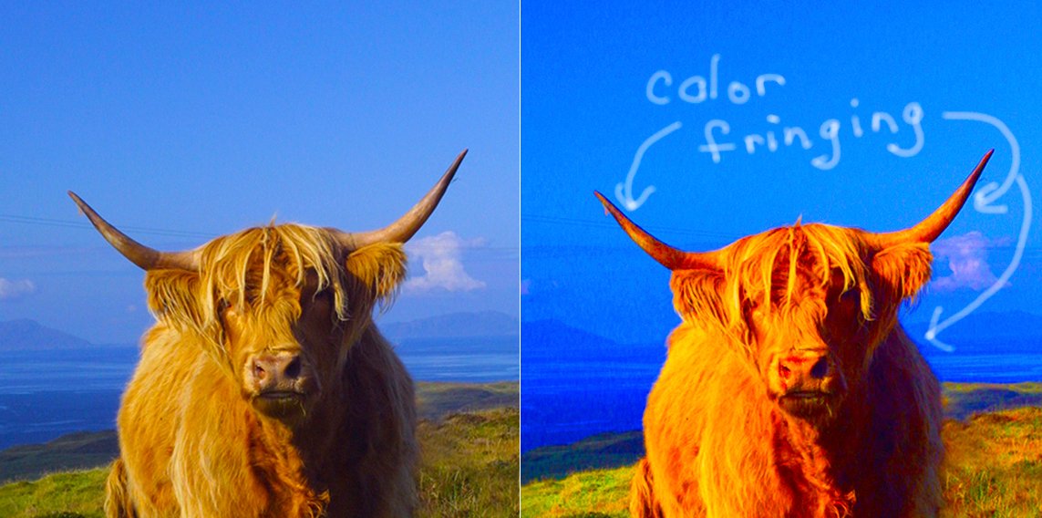
Image © Diane Macdonald. All Rights Reserved.
XXXXXXXXXXXXXXXXXXXXXXXXXXXXX
Thanks for taking the time to read this! I appreciate it. In my next lessons I will cover the other mistakes listed above.
Your assignment for Lesson 7 is to shoot some images that are moderately saturated so that the main focus of the image is the subject, and not the color!
Don't forget to add the tag #photography101 if you would like to have your images critiqued by myself and your peers!
XXXXXXXXXXXXXXXXXXXXXXXXXXXXX
Thanks for taking the time to read this! I appreciate it. In my next lessons I will cover the other mistakes listed above.
To check out my art prints and stock images online, please visit my website.