Every time I go through one of Washington DC's Metro stations, I'm impressed.
Harry Weese is the architect behind the design of the massive, vaulted ceilings and repeated rectangle motif, in a fine example of the brutalist architectural style of the late 20th century.
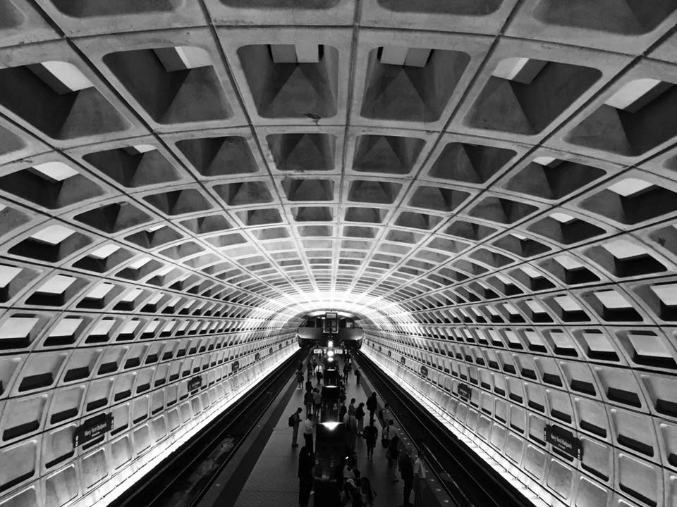
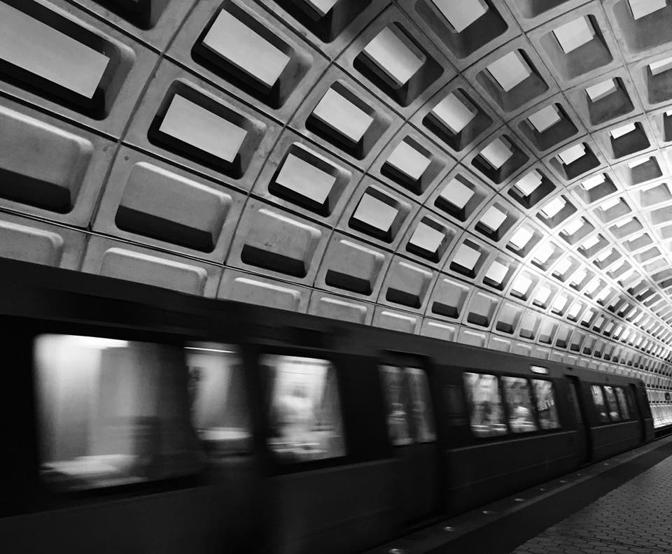
Many of the District's Metro stations were completed in the late 1970s. While brutalist architecture is not common in corporate buildings, many government and educational institutions are built in the style. Other noteworthy brutalist-style structures in DC include the United States Department of Energy, Department of Labor, Department of Education, Department of Health and Human Services, Department of Housing & Urban Development, and the (in)famous Watergate Hotel.
 (image sources: Wikipedia, compiled by @jaymorebeet)
You may have noticed that many of the example buildings are government buildings. Why?, you ask? Concrete is among the lest expensive of construction materials, and the brutalist style evokes a sense of power and fortitude. What better winning combination in the eyes of federal governments?
The term brutalist is derived from the French word 'brut' which translates to 'raw' in English, and was appreciated by one of the pioneers of modern architecture, LeCorbusier. Throughout the world, the brutalist architectural style was popular all across the world in the 1950s to the mid-1970s, in sharp contrast to the highly adorned and nearly decorative style of architecture used in the earlier part of the 20th century.
Generally, brutalist architecture features prominent use of blocky, exposed concrete, lacking fine detail and ornamental features, in place of a fortress-esque style. And while the array of rectangular elements is often seen in brutalist structures, they also commonly feature smooth curved concrete walls. In this style, the architect uses the hard, unadorned materials of concrete and steel to contrast with the gently sloping curves of arched ceilings and smooth curved walls.
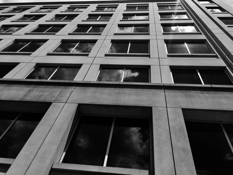
300 M St. SE DC
Critics of the brutalist style will say that the style is too harsh, lacking beauty, warmth, and visual appeal. Some have even wondered whether such buildings would be better served either demolished or used as 'distopian movie sets'. However, there is honesty to be found in these concrete structures. The brutalist style hides nothing; what you see is what you get. While it may not be beautiful in the frilly, ornamental details way, the straightforward honesty of these buildings is refreshingly beautiful in an unexpected way.
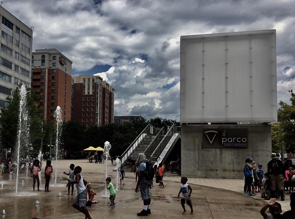
DC Splash pad adjacent to brutalist pizza joint
If you know one thing about the DC Metro area, that one thing might be that it has some of the worst traffic congestion in the United States. However, taking the Metro when it is possible keeps you from inevitable road rage, and exposes you to some strong examples of architectural beauty.
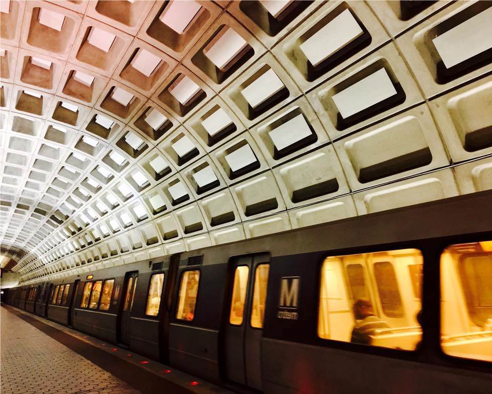
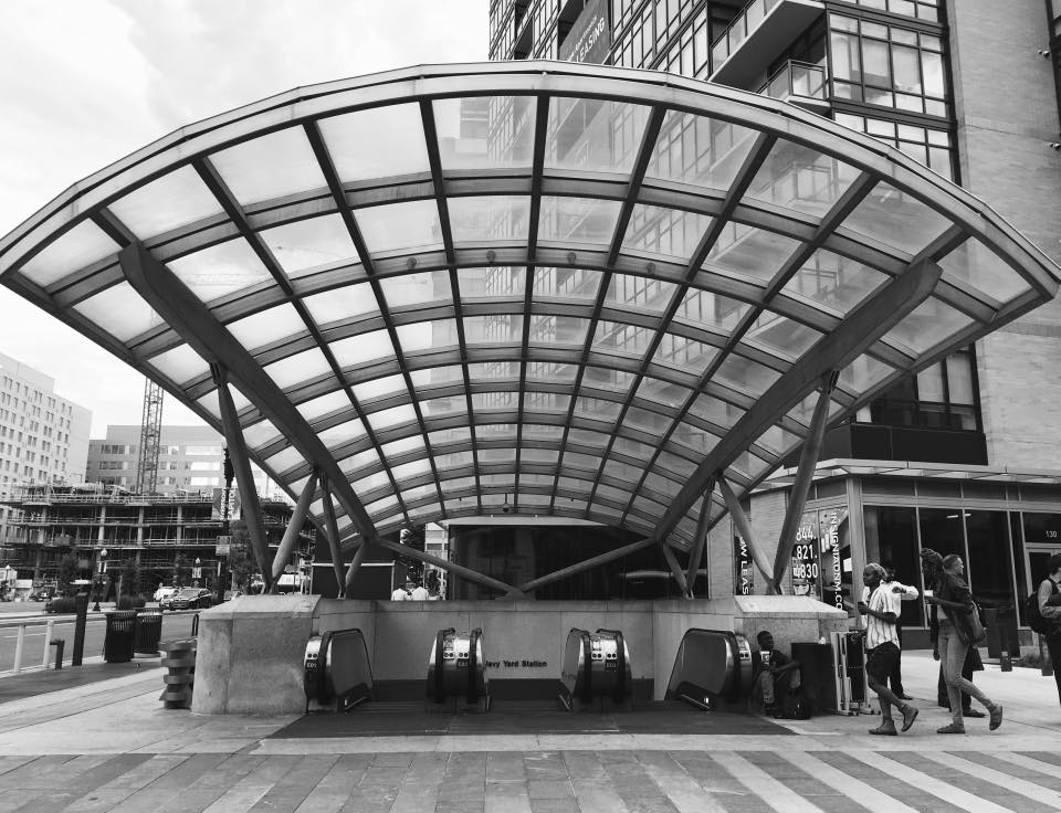
Entrance to Navy Yard Metro Station. Notice how the overhang mimics the interior architecture.

Fort Totten Metro platform. Notice how the ceiling overhanging the platform mimics the vaulted ceilings of underground stations.
All images were taken by @jaymorebeet, except as noted otherwise, on June 20 and 21, 2017, using IOS10.
