Editing Your Photos 4
1. @edrivegom
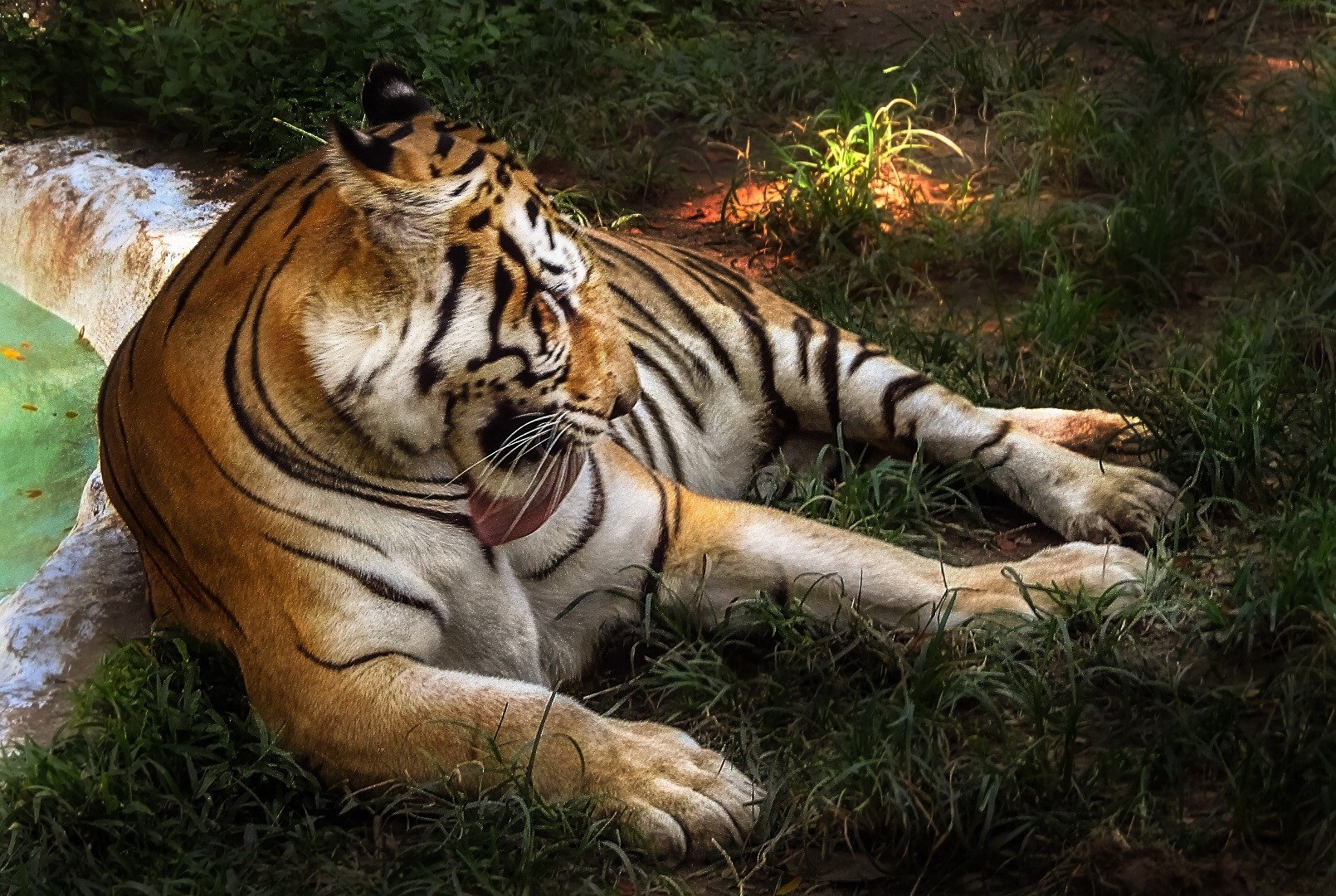

Tigers are cool :D
I cropped the picture to only contain the tiger, everything else was really not interesting. I got rid of the blueish tint that comes from the sky and painted some color on the tiger where the colors were off. Because the tiger's head was very blurry (the head moved while shooting - use faster shutter speed) I decided to go heavy on high pass sharpening and direct the attention to the whole body not just the head. After that I did a lot of subtle dodging/burning to add depth to the tiger and some foreground grass.
Second entry
Edited image:
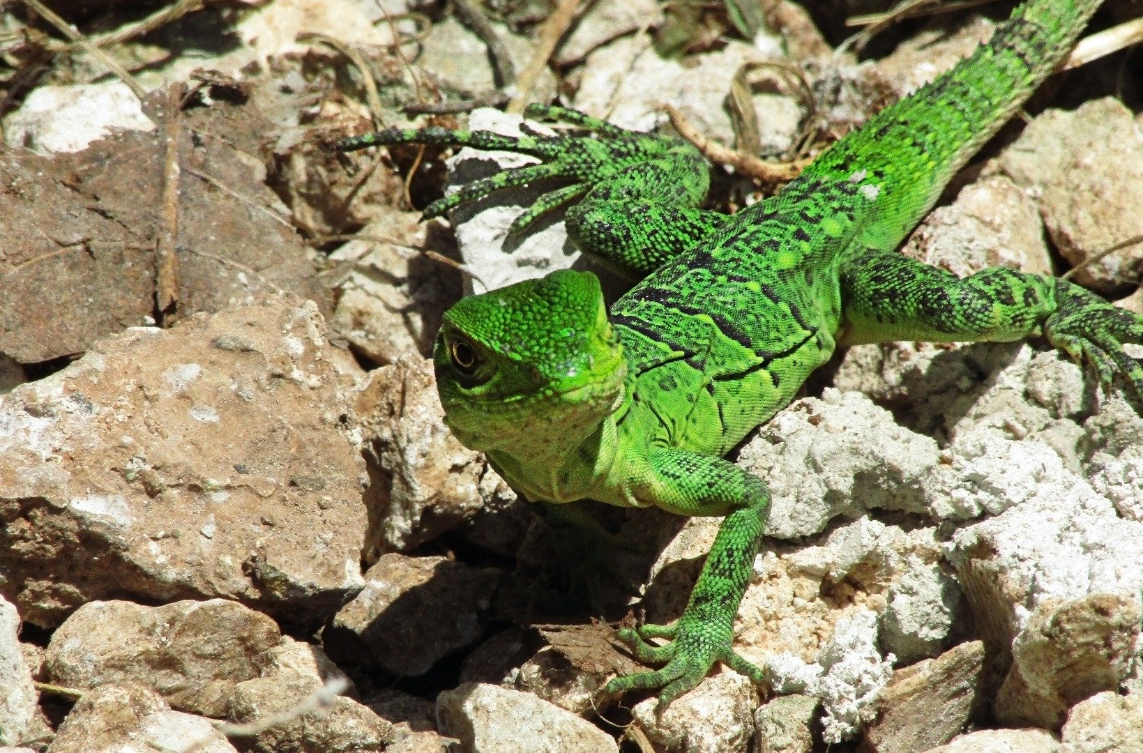

This was a cool image already. The eye was nicely in focus and the pose just great. I again cropped the picture to get the head right in the middle. I decided to lose the grey color on the back and add some more detail to the whole body. To finish, I made the eye iris very bright and added a some golden color. Came out nice.
2. @ace108
Edited image:
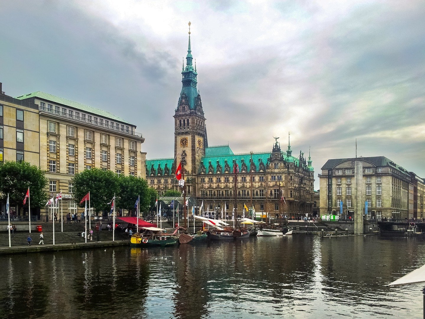
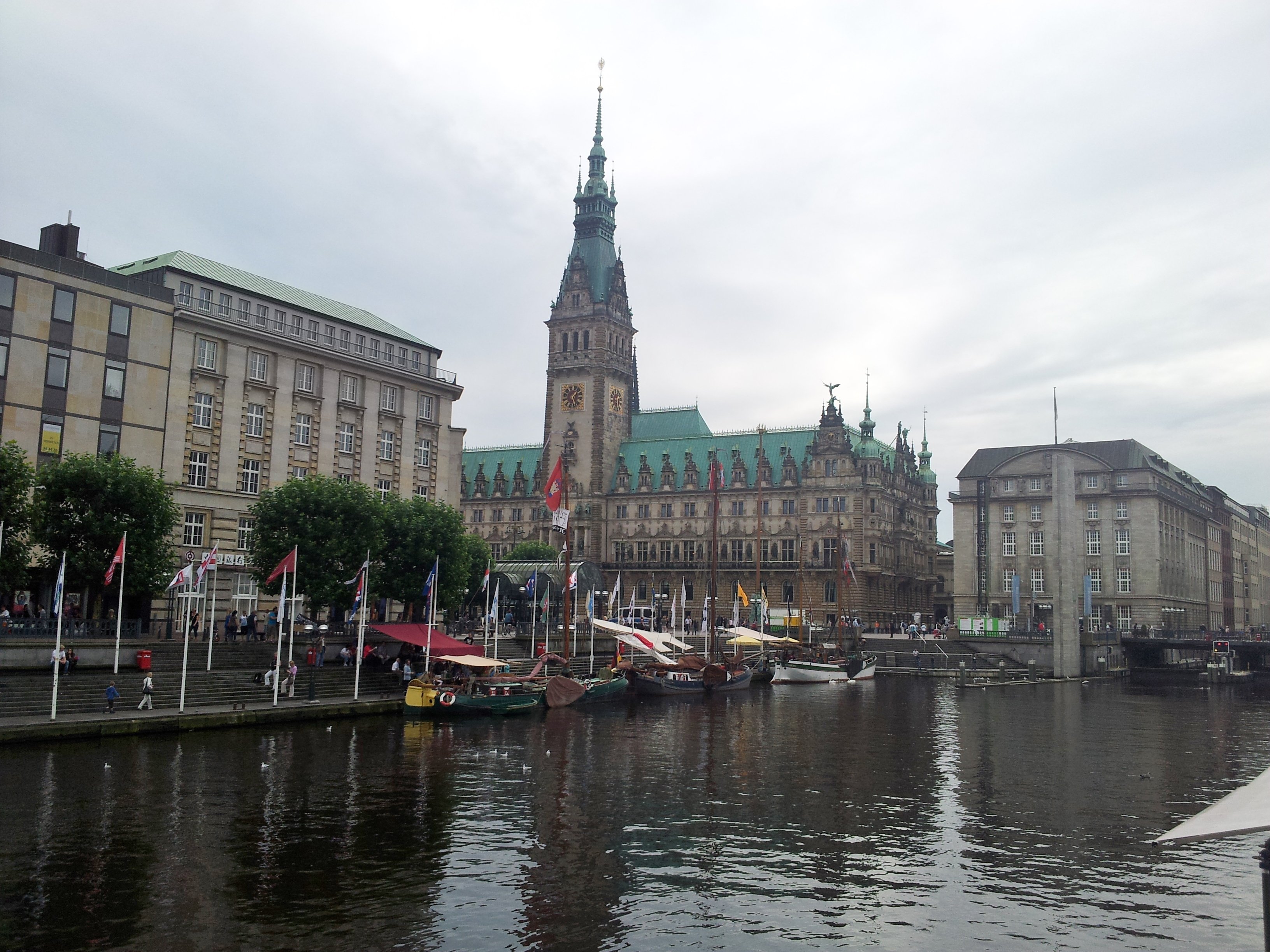
Here I adjusted the perspective to make all the buildings line up. I did a bunch of basic adjustments to get rid of that "foggy" feeling, added color, contrast, some sharpening. I masked out the sky and made it a lot darker. I think I did it even too much, but a dark sky better than an overly bright one in my opinion.
3. @smolalit
Edited image:
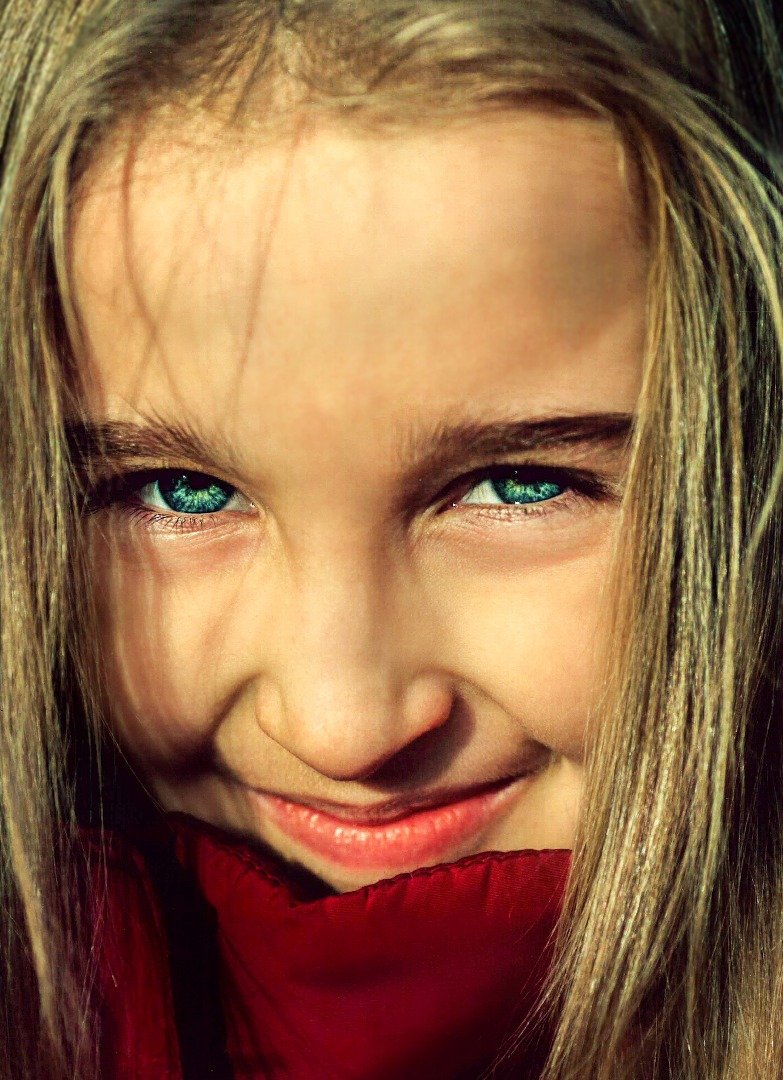
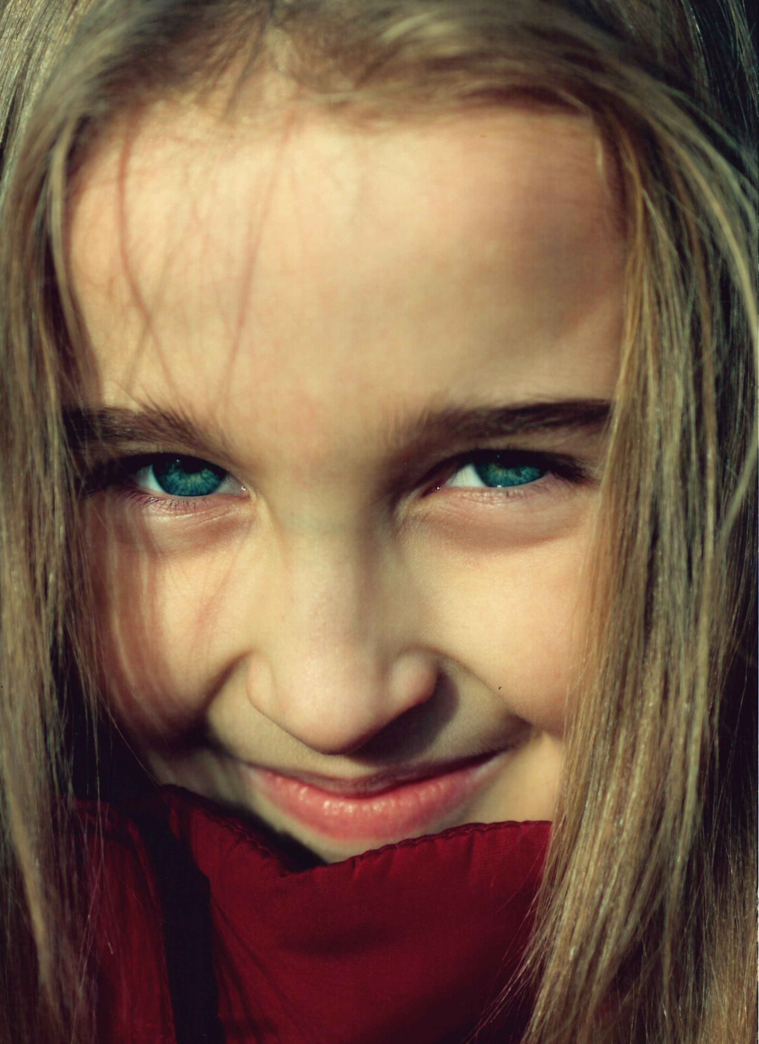
This is a cool picture, though I feel it could use some more room on the sides. I started by adjusting the skin color by adding some green and red. Once I was happy I started coloring the darker spots on her face, mainly her mouth, nose and left brow. To even out the skin some more I used a mix of gaussian blur + high pass filter. I added some color in general and made her eyes stand out more. In the end I also reduced the dark areas under her eyes. I think it came out quite good and I learned a lot by doing this picture.
4. @seisges
Edited image:
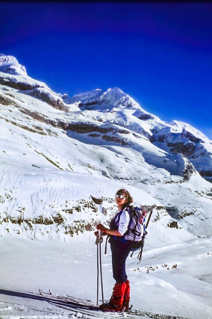

This picture needed some light first. I increased the light areas and darkened the dark areas with adjustment curves. I also reduced the blues and increased the temperature to make it feel sunny. To lose the noise in the sky I simply blurred it out. I did the same thing on parts of the skier. Added some detail, increased contrast and added a lot of color to make her stand out more. I think that was about it :)
Second entry
Edited image:
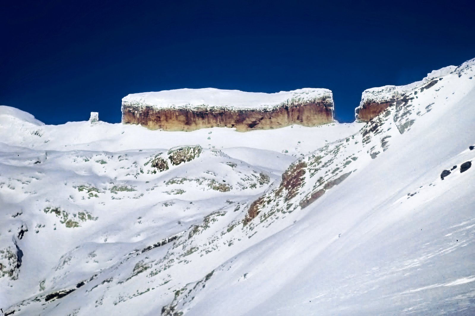

This picture was very similar to the previous one. I added color to the rocks, used many adjustment curves to increase contrast where and how I wanted and blurred out the sky.
And the winner is @smolalit

Previous Posts


