Introduction
As a follow up to my previous tutorial "How to Fix Damaged Photos in Photoshop" I thought it would be useful to look at some standard editing work in Lightroom.
Lightroom has some built in tools that make it easy to do quick retouching of portraits without ever having to go into Photoshop.
Whilst professionals editing photos to be published in magazines or to go on billboards will have more advanced retouching needs the average person can do most things quickly and easily in LR. It is also a much quicker process than going into Photoshop.
The Photo (Original)
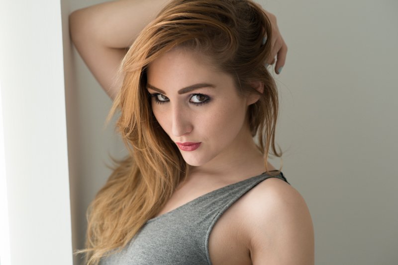
This is a straight JPG conversion of the original RAW file. It actually doesn't look too bad as it is.
Straighten and Crop
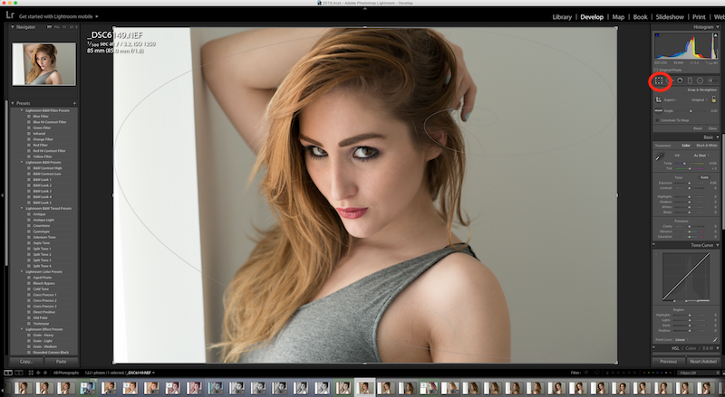
This image just needs straightening rather than cropping but it is all contained within the same tool - highlighted in red.
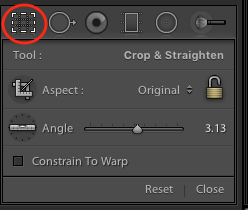
Just move the angle slider until it looks right to the eye. You may need to fine tune this by entering manual values as the slider itself can sometimes be a bit too sensitive. Just click on the number and it will open an entry box. You can also set a different aspect ratio here. I don't want to change it for this photo but it is pretty easy to use - the best way to find out what it does is to experiment with the different settings.
Adjust Exposure and Contrast
The image already looks good from a lighting perspective but I do like to adjust the exposure to see if it looks better. The exposure raises the value of all tones.
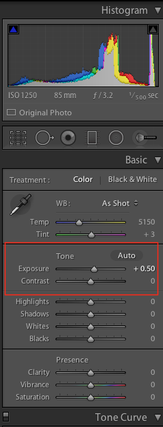
The histogram at the top shows how much of the available range of tones you are filling. Technically you are supposed to fill this from top to bottom. I prefer to use what looks good to my eye.
A higlighted triangle in the histogram corner indicates clipping (i.e. a particular tone has gone to pure white or black) - slight clipping is not a problem and I don't worry about it.
Too much can mean you are losing detail. It is always a creative choice and some people (for example for high contrast B&W) do it deliberately for creative reasons.
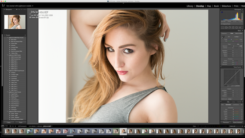
Here I have set the exposure slightly higher. This has reduced the contrast a little but I'm fine with that. The contrast itself doesn't need to be adjusted here but it works by stretching out the histogram i.e. it makes blacks move down and whites move up.
Basically:
Exposure slider = raises or lowers the brightness of the whole photo
Contrast slider = expands or reduces the range of tones in the photo i.e. the difference in brightness between the brightest whites and darkest blacks (the dynamic range)
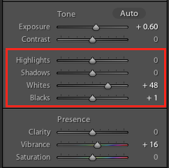
I sometimes prefer to use the highlights/shadows and whites/blacks slider as opposed to or in addition to exposure and contrast controls. These basically allow finer control by splitting up exposure and contrast into 2 settings each. The way to think of it is:
Highlights/Shadows = exposure control for light and dark areas (normal exposure affects everything)
Whites/Blacks = contrast where you can adjust the white and black point independently (or at least as close to that as possible), normal contrast adjusts both
Blemish Removal
For this we use the spot removal tool. Which is just to the right of the crop tool.
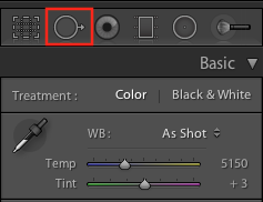
Zoom in on the photo and click on any blemishes. Lightroom will automatically pick an area to clone from and fix the blemish. This will be indicated by another circle with an arrow and you can manually move the clone area around if you don't like the result. You can also adjust the size of the circle using the mouse slider or the size control on your tablet.
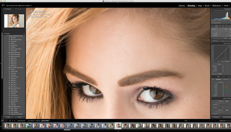
There aren't actually that many on this photo - at least not that you can see at these sizes. Make sure to keep adjusting your zoom and keep moving around so you can spot all the obvious blemishes. Also be conservative too much correcting can lead to a loss of skin texture and an artificial appearance.
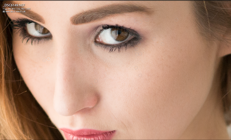
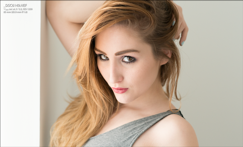
On zooming out it appears that this is now done.
Saturation and Vibrance
On looking at the photo I now think that it could do with a bit more saturation to give it some more "punch".

I prefer to use "vibrance" rather than saturation as it gives a more realistic appearance. Vibrance seems to act by only increasing the saturation of the least saturated parts of the image. It basically a more refined version of saturation which just increases the saturation of the whole image.
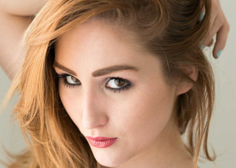
The difference is actually really subtle and only obvious when you move the slider around but that is what we want for this kind of portrait. Too much will make it look strange and unnatural.
Grain
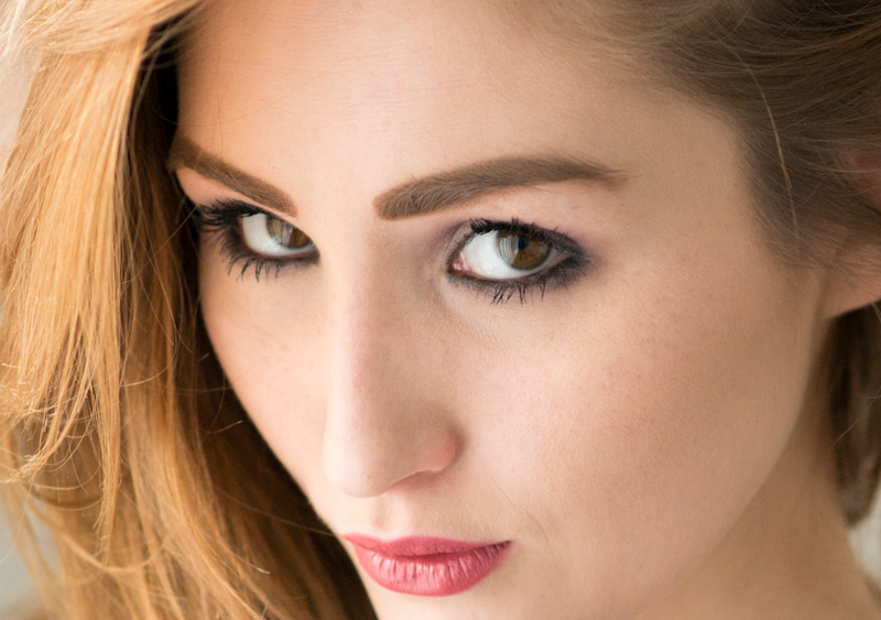
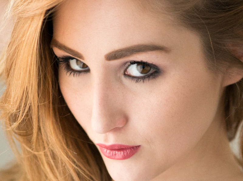
Modern cameras particularly SLRs like the Nikon D800 have very low noise levels which is great but compared to old film cameras the pictures can look very "clean". This is completely a matter of taste but I like to add a bit of grain to my photos to give more of an analogue look:
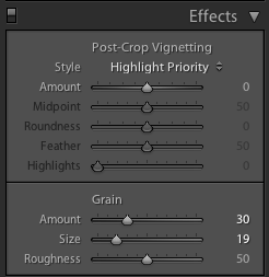
The grain slider is in the effects panel and has 3 settings. These are fairly self explanatory and you can adjust the sliders to see the effect in real time. "Roughness" seems to make the grain more prominent without changing the amount or size.
Before adding grain:
After adding grain (apologies for the different crop). The difference is subtle but I prefer it:
The History Panel
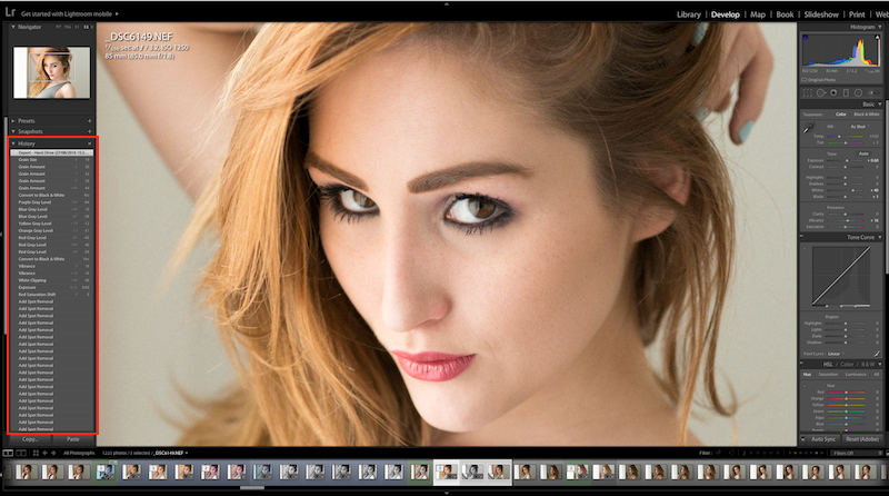
I just wanted to quickly mention that to the right of the Photoshop window is the "history" panel which shows you all the changes you have made.

By clicking on previous changes you can effectively go back to previous changes almost like a time machine and quickly see the differences particular adjustments made. You can also quickly undo them this way without destroying or losing the change in case you change your mind. This is all part of the non destructive editing ethos of Lightroom.
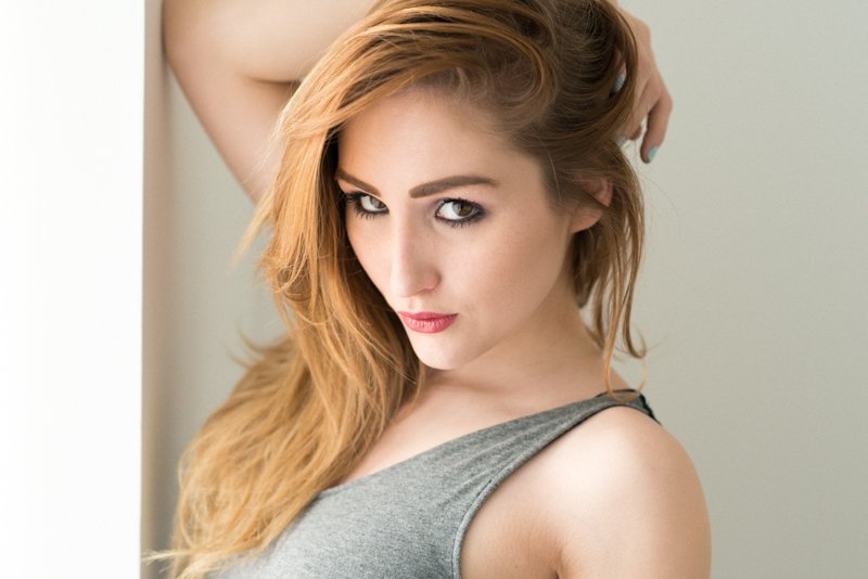
The Final Image
Conclusion
I hope this very basic tutorial has been helpful.
I think these are the most important LR adjustments for basic retouching and should cover 99% of cases for the average person. They are also pretty quick to do and completely non-destructive so you can always go back if you don't like something.
I have tried my best to make it simple and easy to understand so apologies if I have failed at all in this regard. I'd also like to apologise for any missed spelling or grammatical mistakes (there is always at least one).
Please feel free to ask if you have any further questions.
(Model in all shots is Rachelle Summers)
You can see more of my work @thecryptofiend - hope you enjoy.
(Verification for me here: http://www.aapicture.com/about-me)
