Branding plays an essential part in a company or event’s success. It builds awareness and communicates your message to the target audience. A well executed visual presence sets an event apart from other existing events.
Steem Summit, being the first of its kind in the Philippines, needs a visual identity that’s in line with its objectives to make a lasting impact. This brand system represents everything that the event is all about - Fun, Promotional, and a Celebration of Cebuano Passions and Talents.
LOGO
The logo is a wordmark that features a modern and clean typeface. It’s intended to be simple and straightforward to contrast the strong and complex imagery that goes with the brand.
The configuration of the logo can be changed depending on its position in the frame. Since the event is proposed to be held annually, the current year can be added.
![]()
FUN
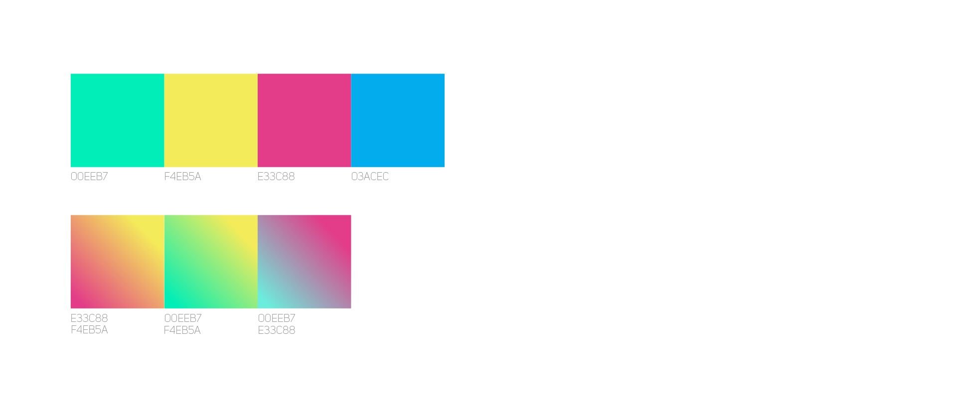
COLOR PALETTE
The fun aspect of the event is expressed through the playful choice of colors. The base color is the mint green shade from the palette of the blogging platform. Complementary colors were then chosen to match and create a distinct palette.
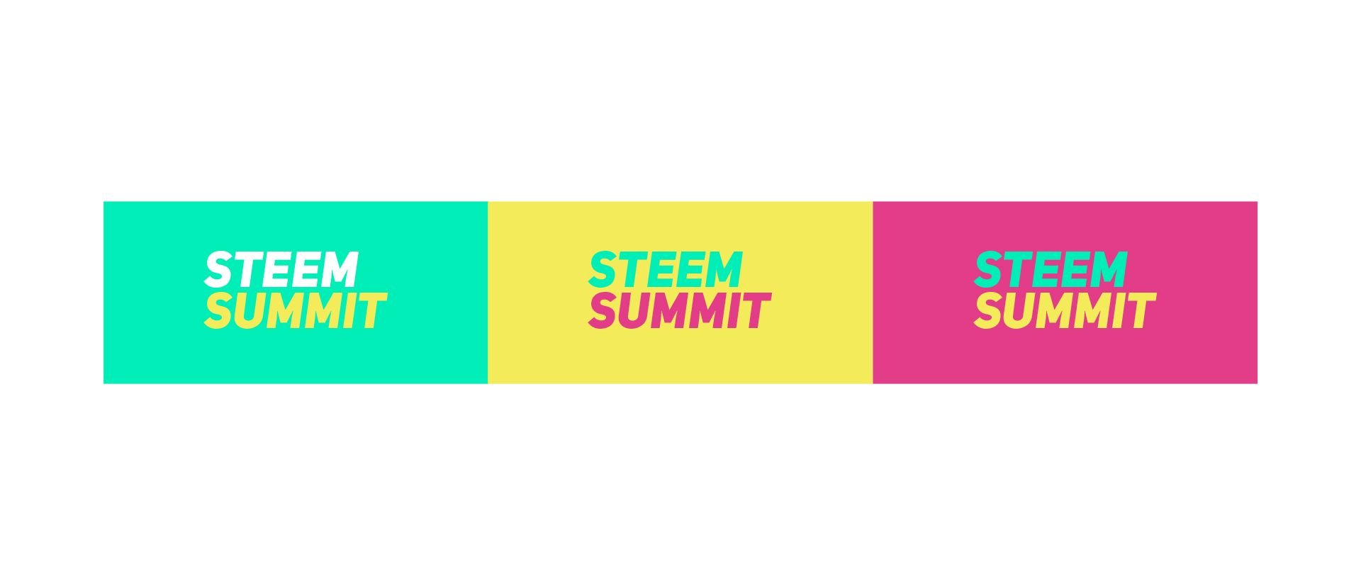
Application of the logo using different background colors.
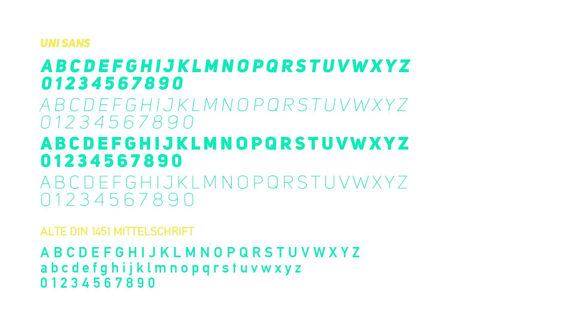
TYPOGRAPHY
All Headlines and Titles shall use the typeface Uni Sans and Alte DIN 1451 Mittelschrift for the Body Copy. These choices are made based on its readability and how it goes well with the overall visual identity.
PROMOTIONAL
Steem Summit is Steemit translated in real life. The brand leads visually in introducing the platform to non-users. To further solidify the event’s identity, familiar elements from the platform were used to create a unified brand system.
UPVOTE
The upvote symbol is easily one of the most recognizable icons on the platform. It’s a powerful feature that sets Steemit apart from other social media platforms.

Basic graphic elements were created based on the upvote symbol. These primary elements are applied throughout the whole brand system.

ICONS
From the two basic shapes, icons were created to serve as visual representations of different functions before and during the event.
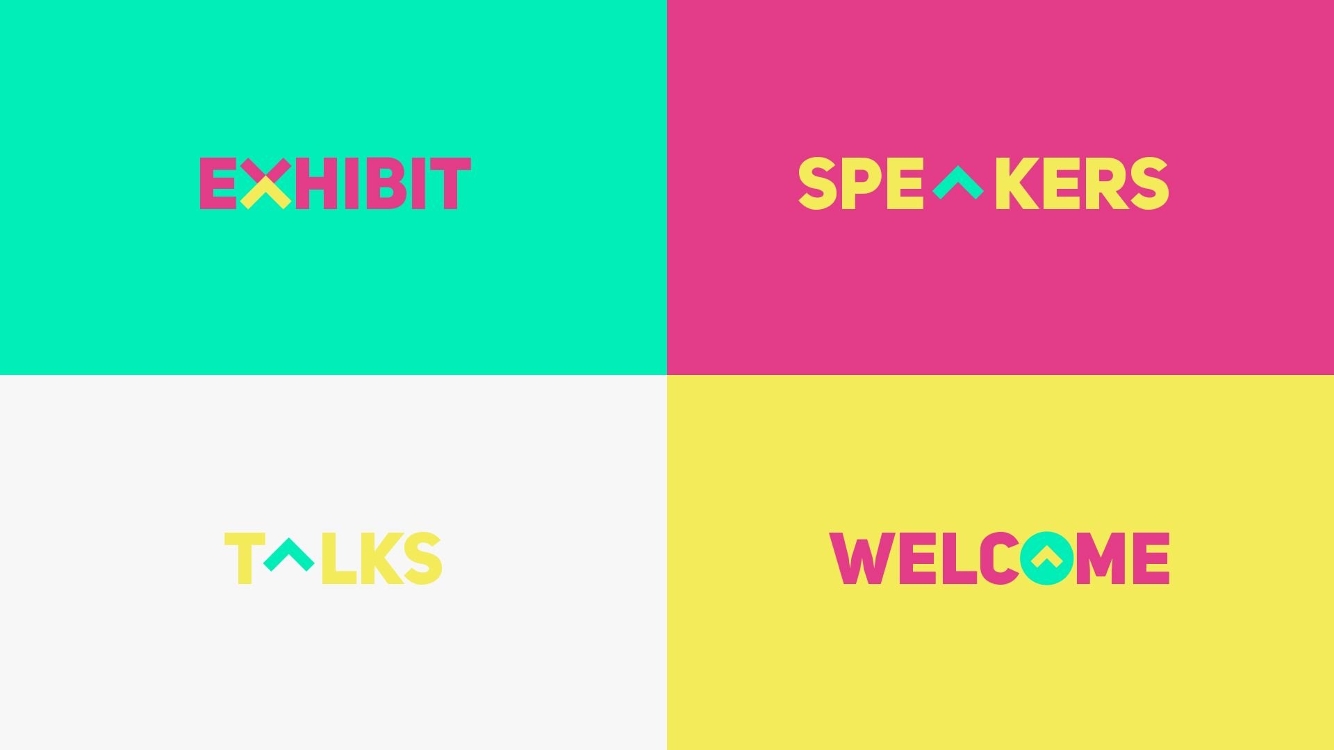
APPLICATION ON HEADLINES AND TITLES
The assigned graphic elements also apply in the Headlines and Titles of the activities and other promotional materials to stay consistent with the brand.
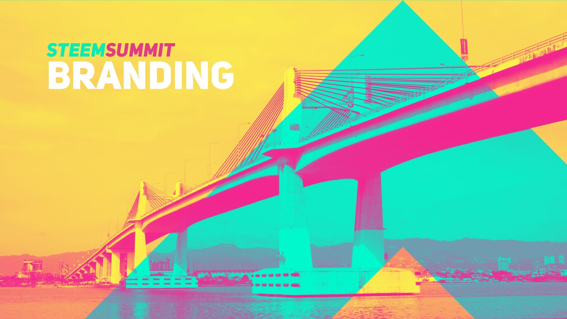
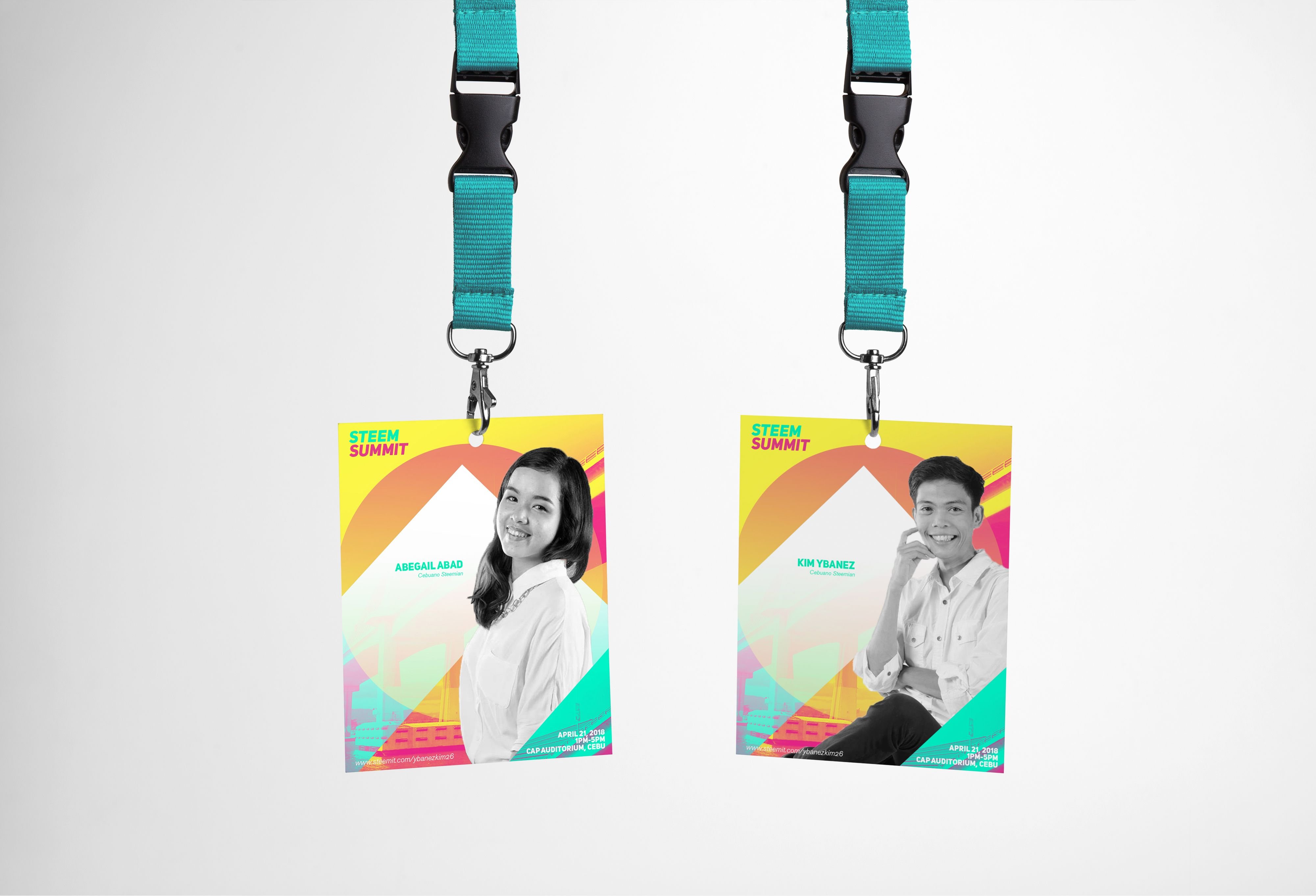
CELEBRATION OF CEBUANO PASSIONS AND TALENTS
Aside from the event itself, the showcase of the diversity of Cebuano talents will also be visible through the imagery of the brand system.
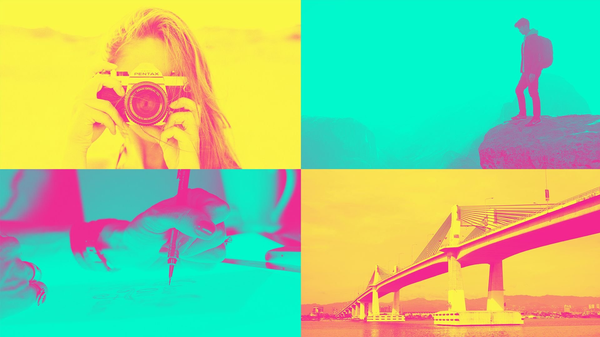
PHOTOGRAPHY STYLE
The photography style makes use of the Duotone effect using two different complementary colors from the brand’s palette. Images of Cebuano artists from different art forms and famous landmarks will be featured in each photograph.
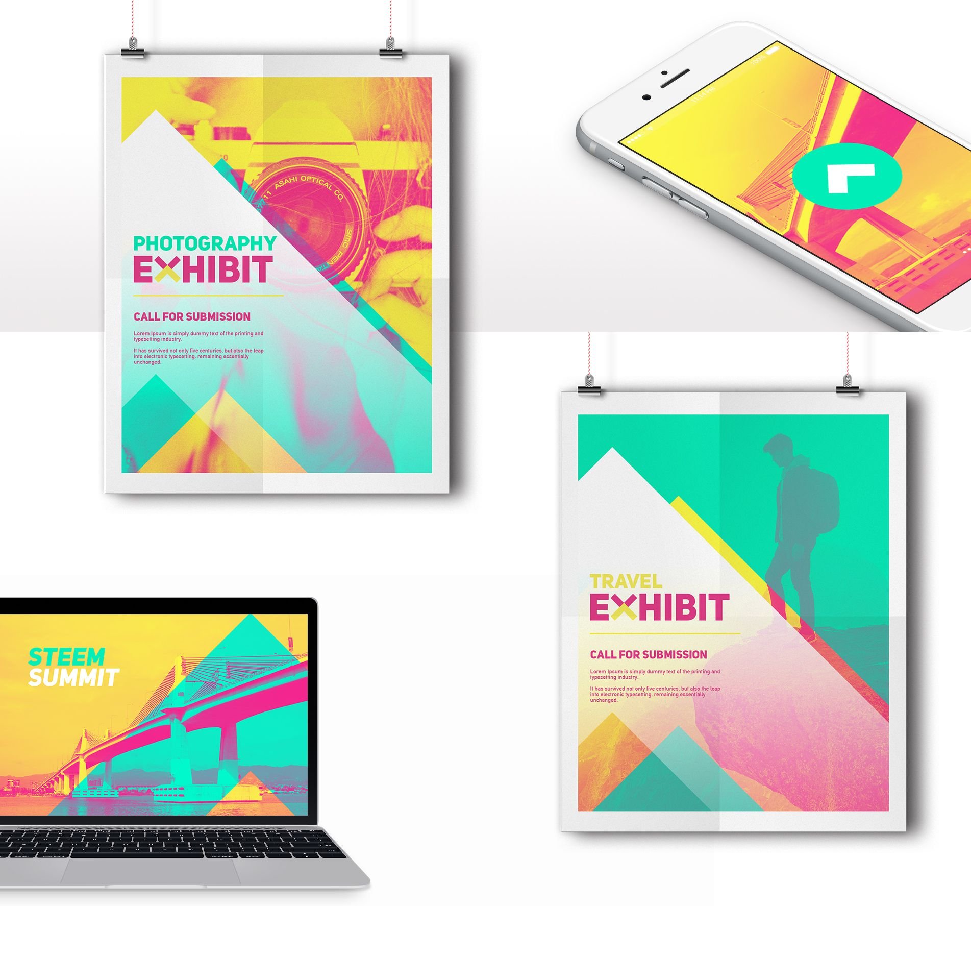
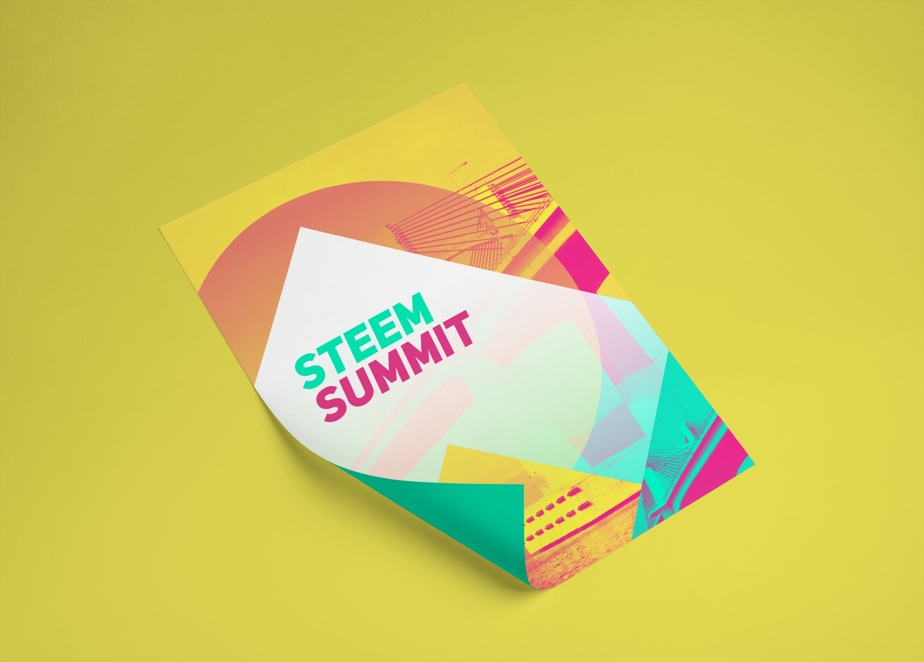
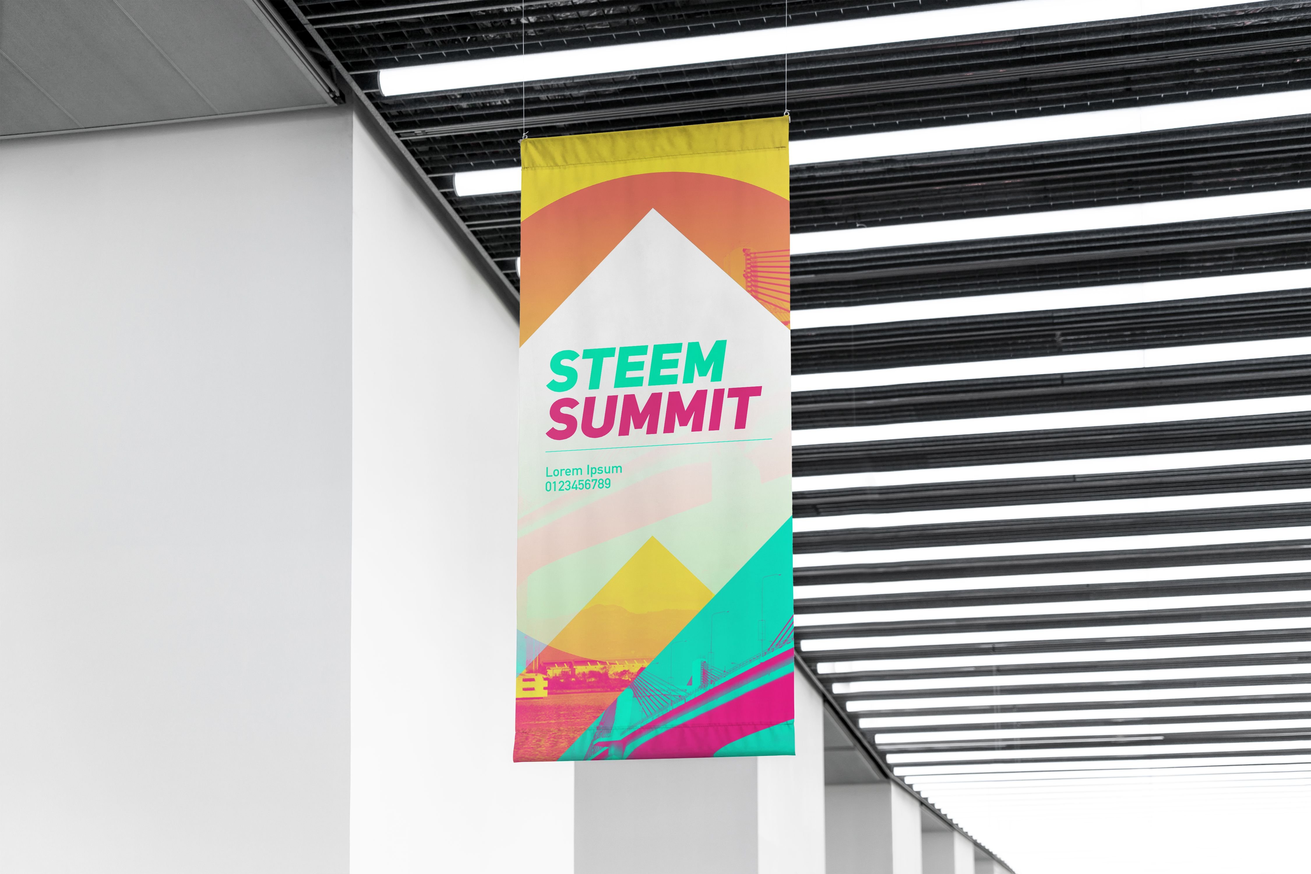
ADVERTISING CAMPAIGN
The brand guidelines will be strictly followed in all promotional materials. Here’s a preview on how the branding is applied in the advertising campaign:
Branding and words by @legendarryll.
Event Organizers:
@honeyletsgo
@legendarryll
@thegaillery
@ybanezkim26