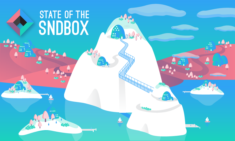
I found this @sndbox competition super late yesterday, and I spent all day working on it. Has it ever happened to you that you finish your work and suddenly there is a power outage? Or your Internet connection goes down? Well, that happens to me a lot, and it happened again this time, but more on that later.
I started working on the banner by redrawing the logo. I noticed it had changed since the last time I submitted for this competition. The one I had redrawn a few months earlier didn't work and now the color palette the @sndbox has is brighter so I made sure to add it to my color swatches window and save time. First step was really fast and I had my main two elements to start.
The Idea
This time I avoided using the logo as one of the graphic elements and started with a digital Illustration of a micro-society.
A micro-society is kind of an imaginary scene of a world that could exist, loosely based on things we've seen and liked. In this case a city of pure white islands, that could also be interpreted as icebergs, in front of the mainland. The city of islands has communities spread out which are only connected by a body of water. Their main mode of transportation is these little taxi-boats that park on each of the island's port to move people around. There is a hub, which is the @sndbox at the top and center of the scene. People are peaceful and hang around in each community, and they all want to go to the hub at some point of their lives. Going to the hub is like a rite of passage with the hanging bridge and a path that goes all the way to the top.
This micro-society is missing things like their citizens hobbies, commercial activities and maybe their ground transportation, but I guess that would go in a more timely creation ;)
How to make a Micro-society?
All the elements should hold a stylistic relation, in this case: color consistency and narrow color palette, very simple and gradient-filled shapes, same shape treatment: no contours and basic shading.
You will need a starting point. For example, the inspiration for this illustration is a monument in Medellin called "The Guatapé Rock", or "La Piedra de Guatapé" and its surroundings. I've never been to this place, but I hope to go someday. When tourists climb the narrow stairwell of this huge rock all the way to the top, they are rewarded with a breathtaking view of a city of islands that seems out of this world. Here is a picture of it:
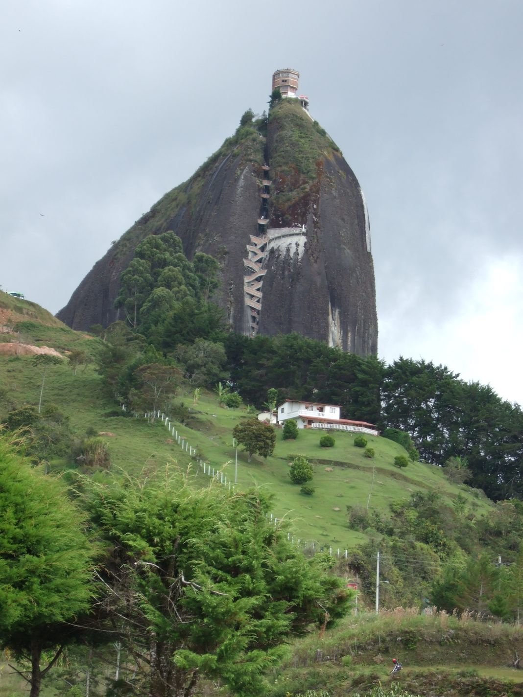
Source: 
Take your inspiration image and recreate it in a loose and imaginative way. The most important part is to think how your people go about their everyday lives.
Anyway, last night I was putting the final touches to this Illustration and just when I was ready to post the Internet went down. It was already 10:40pm, so I was kind of tired and decided to take a short nap and wait till the service came up again. To my surprise I woke up the next day at 8am! I don't even know when service was reestablished. I freaked out and thought I missed the deadline, so I went to the post to see the exact hour 5pm EST, perfect! So here it is, the final proposal for this month's banner as seen on top of this post.
Process screen-shots
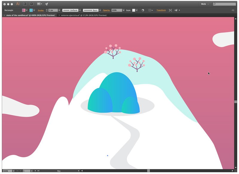
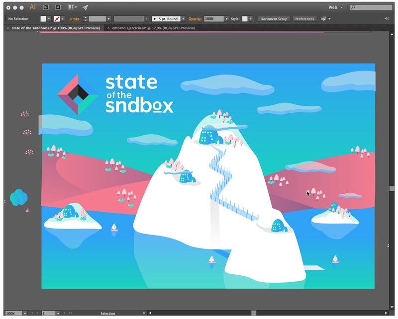
I started with the main element, the big rock in the middle with it's steep path.
Added islands, greenery, sky and sea...
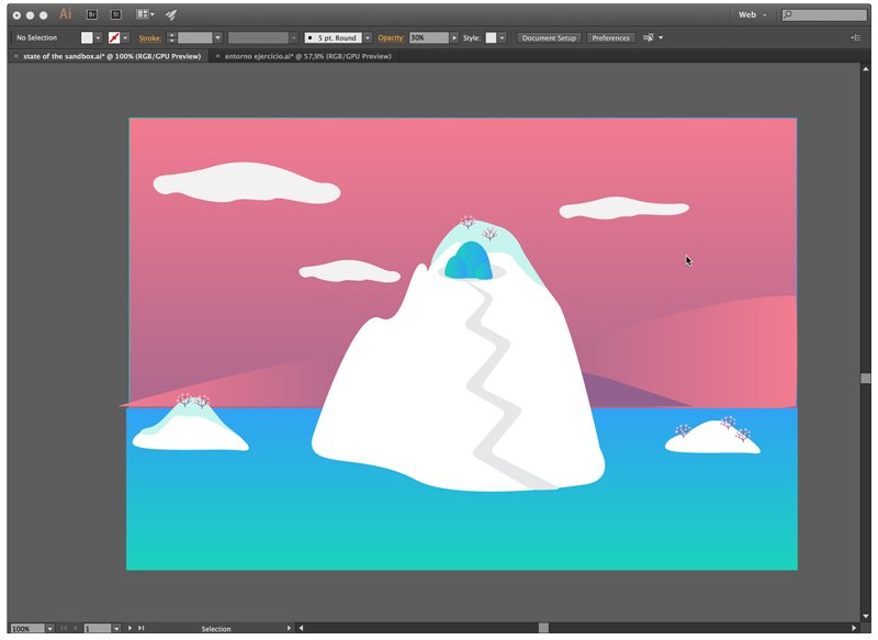
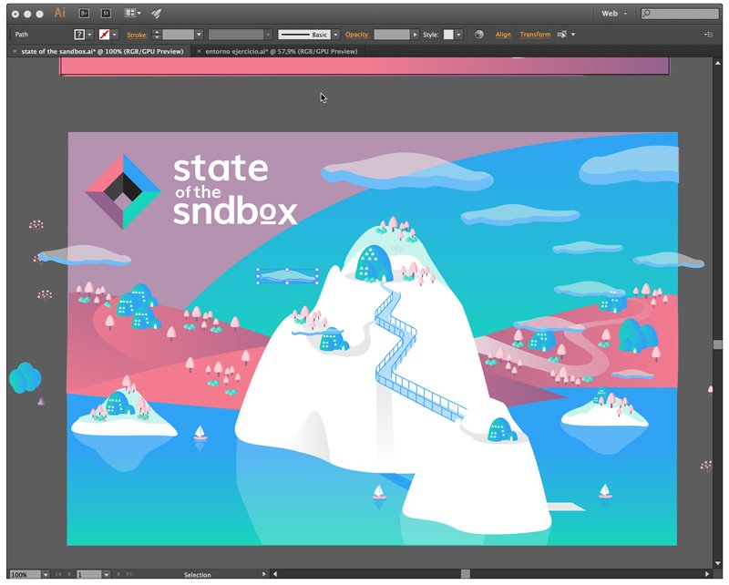
Almost finished with all the elements
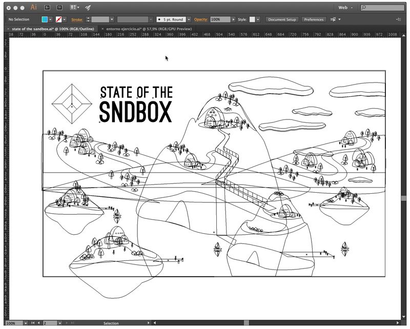
This is an outline to prove I actually did this
And a more advanced scene of the work.
That's it for now. Have a great day and keep on Steeming. Thank you for reading.
If you want to know when I post, follow me on:
Twitter: https://twitter.com/Creativista_
For the occasional pic of my work and life follow me on:
Instagram: http://instagram.com/creativista_
Steepshop: http://steepshop.com/@creativista
