My painting and graphic design for the #sndbox challenge
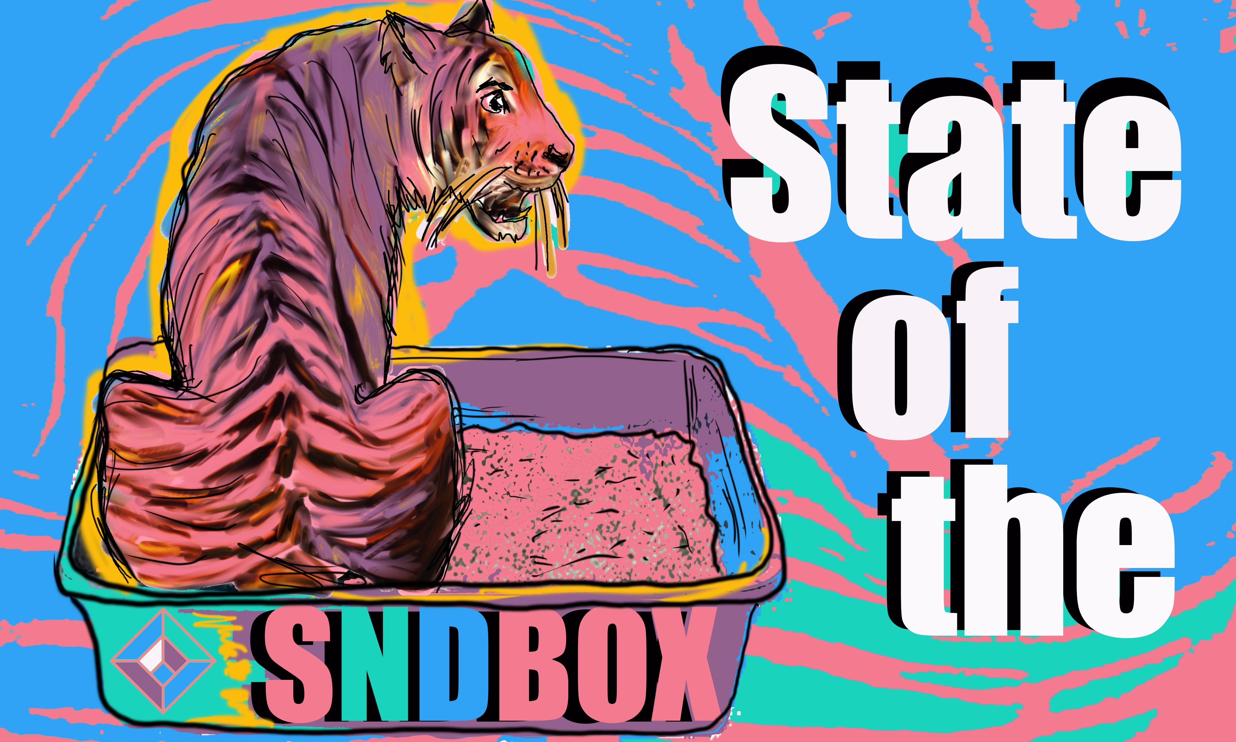
This image is in the right ratio and can be shrunk to 1000 x 600 but I made it larger to make it easier to work on.
I had wanted to do the #sndbox challenge earlier in the week, but we have had a horrible storm here in Coastal New England and were without power for three days. Yesterday we also lost it again for an hour. But, I digress...
I wanted to use a bit of my painting style and love of animals mixed in with a more graphic look for the #sndbox logo. Although today is the deadline, if you would like to join in please go here.
When I thought of #sndbox and wanting to do an animal, my first thought was a cat using her litterbox or sandbox. This did not seem really very positive an image but did like the humour in it. Then I thought, A Tiger is very badass and whatever it could manage in a sandbox would be stellar. Thus the state of the sndbox was tiger awesomeness.
To make the overall graphic I used photoshop and the colours provided. I wanted to have the tiger stripes as a coloured graphic in the background of the image making it pop with the colours of #sndbox logo. So I isolated the stripes of the tiger for that and put a layer of it over a solid background.
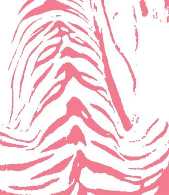
I wanted it to feel a bit pixalated almost low res since I wanted the emphasis on the painting.
So I laid out the background, used the tiger stripes and used an image of a catbox, changing the colours and making it more pixalated and graphic to hold my Tiger painting.
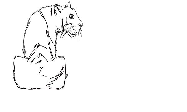
My painting I did as I would normally, sketched then inked a basic outline.
Then using the pink of the colours provided painted in the base of the tiger and sampling the colours of #sndbox with some other shades to make definition.
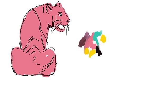
Here it is painted up and ready for application in the graphic with the text. Rather like making collage in real life.
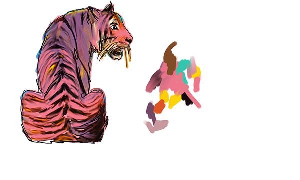
Then I just isolated the painting and pulled in onto its own layer on the graphic in photoshop. Then in photoshop I used a paintbrush tool to outline the box and add a bit more definition to the tiger and then added some bold yellow to make the tiger really pop.
I wish I could have had more time on this, but I am happy with the overall look. I really wanted to make a graphic for this challenge that still held a bit of my painting style and love of animals.
If you appreciate my work please feel free to upvote, resteem, and by all means comment.

