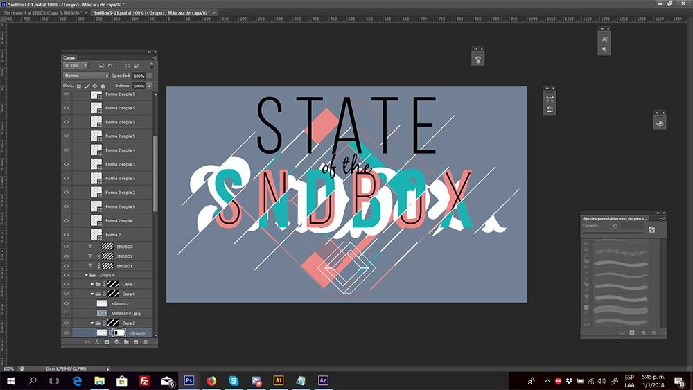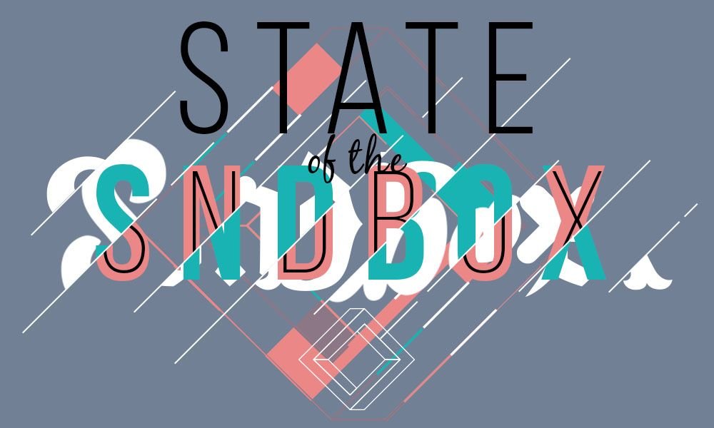
This is my entry for the monthly contest of State of the SndBox, the previous time I made a version with a lot of detail, but then I understood that it should be able to see the text clearly so this time I focused on making it simpler and cleaner, I focused more in typography so I made several sketches of letters that I like and mix.
Process
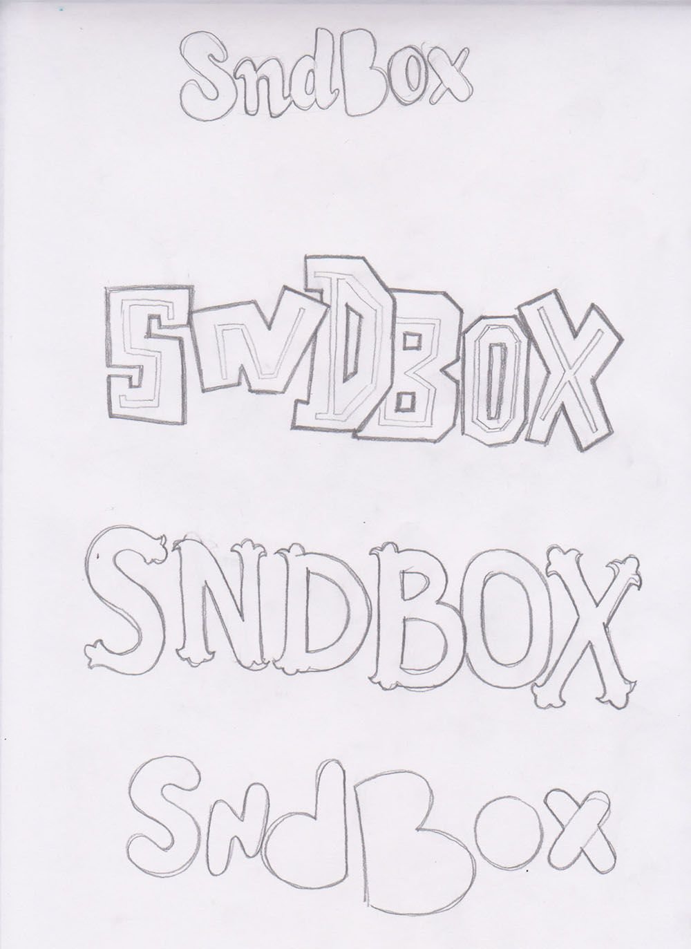
after sketch came the trace pass
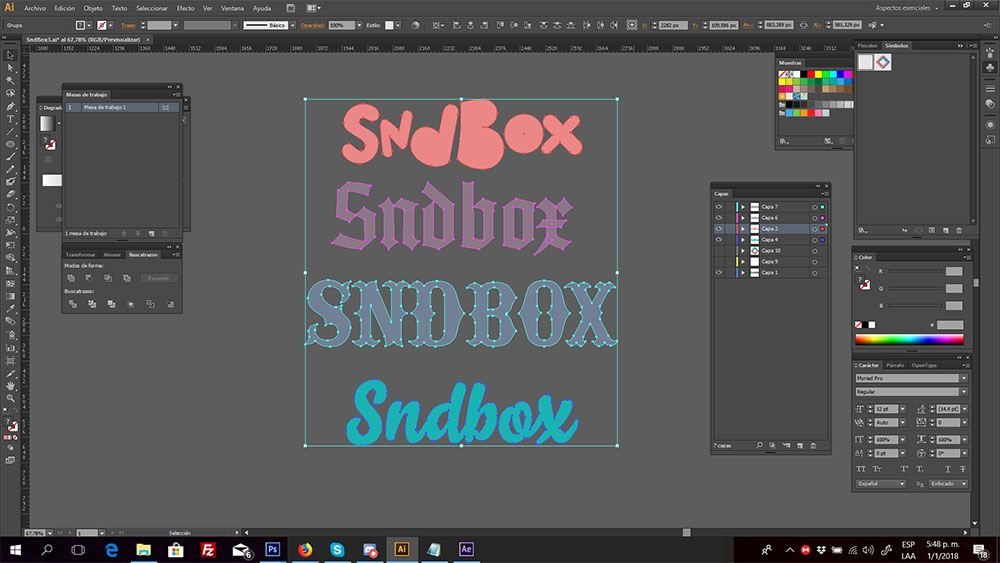
then change to photoshop and make the mask process to mix everything
