Hello y'all...
I just want to share my "state of the sandbox" design with you. I saw the contest yesterday and I felt I would definitely sign up for this.
There are two designs here.
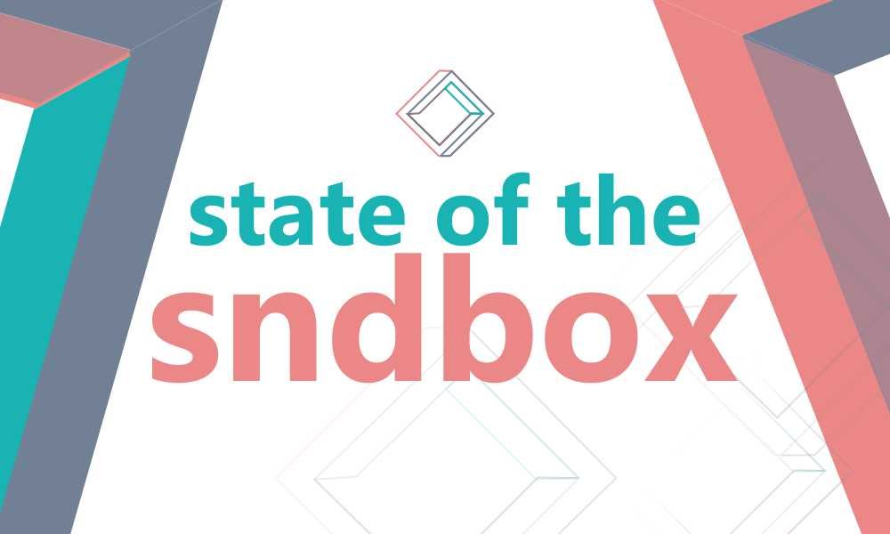
Number 1 was done using the both sides of the logo. The right and the left side of the original brand logo is represented here to give a nice visual appeal of the brand "sndbox". As consistency is the hallmark of great brands.
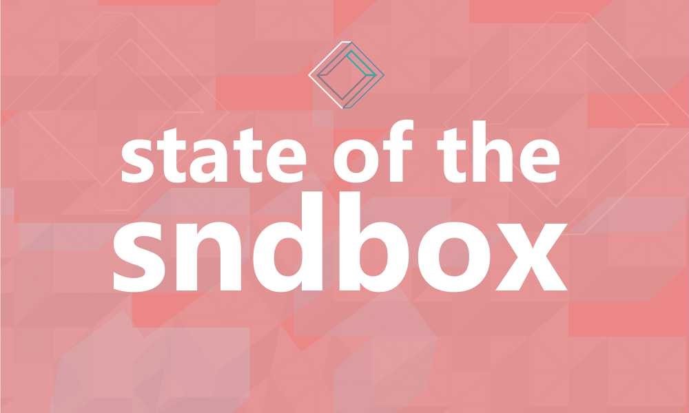
Number 2 was just trying a different style using colours as the tenet. A transparent 3D box pattern in the background. And also a representation of a one colour logo on the main design.
1

2

So, guys... Which one is cool to be the thumbnail design for sndbox this month.
I will appreciate your comments and feedbacks. Kindly upvote my design as well. Your upvotes will go a long way. Thank you
