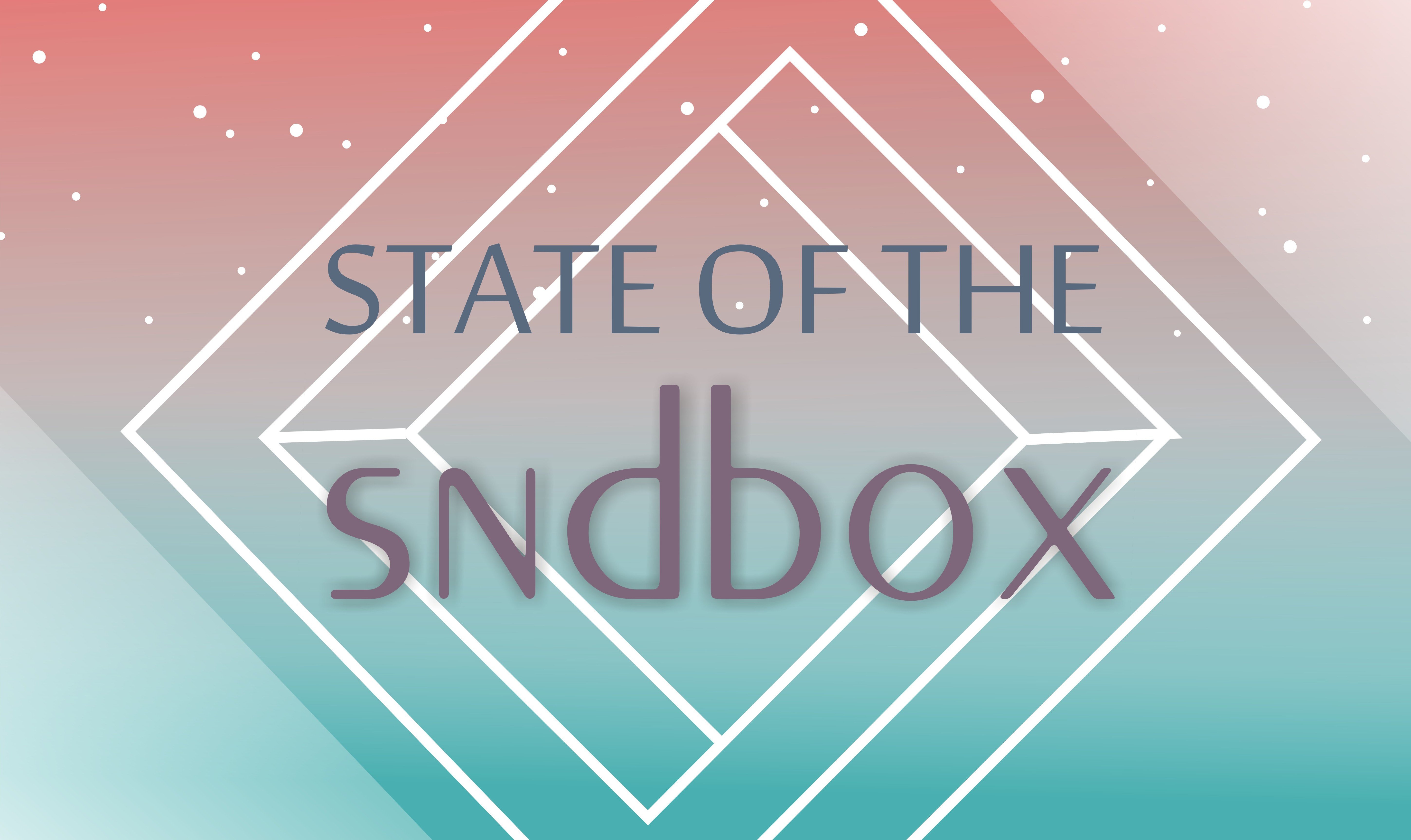
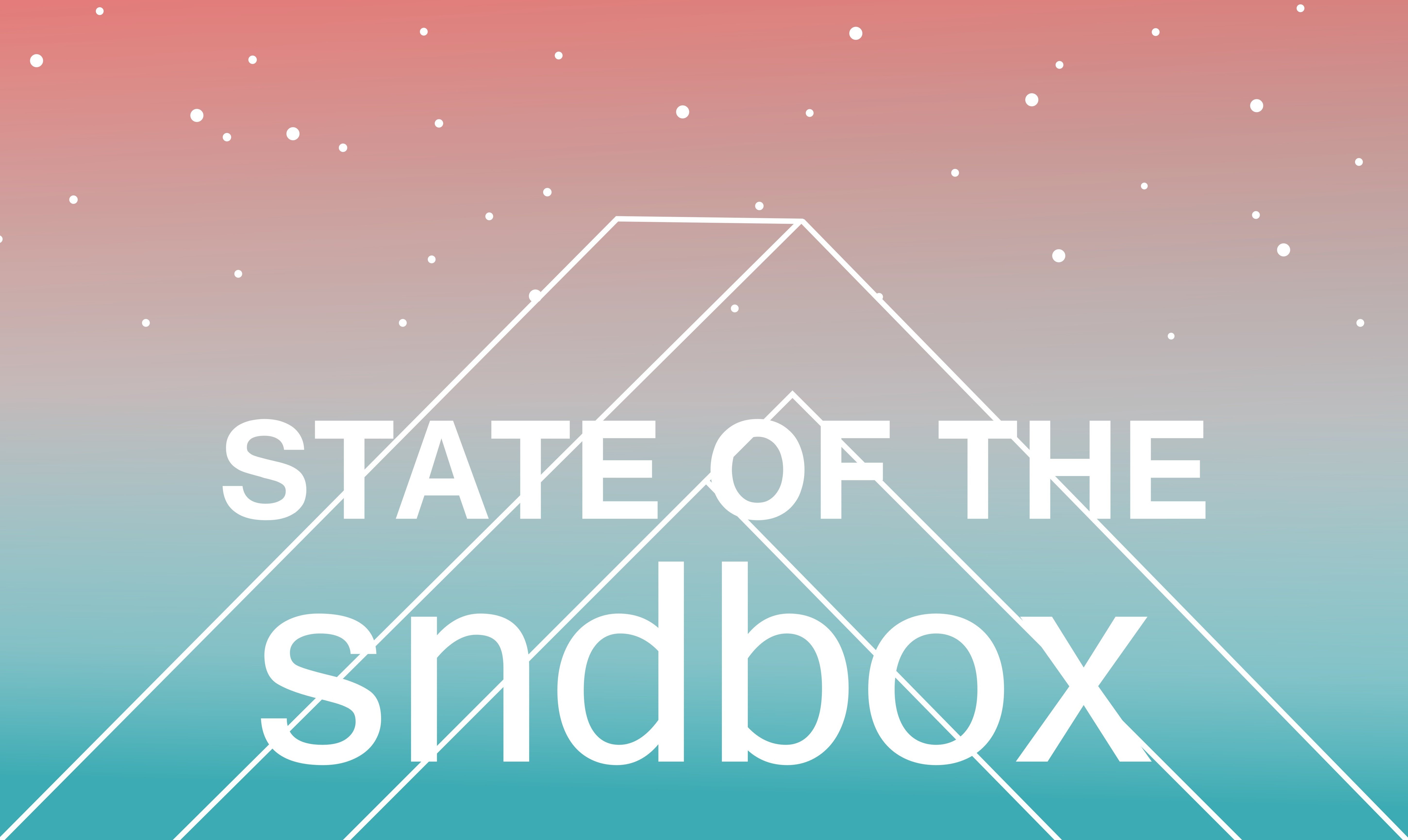
I found an interesting contest by @sndbox. They are searching for a thumbnail . I am not a graphic designer, but I like challenges, so I tried something :)
Here are the results:


I usualy use Corel Draw for works like this. I wanted the thumbnails look simple and soft, so I decided to draw a white outline of their logo. The color reminds me of the evening sky, so I added also stars.... I would prefer the second version.
Thanks for watching and have a nice day!
Follow me on Steemit

