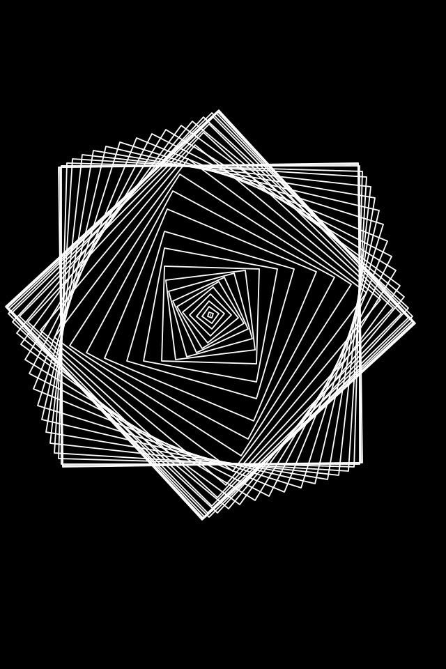
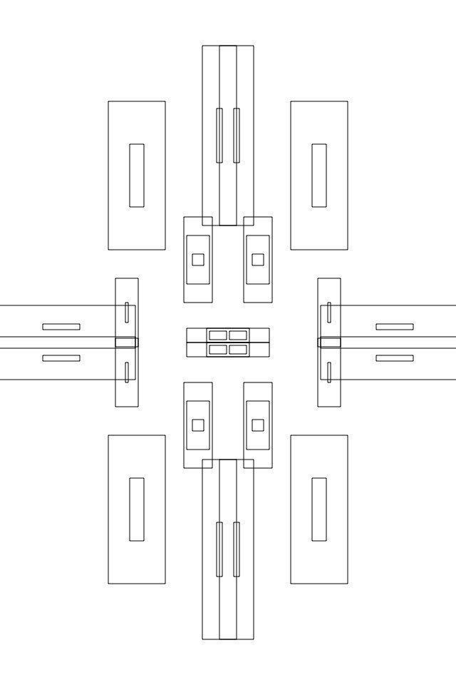
I'm new to the steemit community but really believe in the platform and the message of decentralization. The posts on the @sndbox feed have been really helpful in giving pointers on how to effectively engage with this community. So when i came across the posting for a thumbnail design contest, I figured I would throw my proverbial "hat in the ring" as I have been doing a lot of design and graphic work over the years. Most of the things have been for my own projects or the occasional commissioned work, but i enjoy creating original digital graphics. They are usually pretty simple and abstract. I typically like a lot of "air" or openness in my designs.
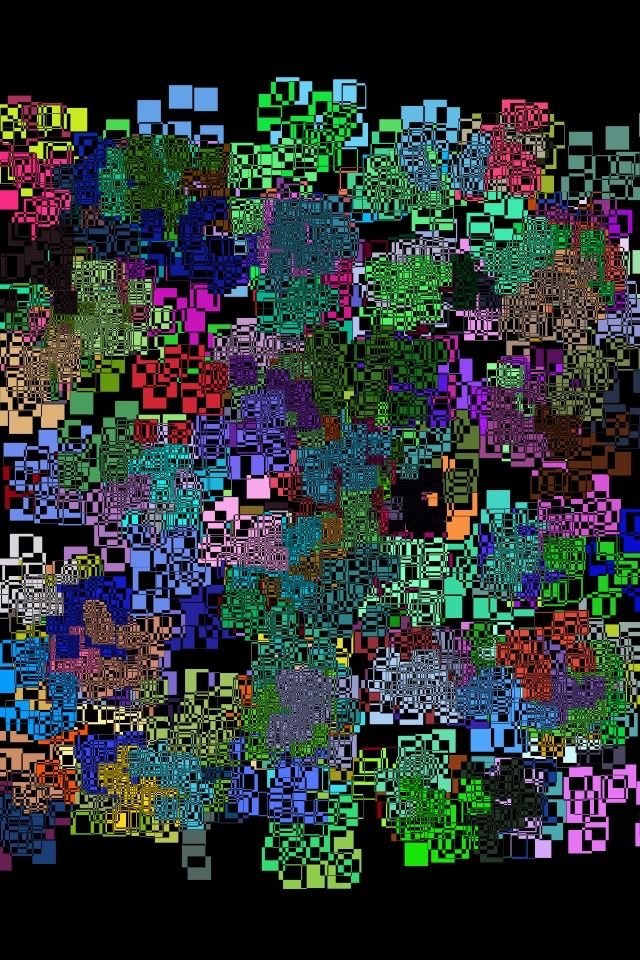
Some end up being a little more colorful though.
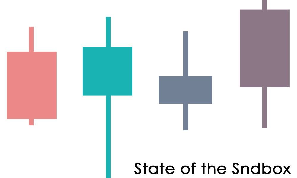
When I saw the posting for the @sndbox contest, I had a clear vision of designing something that reflected the underlying valuation of the community: the exchange-level value of STEEM. As more people start to hear about the steemit platform, there will be more users which will cause the market value of STEEM tokens to rise. Most exchanges and crypto tracking websites display their metrics in graph-form using "candles". I wanted to mirror the concept of candles while showing the (left to right) valuation as fluctuating but growing because that's what I feel the value of STEEM is doing. Our online steemit community is strong because of contributors like @sndbox so wanted to hopefully offer some creative support. Hope you all like it.
Is it too bland? Should I have made the candle lengths steady rising or was it effective to stagger the heights? Any feedback is welcome. Thanks!
