✦Ⓗⓔⓨⓞ✦
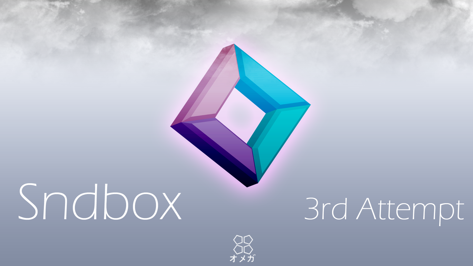
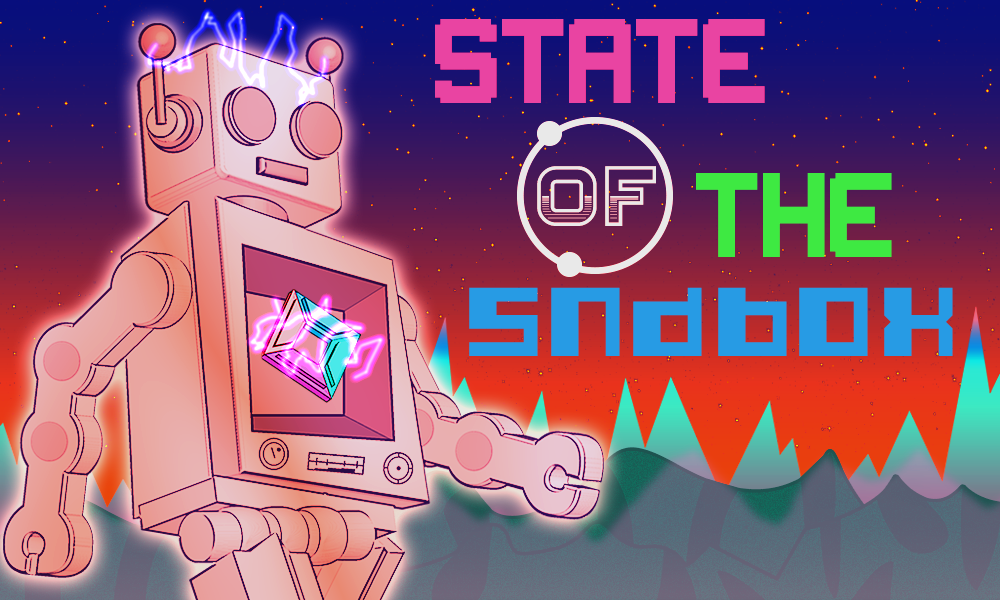
What a wonderful Friday, and I just finished my thumbnail for the sndbox contest. 3rd times the charm, right? I love making these thumbnails every month because it pushes me to make each thumbnail more creative, and the sndbox has allowed me to do just that. But, it can be hard at times, because I start to wonder, is this a thumbnail that I would like, or is there something that I'm missing? Then I start thinking deeply, getting lost into my own mind like a child in the store. And then [click] I'm right where I started, typing to you. Then again, maybe it's all in my head.
Ⓟⓡⓞⓒⓔⓢⓢ
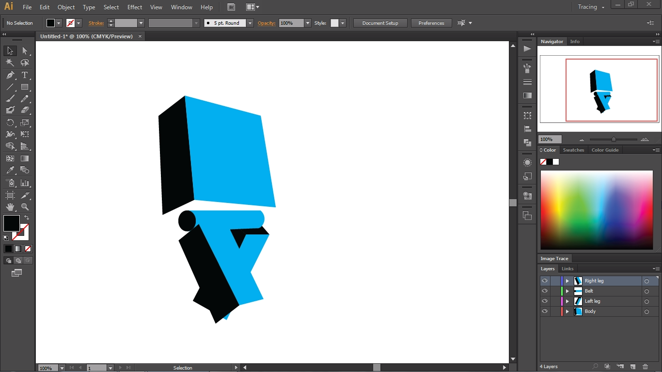
So, first off, I tried to make simple 2d shapes with the rectangle tool for about 10 minutes, and then a light bulb shot through my brain, like the flash running back in time. The 3d effect in illustrator was ideal for this project, so I ended up going with that.
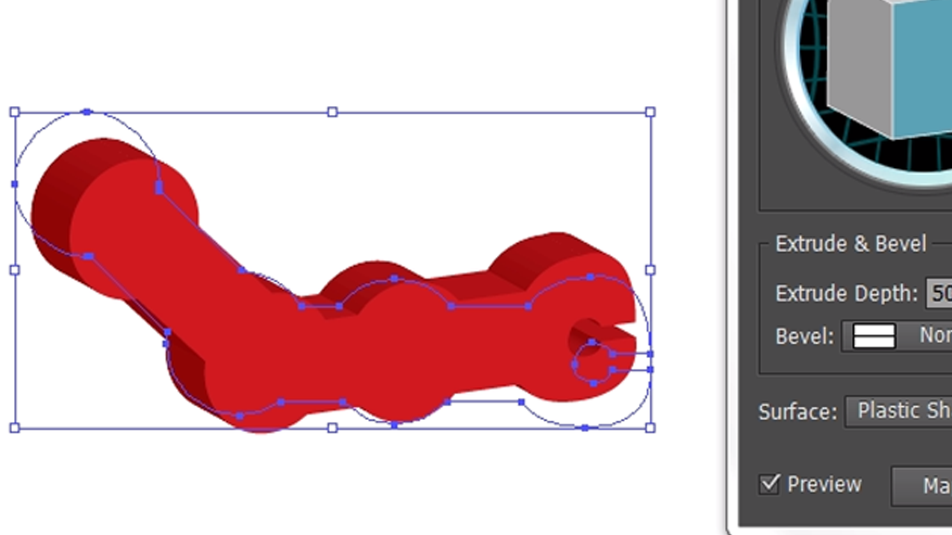
In the left the picture, I drew out the arm with my trusty pen tool. It took me a few tries to get the arm the way I wanted it to. Then I converted it into a 3d object. I just played around the extrude and lighting settings before I finalized the object. The same process went into the other arm as well.
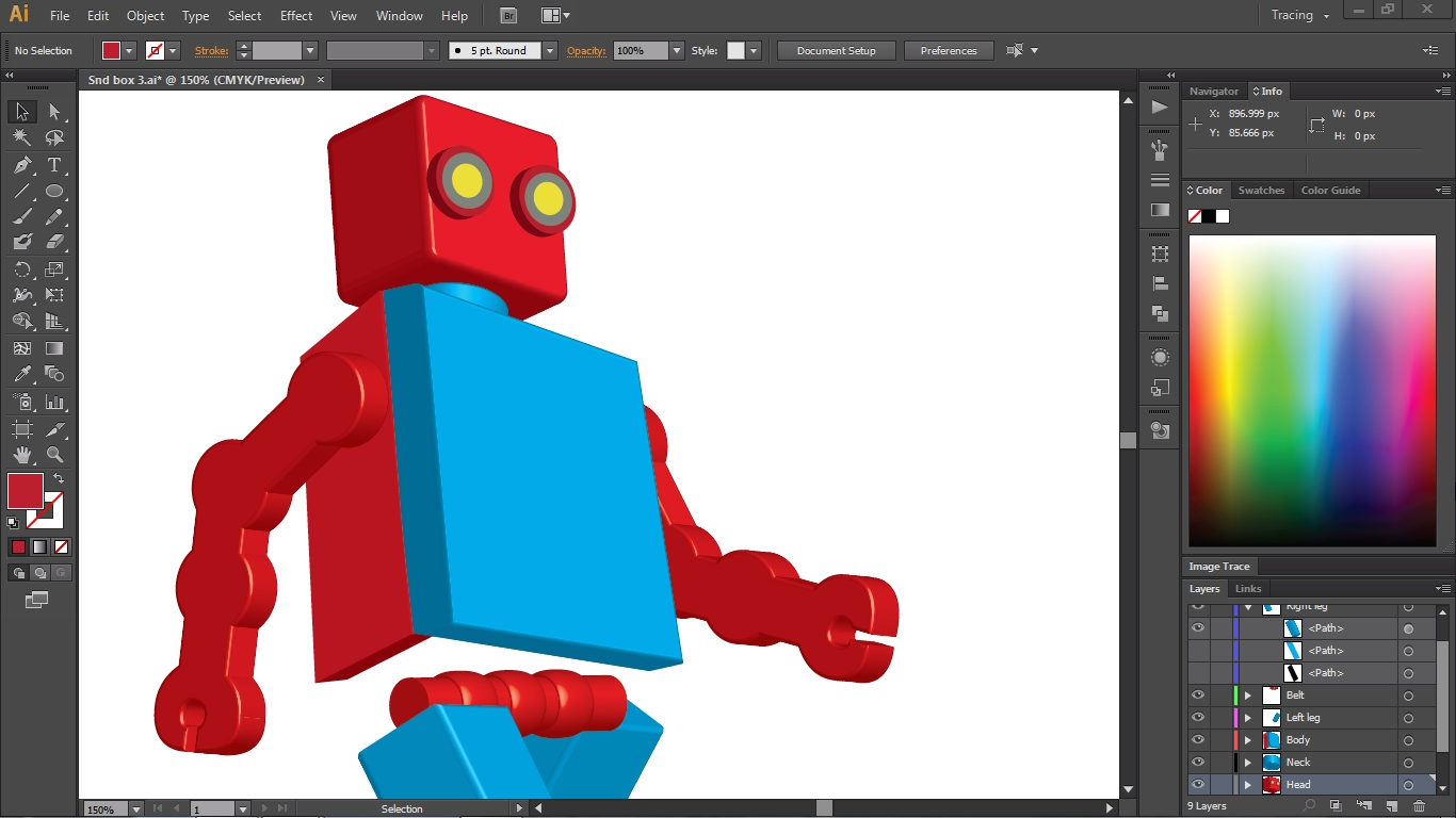
Huh, I just realized something, the picture above has a resemblance to a logo men. Coooool (❍ᴥ❍ʋ) anyway, I was not trying to go for that, but rather a vintage robot from the 50's. So, I proceeded to convert every shape to a 3d object. The trickiest thing to do was layering the objects to their respectable places. For the time being I put the reds and the blues there for a brief moment.
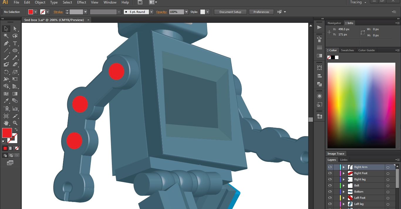
The next thing I did was change the robot's body parts into a dark blue color. Again, I tried to see what color would look the best for this robot. After that I put designs on the arm and a compartment inside of the robot. This would later be a place for the sndbox logo where it powers up the robot to move. ( ̄ε ̄〃)b
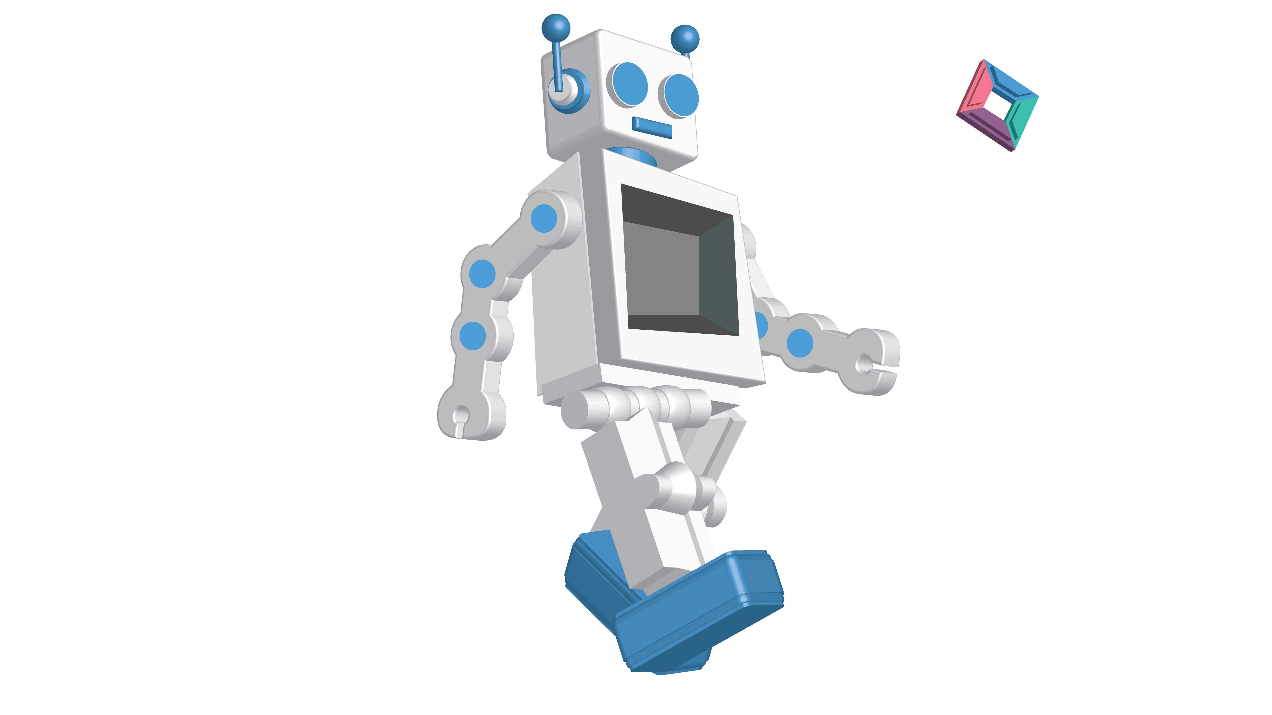
This is the final design for the robot. I just went ahead and exported the file into a png. I think giving the robot a white and blue color was a good chose. I wanted to use the sndbox colors but for some reason it wasn't turning out good. I guess certain colors don't go quite well with certain things.
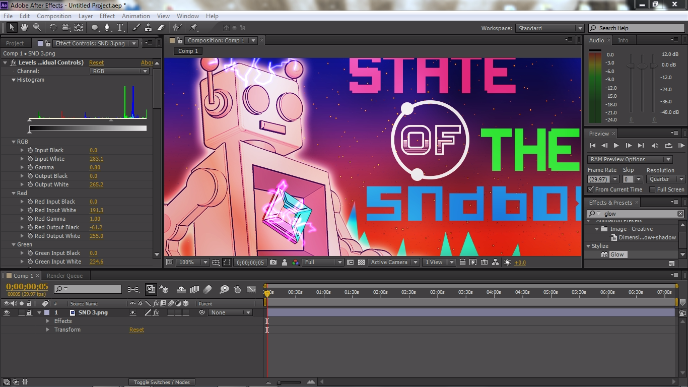
Lastly, I move the image into Photoshop and added in several effects to the picture. But I lied, that's not the last thing I did because after I was done modifying the image, I moved it into after effects. The last thing I did was add in a lightning effect to the logo and head, and also I played around with the filter settings. Then I just rendered out the picture into a png. Done done
Illustrator CS6
Photoshop CS6
After Effects CS6

