A few days ago I've noticed that the fat tail of payout distribution has gotten fatter. This has gotten me curious, so I've decided to investigate.
I have started by gathering data - scraping the Steemit Trending page with all posts above $10. This yielded a little over 300 posts.
Payout Distribution
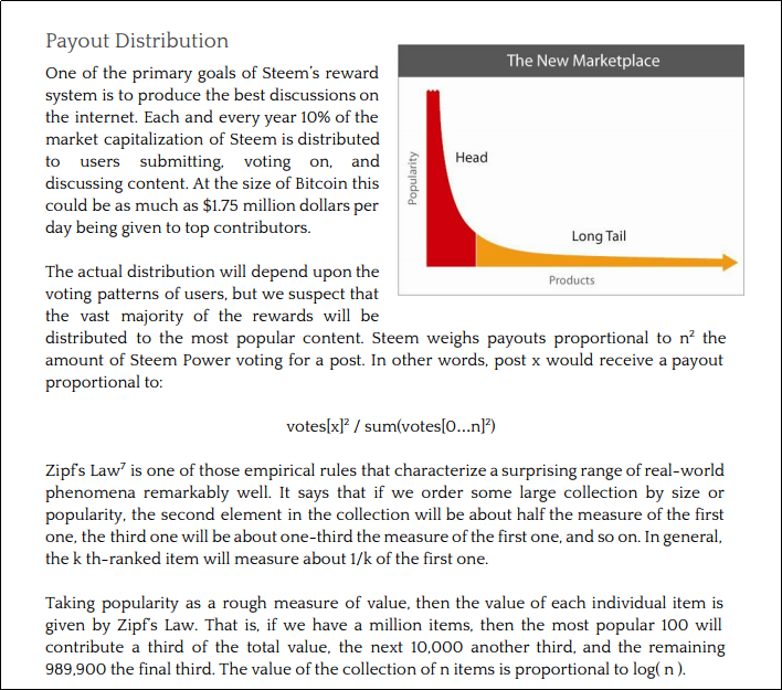
Source: STEEM Whitepaper, page 22.
Interestingly enough, the whitepaper predicts the payouts to follow a power law distribution.
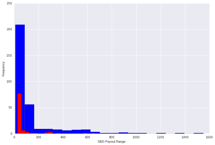
Within the limited top ~300 post sample, I have found an inverse relationship to be true - most posts fall into the lowest payout bracket. This is not an exact power law distribution, but it looks close. This confirms the long-tail hypothesis.

Project Curie
At the beginning of this post I've mentioned that the fat tail has gotten fatter. A month ago, Steemit was more like a lottery. The homepage would have a dozen or so high paying posts, while everybody else would get nothing. Does anyone remember the $31,000 makeup tutorial?
If you decide to scroll trough the trending page today, you will find a very long list of posts that range beteween $10 - $500.
One potential reason for long-tail fattening may be the community effort to find great quality content - including but not limited to the creation of groups such as Project Curie, RobinHood Whale and the smoothteam.
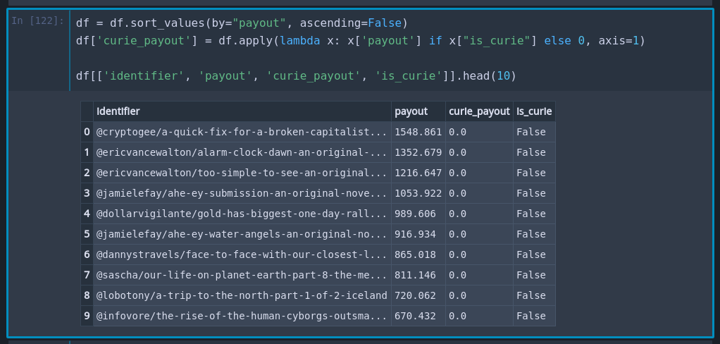
I would have to do more digging to actually prove the causation, but for now, I have decided to just look at the distribution of posts that have been voted on by the Project Curie.
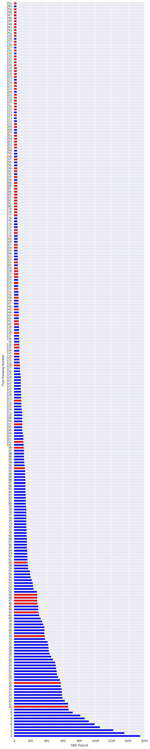
The posts are reverse-sorted by payouts. Red marked posts are those which have been upvoted by the Project Curie group.
It looks like these posts predominantly belong to the long tail. We can see this again in a more succinct view of the distribution (again, Red = Curie).
Links
 Don't miss out on the next post. Follow me.