Hey Steemians,
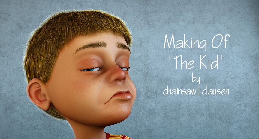
today I want to share my third making of, for the first artwork I've posted here on steemit. It's the image of a little boy with a dropped ice cream cone. (@chainsaw-clausen/the-kid-cgi-artwork-by-chainsaw-or-clausen)
Research and Concept
In 2000, the "Der Spiegel" magazine (a german politics and society magazine like "times magazine") published an artwork by the fantastic caricaturist Chris F. Payne on his cover.
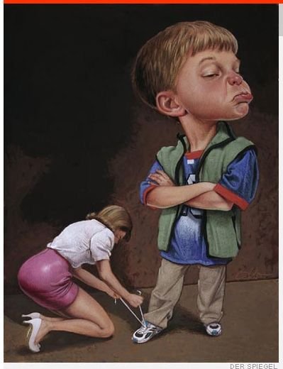
I'm a huge fan of caricatures and totally fascinated about the realism that artists put in their works. And I've identified myself and my own childhood with this artwork.
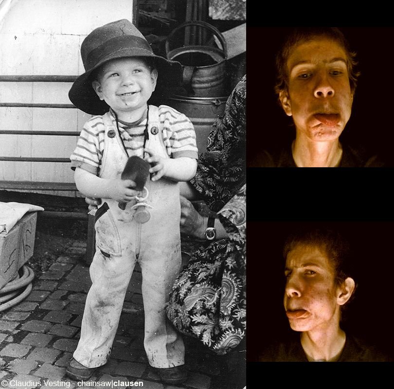
(That's me as a kid and with 19 while doing some facial expressions fun in front of a webcam.)
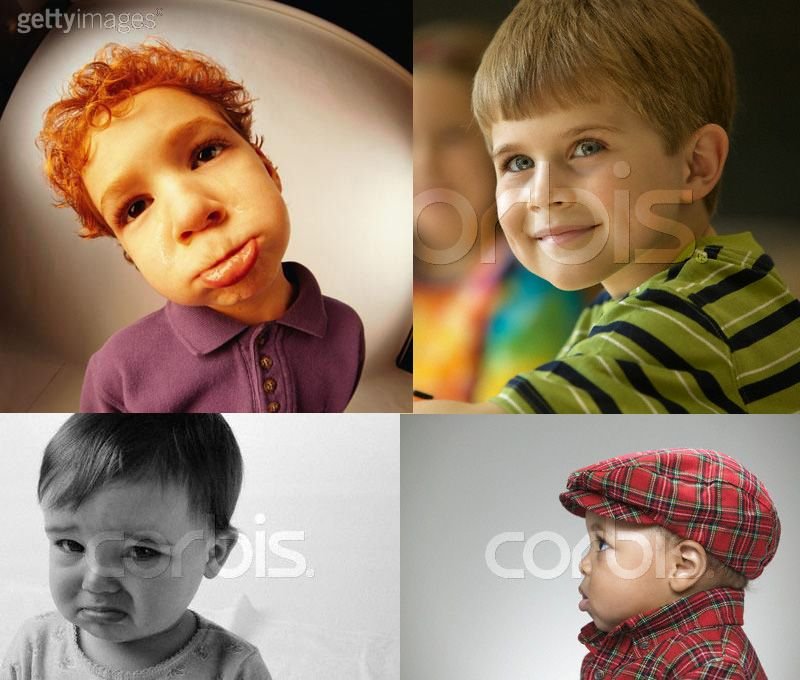
I was thinking to myself that I want to try a similar artwork one day. That was few month before I've start to deal with 3D computer graphics. Over the years I've often rememberd to this image and at the beginning of 2007 I knew my skills are good enough now and so I could started on my own version of this image. I also had a lot of inspiration through my niece and my nephews. It's incredible how arrogant and cheeky kids can be. Long story short. I've started searching modeling references in different image databases and found a lot of good stuff.
Modelling
With a big bunch of references I've started the modeling. It's good if you have images for head modeling from side and front view, because it makes things so much easier but I've learned on this project that it's most important you feel the form of an object and become an understanding of the volume, shapes and curves. I've started the modeling with only one side view reference image but have notice that it's better to continue without reference images in the viewport and do it freehand. The whole modeling of the head and body was made with poly by poly technique. That means I've created face after face in my 3D program to shape out the model.
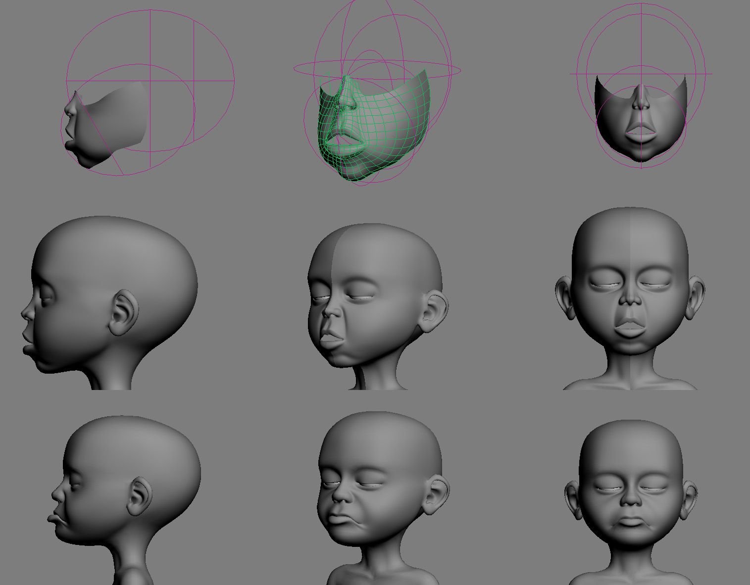
I've completed a normal T-Posed model. At the end I've made a facial expressed model. I've used a morph modifier to slide between the two models. I thought (at this time) it's a nice way to get more control about the final pose.
Rigging and Clothes
I didn't wanted to make an animation and so a complete rig wasn't useful. But I've make a simple rig for posing and cloth simulation. For the rig I've used a biped and the physique modifier (booth things that totally suxx in 3ds max and I prefer CAT and skin modifier today! :D ). For the cloth simulation I've used the SimCloth plugin (it's outdated BTW. If you can... use Marvelous Designer for cloth.). I've started with a simple model of the shirt and pant, UV mapped it, smoothed and simulated it.
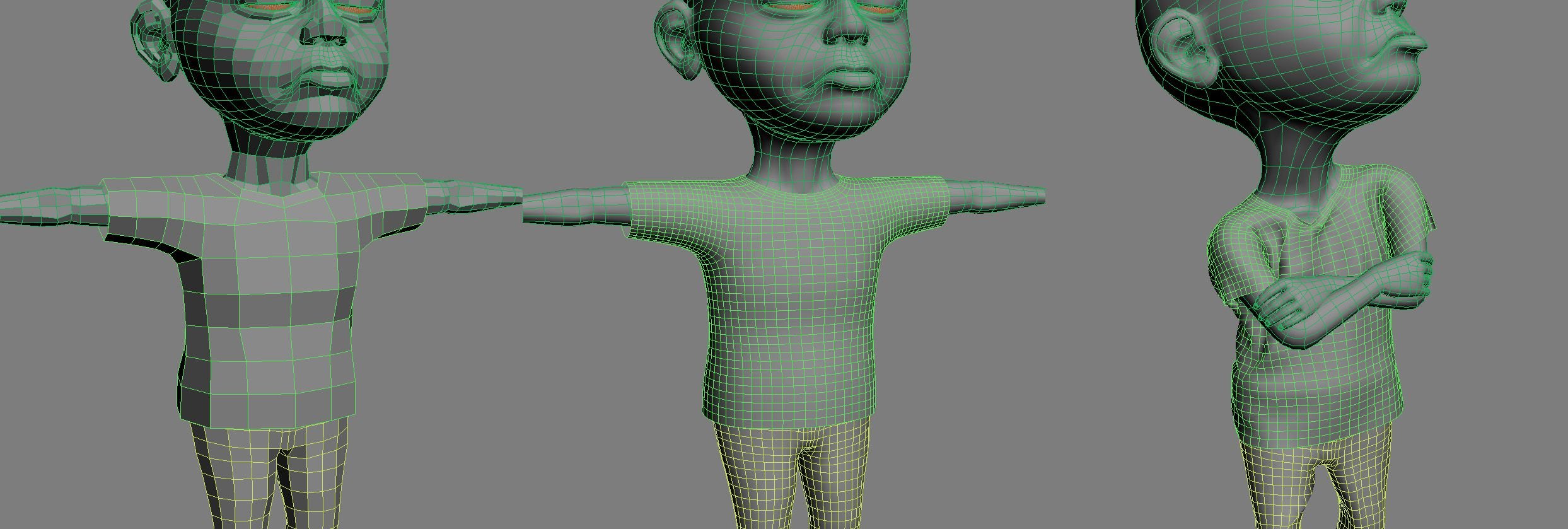
In the next step I've make stitches. I selected the edges, chamfer a bit, extruded a bit, fixed the UV's, solidify modifier for thickness, fixed some overlapped polys, add a collar and voila the shirt is finished. On the same way I've finished the pants.
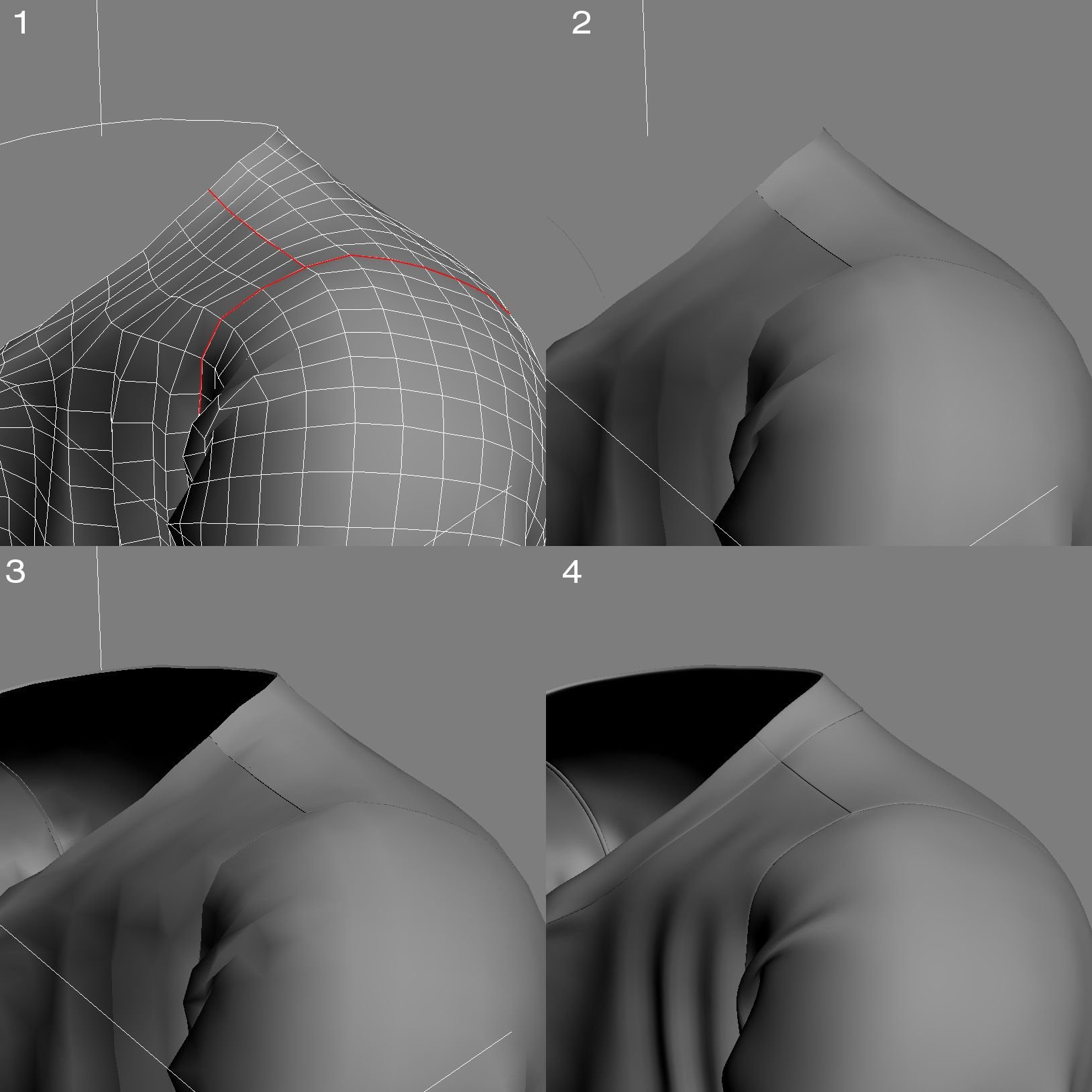
Hair
The hair was done with on board tools (Hair & Fur). I've selected the faces on the head where I wanted hair and let them "grow". After that I've played a bit barber and have cut and brushed it.

Unwrapping, Textures and Shaders
In the next step I've unwrapped the whole model. I had didn't use any special technique or something. Only the good old unwrapping with max standard tools. (Wouldn't never do this today. With some good plug-ins for 3ds max you can do your work much faster.)
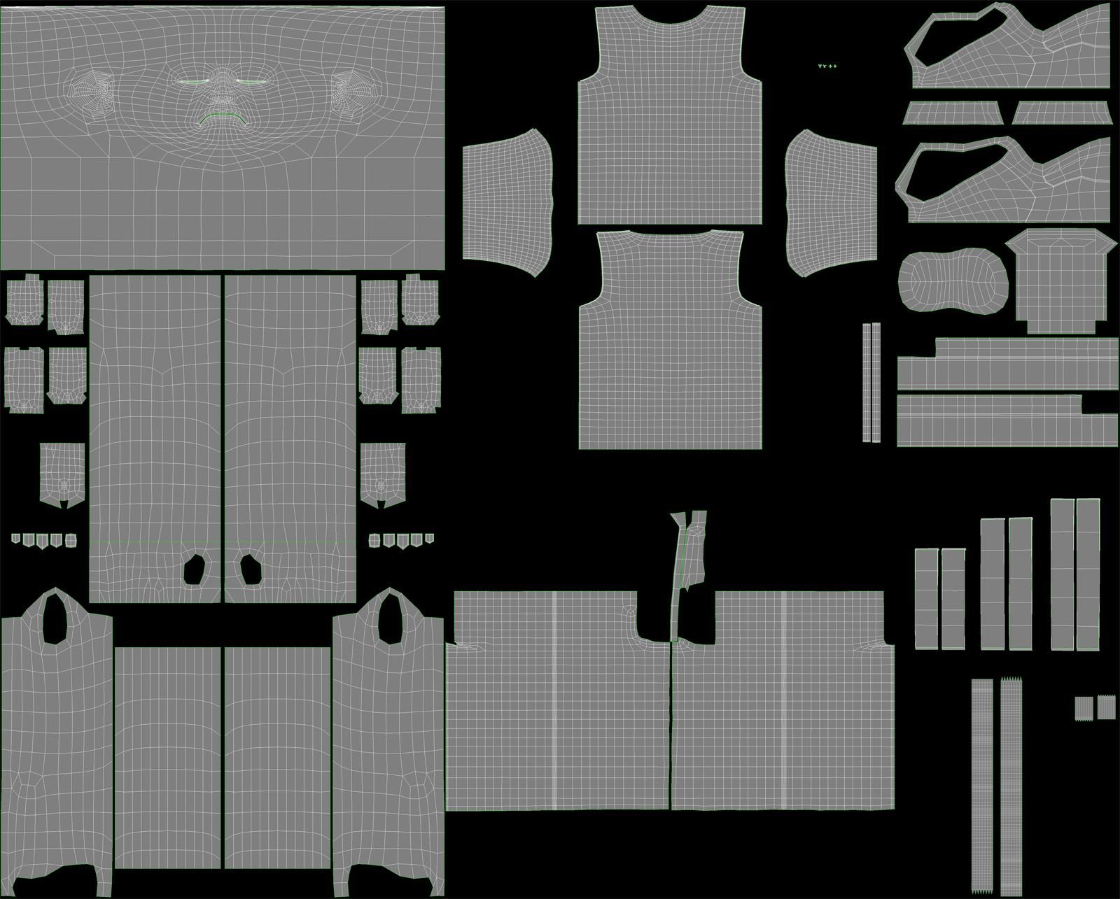
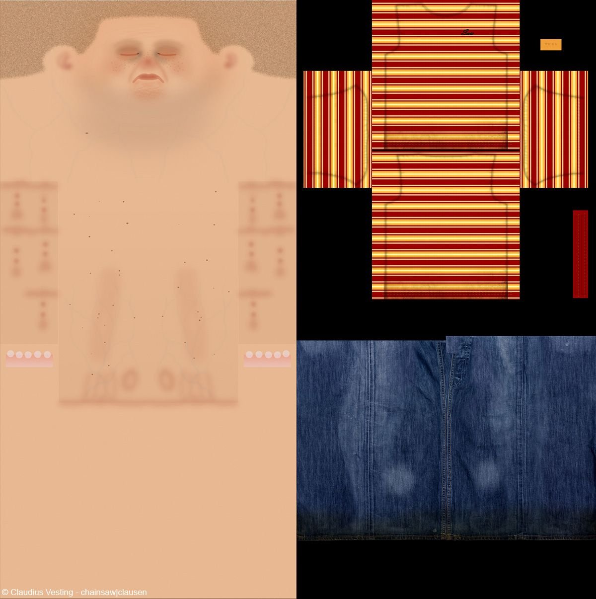
The texturing was more interesting. I've used Photoshop to make my textures and it was the first time I've used the PSD file format for texturing. It was a good way to create the textures and see any modification on the texture immediately in the 3d max viewport. Ok...today I know it's not the same like Bodypaint or MARI. The Textures itself I've painted from hand and used some photos.
Lightning and Rendering
The light setup was "classic/ basic". A simple 3-point lighting with 1 extra light for the background plane.
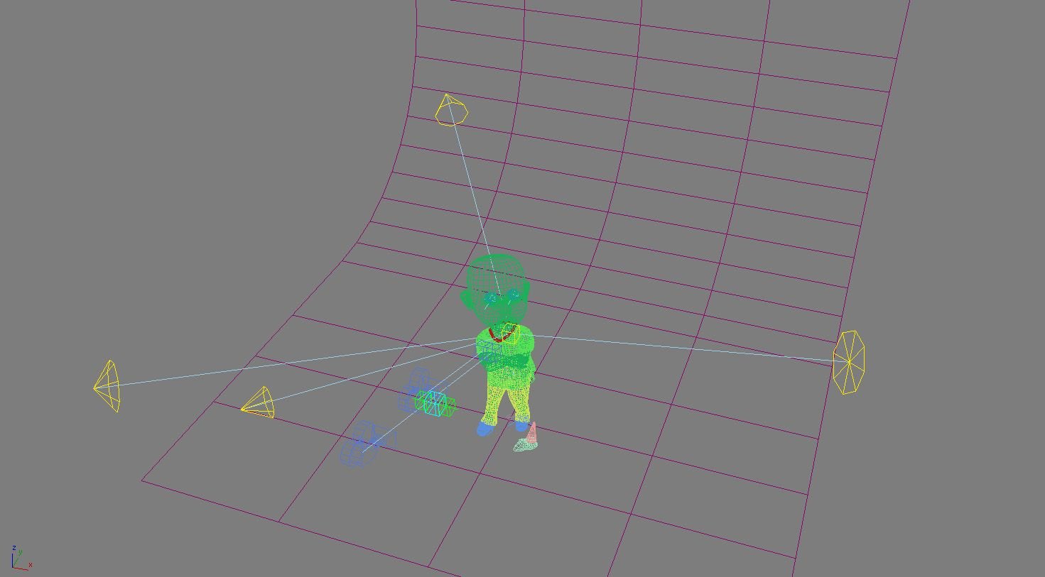
No global illumination or final gathering but I used two different setups. The first setup was for the kid with clothes and stuff. I've used mental ray area lights and mental ray render. The second setup was exactly the same but I've used standard lights and scanline render (for hair only because Mental Ray and 3ds max Hair & Fur have not much love for each other ;) ).
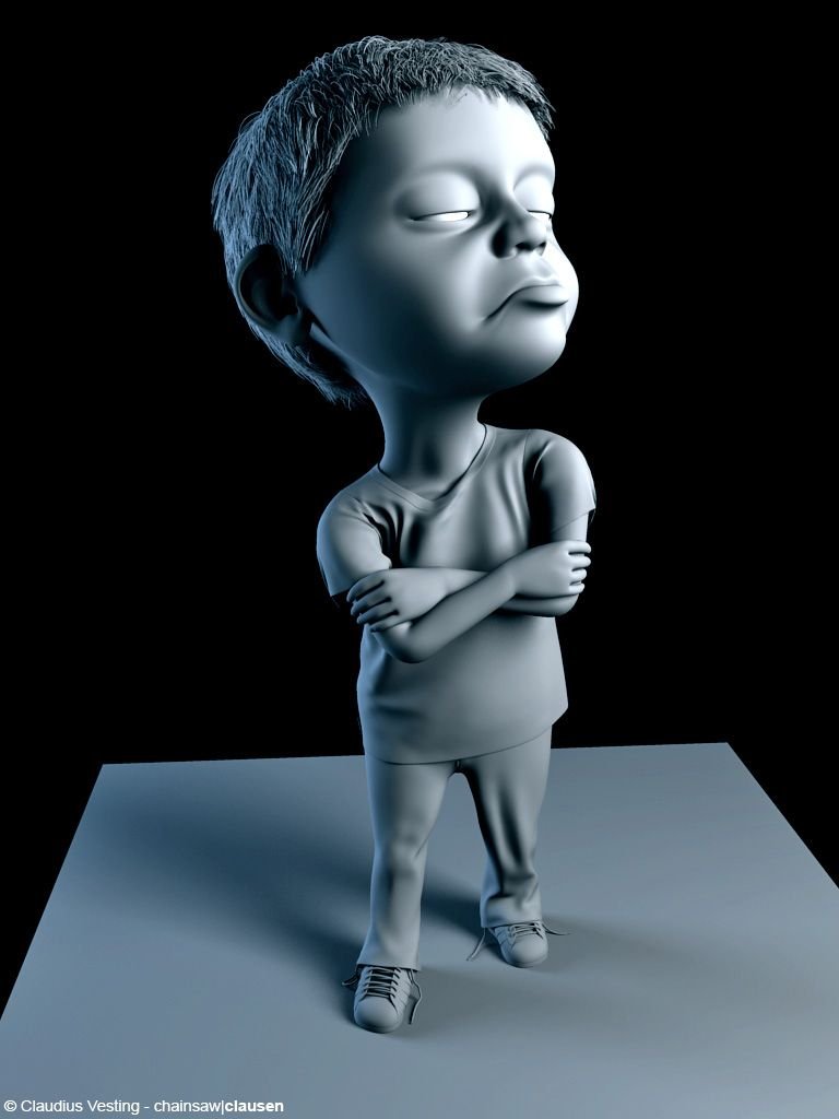
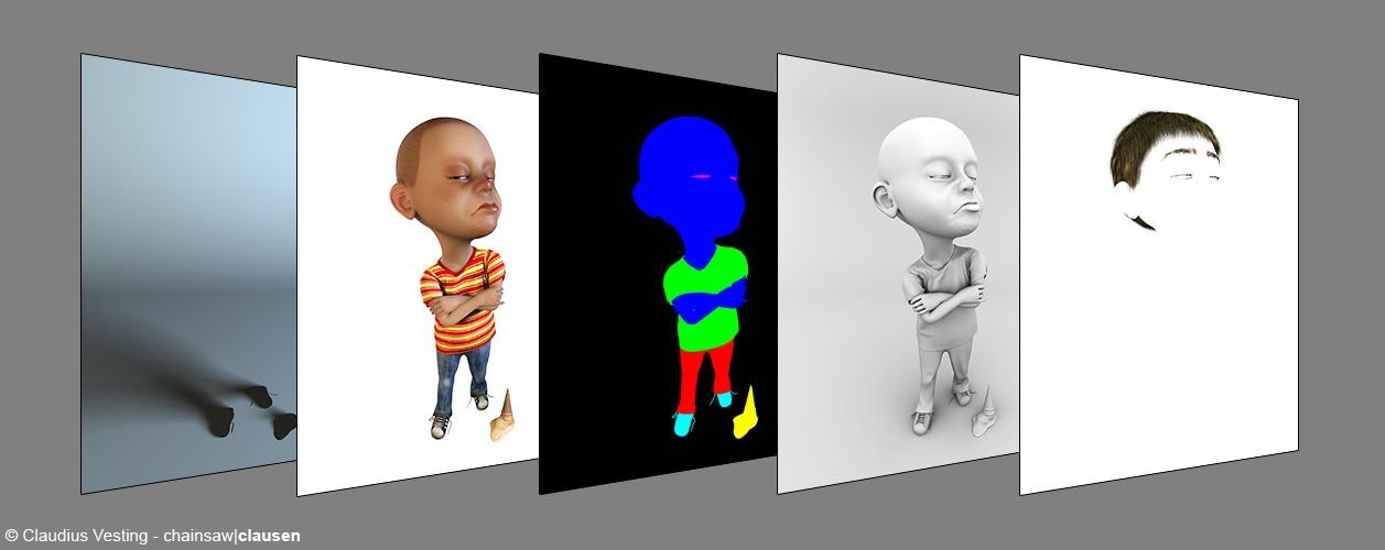
I've rendered everything in different passes/ layers. A beauty pass (kid with clothes and stuff), a background pass, a hair pass, different alpha passes (for t-shirt, pants, arms and so on) and an ambient occlusion pass.
Post work
In the post work I've combined all passes together with photoshop. Did some color correction, didt a bit retouch and add some background extras. That's all.
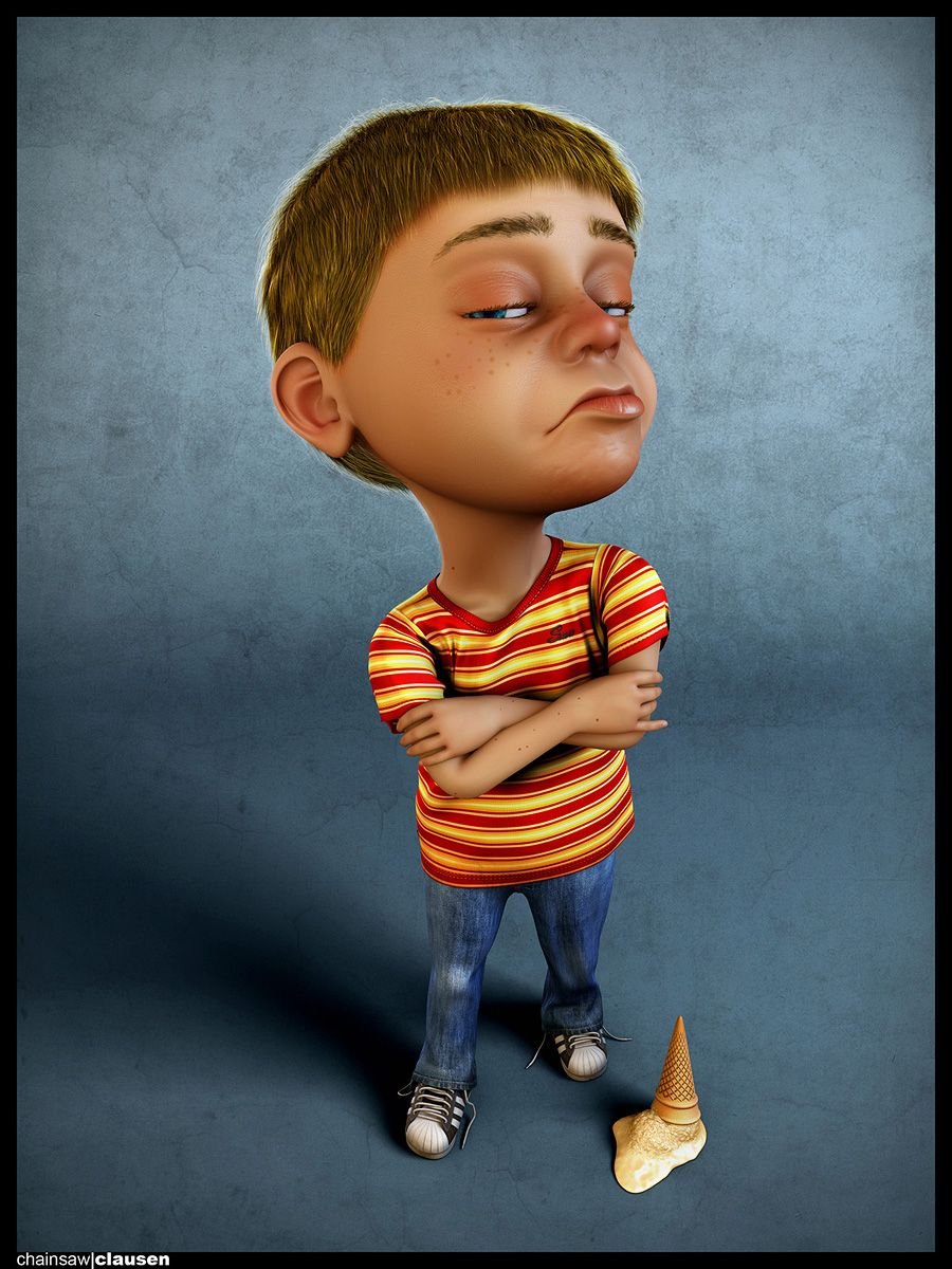
(Right-Click on the image and click 'View Image' for full resolution.)
I hope you've enjoyed the Making of 'The Kid' and thank you for reading.
Feel free to comment, ask if you have questions, upvote and share.
