Whats'up steemit
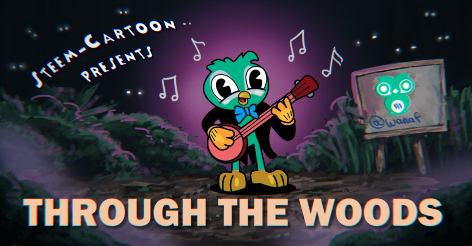
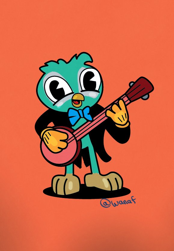
This is my entry into the Steem-Cartoon competition "Musical Retro Wo-Owl"
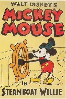
For this competition I wanted to do something vintage like the old disney cartoon Steamboat Willie and a game called Cuphead which does an excellent job mimicking the cartoon look of that era.
 .
.
image source
So I started sketching out some rough ideas. For some reason I wanted the Wo-Owl to play the banjo . Probably because of that banjo duel scene in the movie "Deliverence".
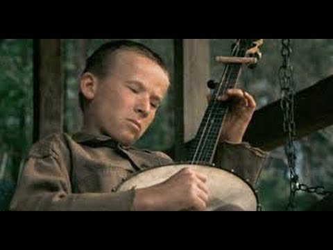
image source
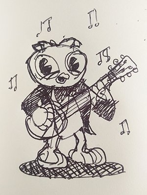
Here are the sketches, Super rough, I found that the design of the character needed to be really simple to convey the time period I was going for.
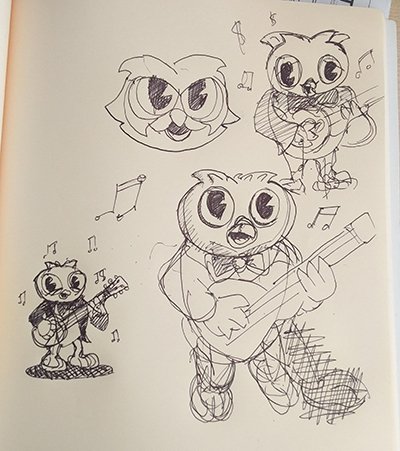
I ended up going with this little guy here.
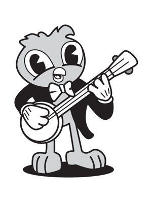
So the next thing that I did is create the line art over the sketch. I tweaked the head so it's slightly bigger to make him look more cartoony .
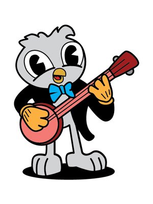
Now I picked the colors. I didn't color him yet as I couldn't decide if I wanted to just leave him white.
Now for the background, I was inspired by an article by @aurah on "Animation Title Cards" .
An animation title card is usually a still poster-like image shown before the cartoon starts. For more info on that , check out his post here .Here's an exemple of a title card from a cartoon called "Adventure Time"
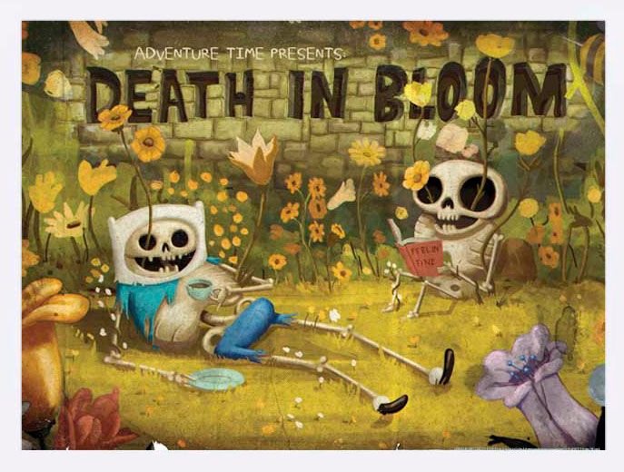
image source
So for the title card I imagined the Owl playing his Banjo in the middle of the forest, with ominous eyes in the darkness looking at him and a signboard which I will put the steem-cartoons logo on later. I did a quick paint of the environment.
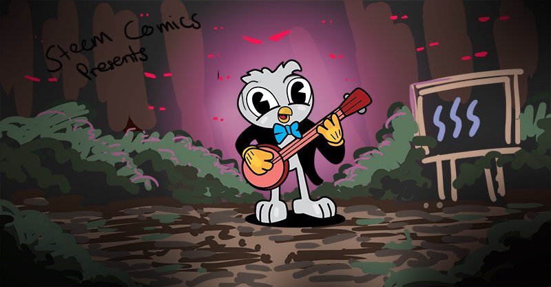
Next is detailing the background. I deliberately wanted the background to look separate from the character, because backgrounds in cartoons are done by a different artist .
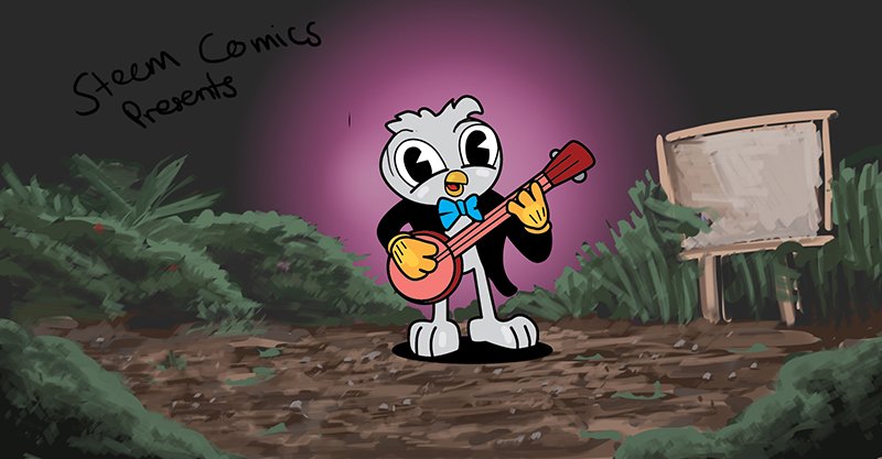
I am a big fan of rim lights so I chose to add them on the bushes behind the Wo-Owl . I also selected the fonts. For the "steem-cartoons" font I chose a free font called "Mickey" and the "Through the woods title" is a font called "Franklin Gothic Heavy" .
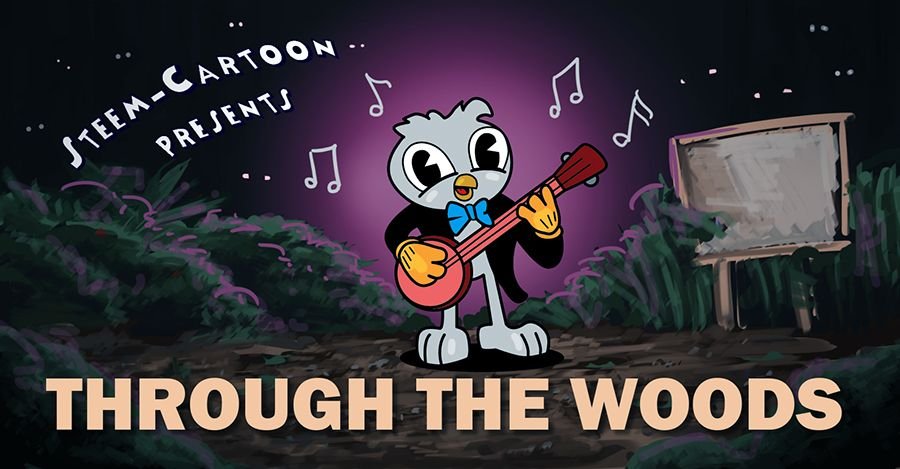
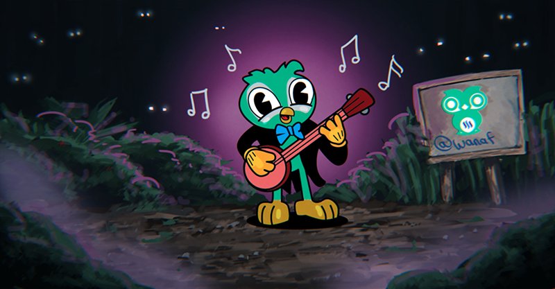
Next, I spent some time adding more details in . Finally, I decided to color him the green of the logo. I also added some fog in the foreground to give it a bit of mystery and Presto! That'll do .

Here is the title card without any text.
Thank you!


credit to @zomagic
Previous Posts
Whale Wars (Steem Cartoon)
Team Malaysia Polo Design
My Introductory Post
Life Is Strange : Before the Storm review

