In this post, I will illustrate how the usage of tags attached to posts has changed over the period between 1st April and 30th May. The data I have analysed is the main tag i.e. the first tag attached to a post.
The table below is colour-coded such that the red indicates a decrease in popularity and green indicates an increase in popularity. The darker the colour, the more significant the change.
The table compares the position at 1st April with the position at 30th May. As the number of daily posts has increased significantly (by a factor of 3) the change reflects the change in the count of a tag as a percentage of the total number of tags on that day.
Another point to note is that I have only included tags that were used both at the start of the period and at the end of the period so new tags since that date have been excluded from this analysis.
Here is the table.
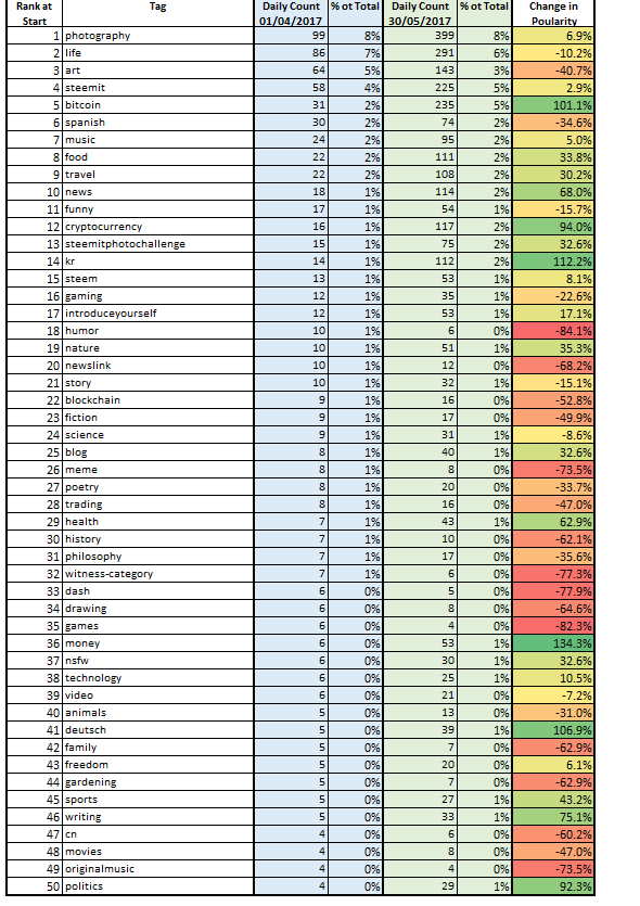
A number of interesting observations can be seen such as:
- The big decrease in art, humour and newslink (as a % of the total)
- The increase in the use of Bitcoin, news & KR
Hopefully, this will help you to position your posts in what is currently the most popular thread for a particular subject.
Thank you for reading.