In this post, I want to illustrate how Bollinger Bands may be used as an effective tool for analysing the price of Steem over time.
What are Bollinger Bands
Bollinger Bands are a volatility indicator i.e. they measure the degree of variability in the price of assets such as Steem over a given time period.
Bollinger Bands are made up of:
an N-period moving average (MA) – this is just the average Steem price over the last N periods (days in this example)
an upper band at K times an N-period standard deviation above the moving average (MA + Kσ)
a lower band at K times an N-period standard deviation below the moving average (MA − Kσ)
Typical values for N and K are 20 and 2. The default choice for the average is a simple moving average. There are other types of averages that can be employed but for this post I will use the simple average.
What do Bollinger Bands tell us about the price of Steem
The graph below shows the Bollinger Bands for Steem over the period 1st April to 23rd May 2017. The graphs shows:
- the actual steem price
- the moving average
- the upper (green dotted line) and lower (purple dotted line) bands indicating the range of variability in the Steem price.
Bollinger bands tell us how variable the price of Steem at a given point in time. Generally, the higher the variability the less certainty we have over what the price will be in the next period.
In the graph below, you will see the upper and lower bands are quite close together throughout April. The bands are based on **two standard deviations” around the mean. What this means is that, based on the variability of the price (of the moving average) in the last 20 period, the price in the next period has a 95% change of falling between the two bands. When the bands are close together, this implies more certainty compared to a situation where the bands are far apart.
The volatility (according to the Bollinger Bands) increases in May. You can see this rapid increase in price, while very welcoming, is accompanied by a lot more volatility.

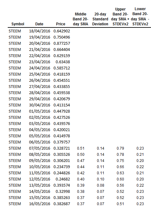
The dataset used to generate the above graph looks like this:
In the next post, I will discuss another technical analysis tool, Mean Average Convergence Divergence.
Thank you for reading.