.png)
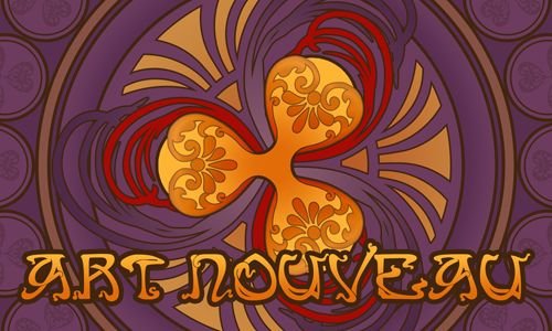
I was extremely uncertain whether to participate for the third time in the Crypto Logo Art Challenge by @sndbox. But the new theme was extremely inspiring as well. I was able to work at night only, but it was great fun.
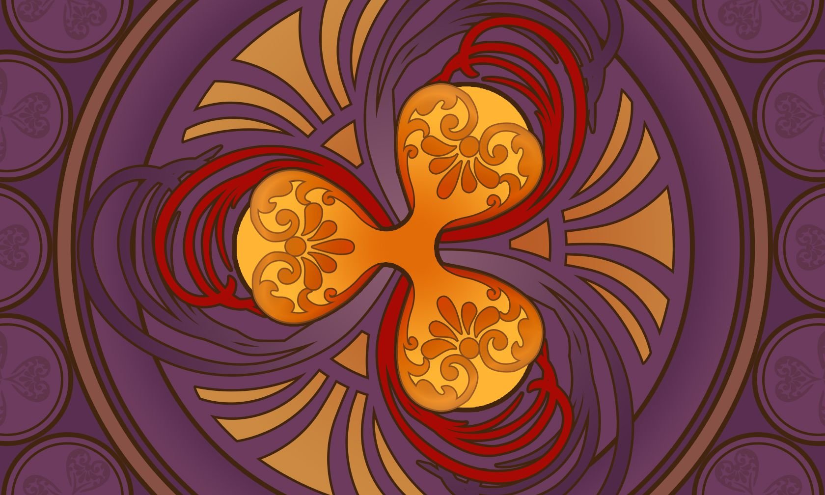
I always try to understand the form, to analyze it before doing anything else. The previous one, The Ethereum logo, was very solid, with sharp edges, perfect for the Art Deco style. This Ripple logo on the other hand has soft, almost natural elements. That reminded me of Alphonse Mucha's incredible and distinct style. .
So I decided to do an Art Nouveau. Or at least I tried. :D
.png)
I was inspired by these images:
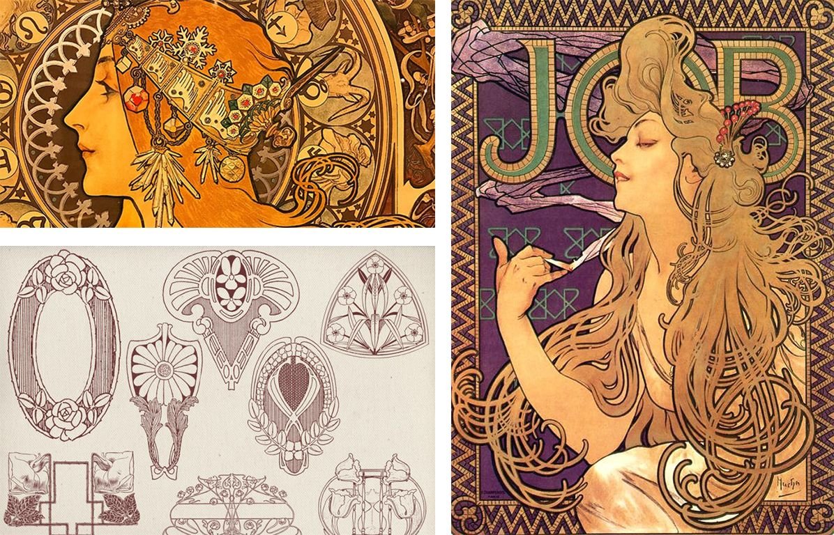
Links are down bellow:
Source 01
Source 02
Source 03
.png)
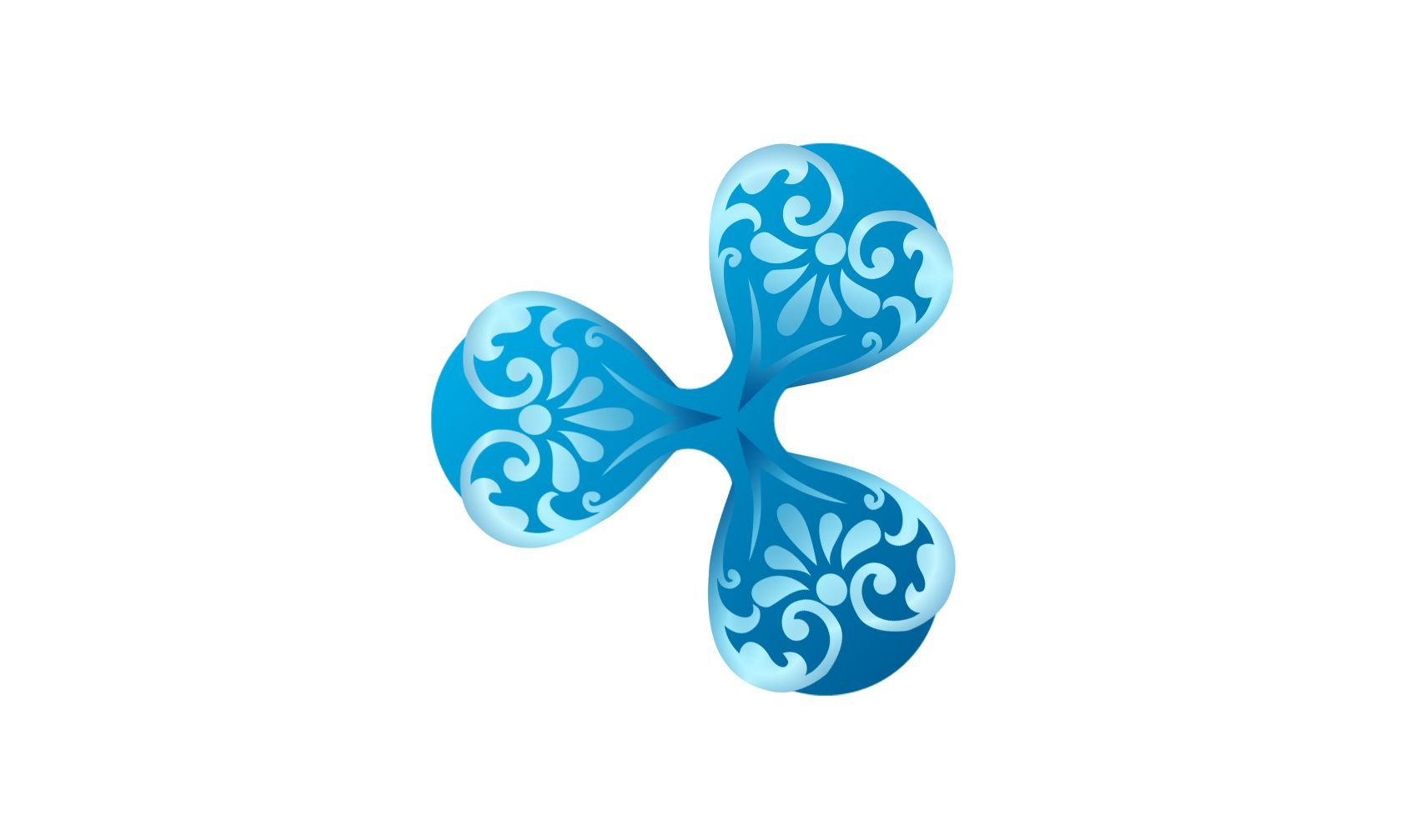
As always, I started changing the logo first.
I had some ornaments I developed for another project, but decided to use in this composition. It's not Art Nouveau related, but creates interesting contrast as part of the logo.
.png)
It was time to change the color scheme to look more like the reference photos.
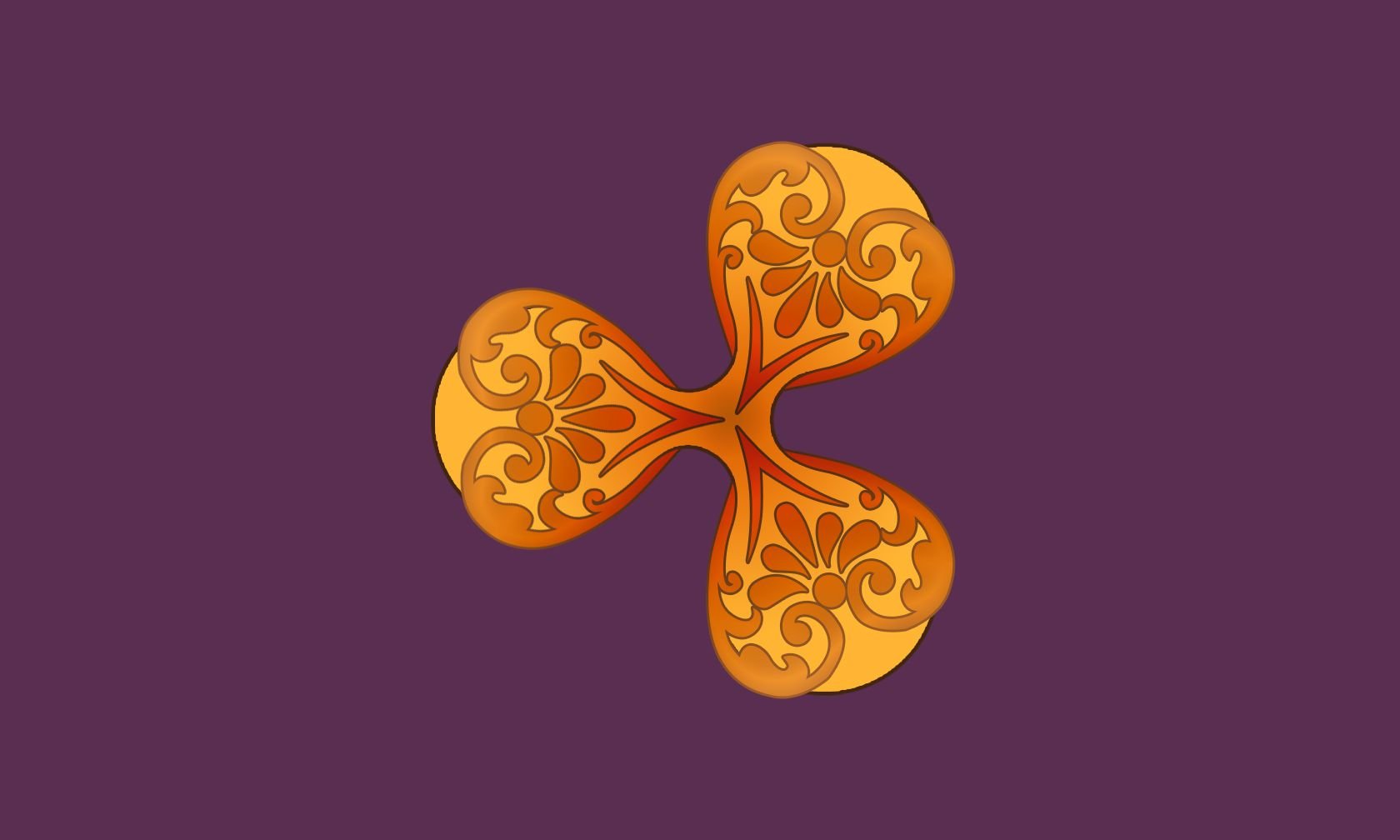
.png)
From here on all I had to do was adding more and more details. One thing I had in mind - all had to be in the same direction as the three elements of the logo.
So first were ornaments very similar to human hair. ;)
In this composition the logo is the brightest one, all the others are darker.
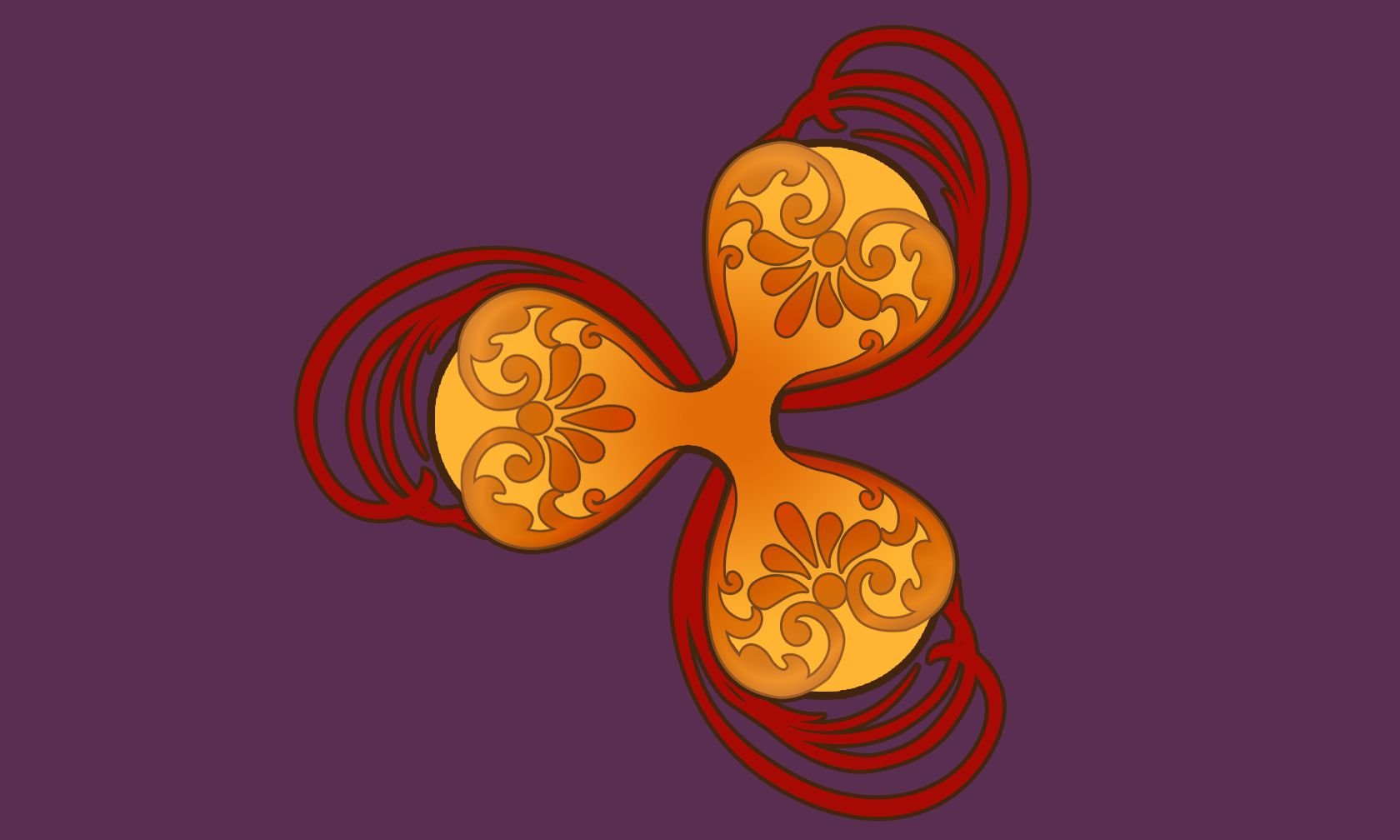
.png)
Next was additional elements for the background, because I didn't know how to finish the center. Decided to leave it for a day. :D
Just duplicated the same "hairy" elements but in different color gradient and size.
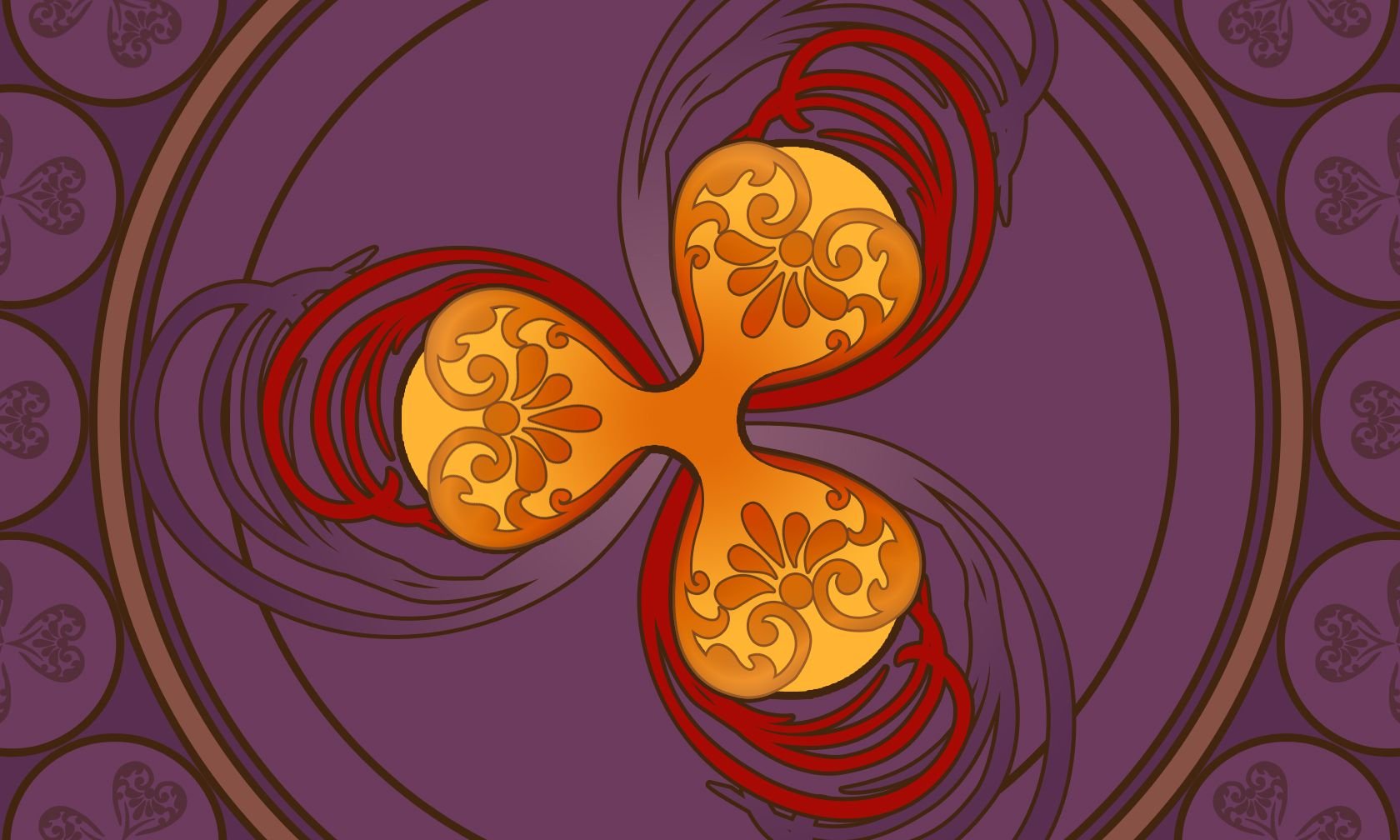
.png)
Finally, had an idea how to fill the gaps. It looked a lot like stylized lotus flower, hehe. This was pure coincidence. ^^
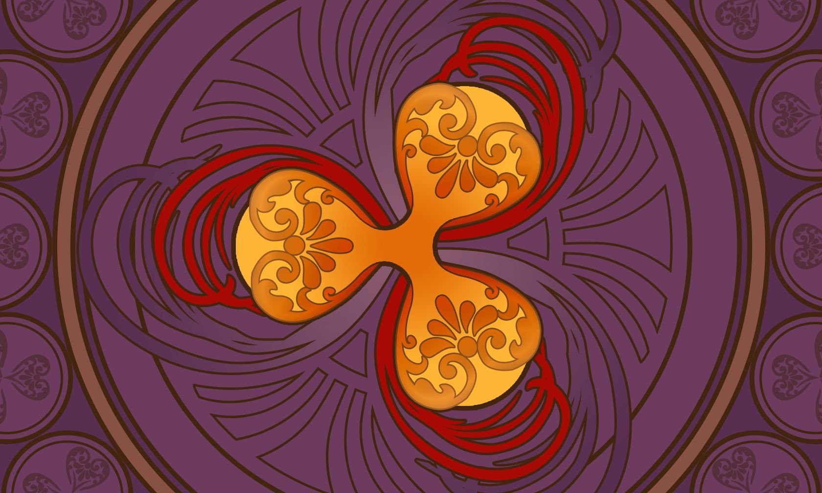
.png)
Finally, I was able to finish it with some additional color, but with a lower opacity than the Ripple logo.
.png)
I really hope you like it!
. Have an incredible day, everyone! .
Thanks for stopping by!
