For the past week I’ve been learning about the app Sketch and designing my first full-stack Javascript web app. This is definitely the biggest project I’ve worked on so far, and it will be my second of three capstone projects with Thinkful.
Before Sketch, I did some work with Balsamiq, which is an app to quickly make wireframes of a website. This time I drew up some wireframes by hand in a notebook, and then used Sketch to make detailed mock ups of how I’d like my final website to look.
One thing I wasn’t expecting when I started the program at Thinkful was how much I’d enjoy design. I spent a ton of time fiddling with the design of my first capstone project in the HTML/CSS, and I’m glad I’m putting in the time now to design it before I start coding it up.
Design Code
I’ve been learning about using Sketch with Design Code. It has been great so far and I’d recommend it to anyone interested in learning design. The site is a great example of nice design (in my opinion) so this on its own was enough to sell me on trying the book out.
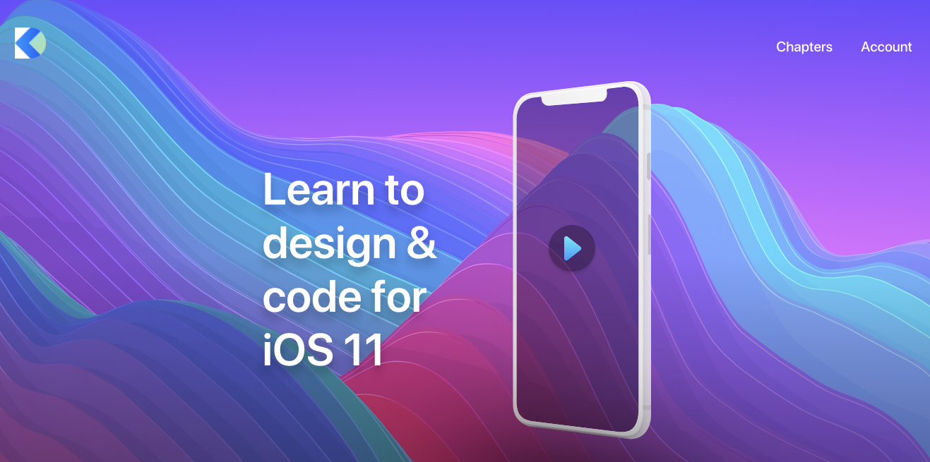
It focuses primarily on mobile design, but there are a bunch of general design sections, along with tutorials on using Sketch and learning web design.
Inspiration
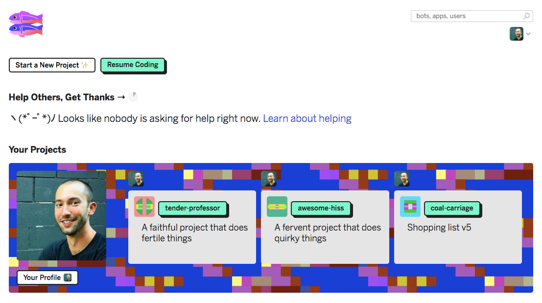
I’m really excited with how my design is looking so far. I like websites with stripped down aesthetics and bright pops of color. My main inspiration was the home page for Glitch:
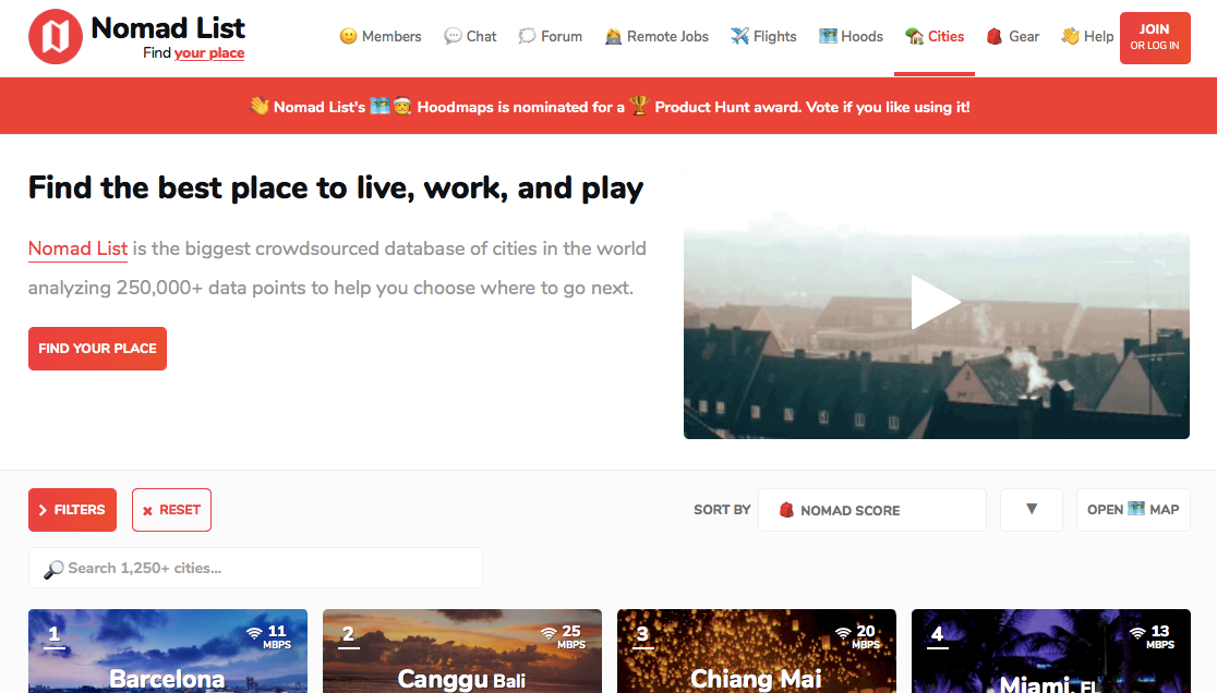
I also like the clean layout and liberal use of emojis on Nomad List:
My Site
I’m building a course where anyone can create and enroll in courses for free. After writing my post on what an education platform on STEEM could look like, I realized that maybe I’m closer to being able to build it than I realized. For my capstone, I’m designing a course building site, and then after I’m finished with Thinkful I’m planning on scaling the site up and making it so that courses are published on the STEEM blockchain.
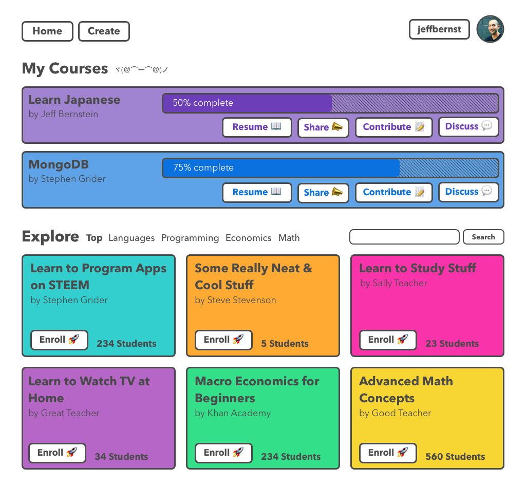
Here’s my first crack at the home page for a user that’s logged in:
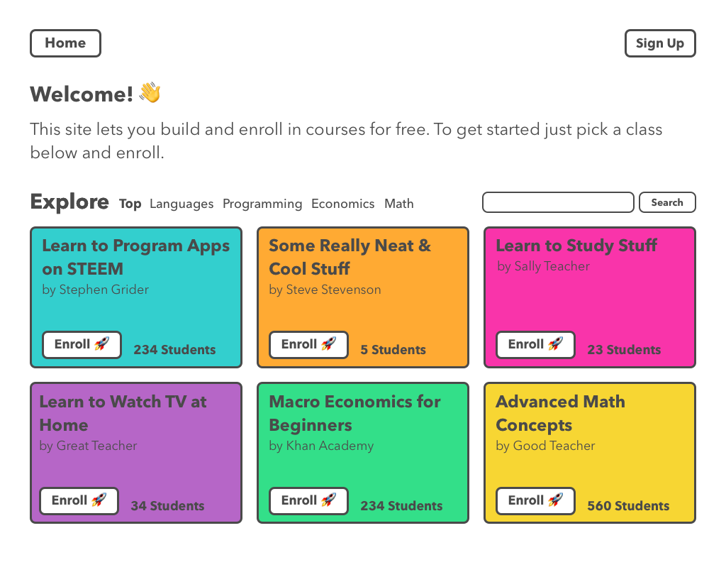
Someone that hasn’t created an account yet will be met with something like this:
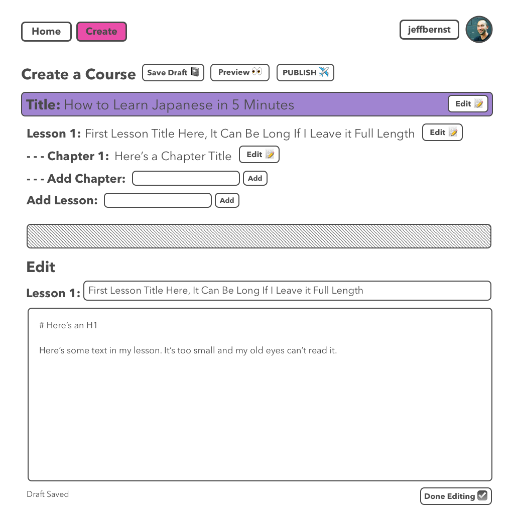
Creating a course will look like this:
And when viewing a course it will look something like this:
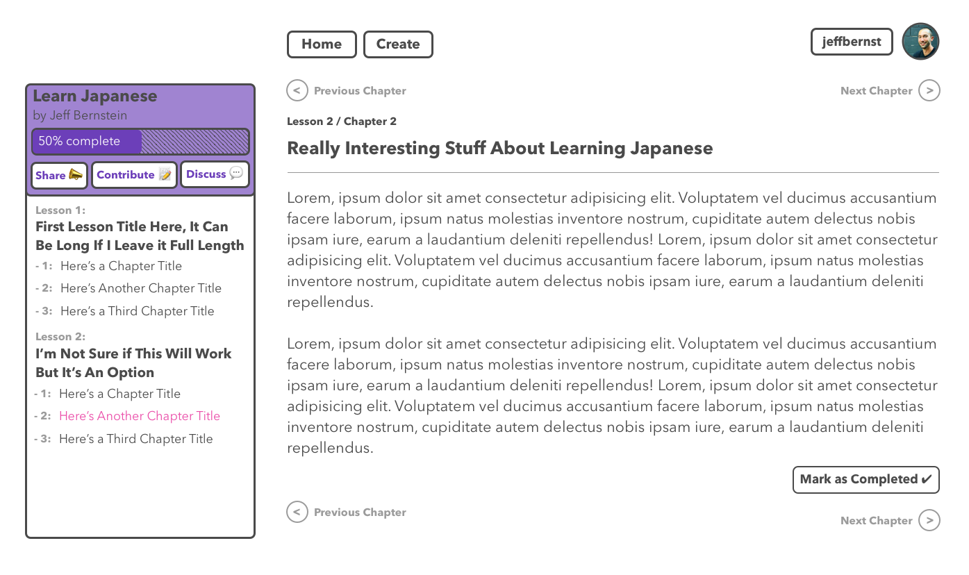
I will probably make the sidebar collapsable to eliminate distraction while the student is reading through the material. It will be a modal on mobile or when there isn’t enough room for a sidebar.
What do you think? Any suggestions to improve what I have so far?
Review of Sketch
I’m glad my mentor introduced me to Sketch because it has been really easy to use so far. I thought I might have to take some classes on using Photoshop and bite the bullet on an expensive software license.
Sketch is pretty easy to use if you have experience with other Mac apps like Pages and Keynote. It’s also much cheaper:
- Sketch: $99 to use forever (includes 1 year of updates)
- Photoshop: $29.99/month without a contract, $19.99/month with an annual contract, $239.88 for a year paid up front
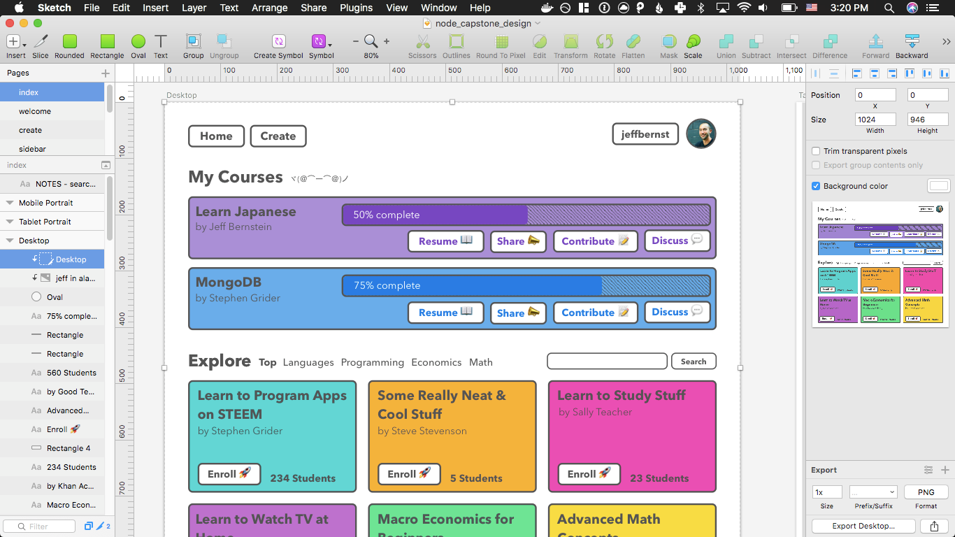
You can tell from the UI that it’s straightforward to use, but I can tell from reading through Design Code that it also has a lot of powerful features I haven’t used yet.
Next Steps
Now that I’ve done a first pass on my design, it’s time to start setting up my actual app. This will be the first time I build anything substantial with Node and MongoDB, so I’m not feeling as confident as I did with my first project. I think this will be a pretty big obstacle to get over though so it’ll be nice to have some experience behind me.
Thanks so much for reading. 🙂 I would love to hear about your experience with design and any advice you have for me in the comments!

