Good Afternoon,
I got a chance this morning to remedy some of the issues users had been having with steemit.pics I had pushing the updates back due to more pressing maters lately, but with several users wanting to actually utilize the site, I went ahead and carved out some time.
For those who do not know about steemit.pics is a Steemit image viewer, essentially a responsive desktop and mobile website that lets you view every image you have ever used/uploaded (automatically) to Steemit via submitted your posts. (Starting from when Steemit actually started handling image storage)
steemit.pics takes all of these images and creates a profile for you (or anyone) displaying all of your images in a neat and orderly view. Images can be reorganized and expanded to gain access to more options including: embedding codes for use on other websites (since these images are now stored on Steemit), links to view in full resolution, and links to where the image can be found on Steemit.
With the linking of content one can easily navigate to the post from which the image came. This allows the users to search their posts visually instead of continuously scrolling down on your blog page.
Trust me there is more to come with steemit.pics and I look forward to getting some more time on the project.
Expanded Image Example (Image by @jamtaylor)
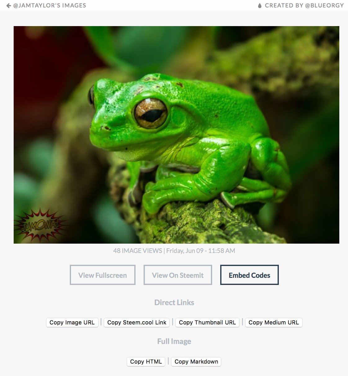
Just like my now unnecessary 😪 (redundant) but still awesome website SteemIMG.com 😎 you can now manage all of your images in one place and never have to worry about losing an image to a unknown image host provider. Steemit really did make the right move offering free dedicated image hosting, truly epic on their part and often already overlooked. 👏 Steemit!
Resolved!
Image Distortion Issue
Because of the layout of the website I was attempting to fit everything into a nice little square pattern and although this looked very clean for horizontal photos, vertical on the other hand, not so good. I first attempted to solve this by cutting off the bottom of the image (overflow:hidden) for you CSS people, but this often took away too much of the image making the thumbnail very awkward.
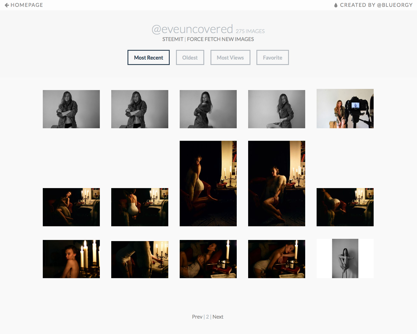
Initially this Issue was brought up by @eveuncovered, who was interested in the website and wasn't sold on the look and feel of vertical images, which she has in almost every post, so you can thank her for pushing me in the right direction. Plus... She's not someone you want to mess with! - Just take a look at this post of hers. 😉
So I decided to go with a showing the full image but containing the width to 200px. The website is fully responsive, as is most of my websites, and still portrays a simplistic, modern, and clean feeling, almost art gallery quality look... and Eve approved.
Updated!
Image Load Times
Just as it sounds I was able to optimize how the images come into the website and how they are pulled from Steemit decreasing load times.
Under Development
Displaying Images that require variables
Stil working this out for example: "?oh=34753894"
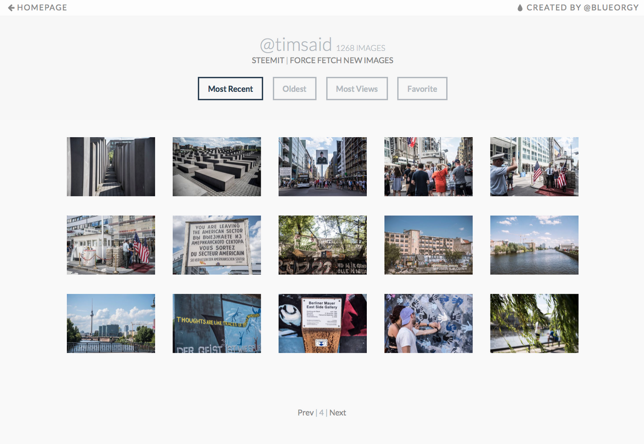
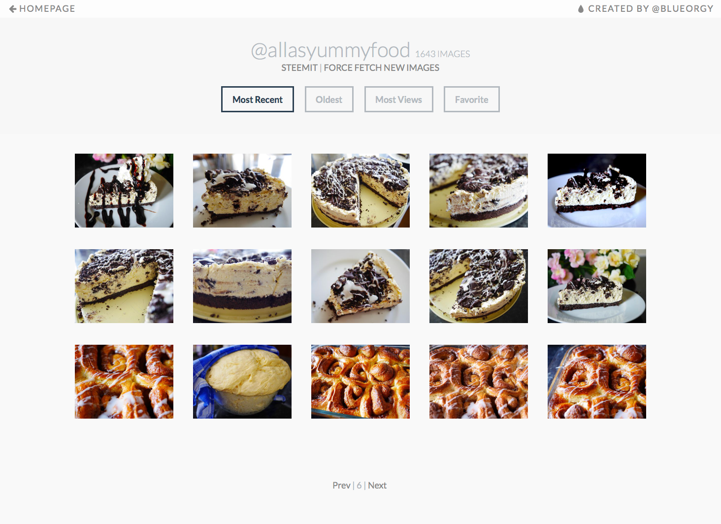
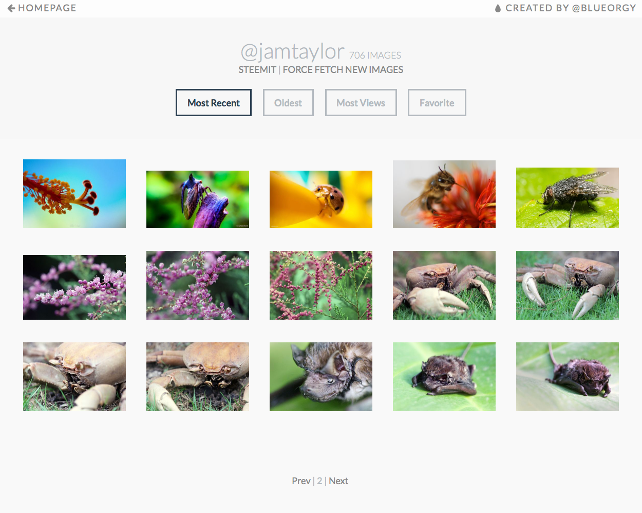
steemit.pics Profile Screenshoots
Some awesome users profiles on steemit.pics
Vote for @blueorgy as Witness
- Go to the witness voting page on SteemIt.com
- Scroll to the bottom of the page and locate the vote box
- Input my name (blueorgy) and hit vote.

- Rejoice in self achievement!

