I'm not sure whos idea it was to change the logo and the steemit color but wow it looks really ***.
Nothing like making text harder to see.
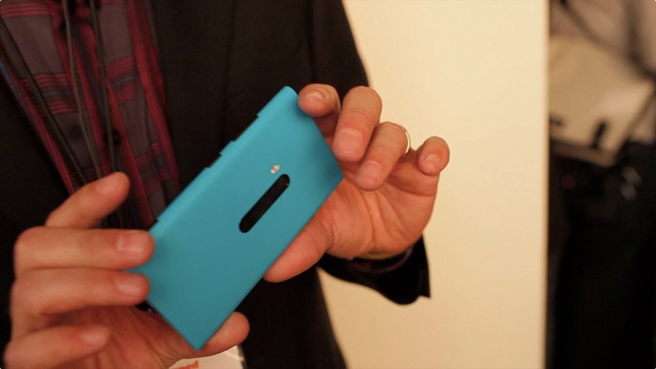
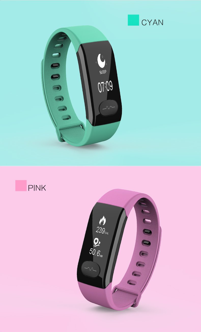
This is not 2008, cyan and powder pink are so last generation.


I'm not sure whos idea it was to change the logo and the steemit color but wow it looks really ***.
Nothing like making text harder to see.
This is not 2008, cyan and powder pink are so last generation.

