Today I unboxed a new laptop, (bought in part with some earnings because of Steemit), of course what was the first website I visited?
You guessed it, http://www.steemit.com.
I really liked the design and the feel of the splash page but I got a fresh perspectives from seeing it for the first time on my new computer in 3k resolution, which left me feeling uneasy.
Would it be better to show something different than the top paying posts as the splash page?
The Default Page
The message "Welcome to the Blockchain!", the wonderful graphic and the tagline "Get free STEEM POWER when you sign up today" is very inviting.

Being critical what stood out to me the most was the default selection of trending posts as the splash page. The payouts are staggering!!!:
- $2,411 for a post about chainbb to @jesta?
- $1,478 for a post about life to @trafalgar?
- $1,470 for a post about Science to @joseph?
If I was new I would be thinking, I can do that lets give it a try!! Great right?
Inflated Expectations
For my first visit to the site the issue is my expectations are being set very high at this early stage. In reality I have been on Steemit for months and I know how much work these guys do, and the talent it takes to make posts like that but if I was new from seeing this I would have very inflated expectations.
I would propose that something positive, but attainable for the masses should be the first sight people get of http://steemit.com. Something that people will respect and think to themselves, that looks good I will give that a go.
Other options for the default selection
There are three other options already along the top; new, hot and promoted.
Promoted
If Promoted was selected it would look like this.
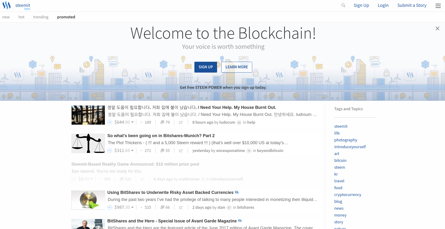
I think this looks a bit more realistic in term of payouts, but content may be limited and obviously people can manipulate this page so it may not be a good option to put as the splash page.
New
If New was selected it would look like this.
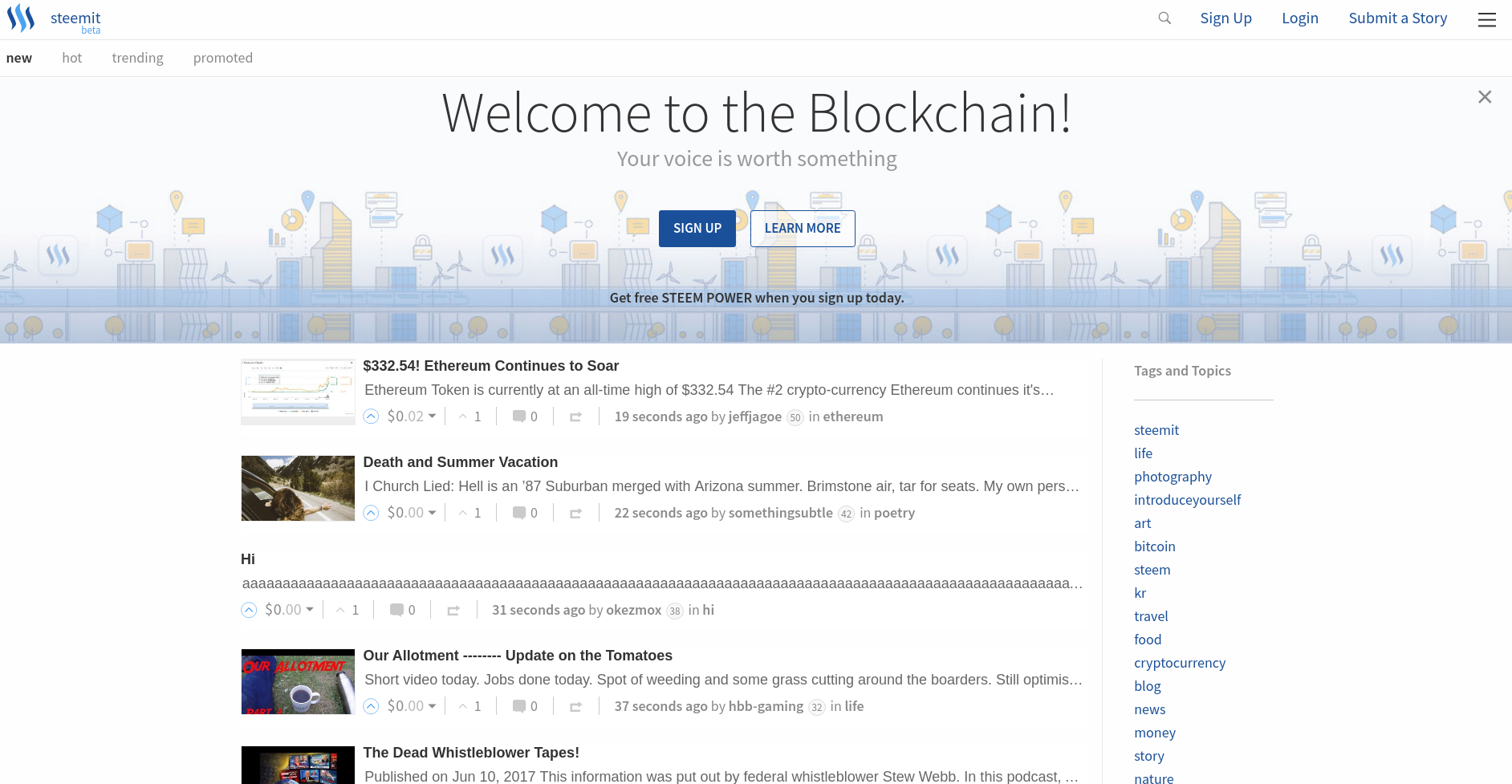
This might be fairer, even dare I say it more realistic but lots of 0's or aaaaas may not be as desirable to show to new users for the first time. We obviously want to give some sort of fair representation of the platform and what is possible, i.e. some view of curated content.
Hot
If Hot was selected it would look like this.
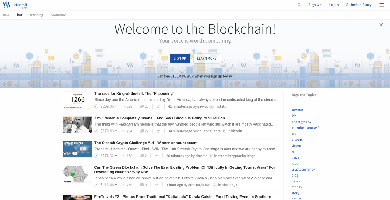
For me Hot would be the fairest out of the 3 other options, the posts would be dynamic and would represent what people are voting on and what are the bread and butter of Steemit. It still shows very favourable posts first, with big rewards but some more realistic and attainable rewards.
Would one of these be a much fairer way to present Steemit to the world?
Other Options
There are also many other options that could be considered and may have been considered already but I will list some I can think of in case the are helpful for discussion.
Curation
Some form of curation such as listing "good" posts, active posts, or even advertising.Scenarios
A realistic and best case scenario, such as a mixed selection of hot posts and top paying posts could be shown.Videos
Is it even a good idea to show posts on the splash page. Should we be showing a video to explain how steemit works.
What do you think?
Thank you for reading this. I write on Steemit about Blockchain, Cryptocurrency, Travel and lots of random topics.