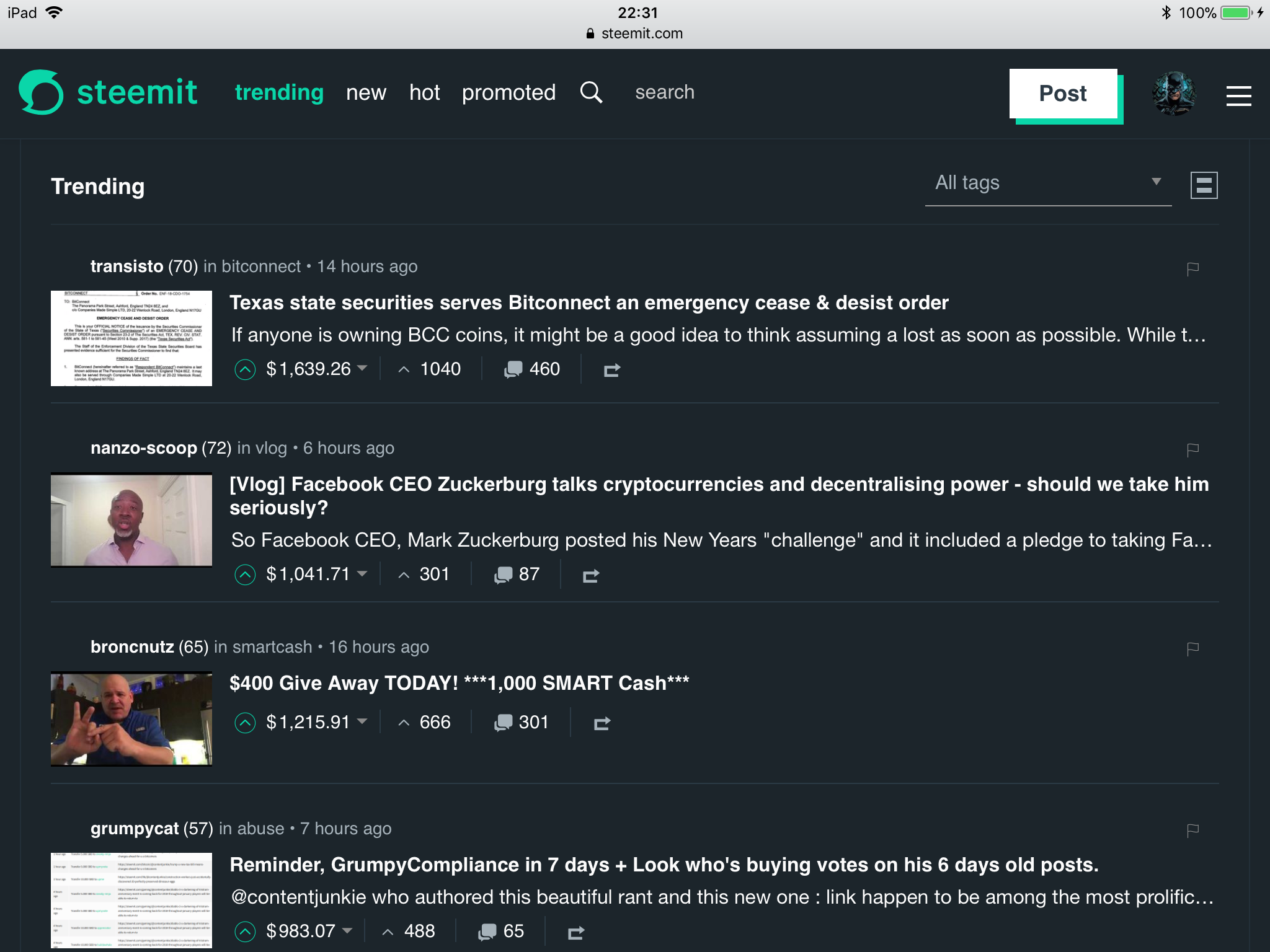
Wait a second with that finger and that downvote - or upvote! Allow me to explain that title first, please. Wow, I almost lost you there, didn’t I?
Being someone who follows Steem’s ecosystem, its evolution and growth, and thus also Steemit’s by extension, no day passes without another post about Steemit’s UX and its lack of kitchen sink features popping up in my feed.
I hear, ya.

Photo by Clark Tibbs on Unsplash
I could submit a series of posts of features Steemit lacks, and I want would love to have, to Utopian and sail off in the sun for the next few months after doing so, because you would all upvote them. And what with those crazy SBD rates, right!
But that would be wrong. That would merely express a failure by me, a failure to understand what Steemit actually is. All it would do is to increase the noise level and most likely result in... nothing. Zero, zilch, noppes, nada, nil.
So What is Steemit?
Allow me to break it to you first: Steemit is NOT your usual, your average social network (website/app) many think and claim it is. It isn’t supposed to have all features you love so dearly other social networks have.
If you read that once, or hundreds of times, all I can say to that is: Don’t believe everything that is written on the Internet, or on Steem(it) for that matter.
You are also totally free to dismiss and not believe this post, but I hope at the very least you will give this post some thought first.

Without having run this through or verified with Steem Inc (@ned or @sneak may even downvote me into oblivion for this post), there is something about Steemit.com you need to understand.
Once you know and understand that, you may feel differently about all those things Steemit doesn’t have. Because it’s an awesome thing.
It proves once again that Steem Inc., together with our witnesses, are the right guardians for the Steem ecosystem.
What if I told you that within the grand scheme of the Steem ecosystem, Steemit isn’t supposed to be the shopping window everyone thinks it should be? Or that Steemit isn’t supposed to be a better platform than the best of Twitter, Facebook, Reddit, and Google+ thrown together and mashed up in one gorgeous, absolutely awesome to use site?
How does that thought make you feel? Does it make you feel bad? Do you feel disgusted now?
You shouldn’t, not at all.
It should make you feel confident about Steem’s future. About Steem Inc. as our guardians, steering the road where the Steem blockchain can evolve to, together with our Governance structure, our witnesses (DPoS).
What is Steemit’s Role Then and Why is Its UX “Poor”?
Steemit.com is the centralized roll out platform, the first big profile website launched on the Steem blockchain in order to gain traction and to inspire further adoption.
Steemit is not supposed to be the only one and isn’t the only one either. Even Steem Inc’s CTO, @sneak, said so and emphasized that during his talk at SteemFest².
If steemit.com stays the only gateway to the steem blockchain, we failed at our job.
We disencourage [our] people to use it, we are building a protocol, a decentralized platform. We need to make sure that the Steem blockchain is powering thousands of websites, not just 5.
To fully understand Steemit’s role, we need to understand that the Internet is changing and that the Steemit website is merely a gateway to a new Internet. In a previous post I referred to the Web 3.0 (or Internet 3.0), as coined by Sir Tim Berners-Lee: the semantic web, later expanded to mean the Internet of Infrastructure, by Sir Berners-Lee himself.
As such we need to remember that the Steem blockchain, not Steemit, is at the heart of everything. And is also the main interest of Steem Inc., the operator of the Steemit.com website - an interface, gateway to the Steem blockchain.
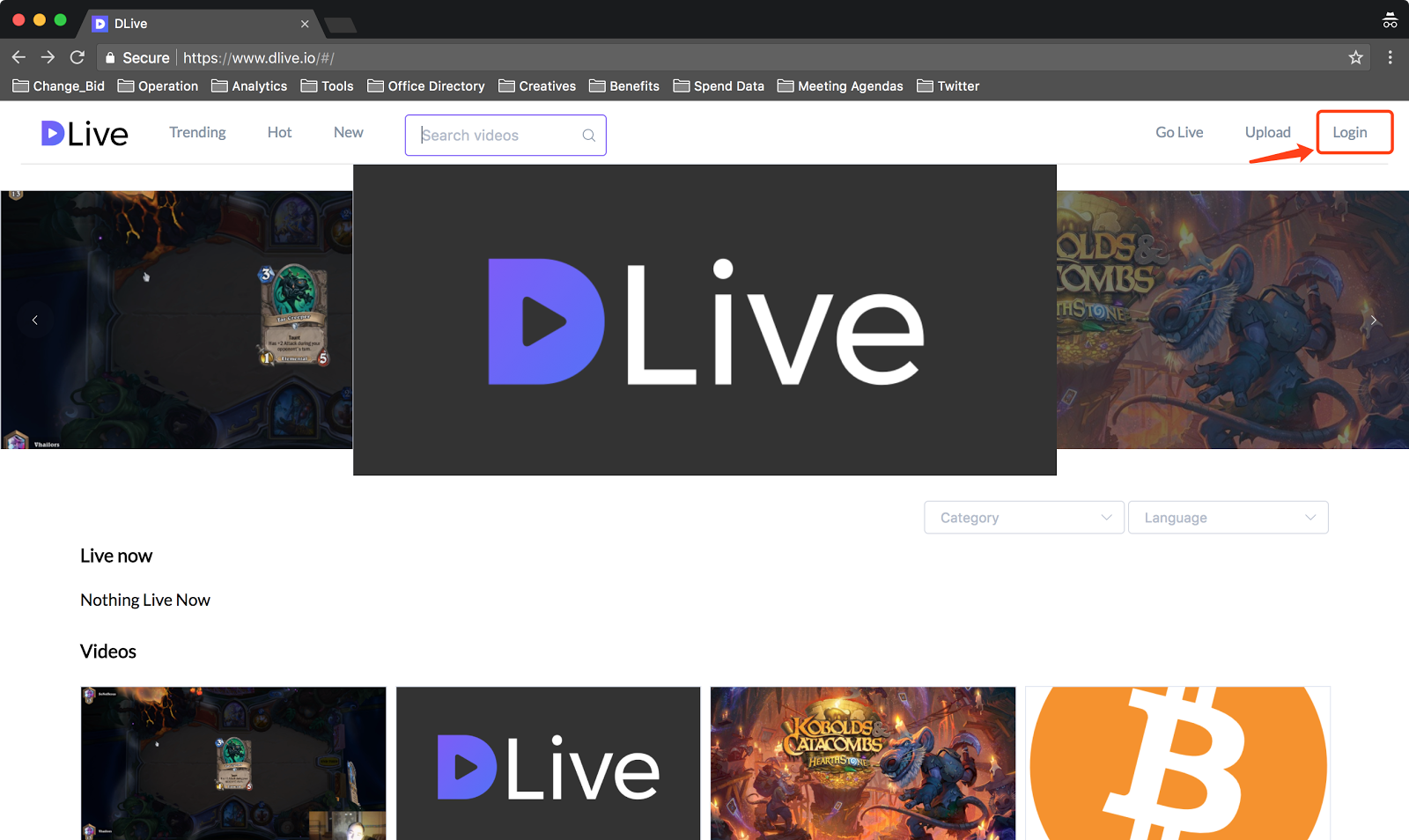
One of many gateways already (dTube, dSound, dLive, dMania, Utopian.io, chainBB, busy.org, esteem.ws among the most popular ones so far), with many more to come. If things go as planned this month will also see the launch of another vertical built on the Steem blockchain, a ProductHunt alternative: @SteemHunt. Check out their most recent update to get a sneak preview of something they will do differently.
All those gateways mentioned have their own focus and/or are tailored to specific use cases. They are the frontrunners of a vast ecosystem which will (hopefully) continue to grow on the Steem blockchain in the next years, creating a whole new economy and potentially disrupting the so-called Old Money while at it.
As the company spearheading much of Steem’s evolution, Steem Inc. is in a not necessarily enviable position. Steem Inc. at the same time needs to satisfy the community, a community mostly operational on the centralised largest platform on Steem and also needs to inspire new projects.

Needz moar kitchen sinkz! on Unsplash
The latter is where it gets interesting. Interesting because as our unofficial guardians (Steem Inc has no direct role in Steem’s DPoS based Governance structure), @ned and Co. are able to steer the future of STEEM, and thus also our potential own riches.
While most may think that requires an absolutely awesome website, with all bells and whistles, three kitchen sinks and at least as many fridges thrown at it, that is a not necessarily correct thinking.
Sometimes progress can be inspired by providing a more minimal experience, an experience lacking something. That is not to say I think Steemit.com is a bad website, but I think we can all agree that it could be better. My Steem feed tells me every day that almost all of you want Steemit’s UX to be better.
There’s a Solution, and It’s What Steem Needs and Steem Inc. Allows and Tries to Provoke: #DIYitbaby!
Anybody is free to build their own gateway to the Steem blockchain. Anybody is free to identify pain points and improve on them. The latter can be done via pull requests submitted to the Condenser project (Steemit’s front-end app) on Github, but better even by rolling out your own website, app to interface with the Steem blockchain.
Your own because Steem Inc. can not cater to everyone’s desires. You are totally free to build your own one and make it a raving success!
- Want to reward your users with an upvote bot? Feel free to do so! #DIYitbaby
- Don’t like Steemit.com doesn’t have a user reputation based filter mechanism for your feed? #DIYitbaby
- Want better resteem features? #DIYitbaby (that would be me)
- Want a kitchen sink of sorting options? Heck yeah! #DIYitbaby
- Want Medium’s editor?
Rip it off alreadyClone the editor and integrate it in your own condenser-based Steem gateway. #DIYitbaby - Want to offer your audience a Steem with only art? Build it. #DIYitbaby
- Want to display new apps launched? Being built but build another one! #DIYitbaby
- Open source contributions? Audio? Live video? Videos uploaded? A new algo ranking the trending feed as a quality feed? #DIYitbaby
- Many more... #DIYitbaby

Live video streaming on Steem, thanks to @dLive
That’s how many of the above listed examples came to existence: somebody experienced a pain point and went out and did.
Trust me when I tell you that Steem Inc won’t do it for you.
And shouldn’t either do it either. Because the more gateways there are to the Steem blockchain, the better Steem’s future looks and the more we all stand to earn from our Steem (Power).
Remember @sneak’s words during his SteemFest² talk?
We need to make sure that the Steem blockchain is powering thousands of websites, not just 5.
Those thousands of websites on Steem will ONLY ever come to exist if we create them.
Creation, which requires more than suggestions. Creation, which since open source and cheap hosting, is more democratized than ever before. It is happening already as we have seen with the already existing verticals mentioned earlier.
That purely because Steem Inc. has decided to keep Steemit.com simple in features, in functionality.
Steemit’s UX is “poor” by design and that’s awesome.
It’s an awesome testimony that the company who is among the largest holders of Steem, and its employees, has its focus right. Has a long term vision rather than a narrow scope on only one Steem gateway, its own site Steemit.com.
Next time you miss a feature, or are annoyed by how Steemit does something, check your network. Maybe somebody else has experienced the same lack and maybe together, or with others, you can build a team and make change happen. You may be the next Steemionnaire because you launched your own Steem gateway!
Do, don’t just vent.

This post was written in and submitted via busy.org, my preferred interface to Steem to write content in. And if you use the #busy tag when posting through busy.org, you can also get a free upvote from the busy.org bot.

