Steemit with built in chat feature, 'tip' button, bookmarks and more? My Steemit life just turned full-time! Introducing busy.org, Steemit's new bestfriend!

I am kissing my personal life goodbye.
About 2 weeks ago I came across an article mentioning busy.org. I didn't know what it was, but I heard that it was basically Steemit on a social-media-esque, more user friendly interface. More than that, it wasn't being viewed as a rival, it was being called "complimentary to Steemit."
Well, what does that mean? I wondered so I decided to find out.
I was intrigued but I also was flooded with other things on my mind so I asked around a bit but no one seemed to know anything about it (at least no one that I asked!) A research project was born.
Today, I gave myself a little bit of time that turned into a lot of time looking into this.
I began digging and searching for information and then, decided I was just going to go for it and sign in to busy so I could see from the inside myself what it was like and let you know!
Signing in requires your user name and your active key... the reason for this is because you need to be connected into your account in order to post/comment/resteem/transfer what-have-you. Active key is required, not your password!
On sign in, I was prompted to set up my profile. Here I have an option for not only a display picture, but also a cover photo (which adds a bit more personality and I like that! )
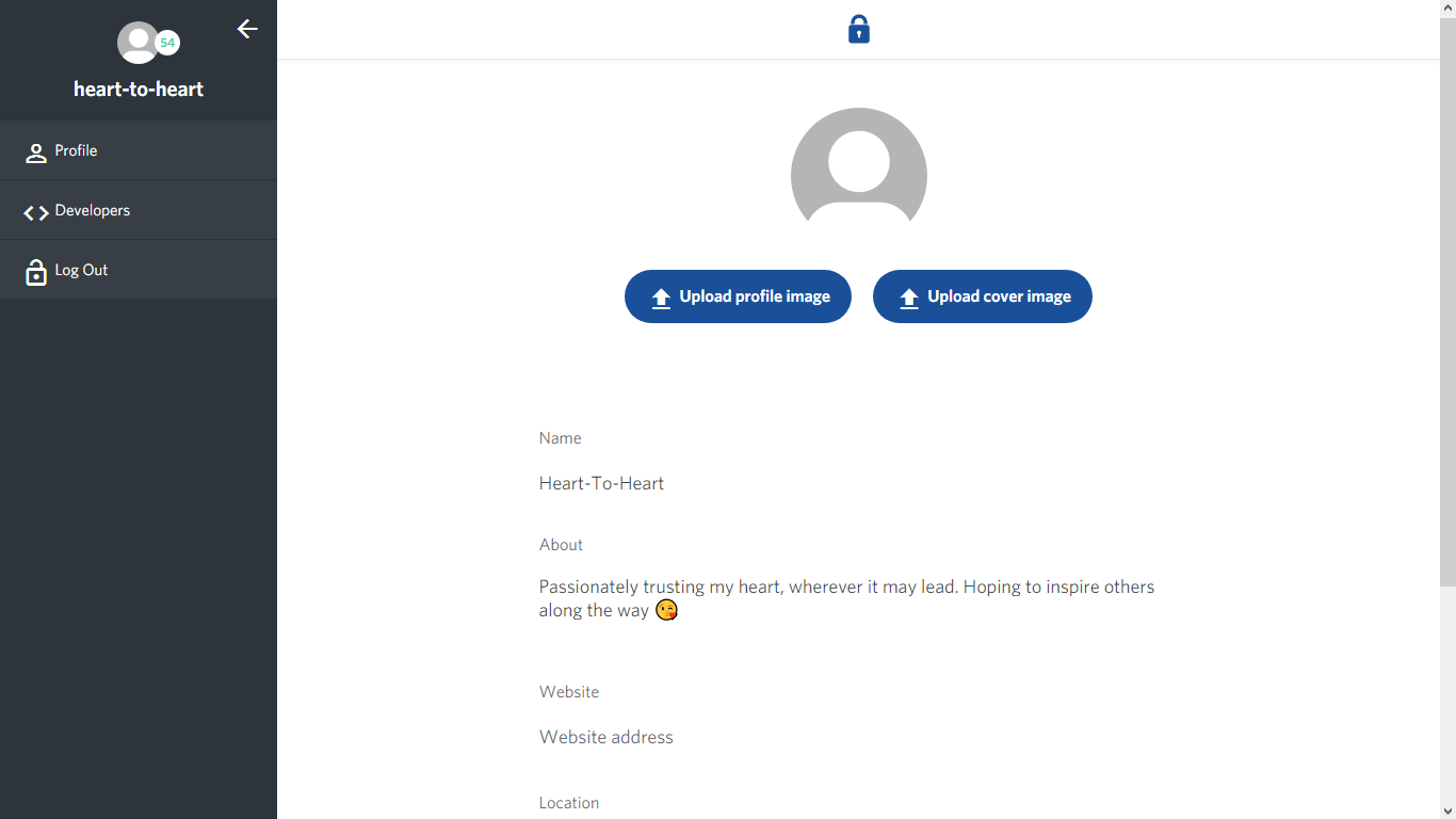
Unfortunately, despite 3 separate tries, my account would not update with my images... I can't say if this is a problem on my end but alas here is my picture-less profile on busy. Strangely, my profile picture on Steemit did change to the one I tried to upload here even though it's not seen here. (Will continue trying and update you!)
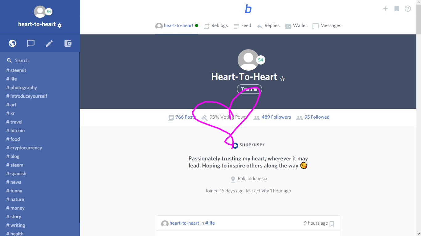
Note: it shows voting power directly on the Busy profile which is also another useful feature that I wish Steemit had.
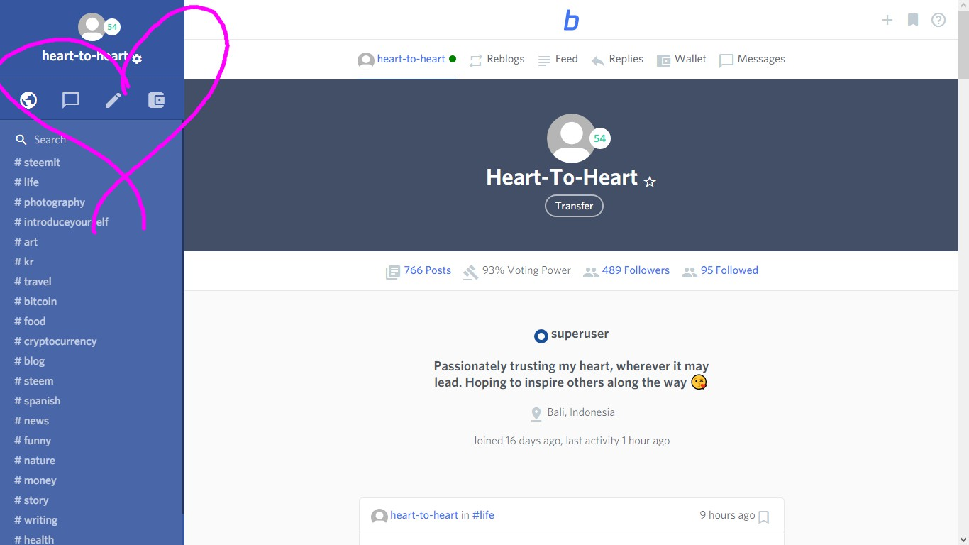
On the left hand side under the user name (as you can see) there are icons, you can browse, instant message, post and transfer. The added feature worth noting here, is the addition of the chat feature.
Did you just say, chat feature?!
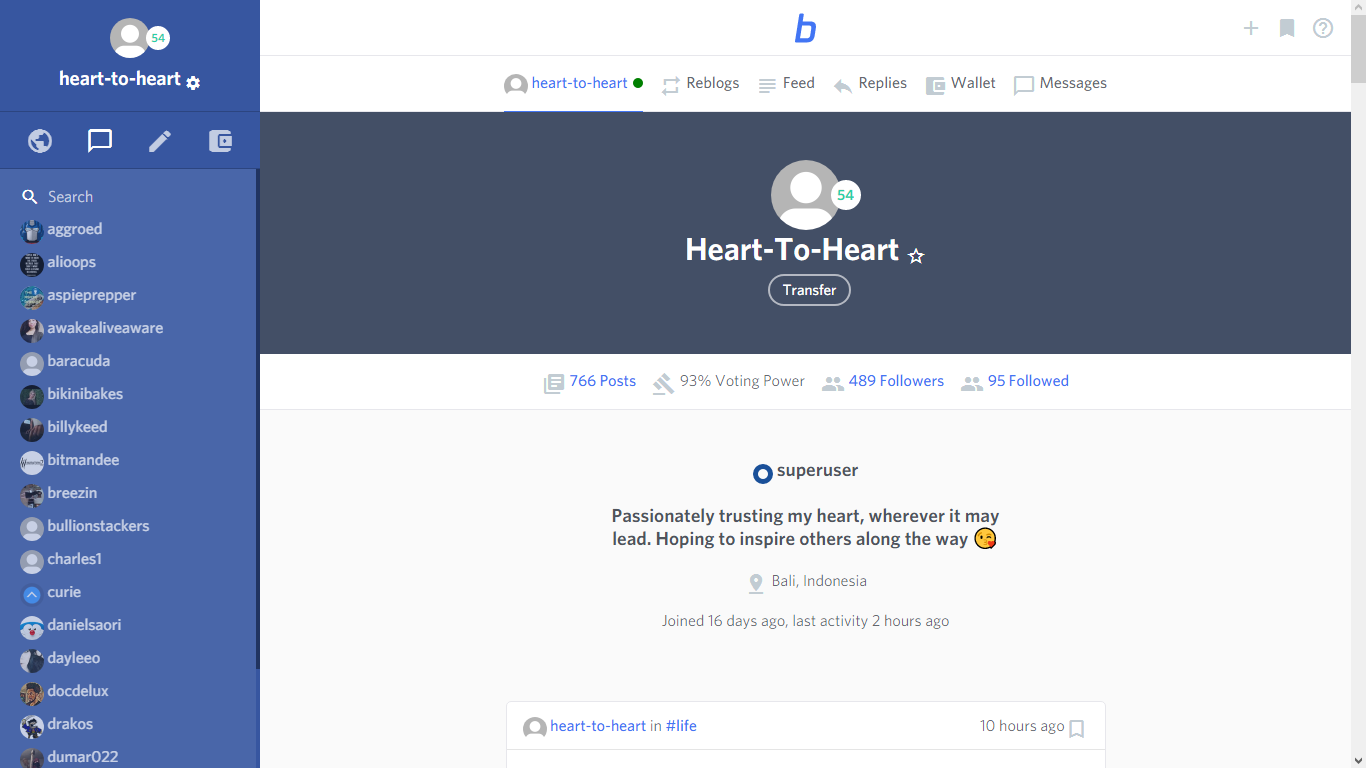
All of the people I interact with most are shown to me on the side, with easy access to send them a message. I for one, LOVE this feature and it is a huge selling point for me.
However, the chat bar is 'stuck' and doesn't show me everyone that I interact with. It gets stuck at "F" and won't scroll down further so I have qualms with what it's showing/not showing me." !
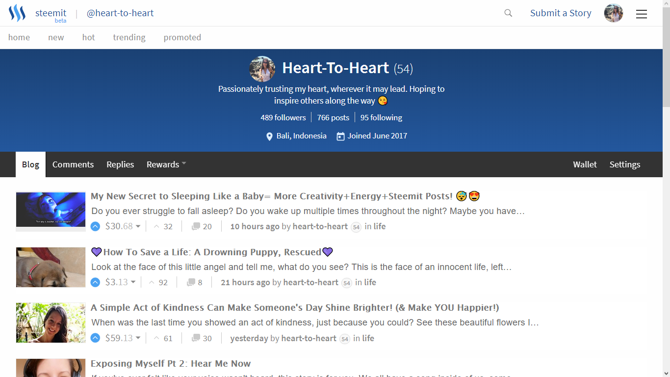
(Sadly, as we all know, Steemit does not currently have aforementioned chat feature.)
Resteems:
Steemit is a wonderful place where resteeming a post you like can help authors get their content out to a wider audience, but it can also make it difficult to see your content. (This has been a criticism I have heard a lot since joining. )
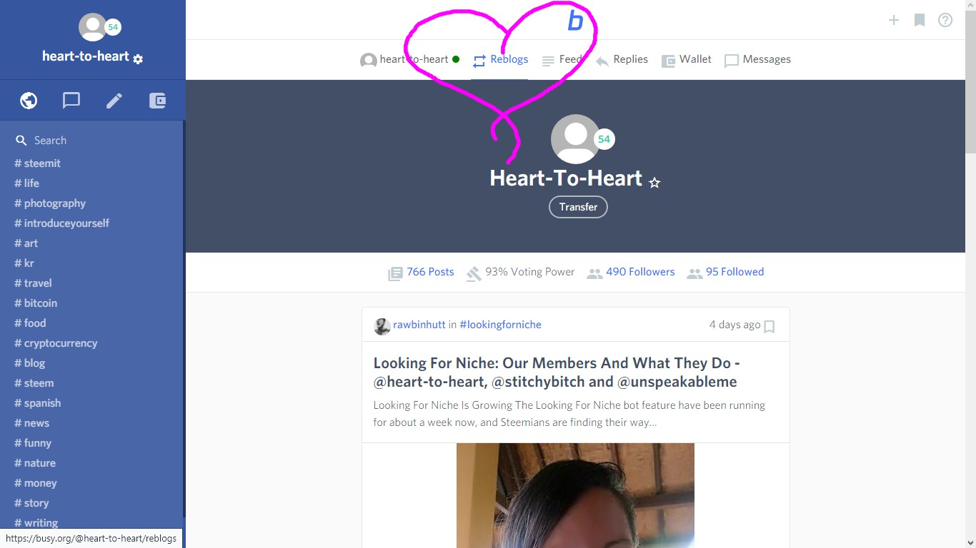
Busy has solved that here: (at the top of the screen there is a 'reblog' section which separates your articles from what you've resteemed. )
TIPS?!
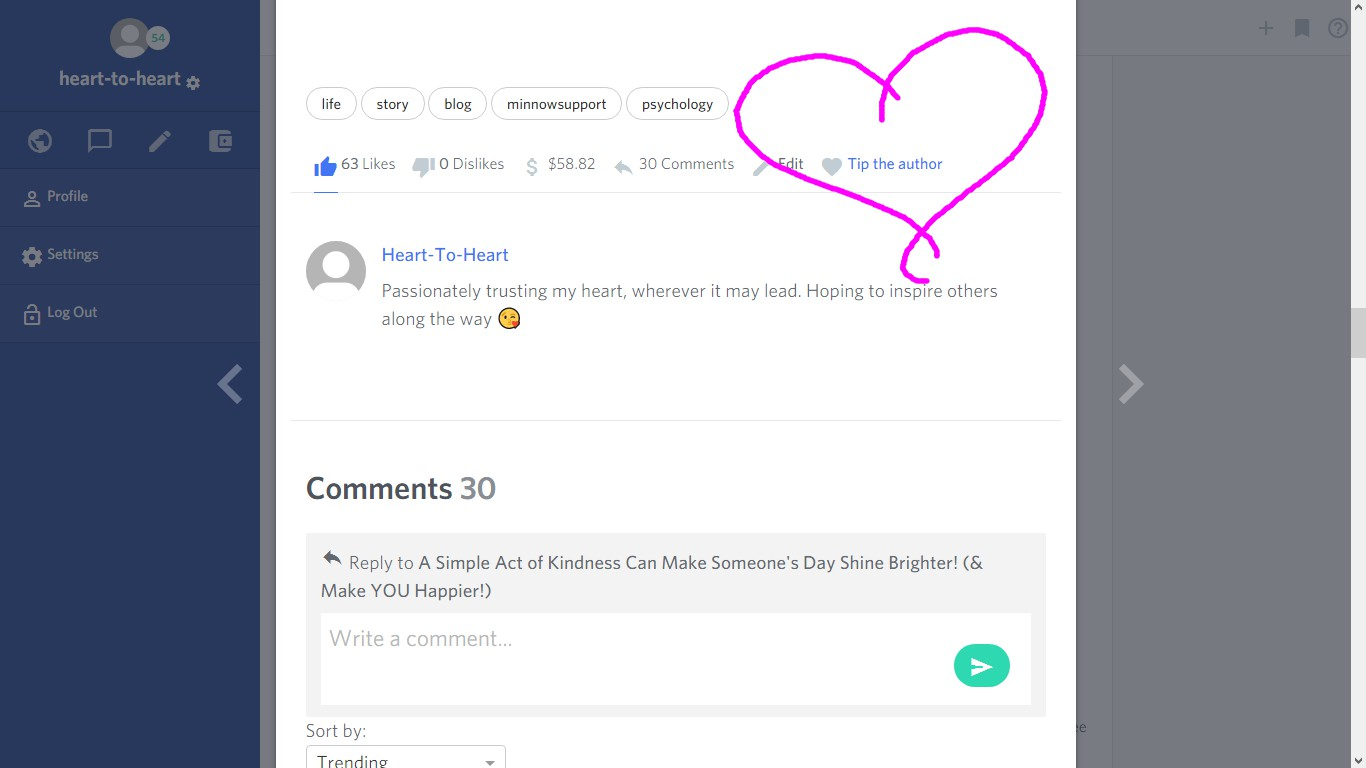
Scroll down to the end of an article and not only can you 'like' which is an upvote, but you can also **TIP THE AUTHOR! **
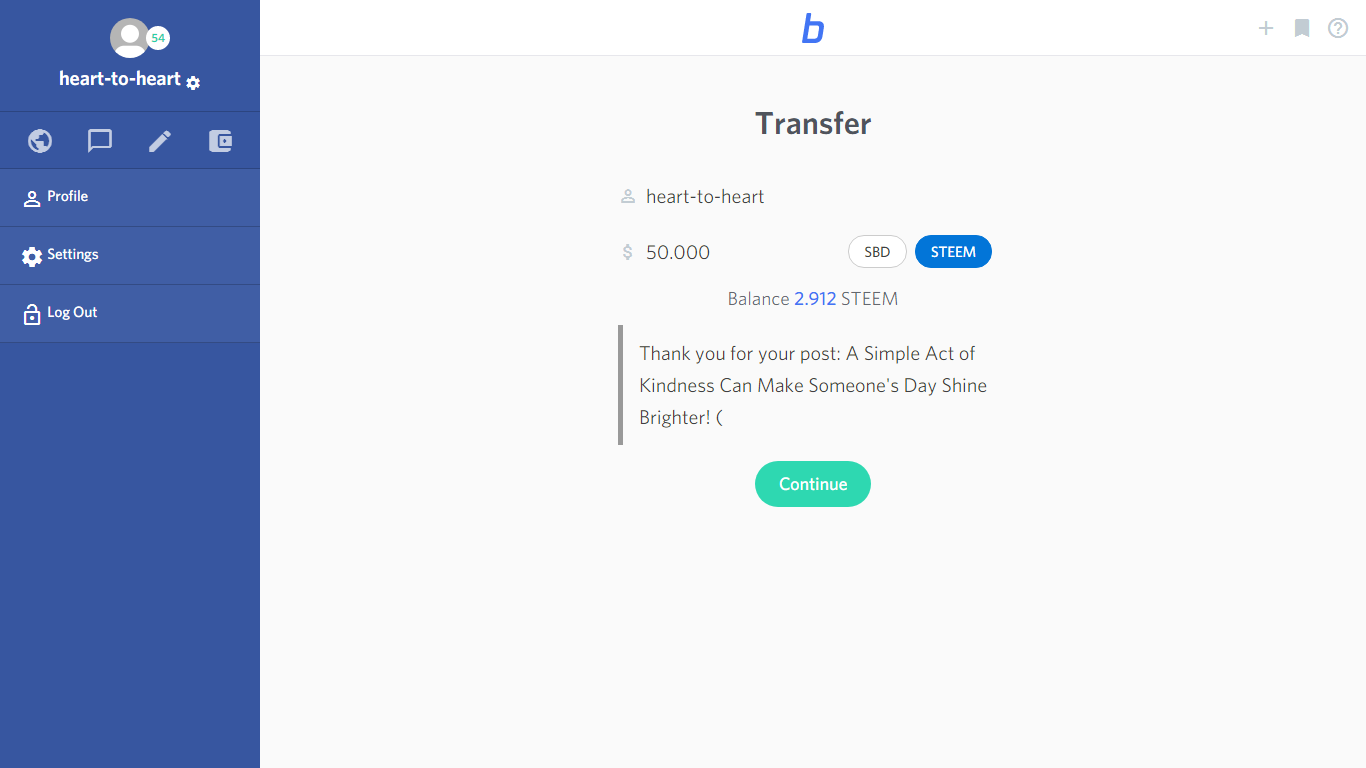
As you can see you can see, you can choose how much you want to give a particular author, which is quite the game changer for reward potential!"
Reading:
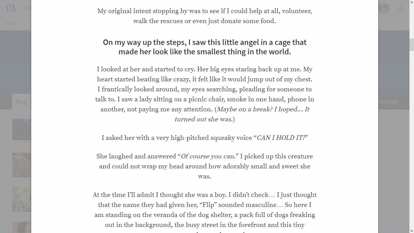
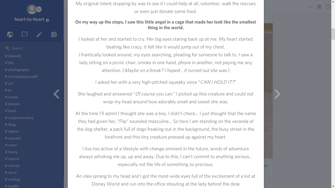
When it comes to reading and viewing articles, you'll see them in a pretty similar way. Nothing too different in my opinion.
Steemit:
Busy:
Browsing:
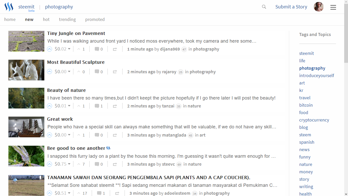
Steemit: Shows many articles at once, in a smaller format. Everything laid out left to right.
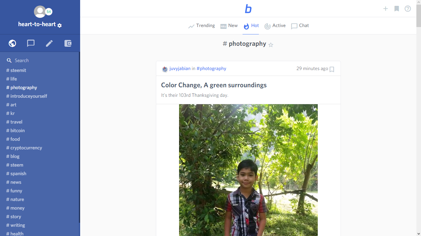
Busy: Gives a larger, more magnified view, which quite honestly proved to give me more insight into if I wanted to click on it or not.
Bookmarks:
See something you like but don't have time to read it? I have like 50 Steemit tabs open at any given time. Busy has an answer. Click on the bookmark at the top of any article to save it to your 'bookmarks.'


Searching:
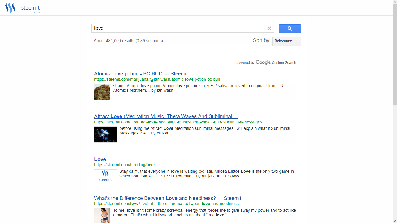
Steemit: I am not the searches biggest fan. It requires a lot of movement to get to where I want to go (and some know-how.)
Busy:
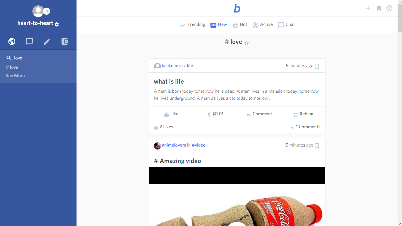
Head on over to the 'world' icon and click it.
Now you have a search bar, type in whatever you're looking for. In this case I used "love" as an example. It showed me # love, so I clicked on it and it brought me to all these tagged under love. Now I can sort them at the top, based on what I want to see (new, hot, active, trending...)
Look how fun the icons are! I have to tell you, the interface feels a lot more friendly in here...
Messaging:
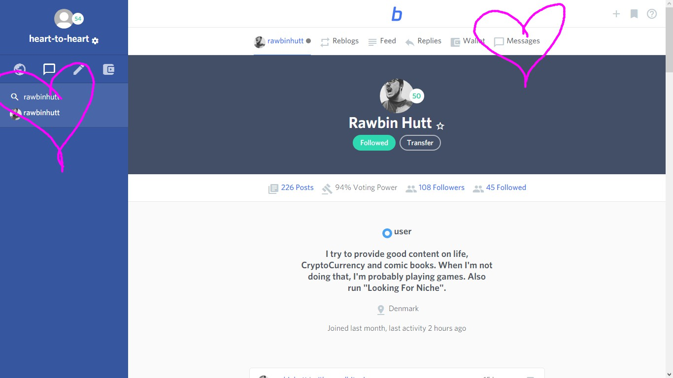
I tested to see if I could message anyone else aside from those in my favourites, and in fact I can. I just need to search for them in the same way as topic (ex: love) above, instead of searching in the browse (world) icon, click the message icon, type their name and they will comes up, go to their profile and click the chat icon above their name to be able to start an instant messaging session. Isn't that super cool?
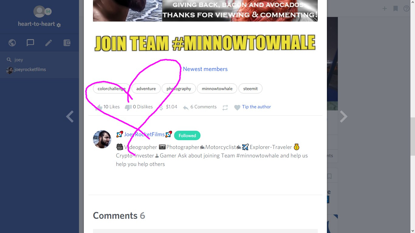
There's another interesting difference over here that really plays into the social media side of things: likes and dislikes. You can like and dislike someone's post and it will show you at the bottom. Busy's 'dislike' plays Steemit's 'flag' feature here and is designed to keep away trolls, plagiarism and poor quality content. It's there to keep the platform a loving, safe, encouraging community of creativity at it's purest form, just the same as a flag would- let's hope everyone is responsible with it.
Now, I am not in any way advocating for one platform vs the other, but I have to say that so far I am an overall fan of the interface here on busy. It's almost like 'Apple', in the fact that it's user friendly and visually appealing whereas I find that Steemit comes with a bit of a learning curve. I really like how easy and accessible it is but I am not 100% sold yet.
Posting/Editing
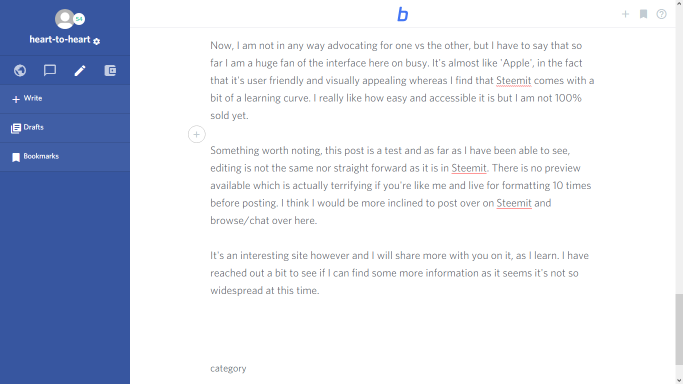
Something worth noting, this post is a test and as far as I have been able to see, editing is not the same as it is in Steemit. There is no preview available which is actually terrifying if you're like me and live for formatting 10 times before posting. But wait
... It happens automatically once code is administered so you can see it right away within this screen!
Here is a screen shot of my post while I am writing it... notice it is very simple, with no other window.
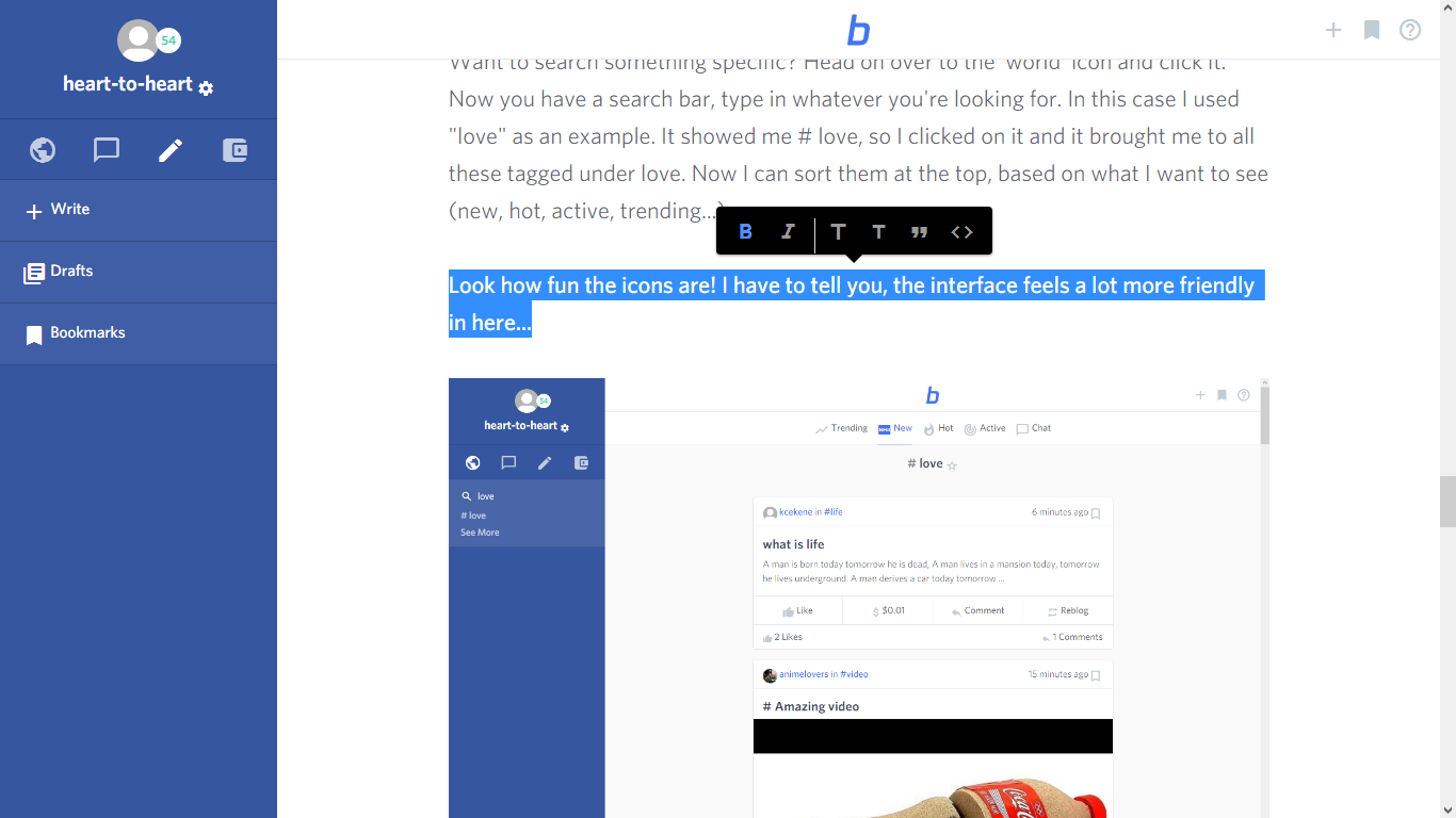
There's also this cool part (no code necessary): _highlight your text and you can edit from a bar of options._
Drafts:
Busy also saves your work as you type into your drafts which are found under the pencil icon (meaning you can write more than one post at a time without having to publish!)
Thoughts on Busy.com:
Busy is an interesting site with some very alluring features. From what I have seen, it has some really great improvements that I love added into the Steemit platform I know and love. This was just a demo, I was researching all day but I will be looking into it further and I will share more with you on it, as I learn. I have reached out to some people who know more about it than I to see if I can find some more information as it seems it's not so widespread at this time. I will post it when I get that information back.
Here's my simplified review of the platform:
PROS:
Chat Feature
Attractive/Easy to Use Interface
Search-ability
Voting Power Preview
Reblog Feature
Immediate Editing (no more scrolling up and down to check your post)
Drafts
Bookmarks
CONS:
Potential Profile Picture Glitch
Potential Chat Glitch
When I published this on Busy, it got completely disarrayed on Steemit. Nothing was in order, there were multiple of the same pictures, the formatting was a nightmare... It took me a long time to have to reorganize it over here in order to share
(I'm going to look into that problem because it looked great over on busy!)
I am always researching and wanting to know about new things, this was one of those fun experiments. I hope that this post will give some insight into this platform!
Until then, tell me what you think! I have been looking for some opinions on the advantages/implications of this site. If you have anything to say about it, please let's open the discussion in the comments!
I'm hoping @fabien @liondani@busy.org @ekitcho @nil1511 @po0 @yamadapc @good-karma can weigh in as I have been seeing their names pop up on this!
XO,


