
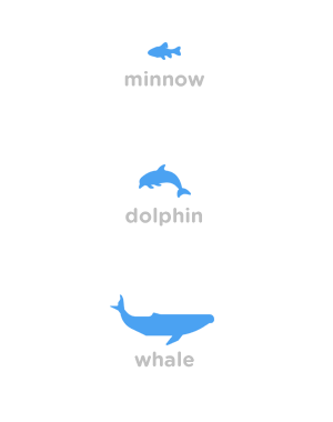
After my last post focusing on designing a user friendly interface for a future mobile app, the idea of Steemit being a "social game" stuck with me. So I thought about developing some simple badges/icons displaying the current status for each member of the community depending on their SP. We all know these are unofficially known as minnows, dolphins & whales, but most users can't quickly identify who is exactly who just by looking at some numbers.
At first we can have the 3 common levels as seen below:
Let's see how they would look in my app mockup, including the progress bar in a darker tone of blue depending on each Steem Power.
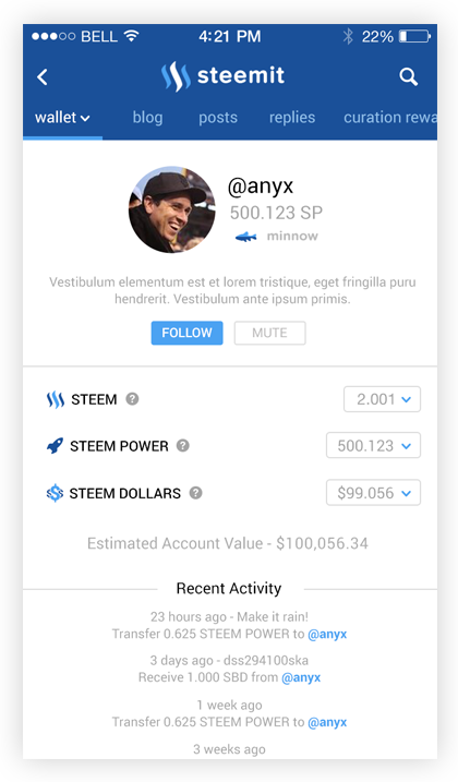
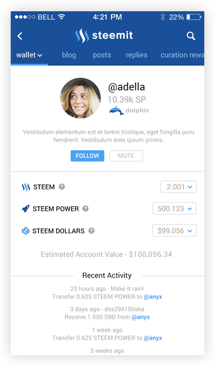
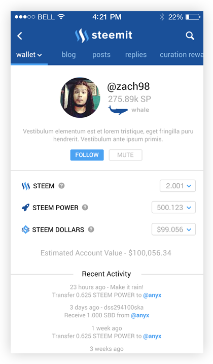
I think it would be great to add more different species based on power ranks to spice things up. I personally vote for having a jellyfish, what do you guys think?
Icons by Ed Harrison, Matthew Hall, & Mallory Hawes from the Noun Project
If you enjoyed this post you may also enjoy these ones:
Steemit Mobile App - UI Prototype
Steemit's Front Page UI Makeover - A Very Quick Mockup
