Hello Steemit friends ❤️,
Welcome to my post and hope you are doing good today!
I firmly believe that some of must discovered that there is a new feature had been added in Steemit!
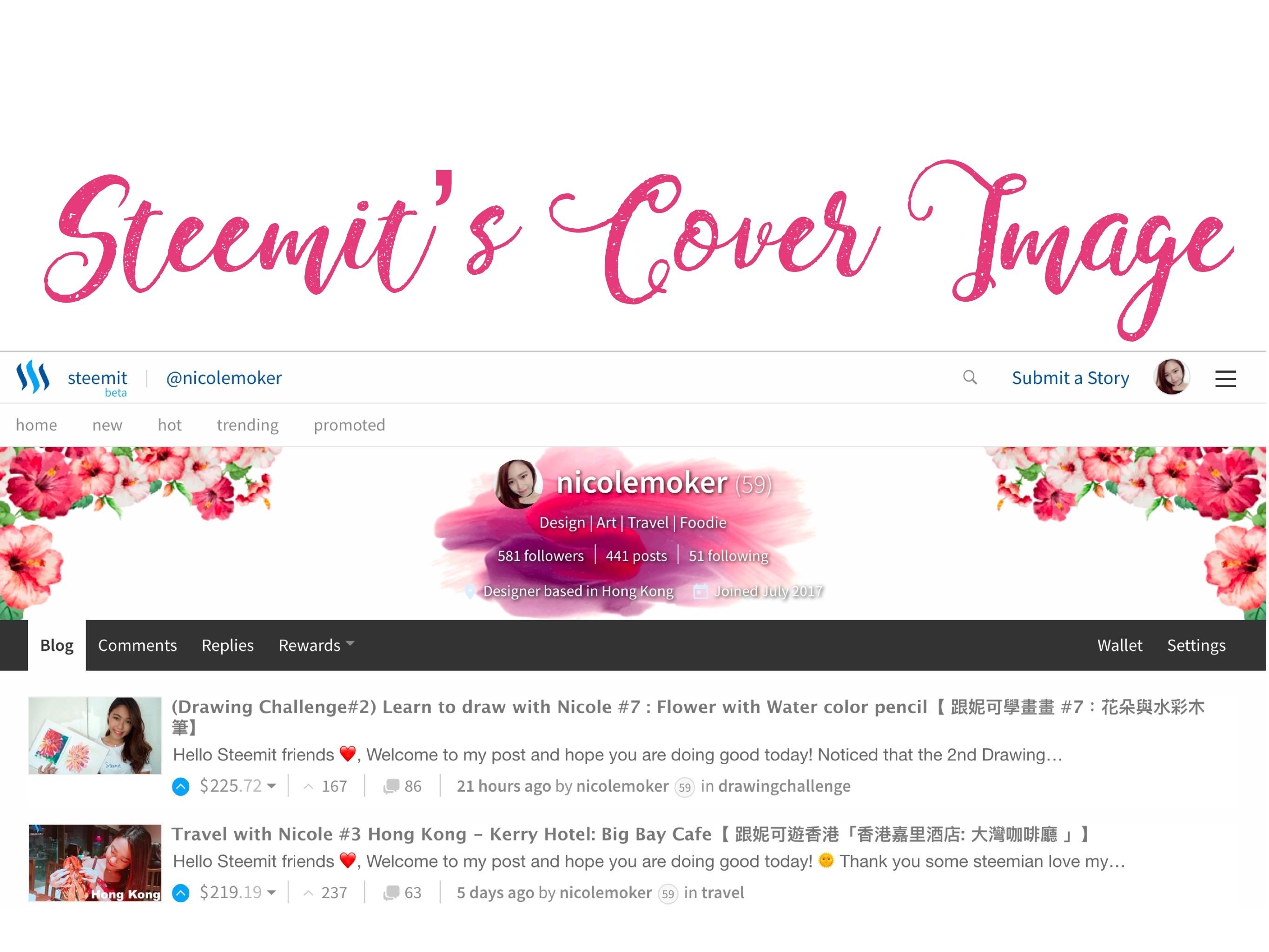
Yes! You are right, it is the "COVER IMAGE". You may take a look of mine.
Today I will teach you to create your perfect cover image. ☺️
歡迎來到我的帖子,大家好!
我相信你們發現了Steemit 增加了一個新功能了吧?
對!就是cover image 封面照片喇!你可以看看我的啦~
今天就打鐵趁熱教大家設計自己的cover image !
How to upload your cover image 如何上載你的封面照片
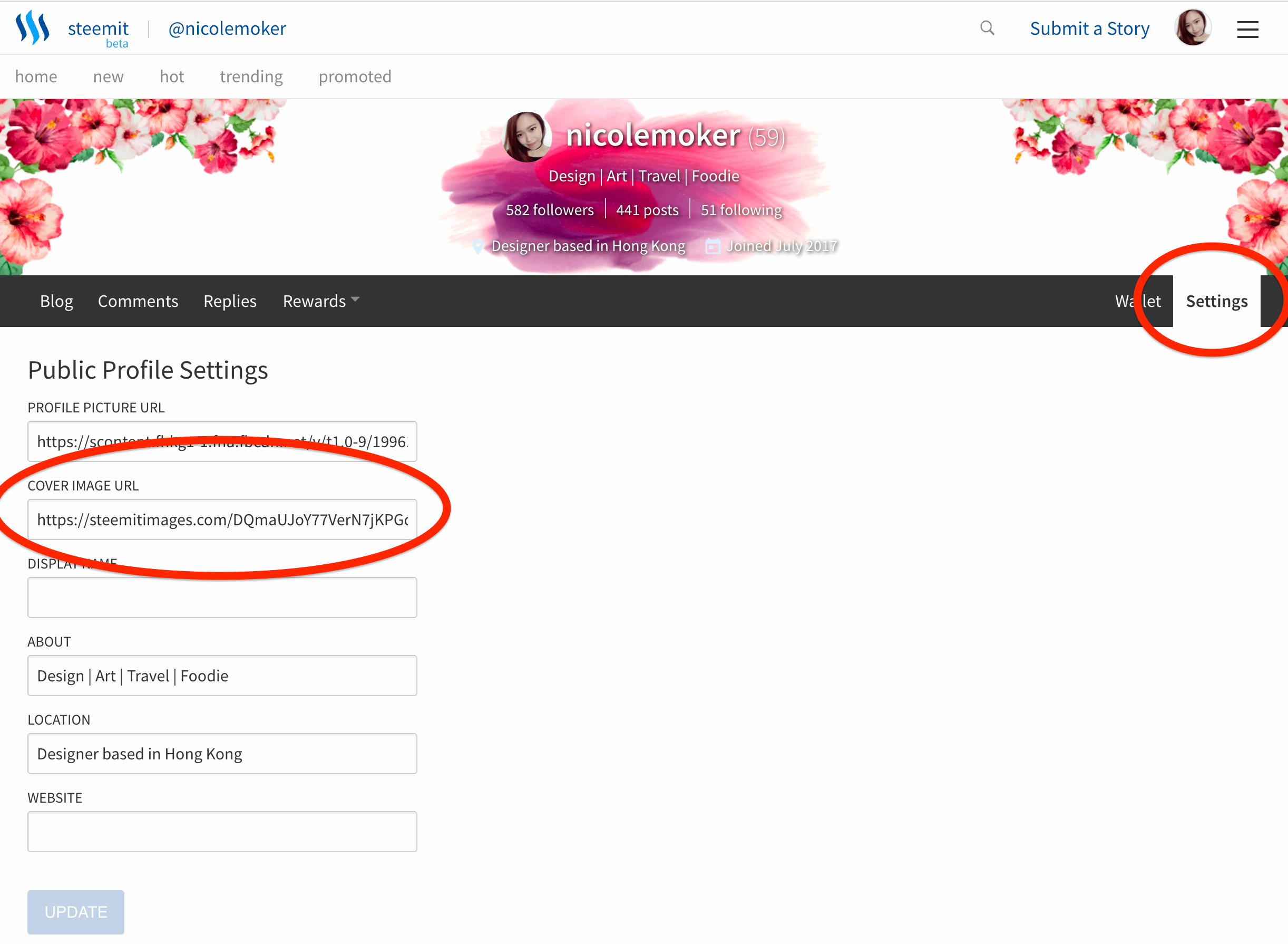
- Go to "Setting" (前往"Setting")
- Upload your image link in "Cover image URL" (上載你的照片在"Cover image URL")
Tips: You may get the link by opening a Steemit's draft and uploading it.
(提示:你可以把照片上載在Steemit 的初稿裏,然後你就得到link了。)
How to create your perfect cover image 如何製作完美的封面照片
1. Understand the size of the banner area 了解橫幅的尺寸

Red border(紅色範圍): W1366 x H177 px
Blue border(藍色範圍): W1130 x H140 px
Green border(綠色範圍): W310 x H155 px
The Steemit's Cover image, which is the banner of your blog's page. The size will be change according to the devices.
For a 27" iMAC user, you may need to use 1366 x 177 px banner.
For a iphone 5S mobile user, you may only need 310 x 155 px banner.
Therefore, please take note when you creating your cover image.
Steemit的封面圖片,就是你博客頁面的橫幅。 尺寸將根據電腦/手機設備而改變。
對於27“iMAC用戶,需要使用1366 x 177像素的橫幅。
對於iPhone 5S手機用戶,只需要310 x 155像素的橫幅。
因此,請在創建封面照片時注意。
2. Create according to the size of the banner 根據橫幅尺寸製作

Red border: This is the outer zone, some users may not see the images or graphic in this area.
Blue border: You should create your main graphic in this area and extend these graphic to Red border.
Green border: Your Info-text will be appear here, which is pre-set by Steemit in white colour text. This area will 100% appears on mobile devices.
紅色範圍: 這是外部區域,有些用戶在該區域會看不到圖像。
藍色範圍: 你應該在此區域創建主圖形,並將這些圖形擴展到紅色邊框。
綠色範圍:您的信息文本將出現在此處,由Steemit以白色文本預先設置。 該區域將100%出現在手機或移動設備上。
3. Tips for the Image Cover design 封面照片設計提示
- Keep your info area clean. Use plain or dark color to keep the words readable.
- Your banner is representing yourself, it gives the first image of your visitors.
- Do not upload low resolution image which makes your blog looks not professional.
- Do not upload large size file, loading time will be too long and may loss your visitors. 72 ppi resolution is good enough.
- 保持您的信息區域清楚可見。 使用單色或深色可以保持文字的可讀性。
- 你的橫幅代表你自己,它是給訪客的第一形象。
- 不要上傳低像素圖像,這樣你的博客看起來不專業。
- 不要上傳過大尺寸的文件,加載時間太長,可能會丟失訪客。 72 ppi的像素已經不錯。
Q&A 問答區
Hope you guys can create your perfect cover image!
If you have any questions about creating the cover images, you may leave your message below 👇🏻
See you all soon ❤️
希望你們可以創造出完美的封面圖片!
如果你對製作封面照片有任何疑問,可以將你的信息留在下方👇🏻❤️


👆🏻Upvote & Follow Nicole! 👆🏻
