I've documented making an account with Steemit with a valid Reddit account and I am sharing it with everyone so we're all on the same page for comment and suggestions on improving the process. My account was originally mined but I wanted to see and document what most users go through to make an account. I did this so I could understand certain things like how much effort is required and how clear the instructions and warnings are for password creation and backup. I'm concerned about this because I've seen several people ask about password recovery, which is not an option on Steemit. These pictures of the UI are presented in order throughout the process.
Guest header
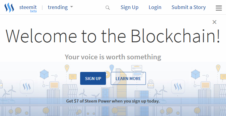
Without being logged in a person is shown this at the top of the Steemit page. It uses the tagline I first posted here so naturally I approve. What happened to "Welcome to the Blogchain" though? Is it trademarked? I thought it was clever. The Sign Up button takes you to the Sign Up dialog (same as the link on top) and Learn More takes you to https://steem.io. I think mentioning that the free account is worth money is great but with the market fluctuating it's hard to keep it accurate. I discuss this in the next section a bit more. Finally it has that X in the corner which is nice because once you've seen the message, it's nice to disable it and get it out of the way.
Sign Up dialog
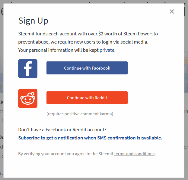
This is a good dialog. I like the fb and reddit icons and colors used for the buttons. With the price of STEEM fluctuating (and new accounts, despite now starting with 5 SP, are worth over $10 right now), it's hard to keep a solid value of this. It could follow the Steem price feed, and drop all decimals to round it down to the nearest whole number. But if the price falls and the price feed lags behind the account won't be worth what it says it's worth. Maybe just drop the $2 value altogether or base it on an external API that is faster than the internal price feed?
I also think we're overdue to have the option to directly buy a Steem account from this dialog, with cryptocurrency. Not everyone has a Reddit account with enough karma or a Facebook account, and some might have them but don't want to use them to link to a Steem account for whatever reason. It seems like the already-existing Blocktrades integration would make this simple, though I know the web team has a lot of work on their plate right now.
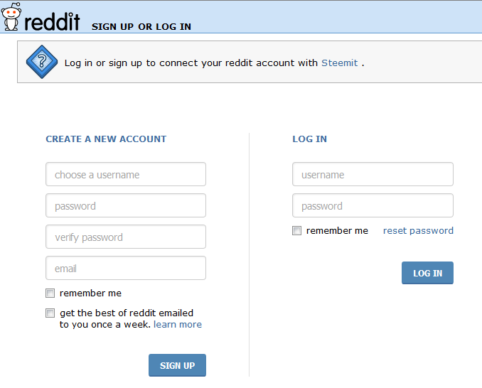
Reddit sign in and authorization
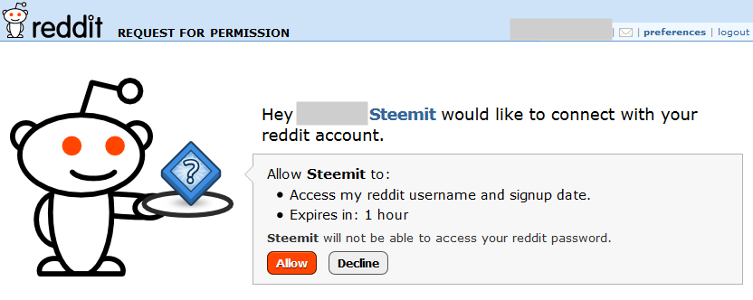
Once logged in, you get this auth page which is nice and explicit in what they tell you you're allowing.
Steemit create account - Account name
I took it as a challenge to find all the disallowed account name messages that I could.


I probably still missed a couple. These are pretty good messages. A lot of sites will give a green checkmark or something similar when an account meets all the rules. It's not necessary, but it's a nice validation when you've tried a lot already.
Steemit create account - Passwords
When you hit the Allow button on Reddit you are taken back to Steemit, to this prompt.
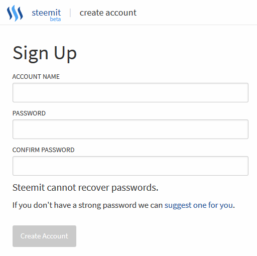
Note that from the start, it says "Steemit cannot recover passwords."
Suggest a password for you
It also has the "suggest one for you" link. Clicking it gets this box:
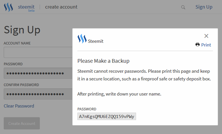
"Please Make a Backup" might not be strong enough language :) Included is a small print link in the upper right, a bit too close to the close-dialog-X. I think this could be bigger and more centrally located, next to the header text. Then a fairly random-looking 21 character alphanumeric password.
When the X is clicked password suggestion box goes away and the password fields are autofilled. I'm not sure if that's a good or bad way to make sure the password suggested is used by the new user or not. You hope they printed it or at least copy/pasted it into a saved document. The fields are greyed out to prevent editing but the Clear Password link can be used to clear the fields and not use the suggested password.
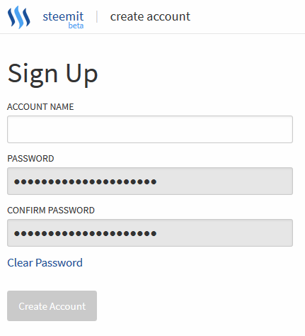
Use your own password
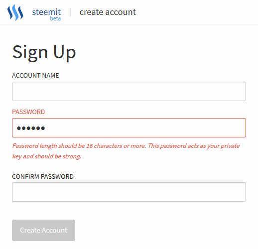
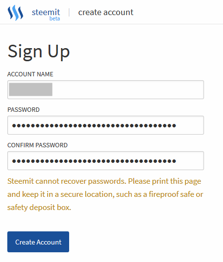
A too-short password is met with this warning. One thing that I noticed is that the warning about not being able to recover passwords has disappeared when you start typing one in. This "Steemit cannot recover passwords" warning should instead get a few font sizes bigger, bolded, and turned the color red. And if <blink> tags still existed, those too.
It's only when you have the fields fully filled out with a matching password does the warning come back, this time looking a bit different. You wouldn't have seen the text about a secure location until now if you didn't click the suggest password link. I think this message needs more emphasis.
Account created
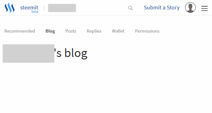
Click the Create Account button and after a second or so your fresh account is made and you are logged in and taken to your own blank blog page. It's sparse, unwelcoming, and probably confusing to many people. This could use improvement. Maybe a welcome splash popup with some links to FAQ(s) and guides. Stuff a new user might want to see.
I want to hear what other users of Steemit, new and old, have to say about this process, so it can be improved and/or streamlined. I think the issue of passwords needs to be very over-the-top explicitly addressed as people are very used to having a reset-password safety net.
Leave a comment if you have a single comment/critique of one thing or if you have something to say about everything. Also leave a comment about your personal experience with making an account: was it easy? Did you have trouble? Do you feel the warnings about the password backups were adequate?
If you like this or my other posts, click here for my blog page and hit the  button in the upper right!
