Some of you may have already seen my first two attempts at developing a landing page for new Steemit users.
In the first I attempted to express the decentralized nature of Steemit through the abstract use of tree branches.

In the second I used binary code to indicate the advanced technology behind the platform.
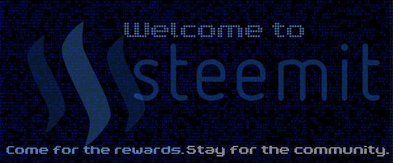
I found both the first designs to be a little overwhelming with visual stimuli, so I wanted to create a more minimalist version for my final effort. Below is a gif which charts the progression of the design process.

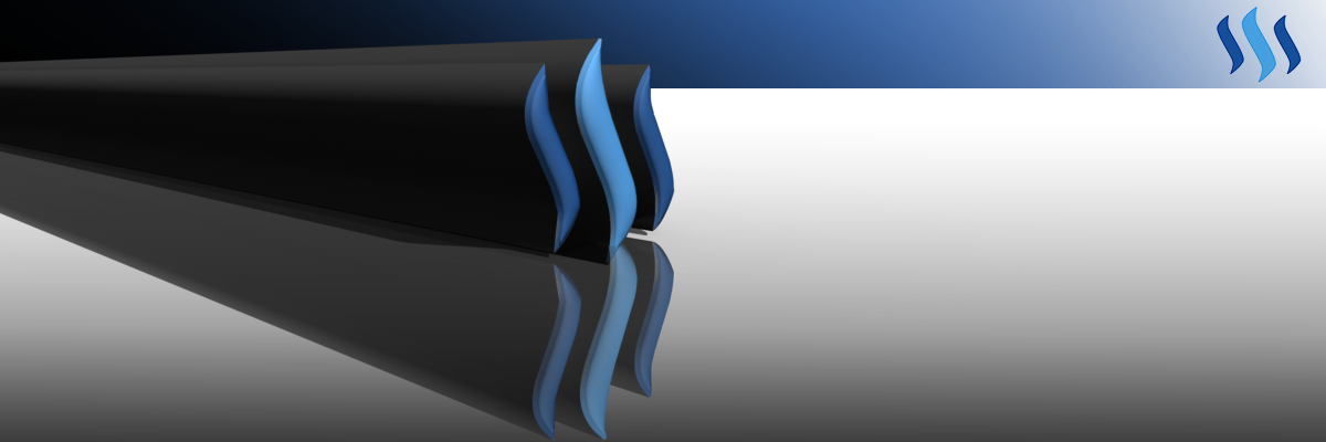
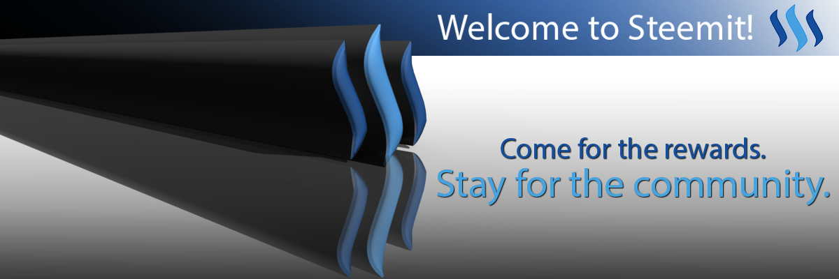
At first I had a very small extrusion on the 3D Steemit logo. In the end however, I decided I preferred it to be elongated and stretched off-screen. For me, this is symbolic of the dynamic nature of Steemit and its continual evolution during this beta period. I also thought it could be interpreted by some viewers as a sign of progress, indicating how far Steemit has come and how far it is likely to go.
Here are the final products.
Without Text
With Text
EDIT: Based on the feedback received in the comments, I redid the design with the suggested changes.
Without text.

With text.