
For the first design I attempted to express the decentralized nature of Steemit using tree branches. This time around, I wanted to try something a bit different. My initial plan was to do some sort of design that incorporated the Steemit source code and logo into an abstract image, but I had difficulty acquiring what I needed to execute that, so I thought I would go with a binary code design instead. This wasn't ideal but, it still fits well with Steemit.
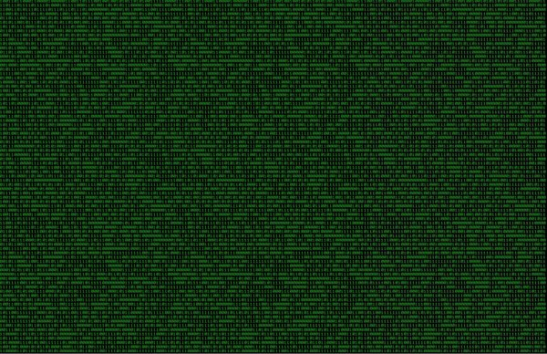
First I found a royalty free binary code image that I could use for the design.
Next I grabbed the Steemit logo and opened it up on a new layer.

The next step was to edit the hue of the binary code image, resulting in a blue tone. Then I merged the two images and altered the layer type to overlay and lowered transparency.

I decided that the logo in the middle was far too generic--and there is nothing generic about Steemit--so I moved it to an asymmetric position. Then I visited dafont.com to find a font that would fit well with the binary design. To do this I chose the category bitmap and then wrote in some preview text so that that I would be able to see how it would look before downloading.
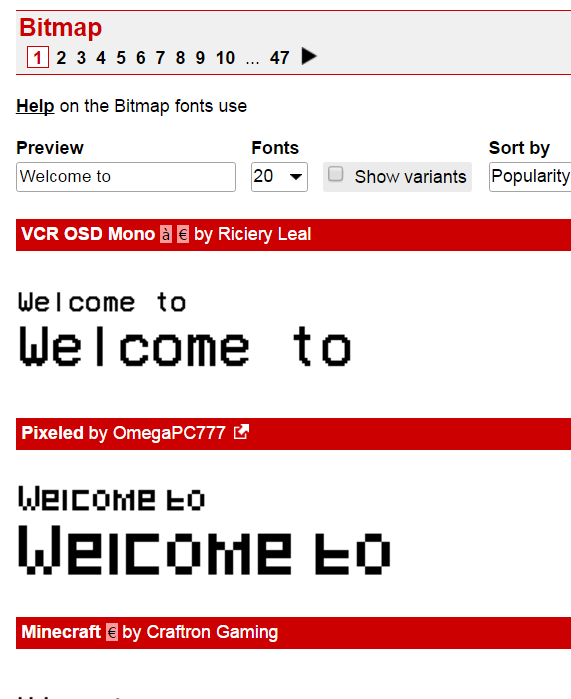
After a few pages and a couple of downloads, I installed my new fonts and went and tried them out on the design. Once I had selected one, I simply added text with a low opacity so that the binary code could be seen through the text, giving the impression that that text itself is composed of 0's and 1's.
I didn't want to overcomplicate the image so I decided that I was happy with this design as it was, but I wanted to spice it up a little. I thought it would look good if it had the feel of a flashy computer screen so I made a copy of the bitmap image and changed its layer type to overlay. I then lowered the opacity on it and moved the new layer horizontally across the original layer--frame by frame--to make it look as though different 1's and 0's were lighting up at differing times. Then I changed the opacity for the text in designated frames and I had a finished product.