New homepage layout
We've been busy synthesizing community feedback and designing ways to improve Steemit.com. Over the next few weeks, we'll be rolling out a series of changes to the User Experience (UX) and User Interface (UI).
To kick things off, we've started a series of small improvements to the homepage which are explained below by our Head of Design, Pon Kattera:
Putting people first
We've included the author's profile picture alongside each blog post. It's the people within our community that makes Steemit special and we hope this small change helps to deepen the connection between you and your fans.
Improve the scannability of each blog post and separate the key actions
We changed the layout of the post summary. By separating the author and timestamp from the key user actions (like upvote and reblog), it's now easier to quickly scan posts with elements in predictable, consistent places.
A picture is worth a thousand words
We've built a new expanded blog view layout. This gives you another more visual layout to browse posts. There is a toggle so you can quickly switch between the compressed and expanded views.
A new right sidebar on desktop
Yes, it does look a little lonely out there right now but this new structure sets us up for some new content items currently in development.
Design is never done.
In this period while we're testing new designs and rolling out changes, there are some visual inconsistencies scattered across the site. We're acutely aware of this and we’re working hard to unify the design and make it better.
Improving security
The following pull requests help make condenser (steemit.com) more secure.
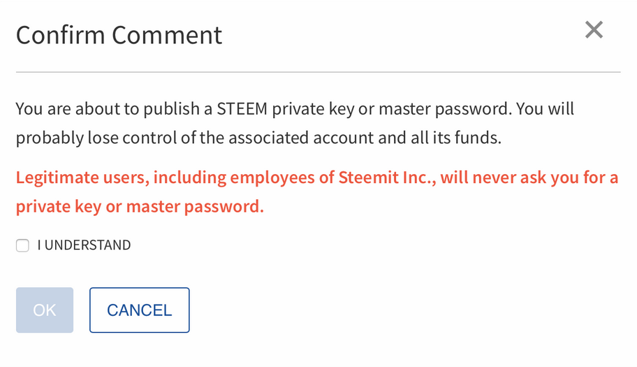
Accidental private key sharing
Pull request 1763 added a warning to users who accidentally paste their private keys in the memo field when doing a wallet transfer.

Malicious link warnings
Pull request 1839 will prevent malicious links from being clickable and will show the actual URL behind them. The text will be changed to red to warn users. Any link where the actual URL does not match the URL that is being displayed will be changed.
You will now see something like this:

Instead of:

Pull request 1822 added a warning to the wallet history to caution users about potentially malicious links that may be sent as wallet transfer memos.

Change to hide-post logic
Pull request 1838 updated the logic to show and hide posts so that any user’s post can be hidden if it receives enough downvotes. Previously users with a reputation of 65 or higher were exempt from being hidden. This will prevent malicious users from being able to use a hijacked level 65+ reputation account to post links without being hidden by downvotes.
Other changes
“Submit a Story” was changed to “Post” in pull request 1768.
Pull request 1808 updated the “Claim Rewards” button so that users know it is in progress, and cannot click it a second time while it is still working.

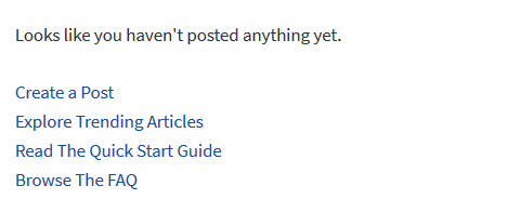
The user profile page that users see if they view their own blog when they haven’t made any posts yet was updated to have new links. (Pull request 1785)

Pull request 1787 ensures that hashtags found in a post are only added to the categories if they don't exceed the limit of five. This will prevent users from getting a validation error if they use more than five hashtags in the post body. #fun #hashaway
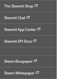
Links were added to the main menu for "The Steemit Shop" and the "Steem Bluepaper" (Pull request 1724).

Pull request 1804 made several updates to the FAQ page to clarify the stolen account recovery process.
More to come
The recent changes to steemit.com are the first of many that we will be making to the website layout over the coming months, so stay tuned and Steem On!
Team Steemit
