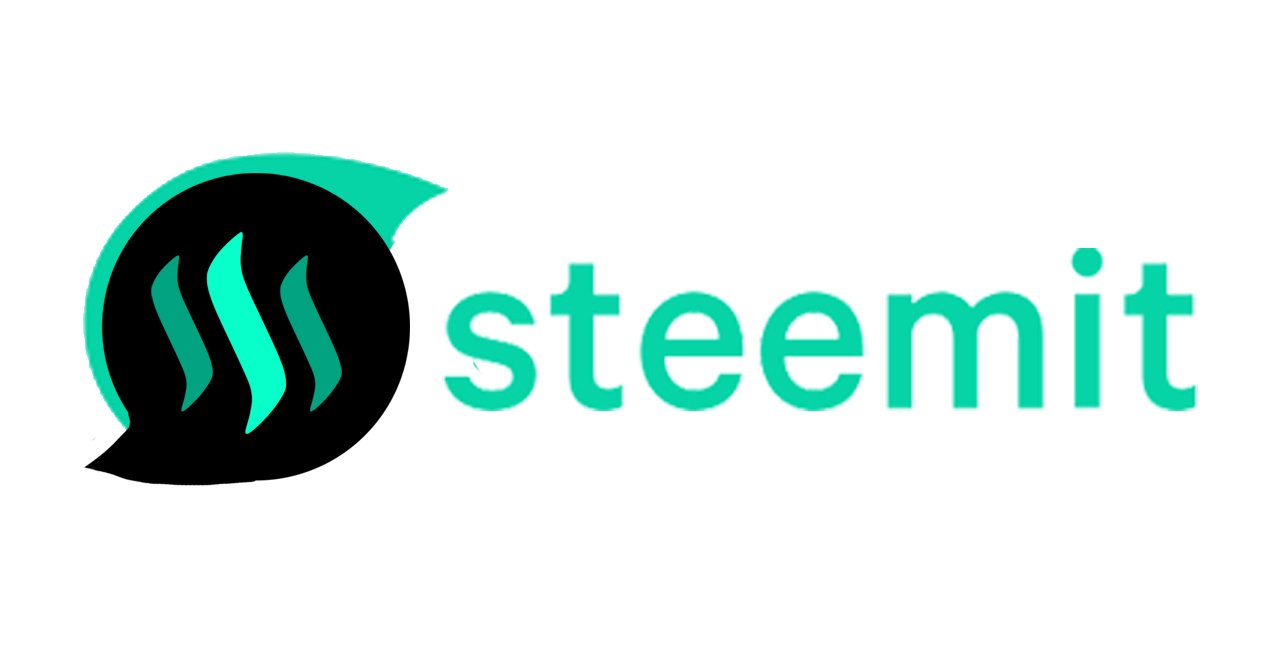

I'm not the one to complain and not have a solution or a suggestion. I was excited to see all of the upgrades on Steemit this last week. One thing I was not to fond of is the logo. I get what they were trying to do with the "S", but it looks like a messenger app to me. I sat around thinking of some ideas on how to make it better. I'm not much of a graphic designer but I came up with this logo.

I figured the reason it felt weird was the lack of "steem". So I simply added the old logo to the design. Nothing crazy. Tell me what you guys think. Post any suggestions in the comments. Being a little guy on this site I doubt I can make much of a difference but, I feel like with all the people I see complaining about it we can make them change it if we all make similar posts.


