It's been another 2 weeks since my last update and it's been a mixed bag of nice progress and cruel grind. I'll begin with the nice progress...
Communities
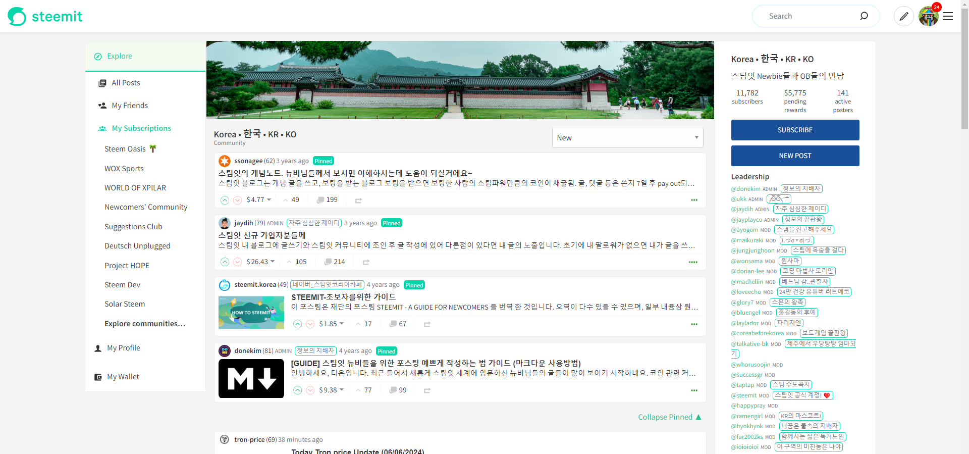
It was nice to see the positive feedback for the direction that the communities were heading in. The consensus being that users don't like having to scroll past years old posts in order to see new content. It was also acknowledged that some pinned posts, despite being older, still needed to be seen (things like community rules and posting guidelines).
@moecki summed it up nicely:
On the one hand, there is a reason why the communities have pinned posts, and on the other hand, I don't want to scroll through 100 pinned posts to reach the first new post.
The post also sparked a useful discussion with @patjewell who in a similar vein to the above, wanted the capability to filter for contests (for example). (My alternative Steemit Interface is definitely the best way to do this.) Whilst my initial thinking is that this would be too resource intensive (I don't think each post's tags are available to the App without additional API calls), it did lead to a better solution:
I could work on the opposite approach where the initial view shows all of the pinned posts and when the user selects "Collapse Pinned", then they can disappear and that setting can remain stored on their computer. It's probably the people who visit a community regularly that get most annoyed by having to scroll past the pinned posts every time so this feels like a better solution.
So this is what I've predominantly been working on.
I'll show the collapsed view first (because it will make for a prettier thumbnail).
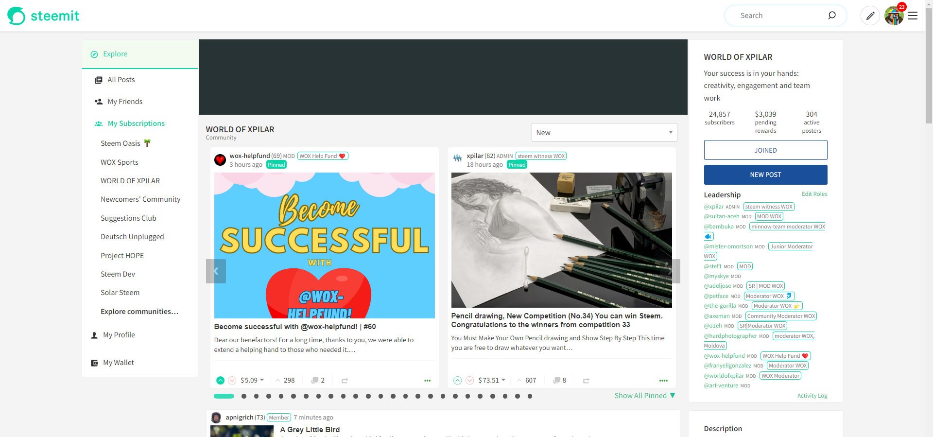
As @pennsif suggested, I'm now showing 2 pinned posts at a time with the ability to scroll left and right, using the arrows provided. Alternatively, a user can select one of the carousel dots to jump through. Once you reach the end, if you click next, you loop back to the start again.
This layout definitely gives the pinned posts more impact upon landing on the page (assuming this isn't your 1st visit and you've collapsed all of the pinned posts on a previous visit). Perhaps this will lead to more engagement on pinned posts (if you're anything like me and pinned posts are now a blind spot).
The carousel can accept plenty of dots so communities that have a large number of pinned posts still work (although with more posts, you lose a bit of the design "finesse").
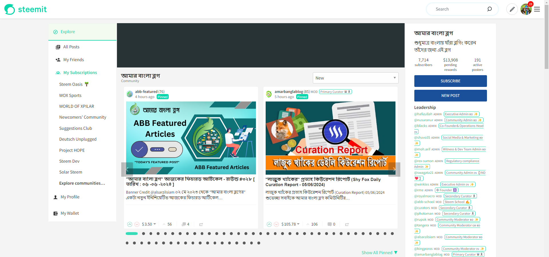
It also snaps quite nicely as the screen width gets narrower until the mobile view reverts to the existing, default "Blog" view.
Fewer Posts
If a community only has 2 pinned posts, the carousel element is removed.
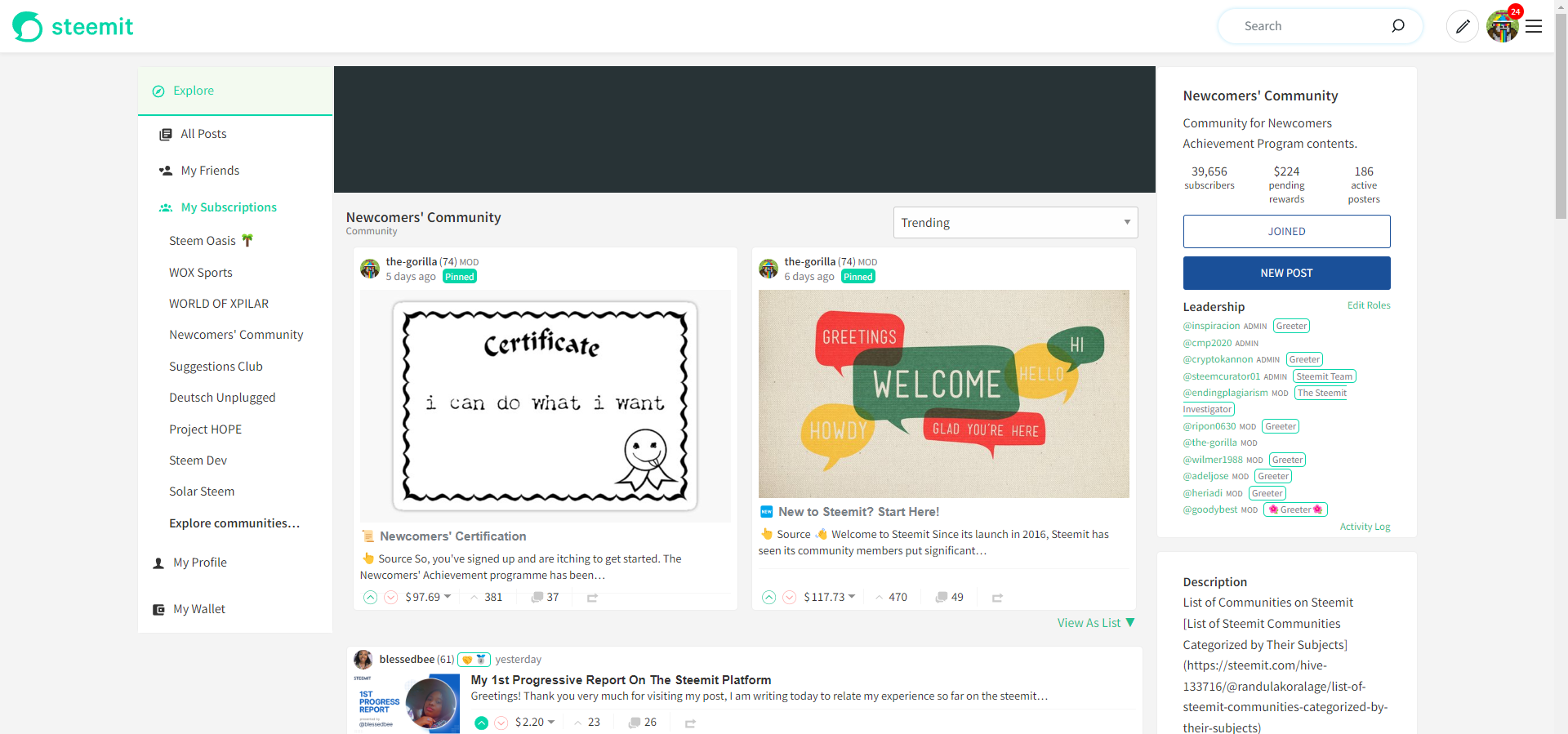
1 post or fewer will display as existing.
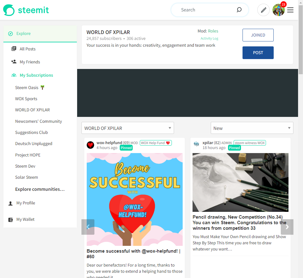
When in default view (before the user has collapsed the pinned posts for the first time), the link separates the pinned posts from all other posts in a clear and unobtrusive way.
This is as far as I've got with the communities - there are still plenty of bugs to iron out and some layout tweaks are still required - in particular what to set the image height at.

🪳 Bug #3918

If you're reading this on your mobile or have your mobile to hand, open up steemit.com and see if you notice a problem. My guess, is probably not. Now scroll to the right and you'll see some blank space. Now scroll down and the blank space disappears. Scroll back to the top and hey! It's back again.
An innocuous bug that's been on Steemit for longer than most of us. A bug that most people won't have noticed because it's never caused a problem. Until now. For the new navigation - only on Android devices though!
Pain in the arse eh?
After much investigation, it became clear that the "Avatar Menu" was the source of all my woes but perhaps strangely, if you open the menu anywhere other than at the top of the screen, the problem's not there. Which I think's stupid.
Once identified, the fix was a simple change to use "display" properties instead of "visibility" which is now committed to GitHub, awaiting a release to steemitdev. (Note: Other solutions were available but this had the least impact upon other areas of the site. For clarity, "least" = "none".)
Google Cloud Deployment
Shall I have a rant about this? Maybe not today. This was the primary grind. Painful, unrewarding and unsuccessful grind. Although I did win. Sort of.

I'd love to hear your thoughts so far. Do you like the direction that the community's pinned posts are taking?