The cat is out of the proverbial bag, The Genie has left the bottle. @Steemporium has been announced and I think it's going to be awesome !
Remember my Niche post ? This is what I was talking about.
@jonny-clearwater approached me a couple of weeks back saying he was in need of 2 logo's for something he was working on with @steemitqa. I'm not even sure why he approached me at that time, since he had not seen any of my logo work at that point. All he knew was that I was a decent pixel artist. He contacted me tough and I was more then happy to help him out.
This is about the first one of the 2 logo's, the one for Steemporium (the other being Steemstreams, which I will post about soon)
The Brief
Basically all I was given was the name, Steemporium, a hybrid between Steem & Emporium.
Emporium, to me inspired feeling of this awesome shop where anything and everything is for sale, multiple levels with balconies and grand staircases and people thronging about looking for that hidden gem. So, in that light, I felt it was in need of a classic 'Old Timey' type of logo. Basically, below image feel as a logo.
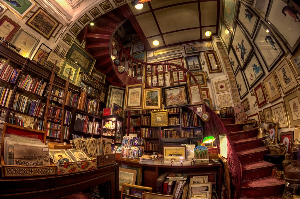
source
At the time, I was thinking, I'd have an overarching feature for both logo's, a sort of 'corporate' thing that would be use for both logo's any any future logo's as well. The S was going to be an offspring of the Steem logo, twisted into an S.
The Initial sketches
I had some initial sketches going on that were mostly centred around that S so I needed to have a clear idea of that one first.
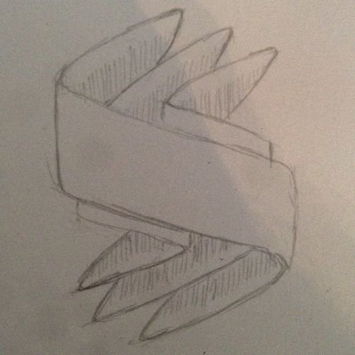
Then, I needed to take that S and add the old time shop of wonders feel to it.
Jonny was totally feeling it at this point, so I went ahead toward the design.
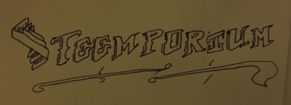
The Designs
So after some back and forth, I had finalised on the shape of the main S. My Initial sketch had the physicality of twisting the steem logo wrong, so i fixed it in the actual design. Remember, this S is the S to be use in all Steemporium related logos so I need a base logo for this, not a steemporium style only one ..

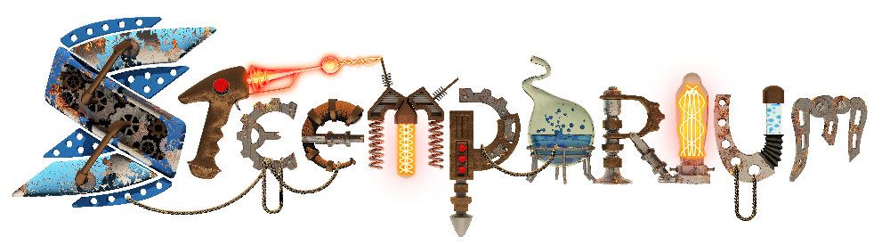
With that in hand, I worked on the complete logo. This is where I transformed the main S into the oldTimey style.

Unfortunately (and these things do happen) it wasn't working for @jonny-clearwater. He had something MUCH more elaborate in mind, and when we rediscussed the logo, I was completely on board. He was looking for a more steempunkish logo, with gears and levers and whatnot.
So, I had to go back to the drawing board, completely redesign the logo jonny was looking for.
after being given some inspirational imagery from the client on what he liked, I entered my blackbook again and started laying down some pencil.
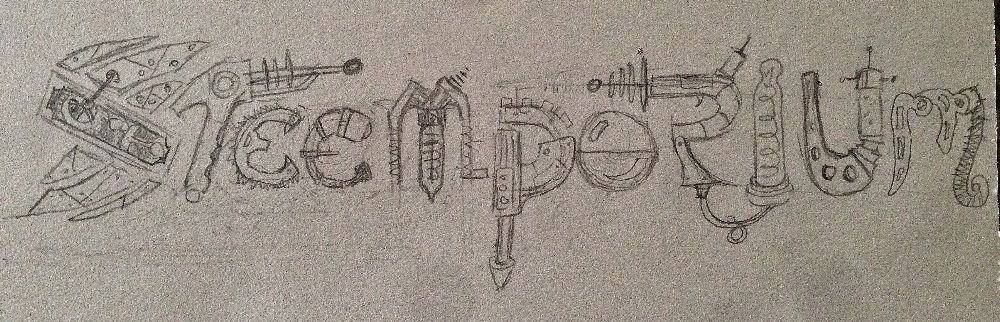
YES, This hit a homerun with jonny, THIS is what he was looking for.
I wasn't sure though how well this would translate to a flat 2d logo and he had mentioned he would want this animated in some way. So, being a 3d artists during office hours, I opted to go the 3d route, bascically modeling it in 3d, so I was able to animate it right away. This turned out to be the perfect choise. I modeled it in 3ds Max, animated it there, then moved the rendered frames over to Adobe After Effects for some much needed extra effects (power build-up in the gun and the glows in the lights) from that, I went to Photoshop to load the animation and export it as animated gif. It did after needed to be on a website so it couldn't be to heavy or use any plugin to play.
The Final Logo
Thank you so much for reading. I had so much fun working on this logo / image for a project that I am SURE is going to be a big success. As storefront where you can buy things with steem. No need for conversion or anything. how awesome is that !!
Full STEEM ahead my fellow Steemians