If I'm looking at the data correctly, I think I made it to the next and final round of voting!
A huge thank you to everyone who voted for me during the voting rounds, especially those who donated SBD towards the production of the coins in the last round just to vote for me. I love you guys! ❤️
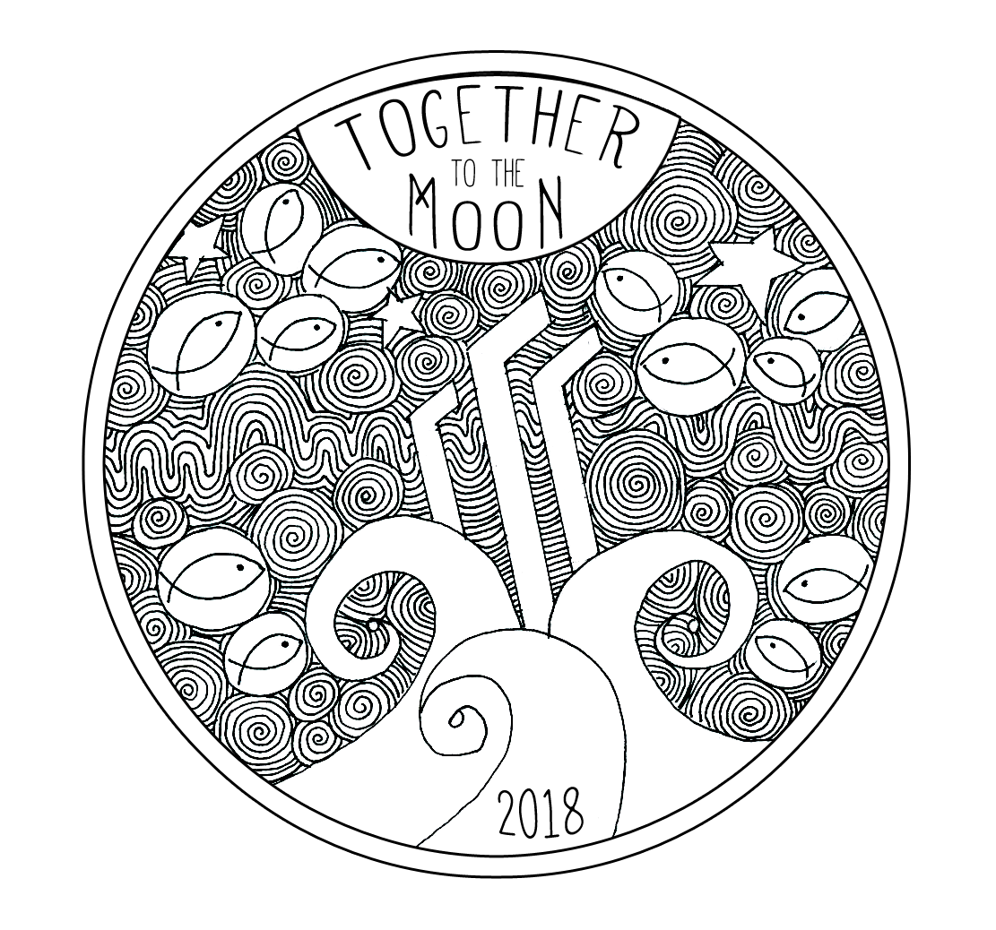
During the second round of voting I became aware of the negative implications of having the text say "Together to the Moon."
For me, the words mean a lot of things, not all of which I managed to include in my initial submission, but it's definitely not just about crypto - I just want to make that clear.
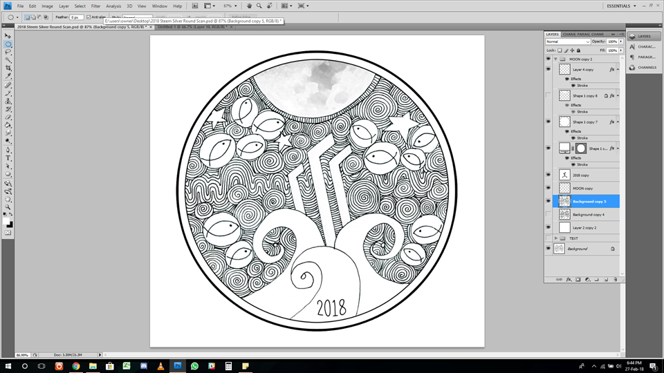
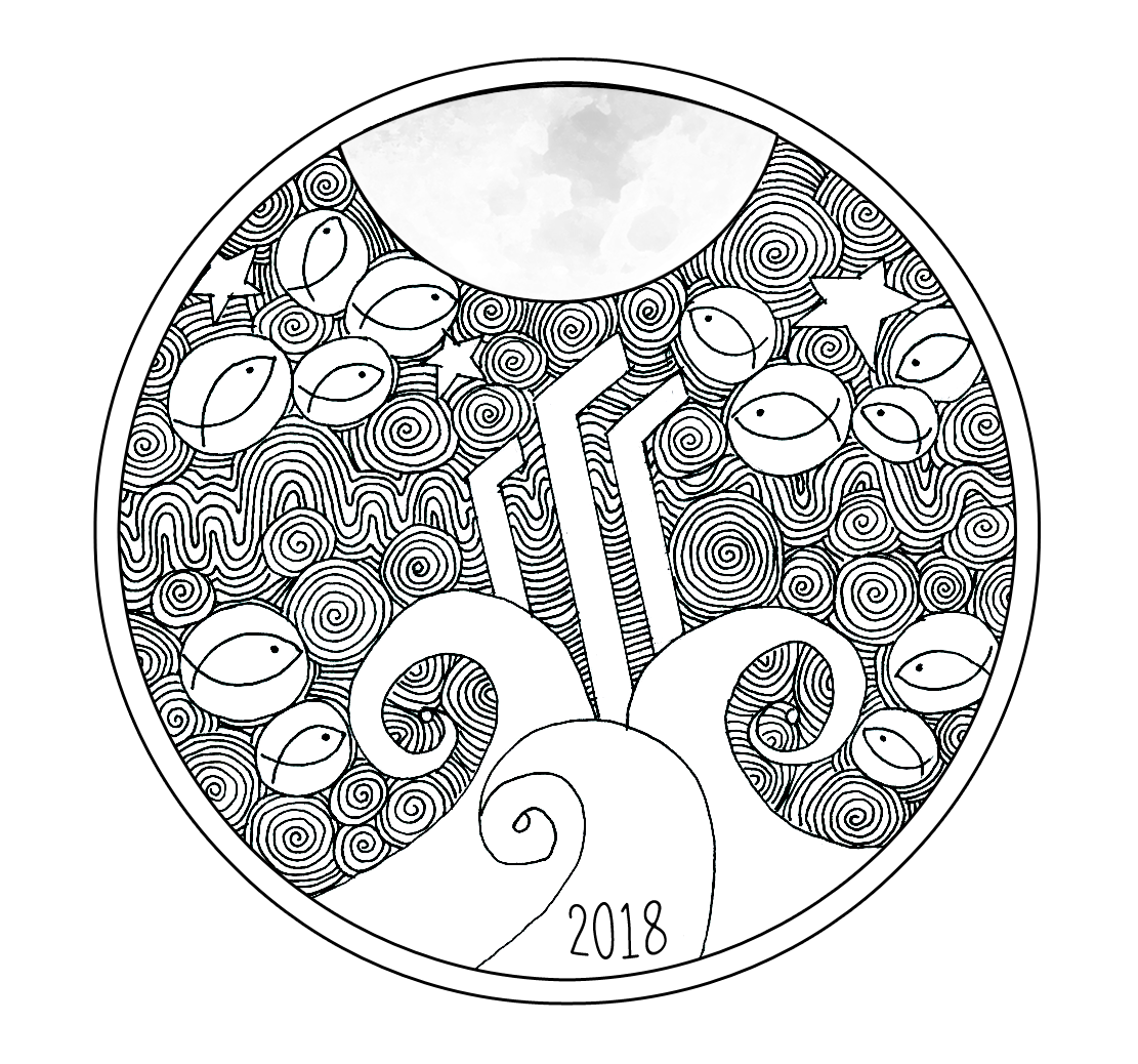
In saying that, I managed to connect my printer to my laptop today and scanned my submission so I could give it a few touch ups on Photoshop and see if I can incorporate someone's suggestion of just having a more detailed moon instead of the writing before the final voting round begins.
The Process
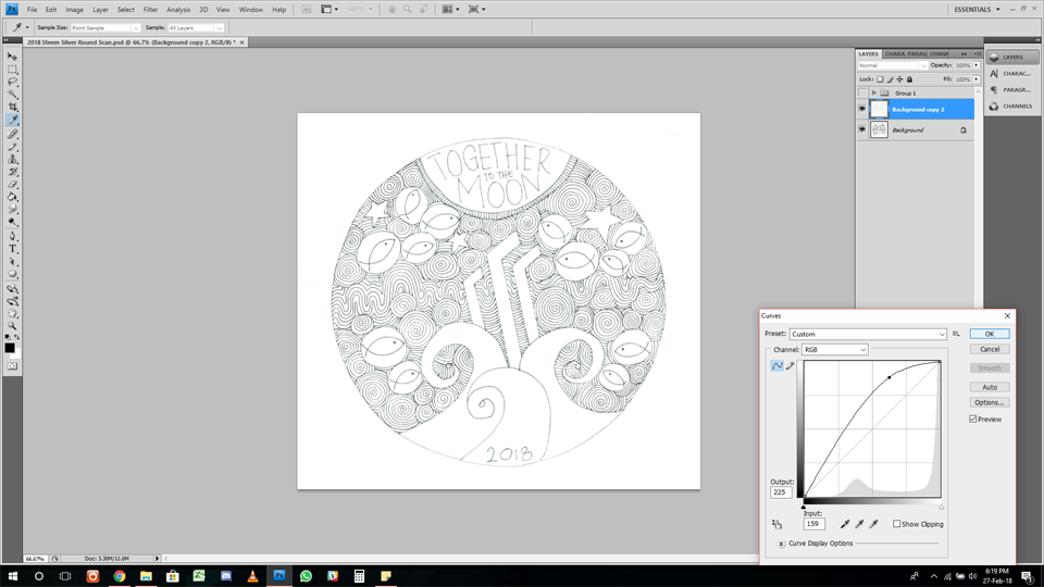
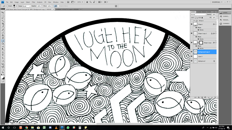
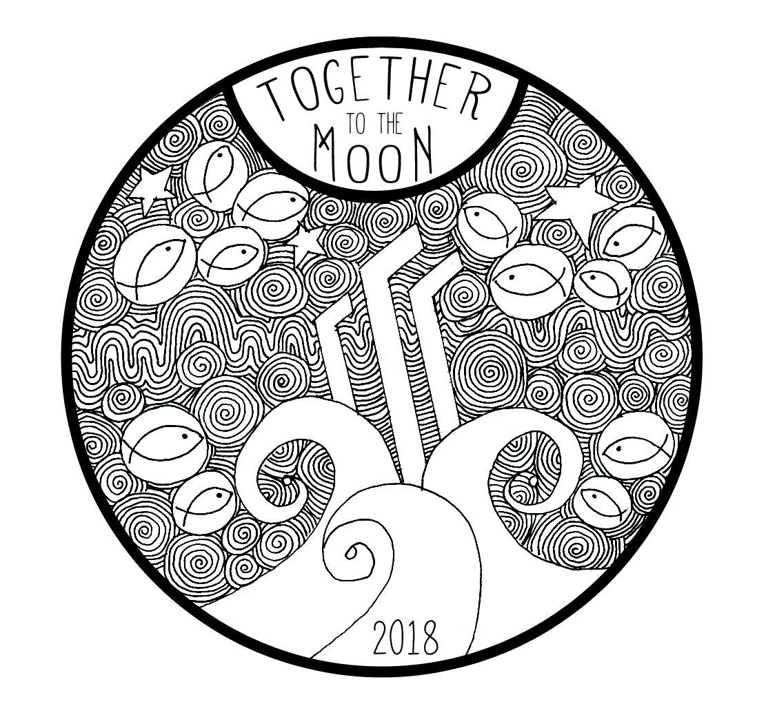
First, I had to fix the colour and define the blacks and whites, getting rid of the grey sections that used to be the pencil marks.
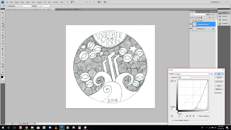
I then made the black lines bolder, more striking, really defining the swirls.
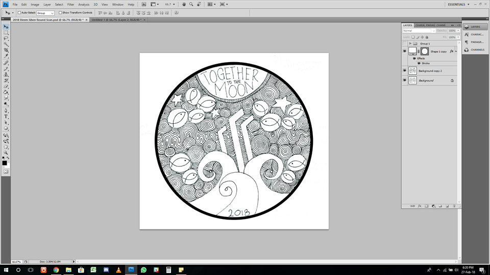
I added a border because the coin will have a border..
I then created a black semi circle for the moon
I then erased everything inside it
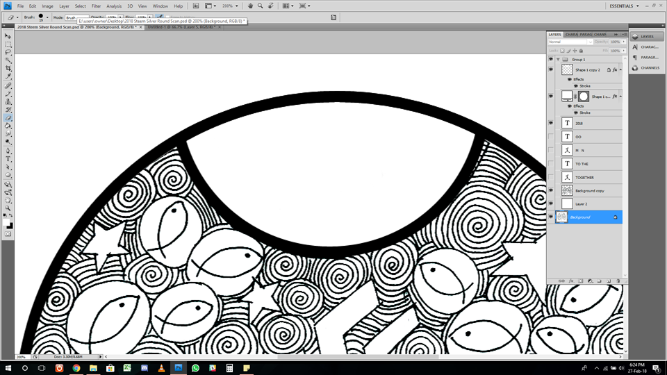
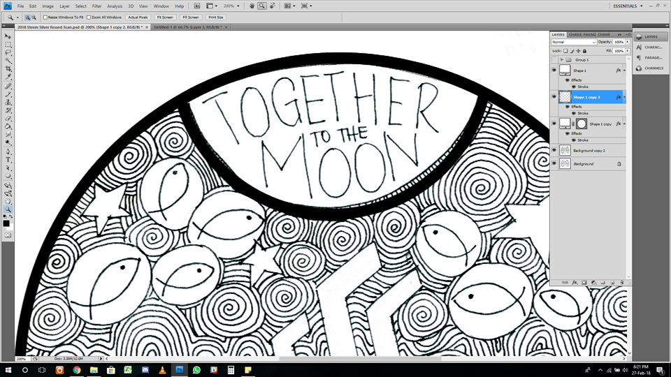
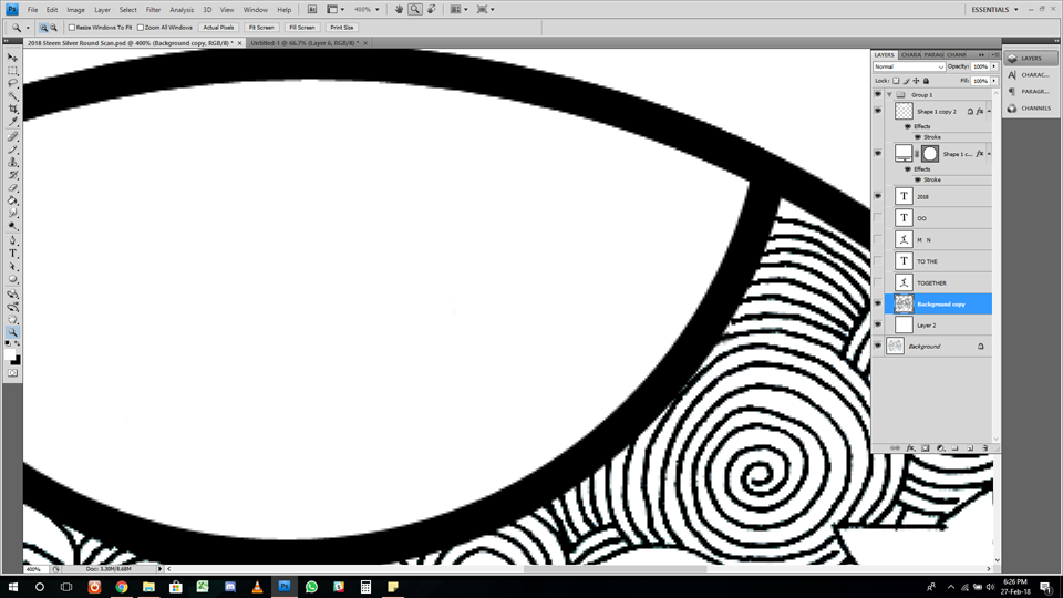
Tidied up a little corner, deleting the old lines and fixing it so it connects seamlessly to the Moon border.
Selecting the Mathlete (Commercial Free) Font, I added the writing, finishing off Edit 1 of the design.
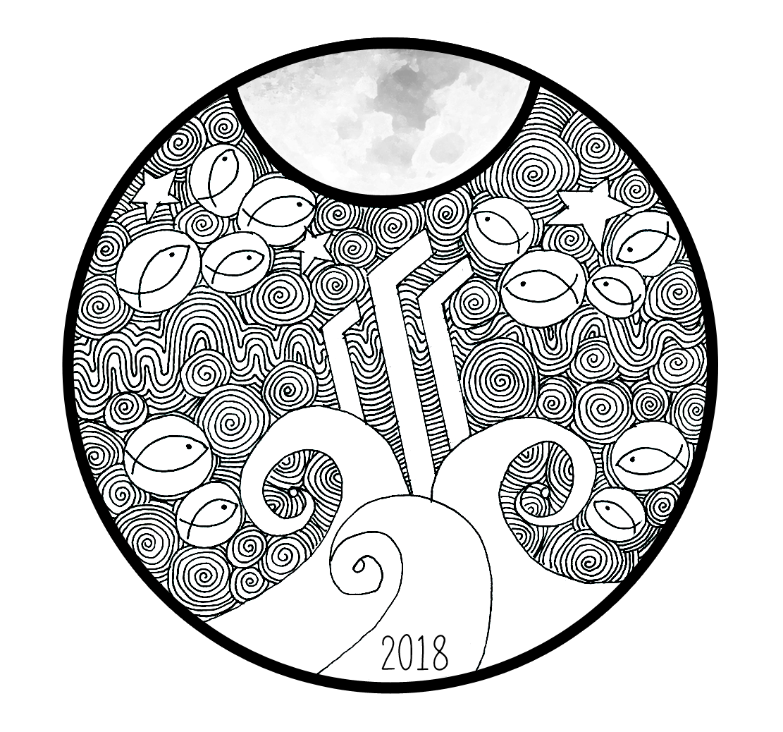
For Edit 2, I added the Moon (Thank You Pixabay!)
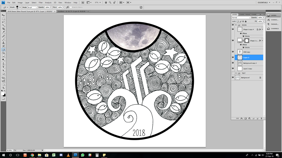
As you could see the Moon looks odd looking so realistic, so I applied the cutout filter to take some of those edges out and smooth out the Moon a little bit.

I then adjusted the colour so the Moon still had detail but more toned down. I felt it provided too much of a contrast of styles being so dark.
(You'll also noticed I changed the border style on this screenshot to provide a more accurate representation of the coin border.)
In the end
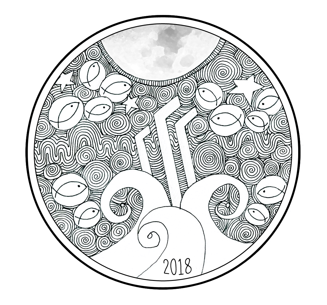
I ended up with these variations.
With text, simple thin Moon border.
With Moon, simple thin Moon border.
With text, chunky Moon border.
With Moon, chunky Moon border.
With Moon, old border.
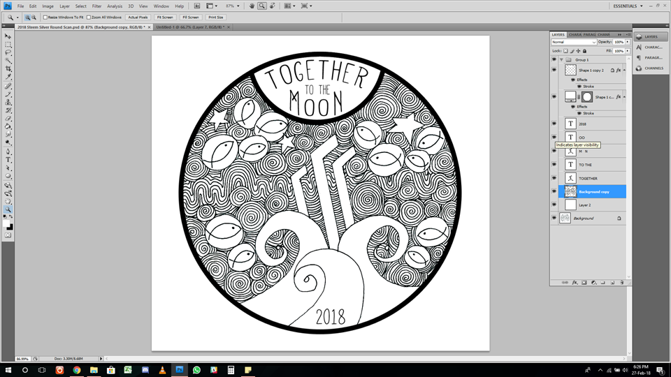
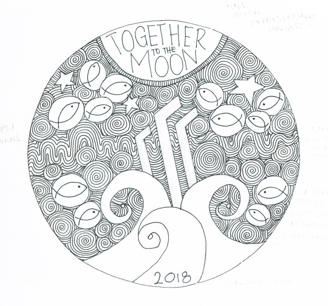
And just to rewind.. Here's the scanned image.
What do you guys think about the edits?
I have considered perhaps another font, but I loved mathlete because it fit the style of my drawing, and was similar to my handwriting.
I was also thinking would it be too cheesy to have a smiling moon?
Let me know your thoughts!
🌼 Arly