So yesterday I actually sat down and penciled some ideas down on paper and today I got around to getting an idea complete.
What do you think?
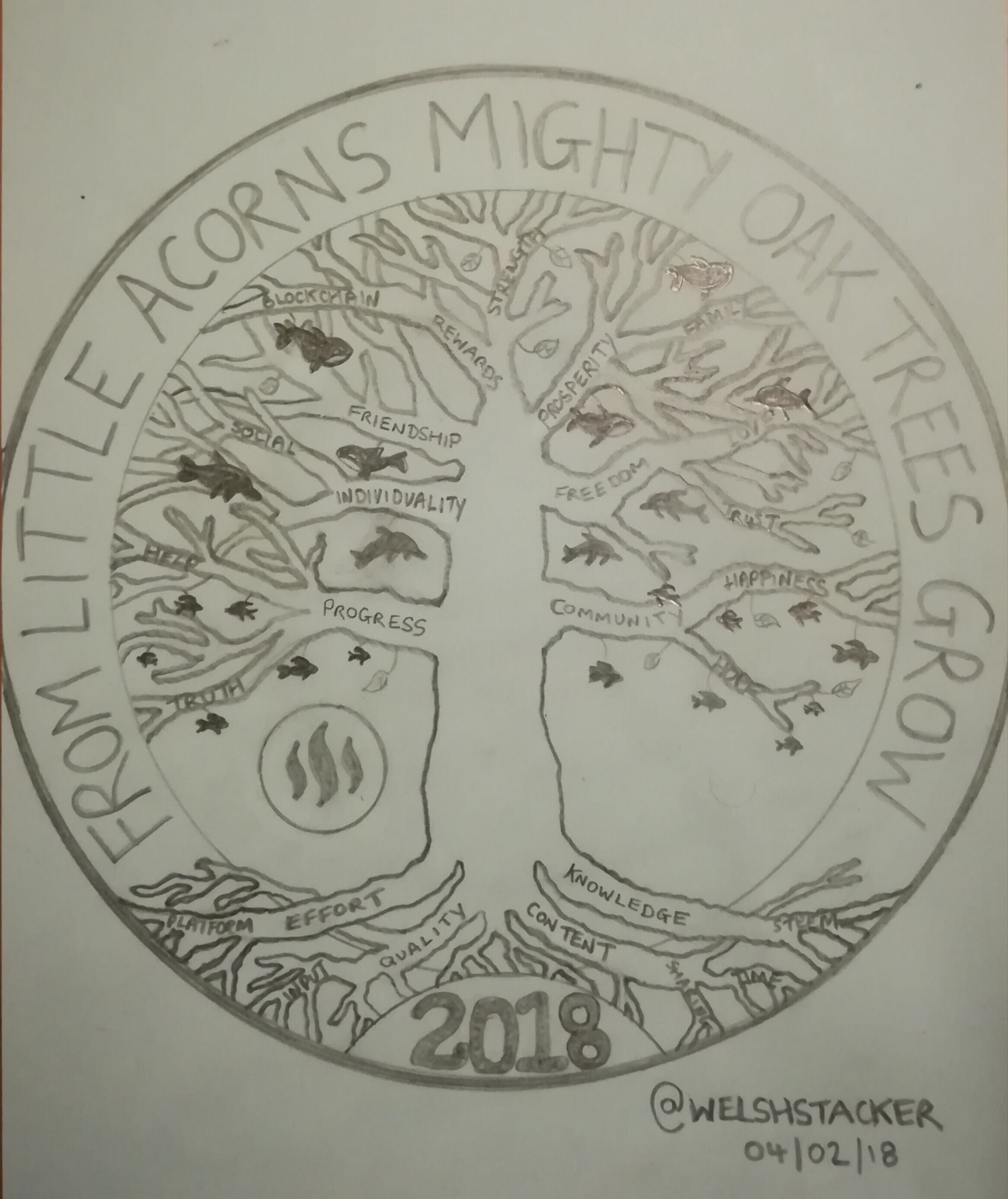
The concept is incredibly "cheesy" yet somehow makes sense.
So I've called the idea THE COMMINI-TREE (community) for obvious reasons, it's based on the tree of life pattern. So sit back, grab a cold beer and allow me to take you through my thought process... Hold tight, it's a mine field of random thoughts!!
So the tree is meant to represent growth, not only as an individual on Steemit but as the platform as a whole. It needs strong roots and will continue to grow bigger for as long as its foundations are strong!! Told you it was cheesy..
The design of the coin itself, I feel needs a chunky rim to it, very similar in size to last years one. It gives a good balance to the design inside and leave plenty of space for writing around the outside.
I have the words "from small acorns might oak trees grow" but I'm happy to change that. Could go fancy and change it to Latin or go for something completely different.
I suggest we keep to date I. E. 2017,2018 in the same position and not start moving it all around the coin. This gives good continuity and most world coins employ this method.
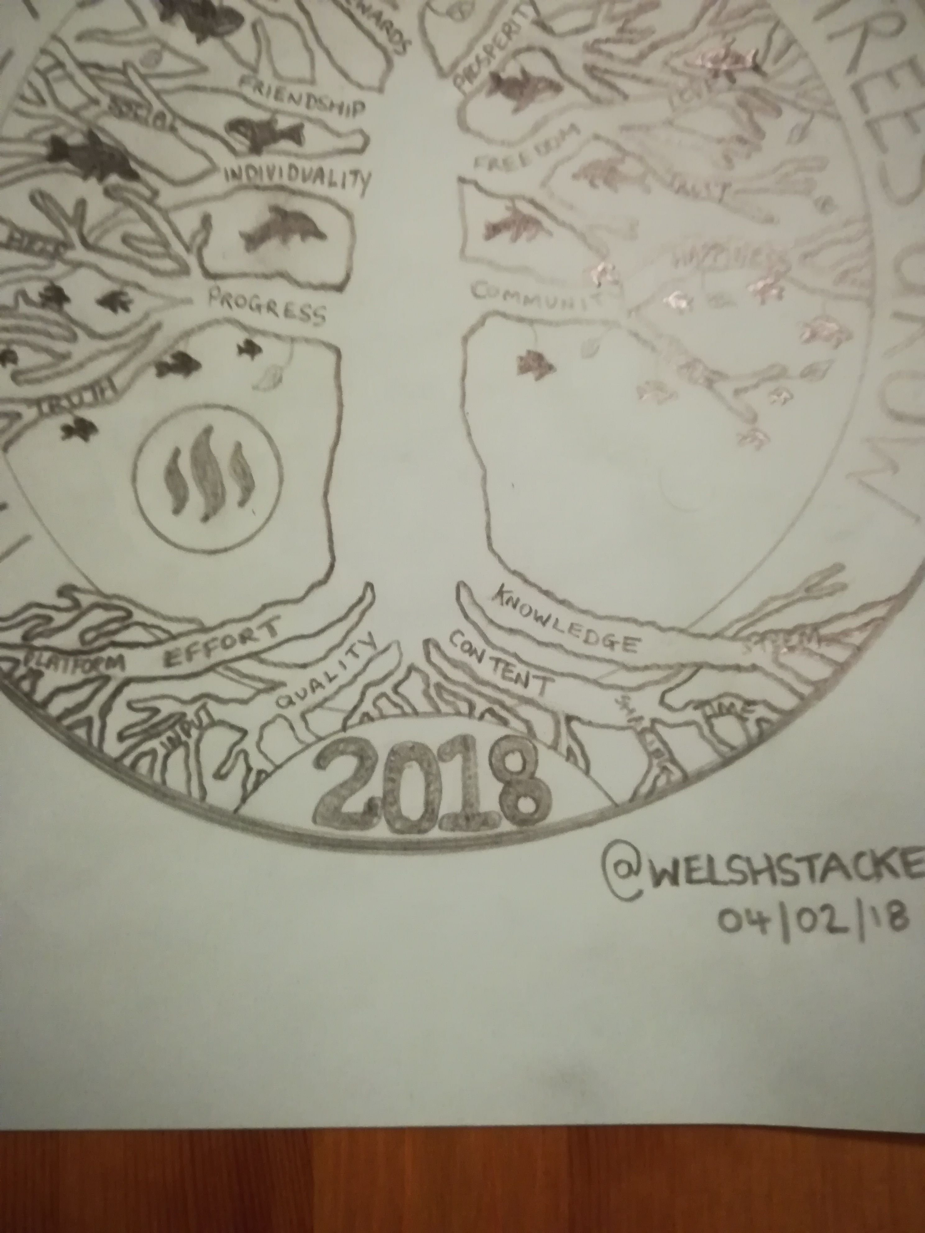
My design shows the root system with many fingers. Each finger could have a different word etched inside. Words like: quality, content, knowledge, effort, platform, steem, input, sharing and time.
These are the things I feel help create a good, strong foundation to most things and in particular steemit..
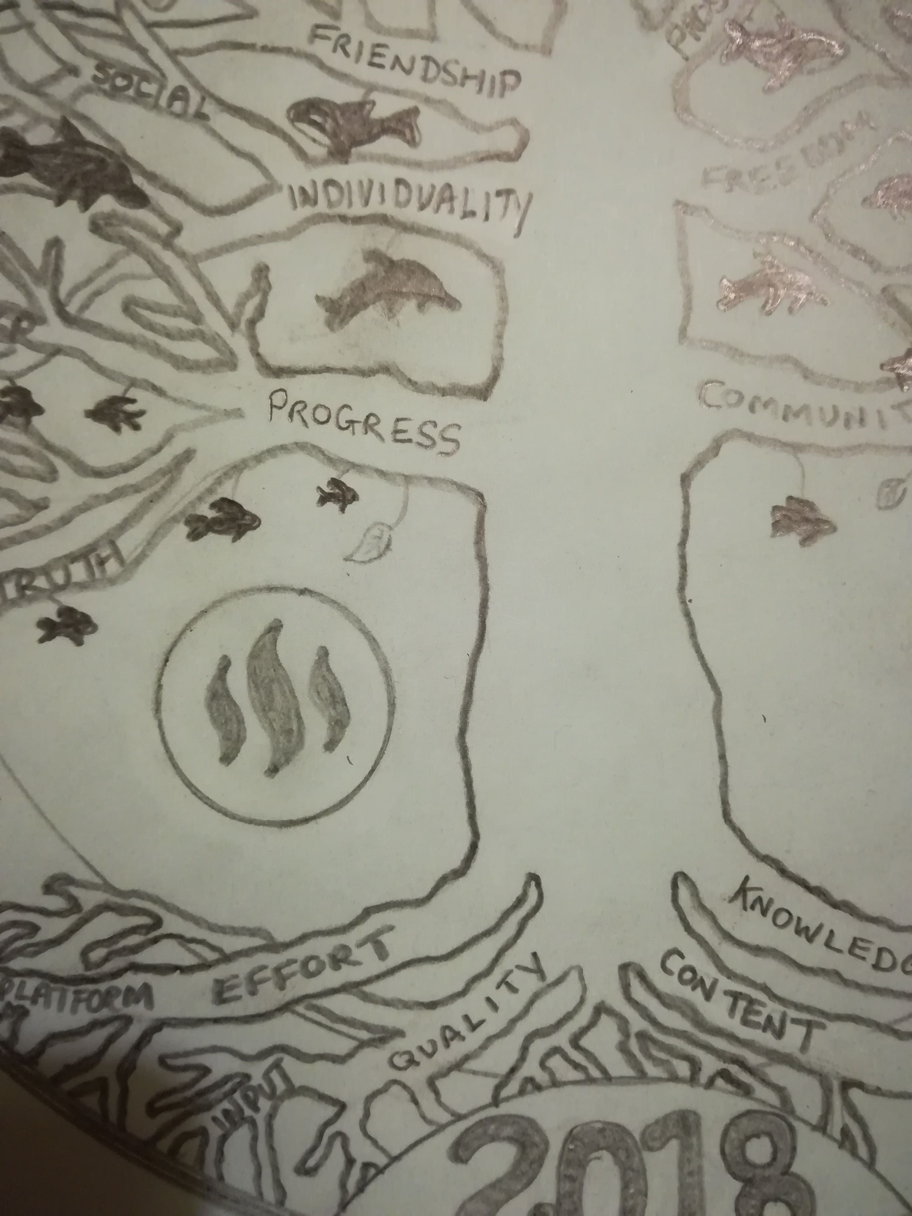
I was toying with the idea of including the steem logo and I think it should be on the coin. I have placed it to the left of the tree trunk and another design/patter could easily be added to mirror the steem logo on the other side.
Maybe an UPVOTE/RESTEEM symbol??
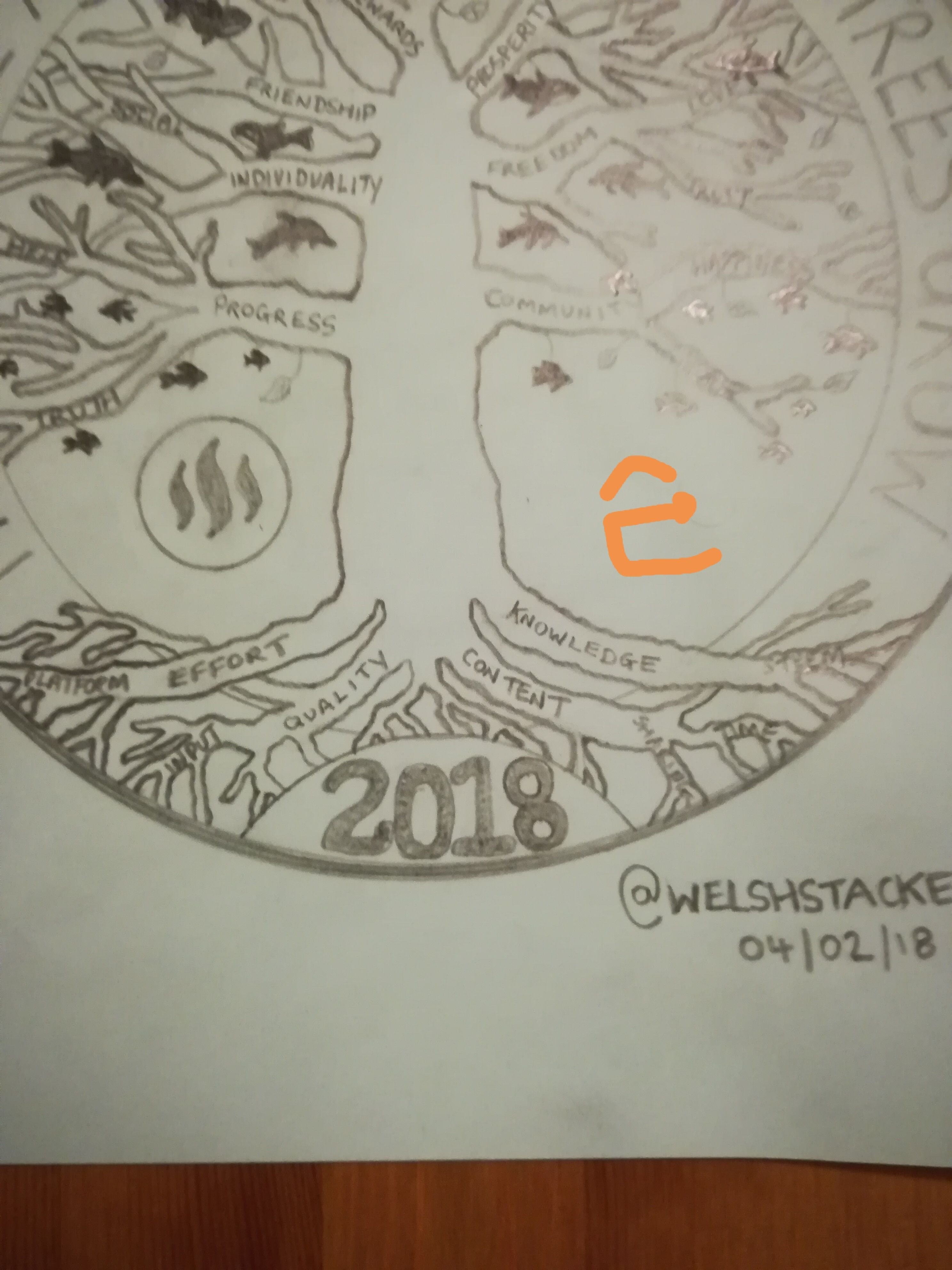
After I drew the steem logo on the design, I had a slight change of heart and now feel that it should somehow be incorporated in to the trunk itself. Make the steem logo centre of the face and build the tree around it.
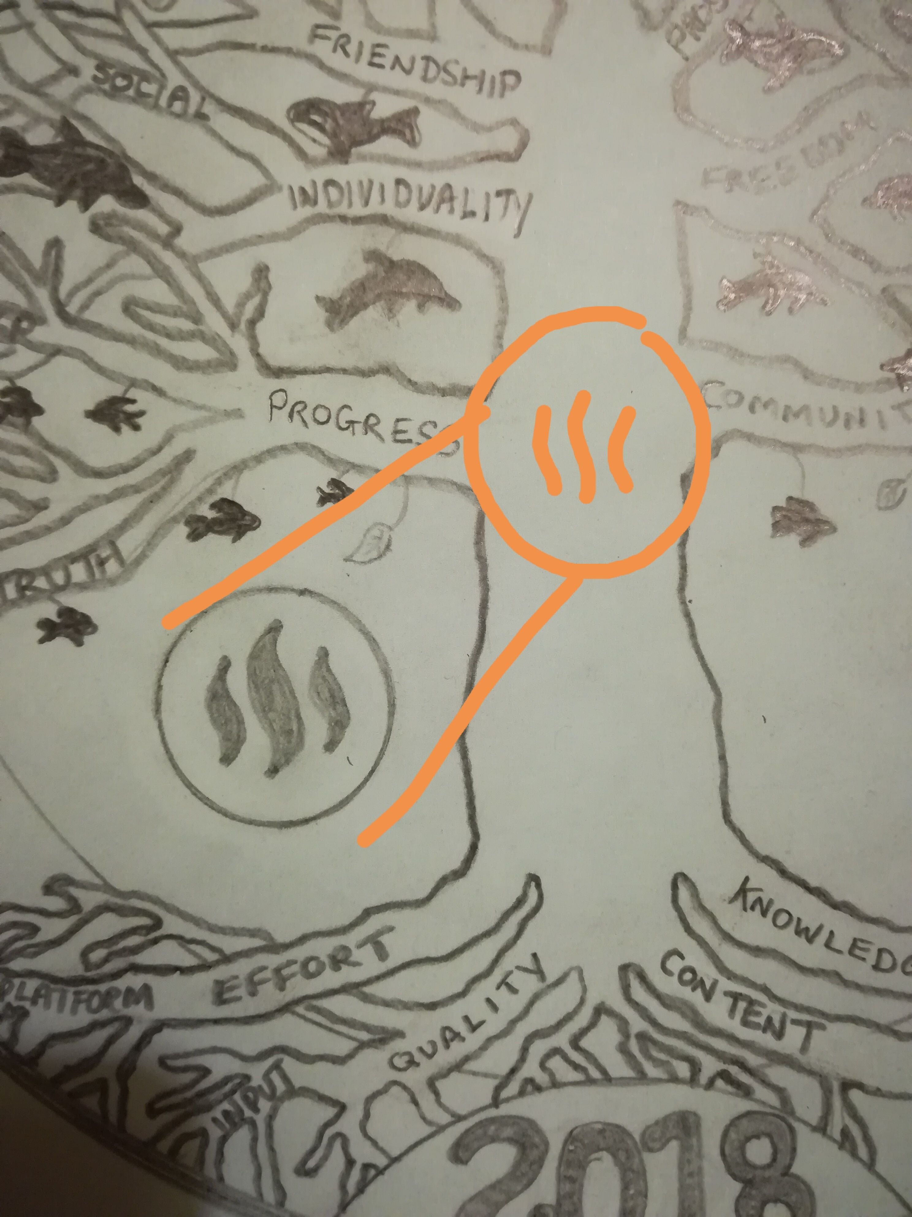
OK, all still with me? Time to re-fill the beer or make a fresh cup of coffee!
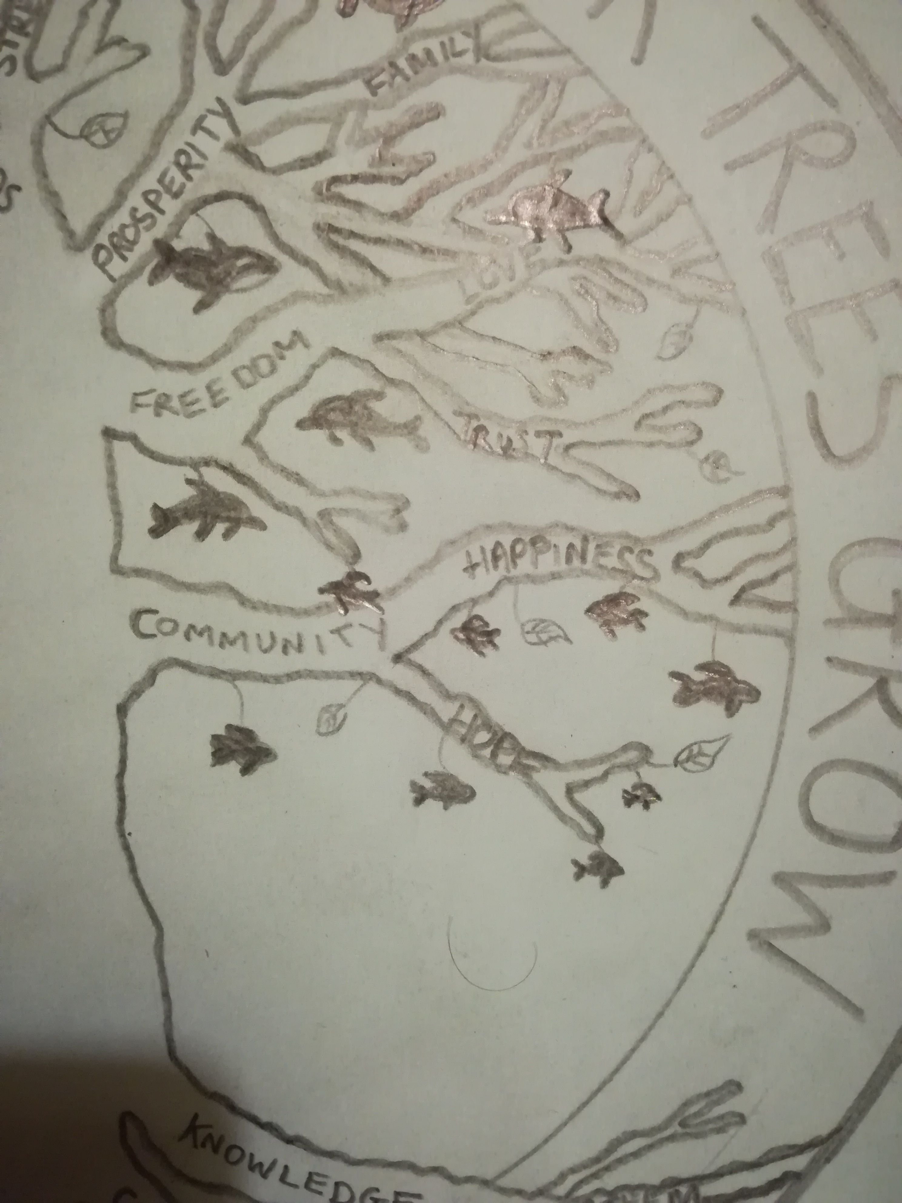
The tree design has many branches and these were to represent the things steemit has to offer. Each branch could have individual words etched on them.
Words to include: community, hope, progress, truth, individuality, freedom, friendship, prosperity, love, family, blockchain, strength and social to name a few.
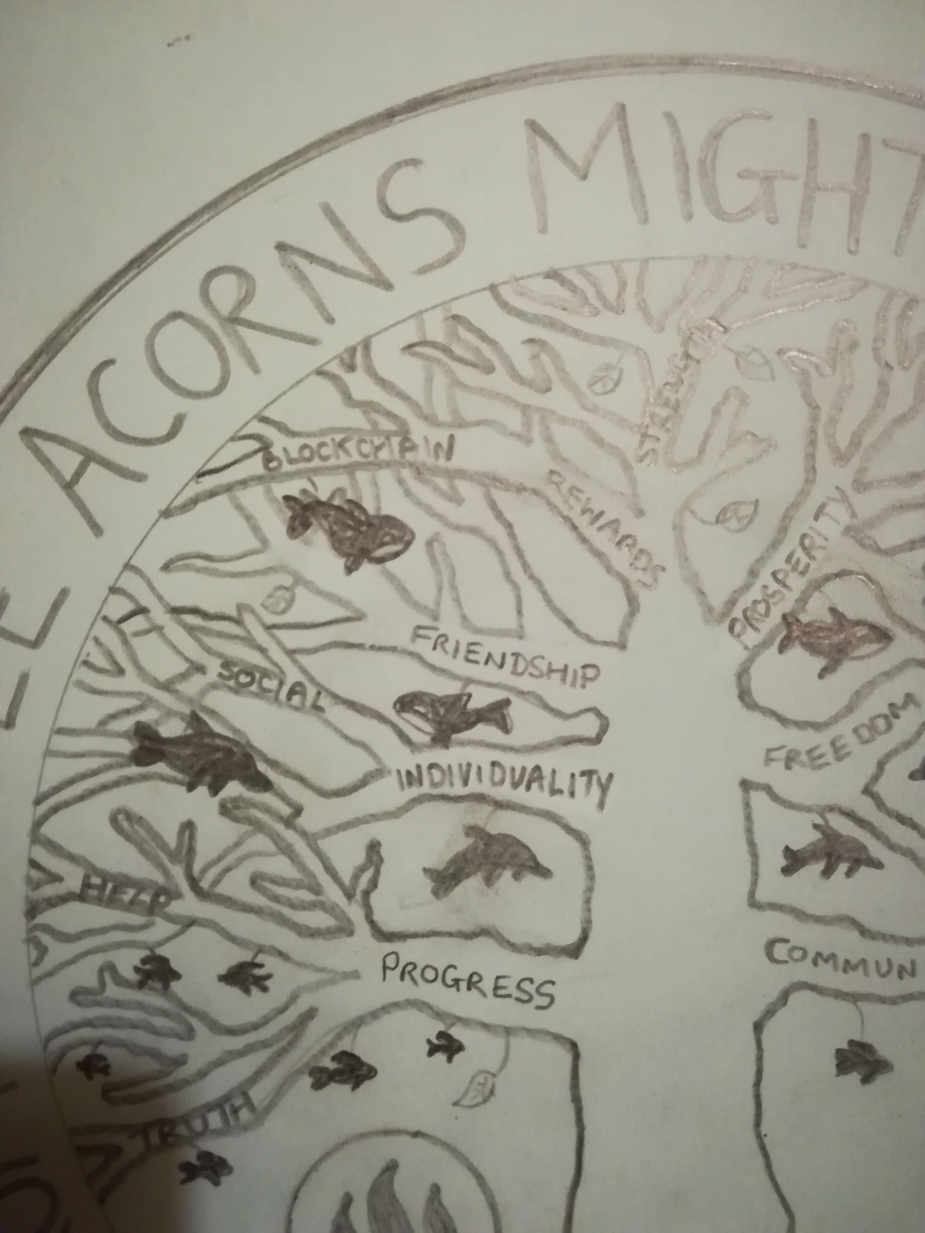
I loved last year's design and would like to use the idea of minnow to dolphin to whale as part of this design. So my thought was, as you progress further up the tree, you move from minnow to dolphin in to whale. There can be a few leaves scattered amongst the branches too. There should be a lot of minnows around the lower branches and get slightly bigger the higher up. These could be mixed in with dolphins and overlap as you go up. There should be less dolphins than minnows and obviously less whales than dolphins sitting at the top. There should be no whales at the very top(leave a tiny space of free branches) as who knows what the future may bring.
I am also OK if you take the minnows/dolphins/whales away and just have leaves.

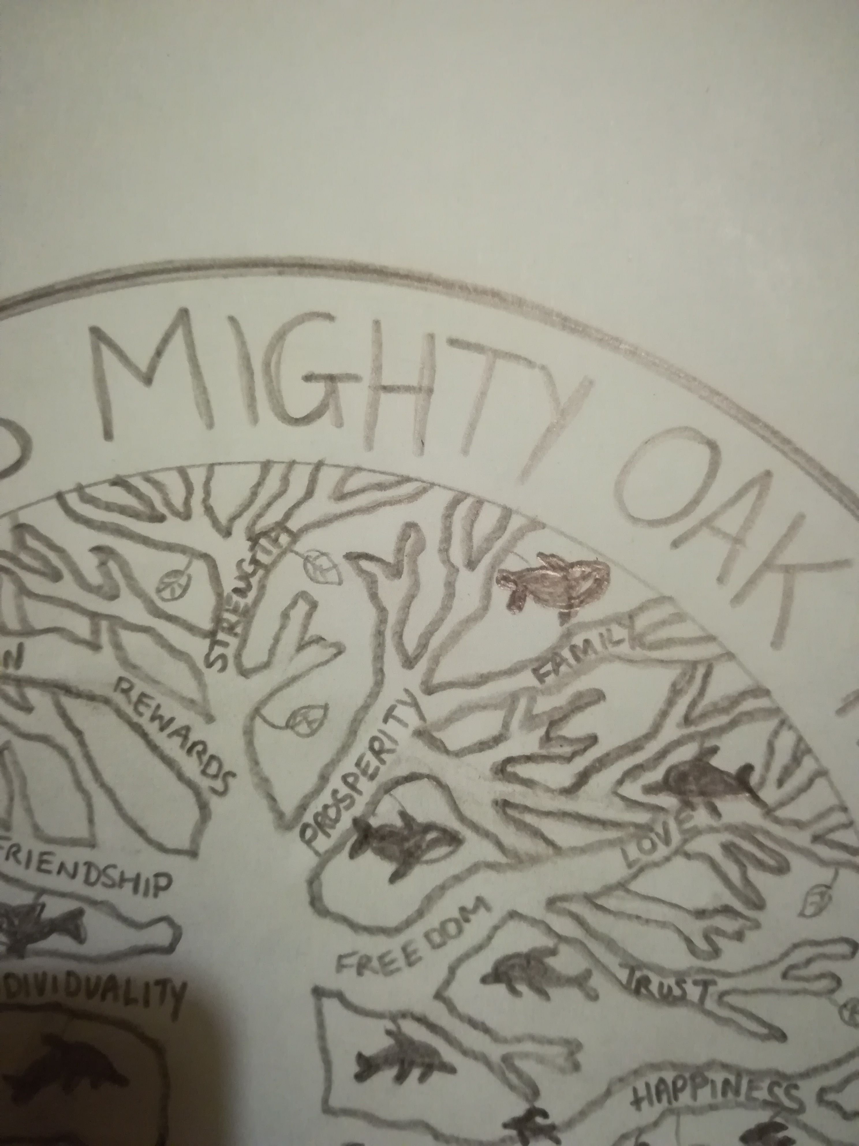
So did you all make it this far?? Congratulations if you did, I did warn you that there were some very random thoughts going on.
Hope you like what you see. Please feel free to take this idea and add to it/switch it up a little.
If we have any computer design folks that are better at drawing than me, please touch this up, use a computer program to draw it, I don't mind.
Yep that's pretty much it for my #steemsilverround design 2018. Once again thanks for taking the time to read it.
