original post of the design:
@skeptic/another-submission-for-the-steemit-silver-round-2018
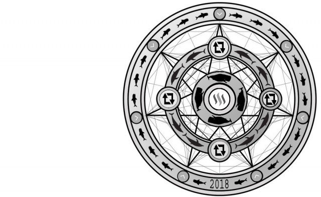
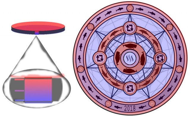
@edxserverus mentioned that there was to many steem logos and that i should add some resteem and upvote logos and i agreed as @edxserverus was so right.
I think it looks alot better then it did.
i tried to color in the depth and the levels of the coin, hope its understandable.
Cheers Steemit!


