First Things First
It's been awhile since I've done a design post because I have been very busy recently with my new work schedule. A design usually takes up most of my Steemit time when I do get on Steemit. It's either I do a design and sleep or a design and a short post. This logo however took me a weekend to complete and I hope you all like it as much as I do.
I would like to thank #teammalaysia for allowing me to design freely this #myjuniors logo. When the initiative was started by @elizacheng, I wanted to see how I can contribute to it. Thank you @elizacheng for allowing me to design this #myjuniors logo for you :) Also to the committees of #myjuniors for giving me feedback.
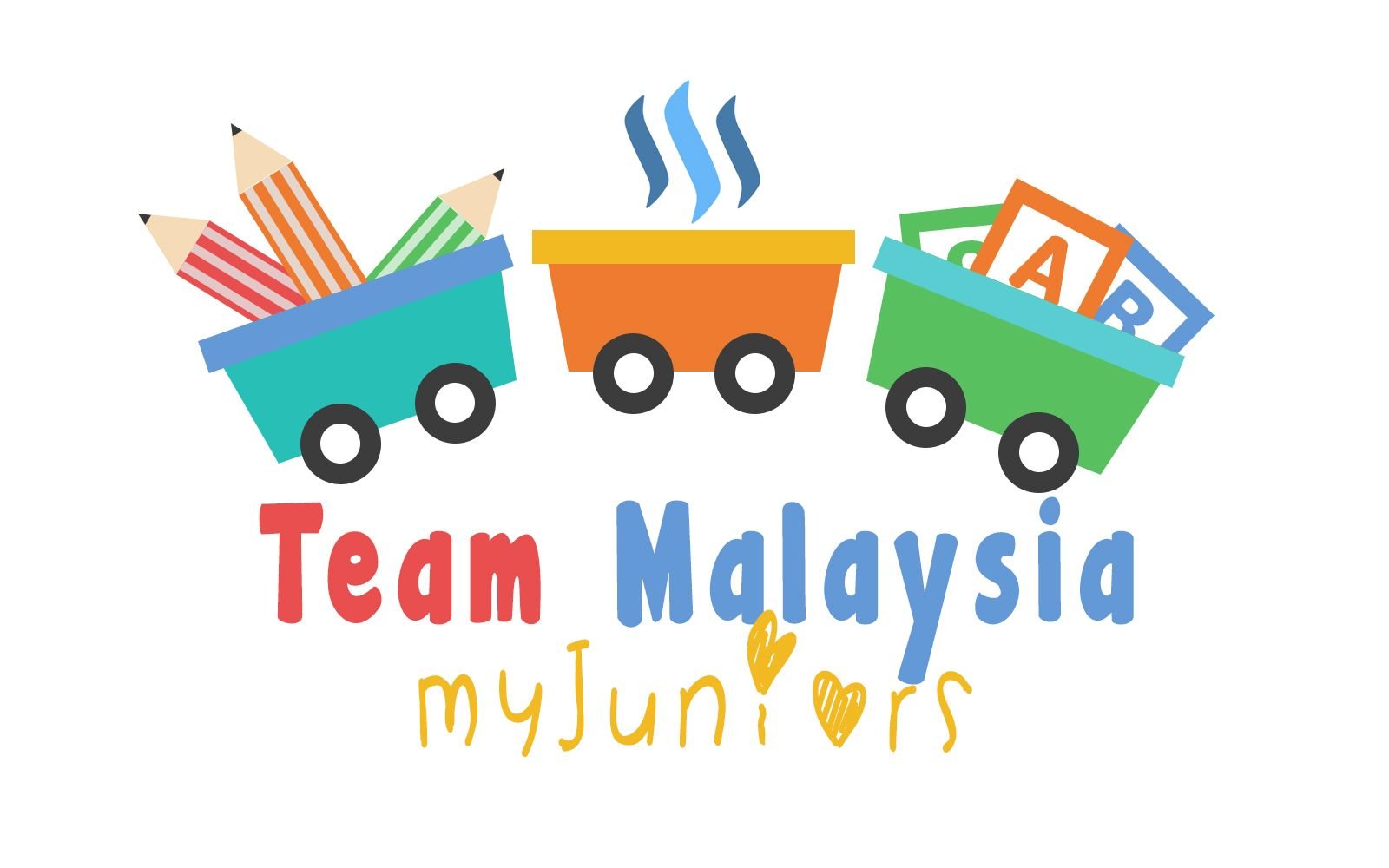
I proudly present to you the Official #myjuniors Logo!

The Idea
During the whole process of designing this logo, I wanted it to be light-hearted and happy. A design that at first glance, able to evoke happiness & excitement to the kids. I can remember when I was young, I always wanted to join those cool kid's club like Kidszania, Kid's Fun Club and the list goes on. The logos and designs are always so bright and colourful and kids love that.
I began to think of the main elements for my design. What would attract kids or rather, what attracted me when I was a kid.
When I was young, I used to love toy trains. Those really cool ones where you can build tracks for them and you have those tunnels and miniature houses around it. I used to be very fascinated with those.
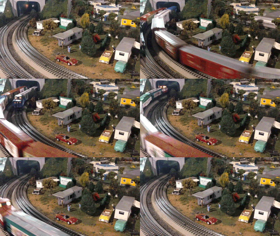
Then I got reminded that for train sets like these, there's always a caution written 'For ages 12 and above' because these train sets contain miniature pieces. So I thought to myself, maybe it doesn't have to be a professional train set because the kids we're dealing with in #myjuniors are ages 12 and below! If I were to create a realistic train logo, I'm pretty sure it would scare the kids away, Like Thomas the train.... That shyt is scary.... and it still creeps me out.
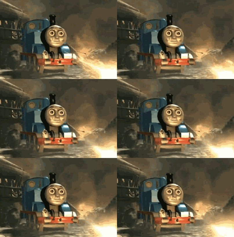
I needed something more appealing than 'Thomas'. Then I remembered having a fun time with my dad sitting on one of those toy trains that just brings you round and round.

'Choo choo!~ All aboard', I immediately knew that this would be my main element. A train ride for kids.
#myjuniors OFFICIAL LOGO Design Process
Creating Primary Elements
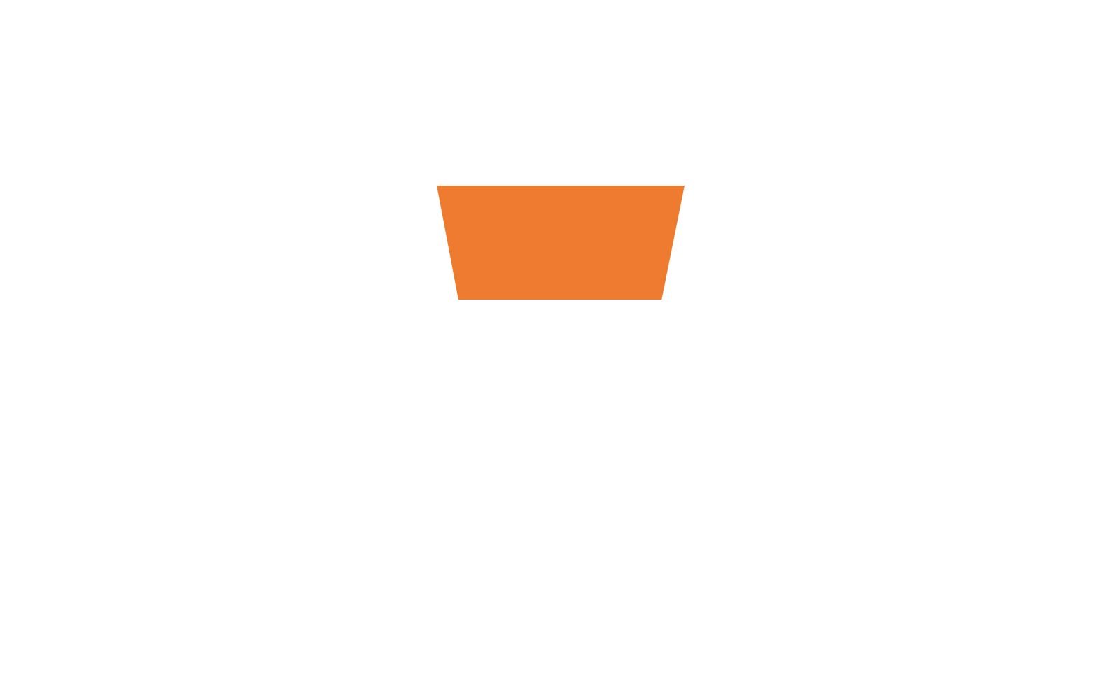
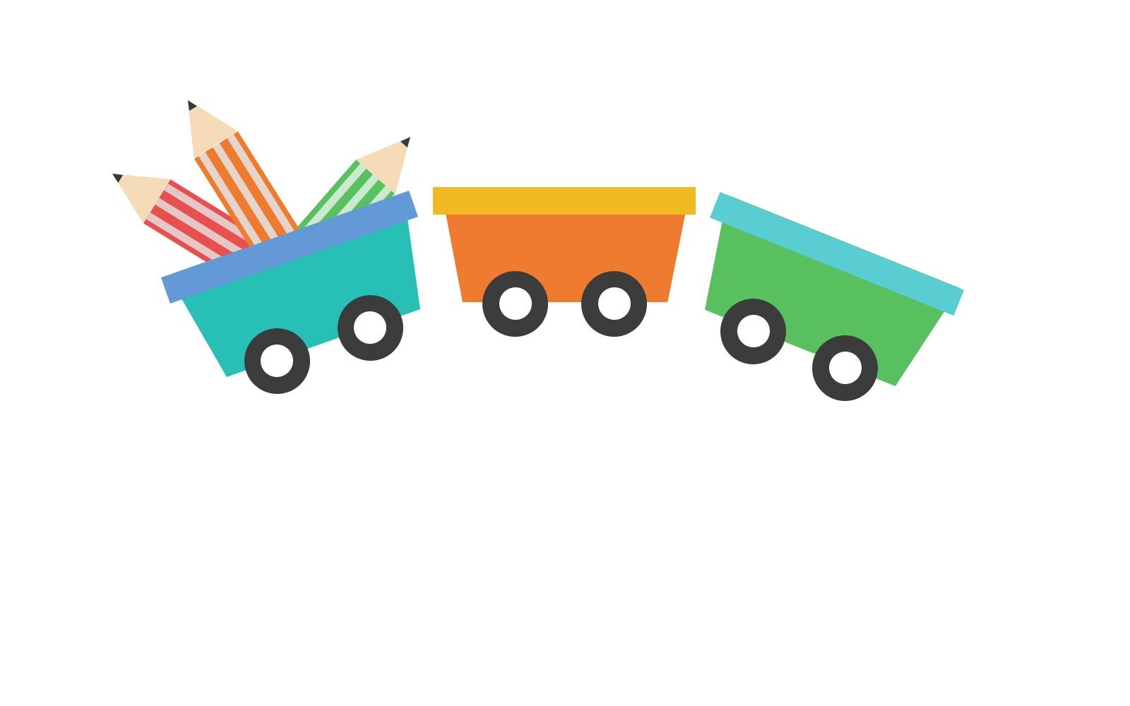
Simplicity at its best. I decided to go with geometrical shapes which are pleasing to the children's eyes. You remember those geometrical wooden blocks you use to build a castle with? Yeaps, the inspiration was taken from that. Basically, I would just design this logo like 'stacking toy blocks'.
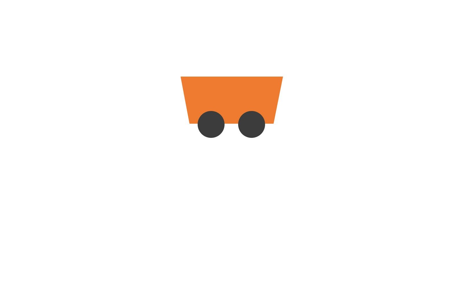
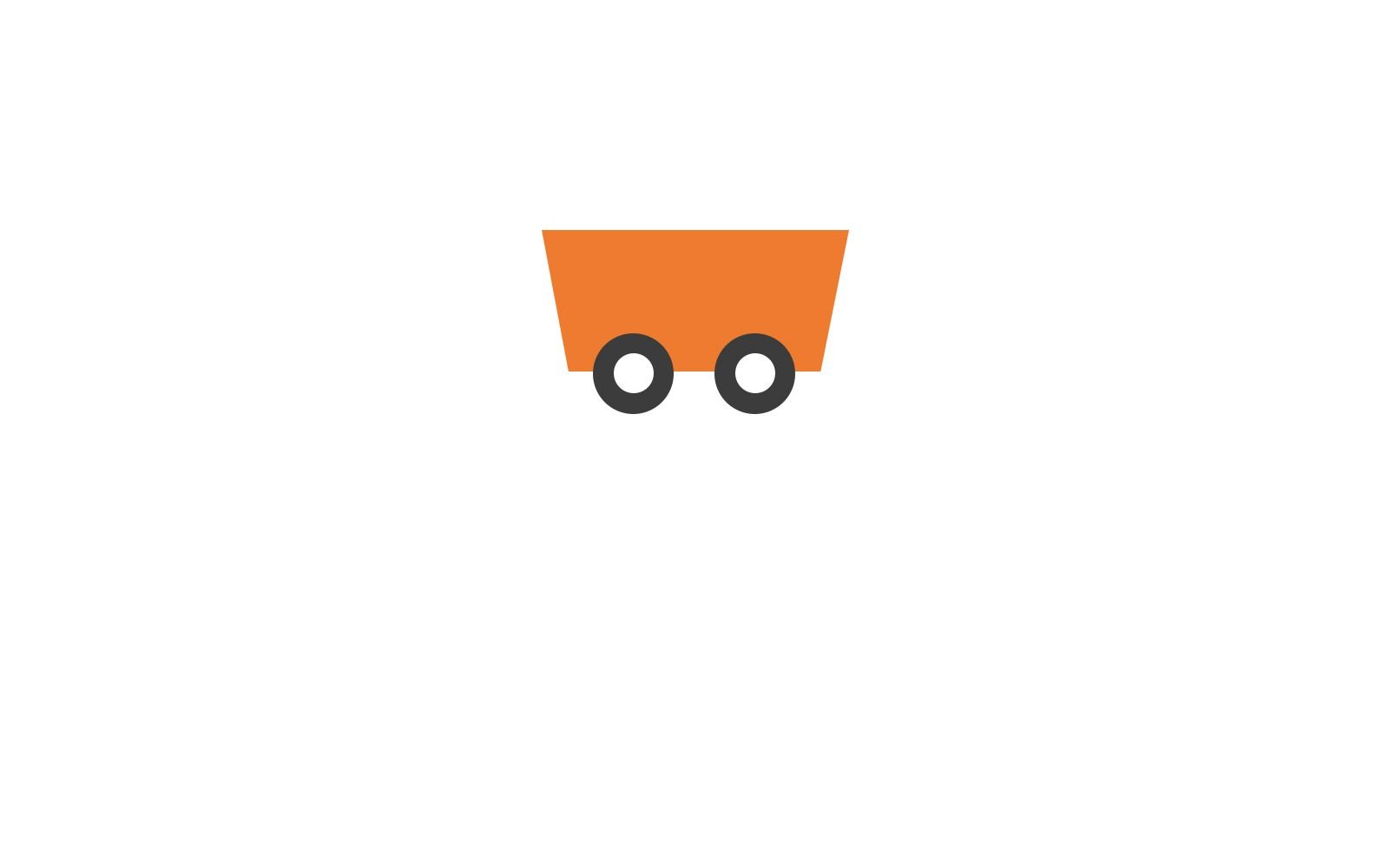
After attaching the wheels, you need to screw the plastic bolts in to hold the wheels in place. Remember not to wind it too tight or the wheels won't turn properly.
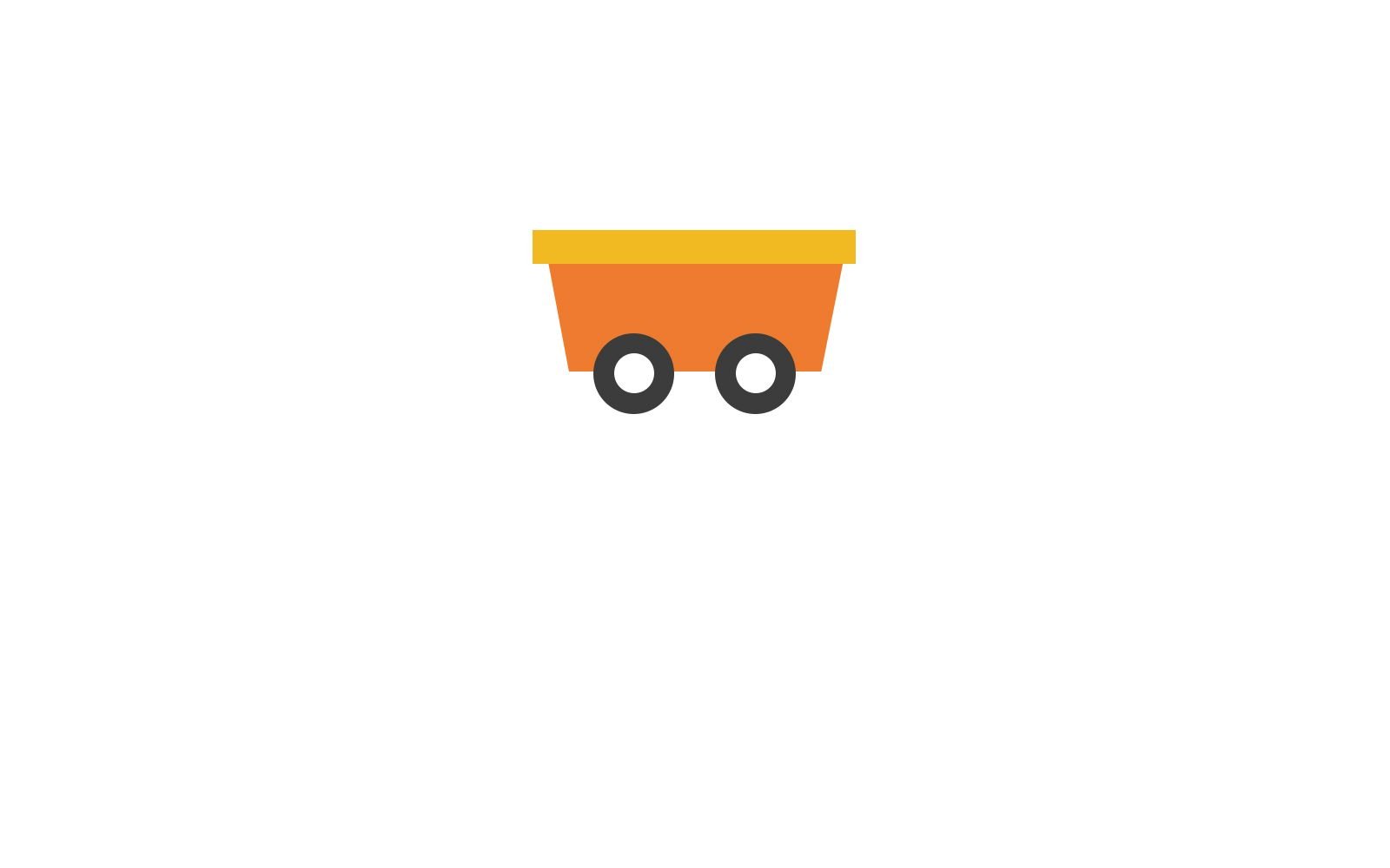
To have a cozy ride, you need an arm rest for you to lean back and forth without falling. Safety first, it's a kid's train afterall. winks
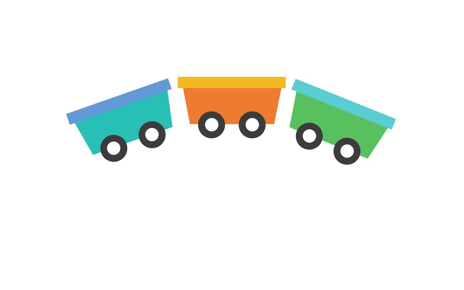
WHAM! Following the steps above, build two more identical train coaster and paint them different colours. Kids are drawn to soft, bright and colourful things.
I decided to use soft pastel colours for my train because it is pleasing to the eyes. I wouldn't want to scare off the kids by using colours like a solid hot pink. I arranged the train coasters in a rainbow shape pattern. It also gives a sense that the train moves in a circular motion, round and round like the rides I've sat before.
Creating Secondary Elements
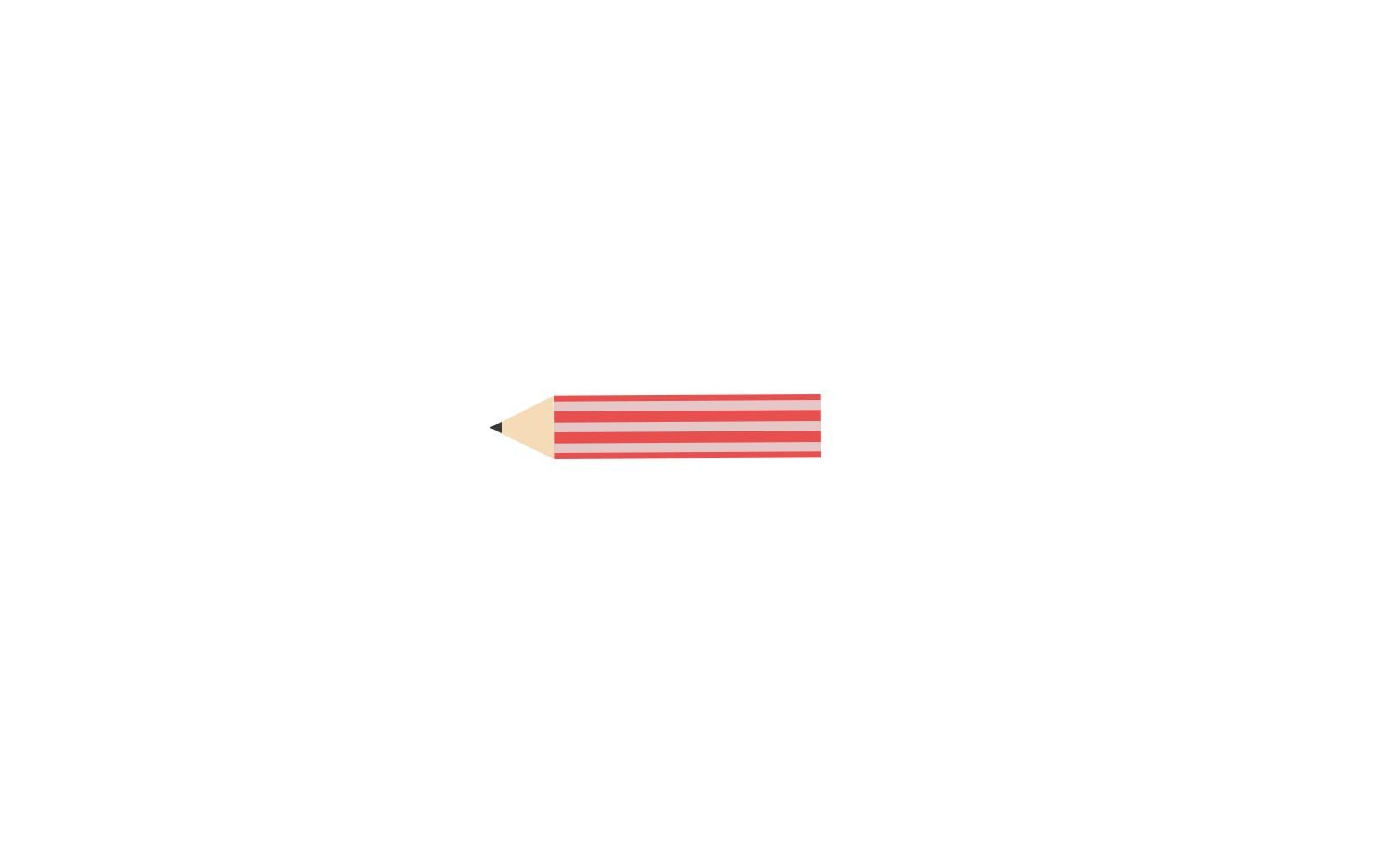
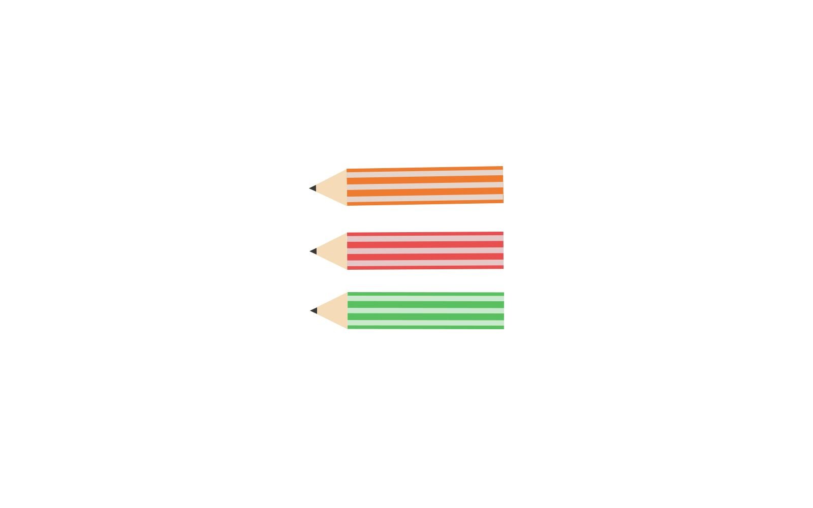
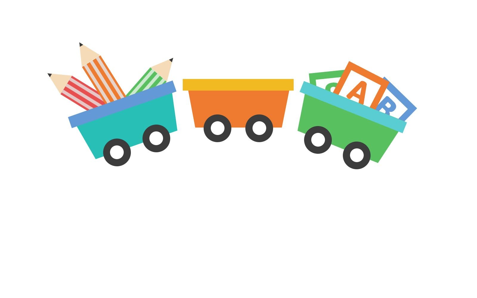
Now that the train is ready to depart, we need to show what #myjuniors is about. When #myjuniors started, it was explained as a hub for children to bond with their parents through the various workshops provided. These workshops are going to mold the creativity of the kids. #myjuniors will be holding many arts & craft, painting, drawing, singing and many others. Hence, I will be designing a pencil which symbolizes creativity and craftsmanship.

Creating More Secondary Elements

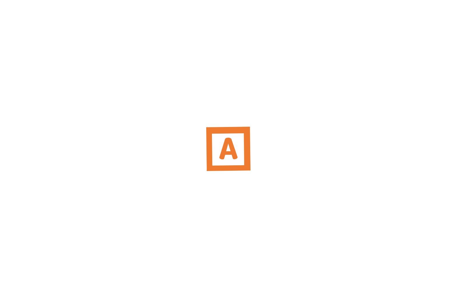
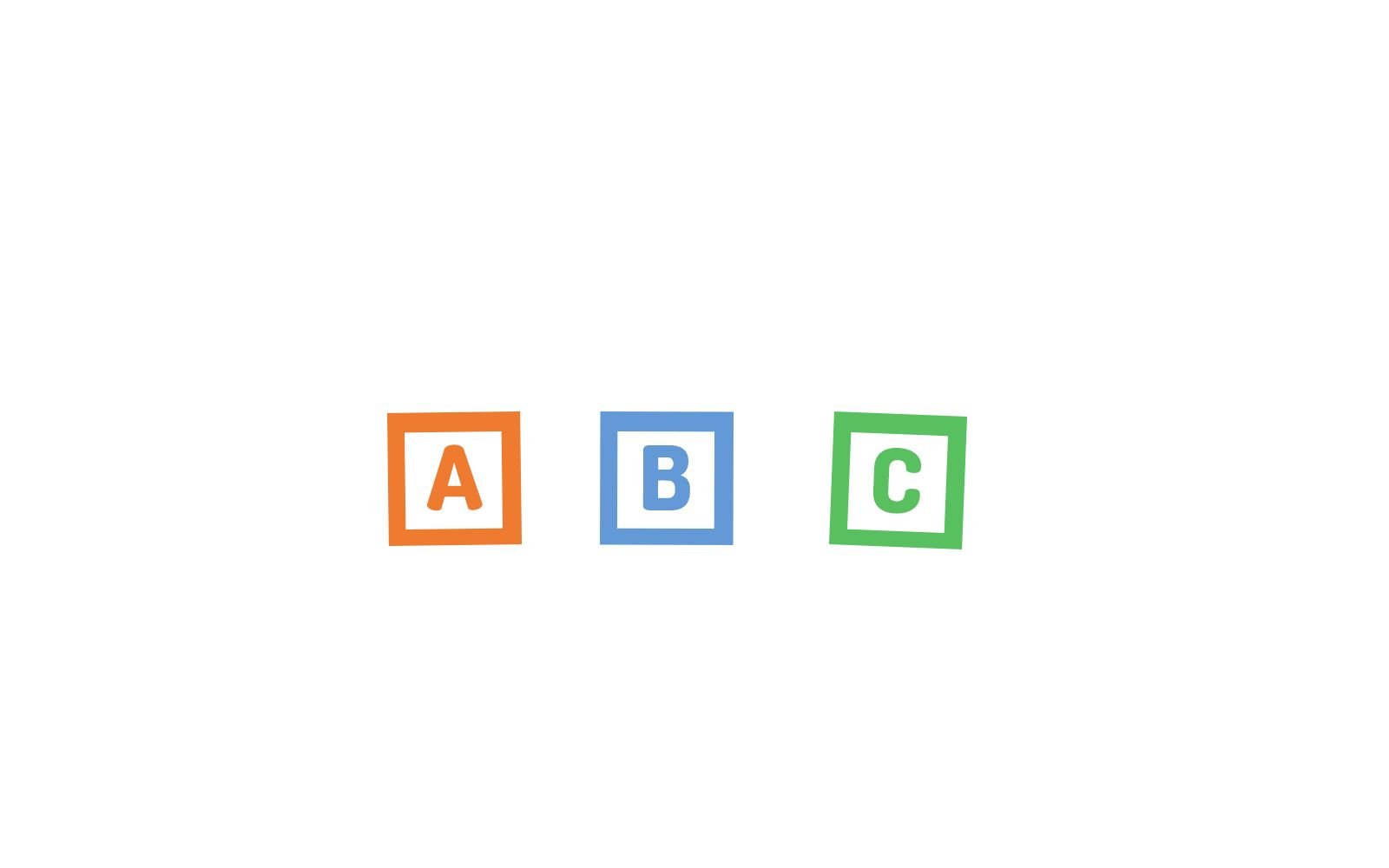
Remember those toy blocks with the ABC letters on them? I felt that the kids can easily relate to this toy unless... the kids have evolved playing their ipads and handphones. You know how it is these days :D
But yea, my reason for creating this element is to represent 'Knowledge'. The pencil is to represent 'Creativity' and this toy letter block is to represent 'Knowledge'. Both of these two pillars are what #myjuniors strive to cultivate among the kids.
Polish & Finalize
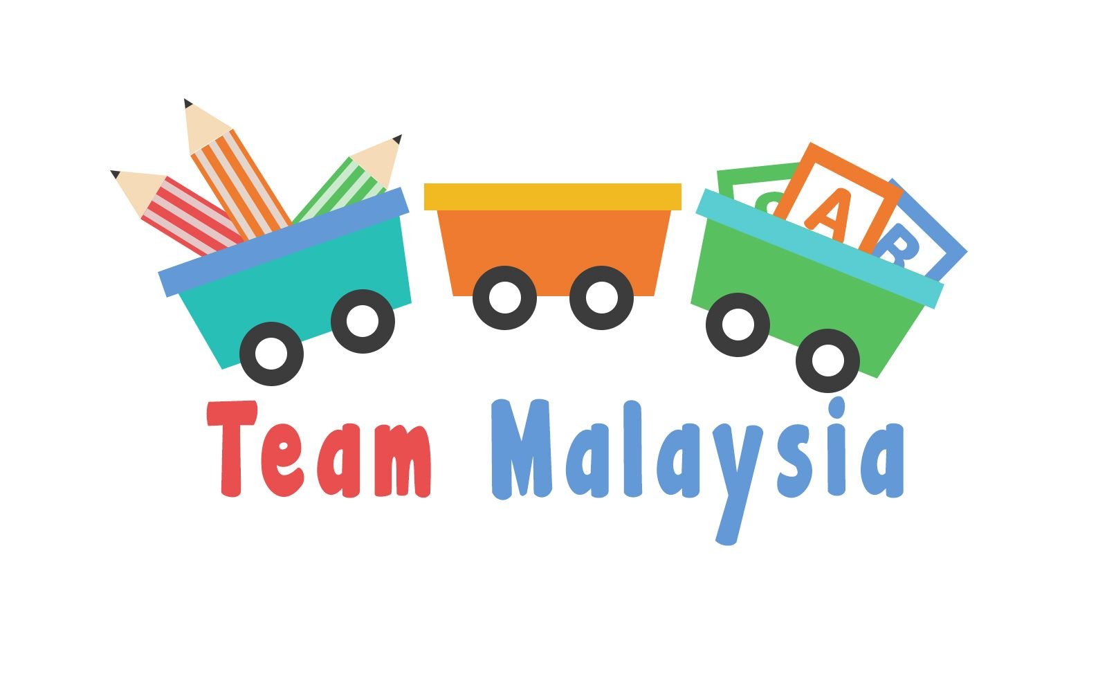
Added the 'Team Malaysia' text because #myjuniors is an extension to #teammalaysia led by @bitrocker2020. I used the Malaysian flag colour, Blue & Red.
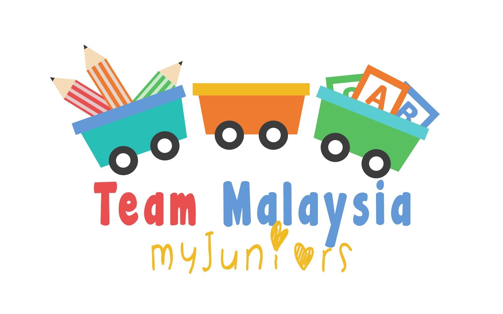
The #myjuniors font took a different approach. It is as though a kid scribbled the word under 'Team Malaysia'. The colour I chose is yellow. If you look at our Malaysian Flag, the Star and the crescent are the parts in yellow.
Final

Lastly, I added the 'Steemit Logo' in the center to finish it off. Steemit is the platform that allows for #teammalaysia and #myjuniors to exist. Hence, it being the center to show it's importance. With the train coasters encompassing the words, it all looks like a big umbrella falling under the Steemit platform.
There you go! The logo at it's perfection. I hope you enjoyed looking behind-the-scenes on what went on in my head as I design this logo. Most importantly, I hope the kids of #myjuniors would love it. Thank you once again, #teammalaysia and #myjuniors for giving me this opportunity to be part of this incredible initiative.
Thank You
If you like what I do, check out my other posts on my artworks, photography & animations.
I'm also open for
Personalized Steemit Profile Banner,logos & GIFs
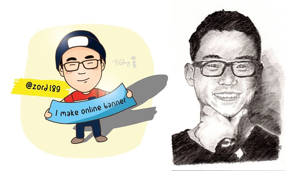
Credits to @pinstory & @coloringiship for this lovely photo of me.

