Hello there!
Last week, TradeQwik launched a logo contest for their website. @tradeqwik wants to be the best trading platform and community for investors.
This post is to present why I made the logo this way.
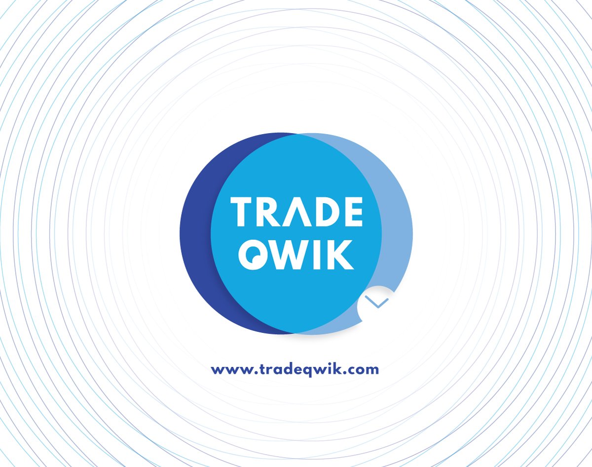
The first thing I thought was to bring some meaning to the logo form. The two circles represent the merging between the platform and their users, leading the name of the platform to stay in the middle as the place where their awesomeness happen.
Form
The light blue circle has another small circle on the right. This circle server as stylized clock from the original logo (resemble, connection to the origin)
Colors
Blue is already the main color used on their website so it makes sense to keep it. Blue is a trending color and is connected with technology.
Context
In order to bring more value to the brand, I created this outer circles to be used together with the logo. This circles expand from the origin (the logo) and represent how the brand can resonate and expand from the core.
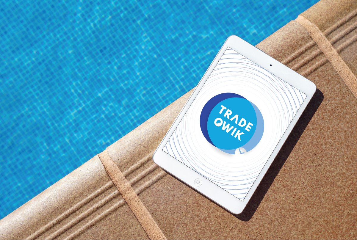
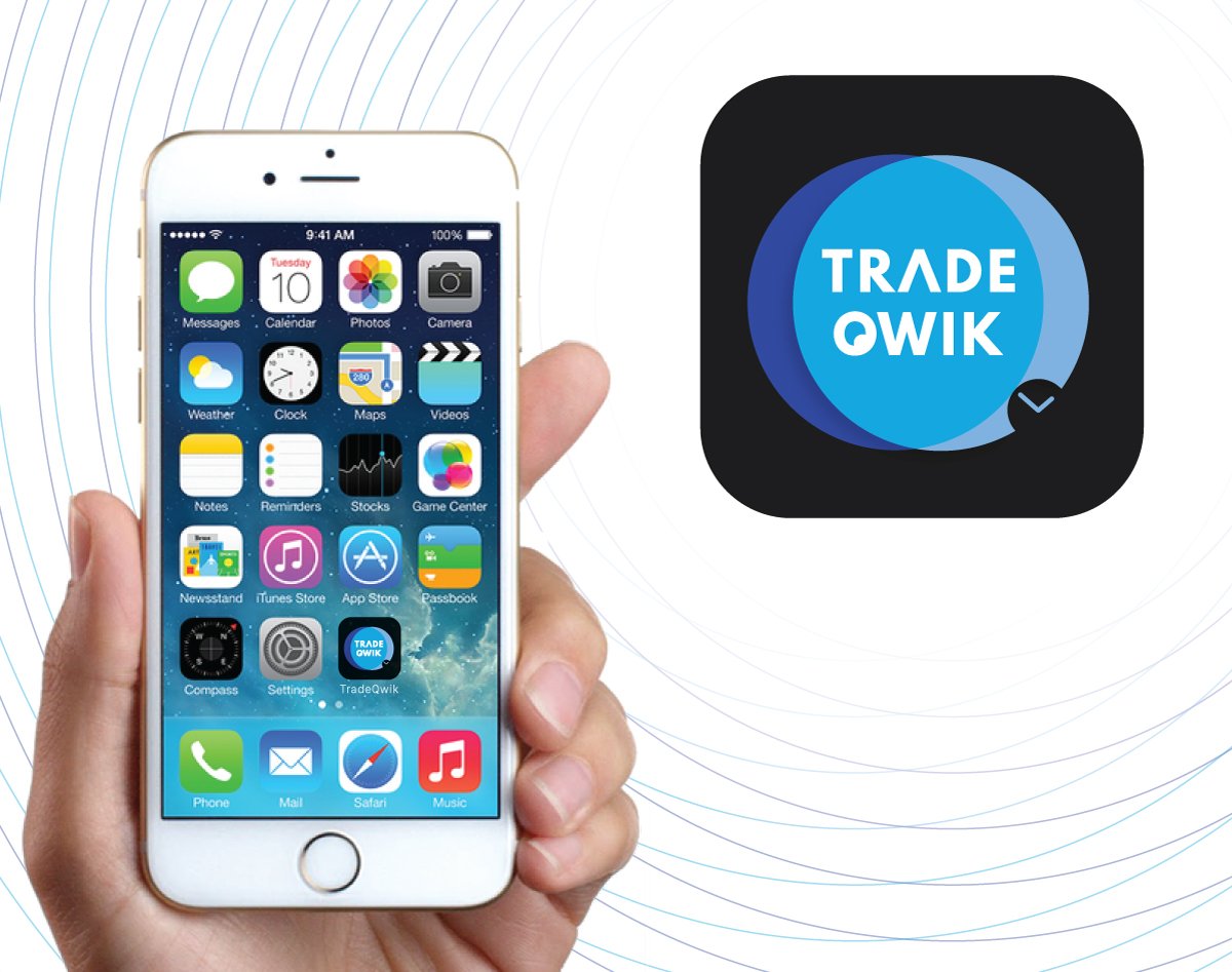
Bellow you can check the logo and some aplications of it.
Hope you enjoy it.


