Hey steemers!
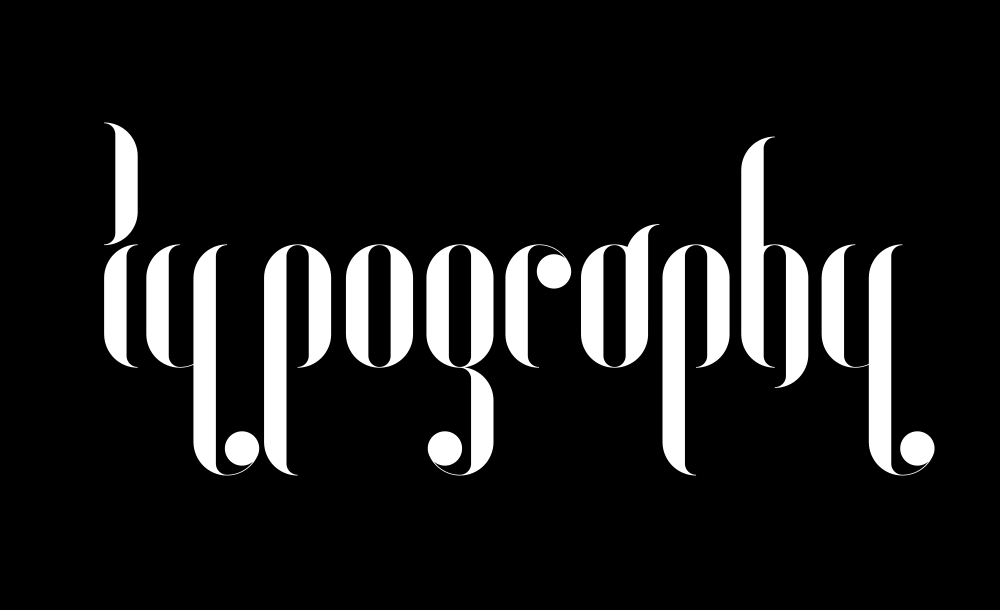
I'm really excited to talk about typography and fonts in general. It's a topic everyone of us deals with, every single day, at work, at home, wherever you are. It's all about fonts. You probably just don't care about it as much as I and other designers do :)
As a designer you should develop a 'personal relationship' to fonts in general. Therefore you have to be clear about the meaning of the fonts. You're going to secure information, permanently. No doubt, the writing system is one of the most ingenious developments so far. It enables the language to be stored and makes it possible to transfer information from generation to generation.
It took thousands of years to get to the point where we are today. Back in times the writing system was sacred, especially for egyptians, they had 2 different types of symbols: one part destined for profane recordings, the other one for religious scriptures. Barely used back in time it's a common knowlegde and of common use today.
The writing system has basically one purpose: Communication. So a good readability is mandatory. Under the constraint of this factual requirement, fonts are being standardized, more and more. Aesthetic demands take a backseat sometimes. Today we find a huge variety of available fonts, older ones and new ones but they all have one thing in common: Each font has the power to add a personal and individual touch to the information, the single word, text or paragraph. Never underestimate the power of a font ! ::))
I thought a good start for this subject matter would be to take a look at the history.
Where did it all start?
We'll take a look at the different stages and explore how this (still) fascinating way of communication evolved. I'm actually using 'it' right now to show you where it came from. Just a bunch of little dark lines, curves and dots but so effective. The images you'll see are part of a private collection and are basically scans and of course some of them are not even reproducible today with modern fonts.
Here we go.
1. The primary stages of typefaces
The Stone Age
Pictography
pre-historic cave art

4000 before Christ
Sumerian Cuneiform writing
cuneiform / wedge-shaped pits in clay tablets;
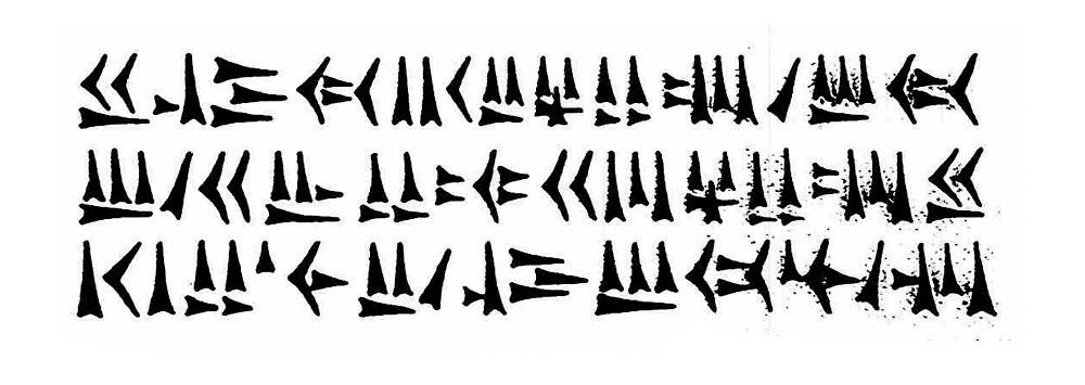
4000 before Christ (parallel development with the sumerian cuneiform writing)
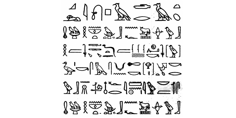
Egyptian hieroglyphics
development of 'word-pictures' using symbolic and abstract signs/word-signs as well as syllable-signs; carved in stone, written on papyrus with a brush and carved in wood;
==========================================================================
2. The genesis of phonograms & phonetic symbols
at about 1500 before Christ
Phoenician writing
further development of the phonetic syntax used by the egyptians; the creation of a pure consonant alphabet, the very first letter writing;
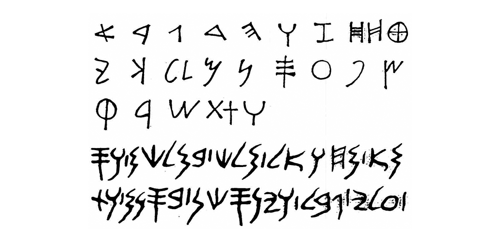
around 1100 before Christ
Greek writing
addition of vowels to the phoenician phonograms; reduction to a complete alphabet of 24 letters;
the archetype of all occidental typefaces; the syntax of writing LTR (left to right) becomes accepted in general;
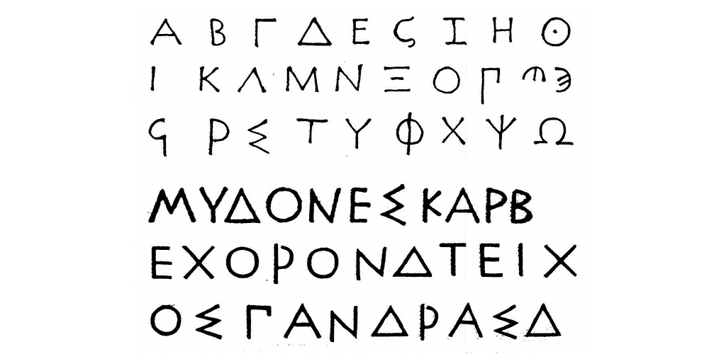
around 1100 – 650 before Christ
Rune phonetics
further development of the greek writings through the goths;

==========================================================================
3. The roman capital scriptures
around 650 before Christ
Capitalis Monumentalis
carved in stone; adoption of the greek alphabet and beautification of the shapes; the template for the majusucles of the Renaissance-Antiqua;
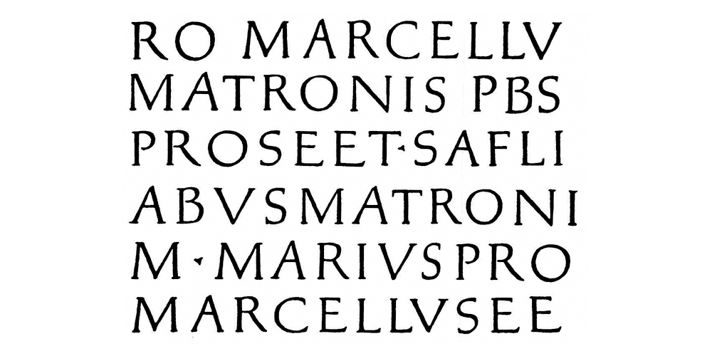
1st century after Christ
Capitalis Quadrata
book typeface written with a reed pen or a broad brush on papyrus; quadratic basic design;
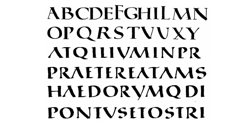
2nd century after Christ
Capitalis Rustica
written with a reed pen or a broad brush; faster writeable book typeface; deviation of the quadratic basic design; narrow letters;
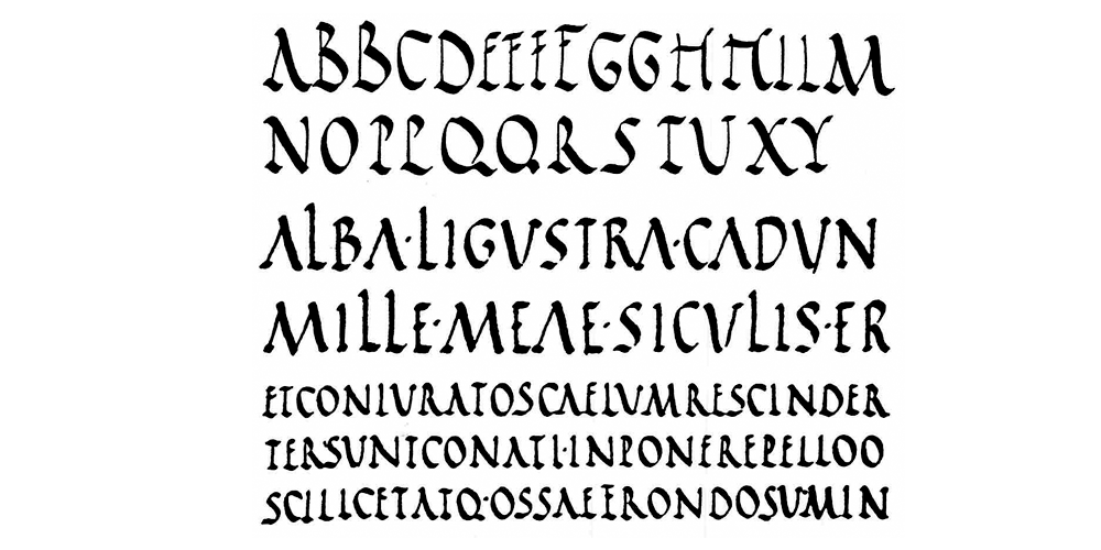
==========================================================================
4. From majuscules to minuscules
4th century
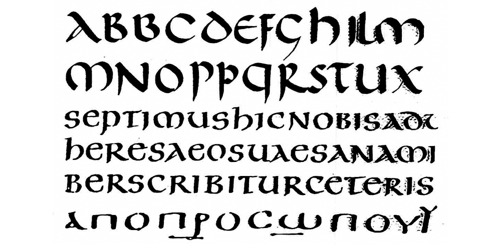
Uncial
book typeface written with a pen; rounded shapes; a gradual transition to minuscules;
4th century
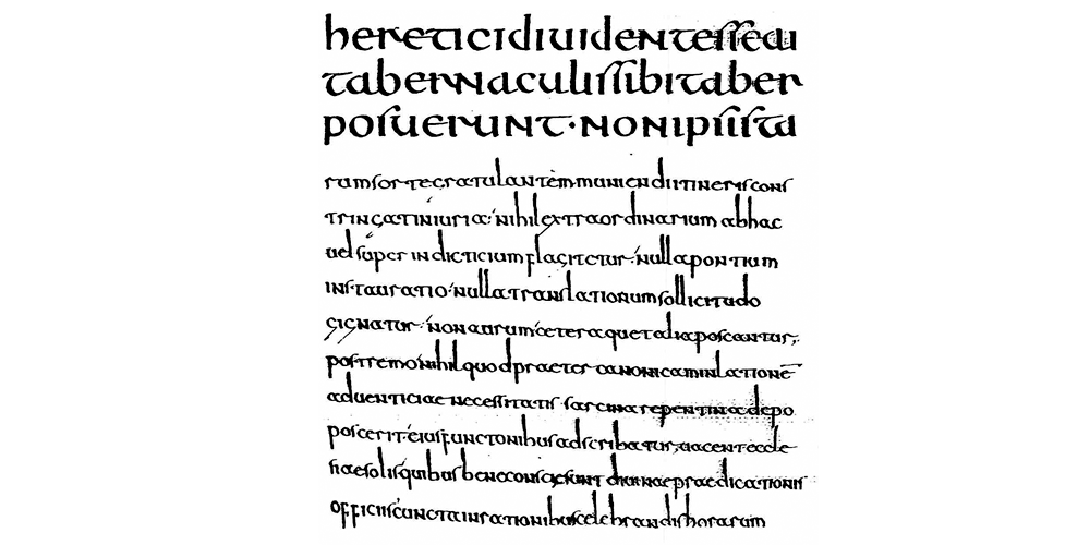
Half-Uncial
pen typeface; contracted letters with distinctively pronounced ascending letters and descenders; the evolution of a pure minuscule typeface is nearly finished for most of the letters / shapes;
simultaneous development of the so called ‘national typefaces‘; a deformed non-uniform creation of 'fonts' caused by national individualism;
==========================================================================
5. A pure majuscules typeface
9th century
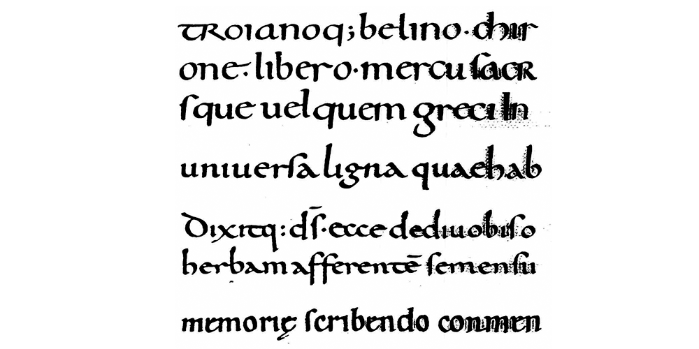
Carolingian Minuscule
the new unit scripture, created in the scriptorium of Charles the Great; Capitalis and Uncialis were used for columns and distinctions; separation of words with a larger space in between; the general development of our writing system was basically finished;
==========================================================================
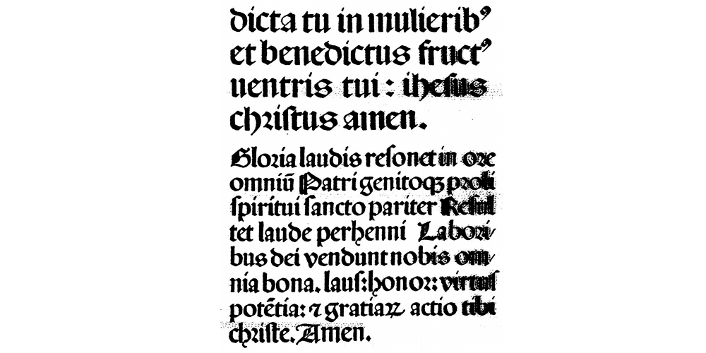
6. Gothic fonts
12th century
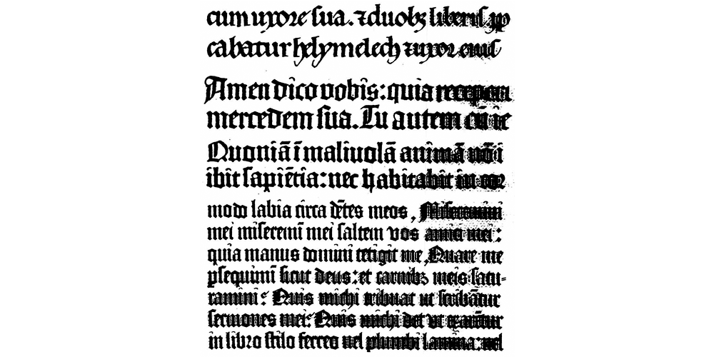
Gothic Minuscule
the evolution of fonts is influenced by the gothic style; steep, narrow and broken shapes; creation of Textura, the most stringent gothic font; it's the paragon for Gutenberg's printings; majuscules were sparely used in books;
14th century
Rotunda (Round-Gothic)
typeface of the gothic times in Italy; broader, rounder, more opened shapes as seen on the Textura, not so much broken; propagation in nothern countries; further development of the 'broken‘ fonts solely in Germany;
==========================================================================
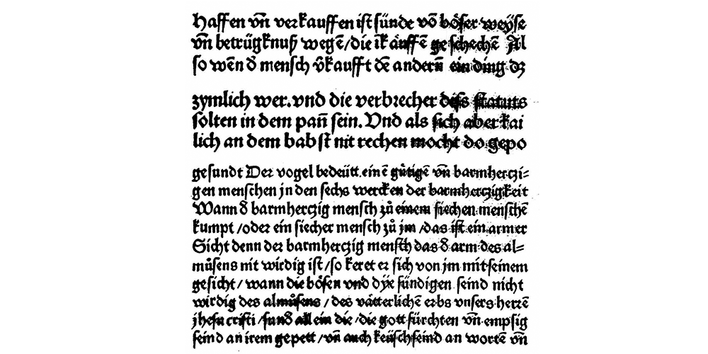
7. German fonts
15th century after Christ
Schwabacher
created in the south of Germany under the influence of Rotunda; more rounded and open shapes compared to the stringent Textura; scripture of use for german folksy literature; lower case and upper case letters build a real unit;
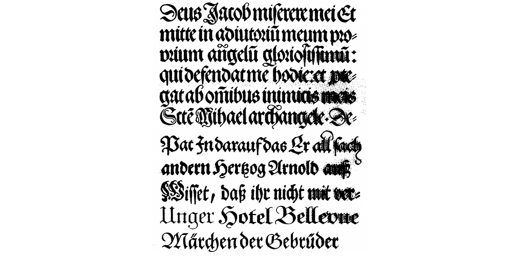
16th century after Christ
Fraktur
refinement of the letters to more elegant, ornated and narrow letters; alternating use of rounded and broken shapes; embodiment of the german renaissance; influenced by Baroque; elimination of Schwabacher; german unit scripture until the 18th century; finalization of the development of broken fonts;
==========================================================================
8. The genesis of the Antiqua
14th century
Humanistic Antiqua
a huge influence on the creation of fonts by humanism; humanistic minuscule is made of the carolingian minuscule; capitals adopted from the roman Capitalis;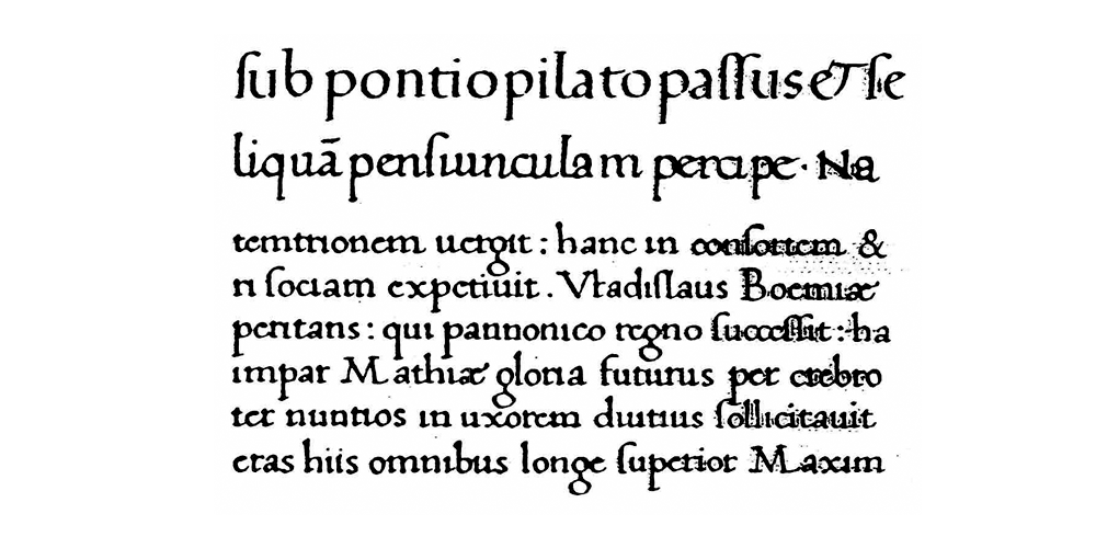
15th century
Early Medieval
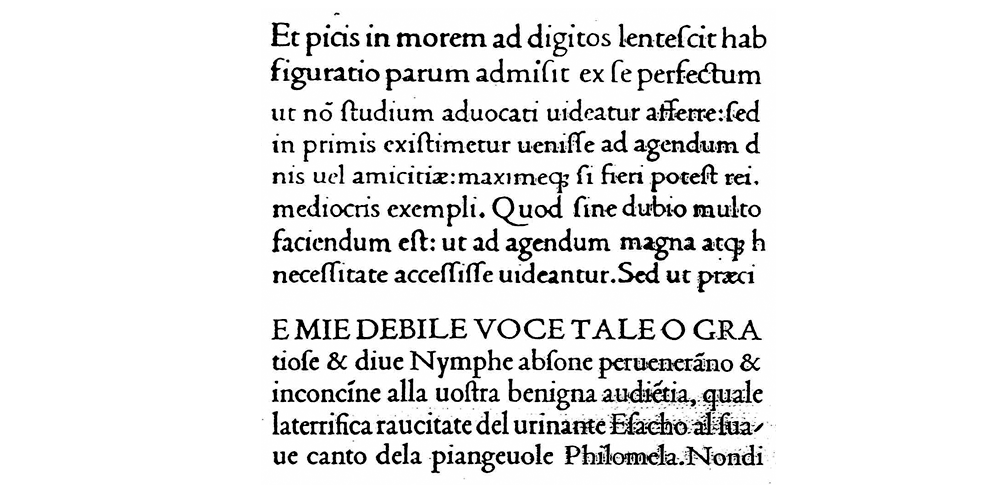
Venezian Renaissance-Antiqua;
1470: completed Antiqua as a printing font by Nicolas Jenson; Venice
1500: Aldus-Antiqua by Aldus Manutius, printer and publisher in Venice
at about 1540
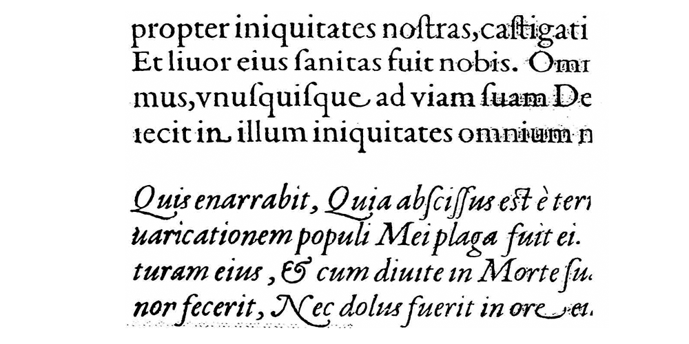
Medieval
French Renaissance-Antiqua; uniform and technically perfected design of the Garamond-Antiqua by the french Claude Garamond; the bottom example shows the italic version;
==========================================================================
9. The characteristics of copperplate prints / copper engravings
17th century
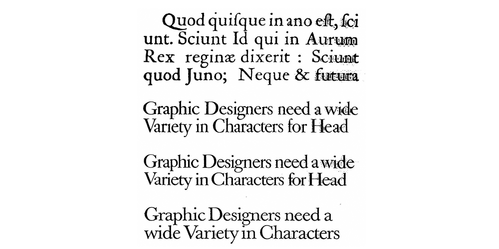
'Transition'-Antiqua
Pre-classicistic or Baroque-Antiqua; the characteristic style of the pen gets lost; the serifs are not so rounded anymore;
At the top: Original by Christoph van Dyck
Beneath: different variations by Anton Janson (1668), William Caslon, England and John Baskerville, England (1750)
19th century
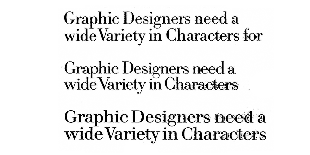
'Younger'-Antiqua
classicistic Antiqua; final breakthrough of the burin ductus; the handwriting like characteristics of the pen ductus are completely gone; strong vertical, fine horizontal lines and serifs; the transition to the serifs is no longer rounded; the center line of the roundings is vertically aligned;
Examples of fonts by Giambattista Bodoni (Italy), the family Didot, publishers and printers (France) and Justus Erich Walbaum (Germany)
==========================================================================
10. Advertising and markup fonts
beginning of the 19th century
Egyptienne
The first serif-emphasizing Linear-Antiqua was created by Vincent Figgins, London

Clarendon
serif-emphasizing Linear-Antiqua with softer shapes;

Italienne
variation of the serif-emphasizing Linear-Antiqua with enormously thick serifs;

beginning of the 19th century
Grotesque
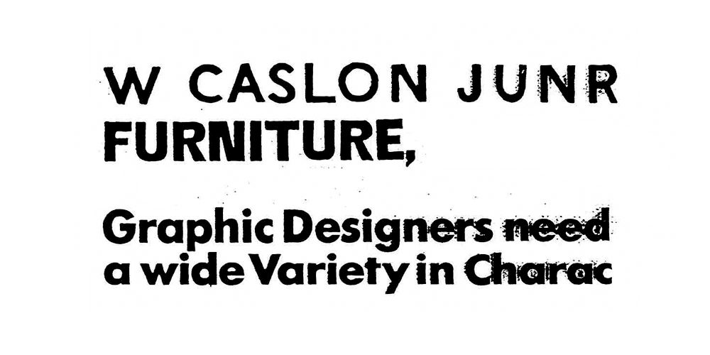
first sans-serif Linear-Antiqua by William Caslon IV, London; sans-serif fonts had a shadowy existence for a long time; today it's a widespread font in many variations;
==========================================================================
11. Font variations of the 19th century
end of the 19th century
Ornament fonts
different variations of historic font faces; general loss of style and lack of style;

end of the 19th century
Decorative fonts
strongly garnished fonts and squiggly form / shapes; the british handwriting font and some others survived until today;

at about 1900
Art Nouveau fonts
fonts by the painter Otto Eckmann and the architect Peter Behrens; after a blooming period of 10 years those fonts disappeared;

1919 – 1933
Bauhaus
Institute of Science for architecture, art and handcrafting (until 1925 in Weimar, later Dessau)

So these are the cornerstones of the ‘written language‘ as we know it. Now you will ask "What happened between the early 1930‘s and now? 80 years have passed by!"
What you see here is the basis. The fonts we have today, the fonts I love to use every day are derived from these crucial developments.
... to be continued
