
UI Vote Button Redesign (playground)
I was playing with some ideas i got in mind after reading a user post here some days ago
I got inspired by an idea of another community member @deepsynergy
-.-.-.-.-.--.-.-.-.-.--.-.-.-.-.--.-.-.-.-.--.-.-.-.-.-
Introducing STEEM POWER & STEEM DOLLAR Symbols
-.-.-.--.-.-.-
thank you
draft by @deepsynergy

-.-.-.-
Source
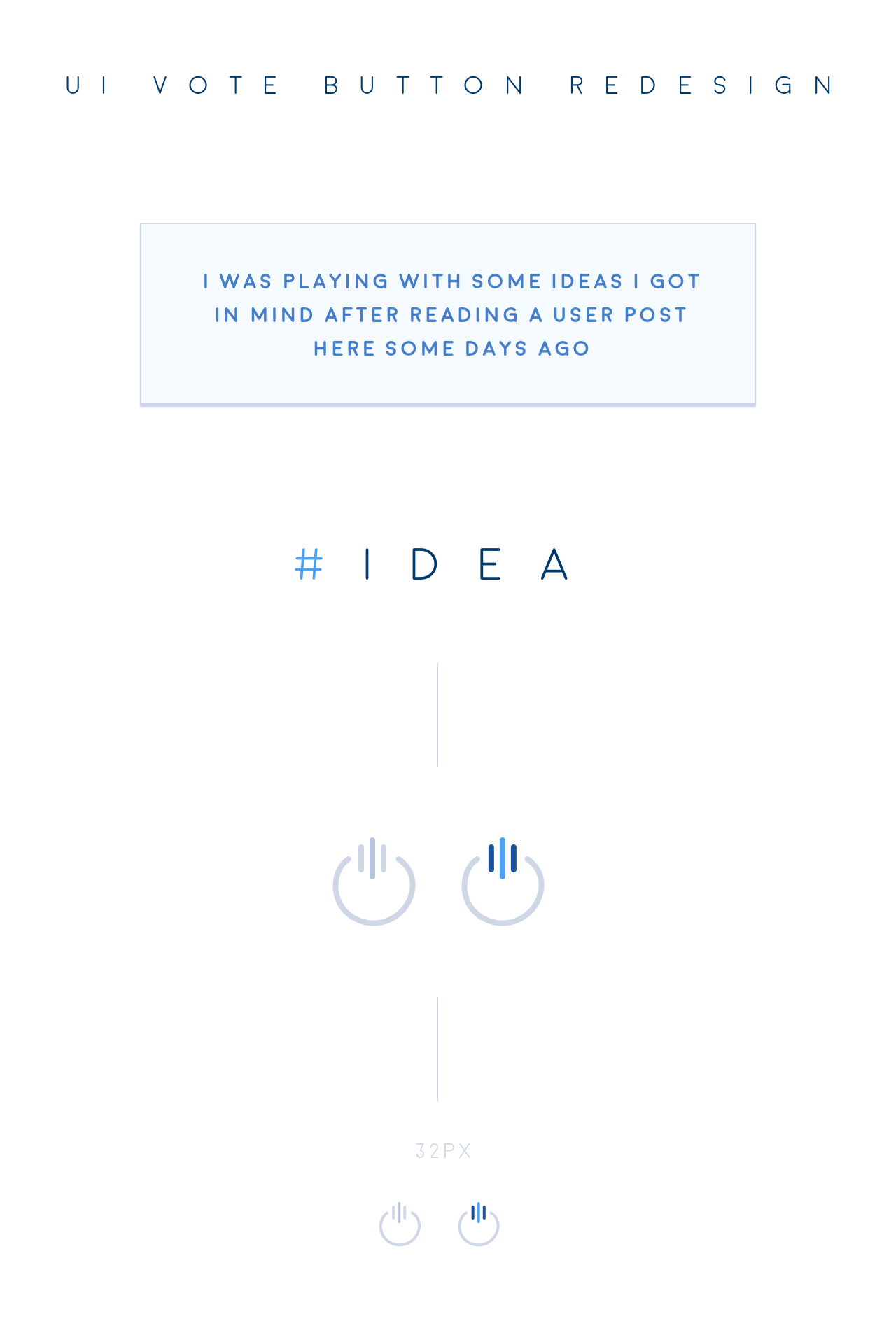

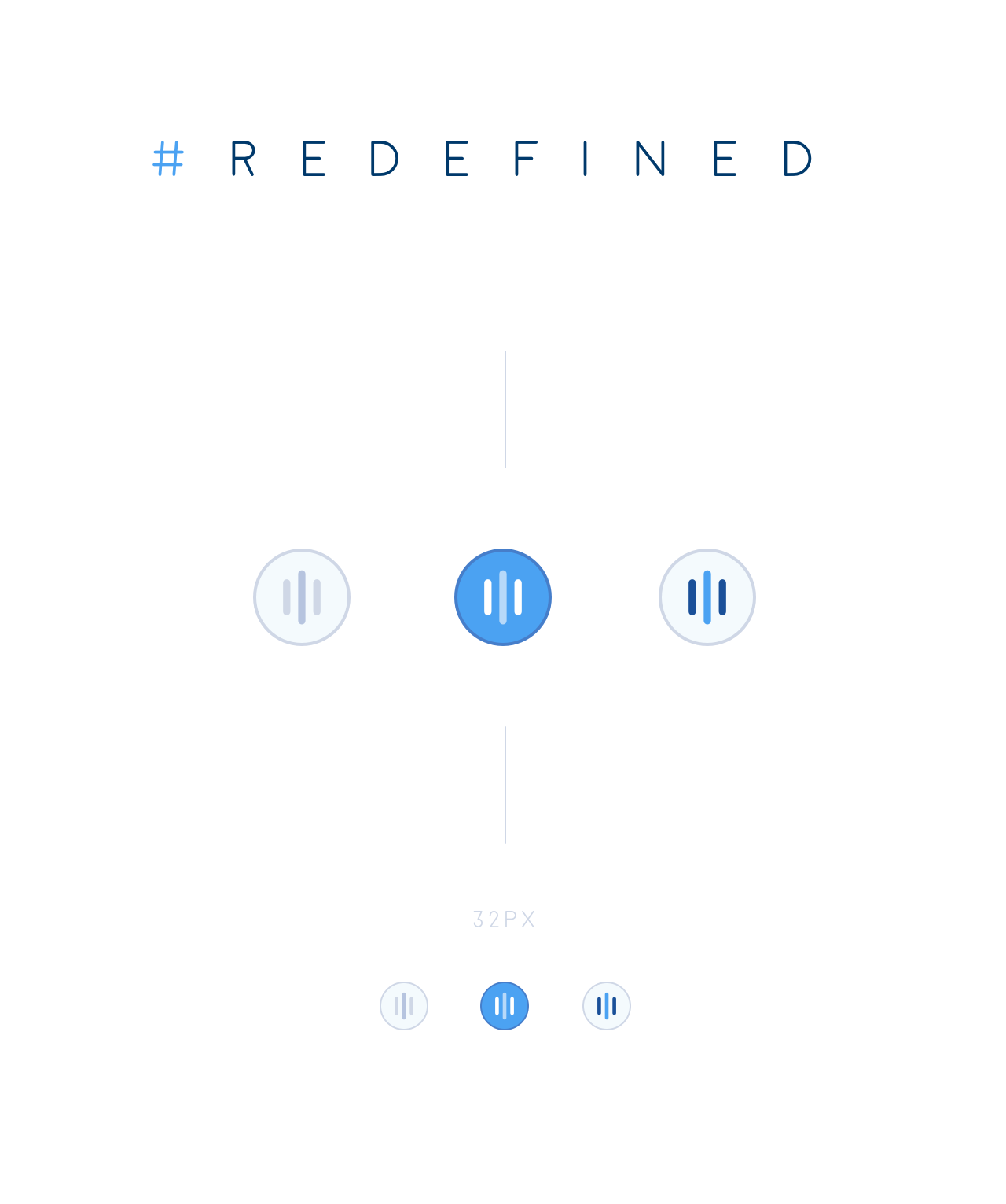
alternative presentation & examples
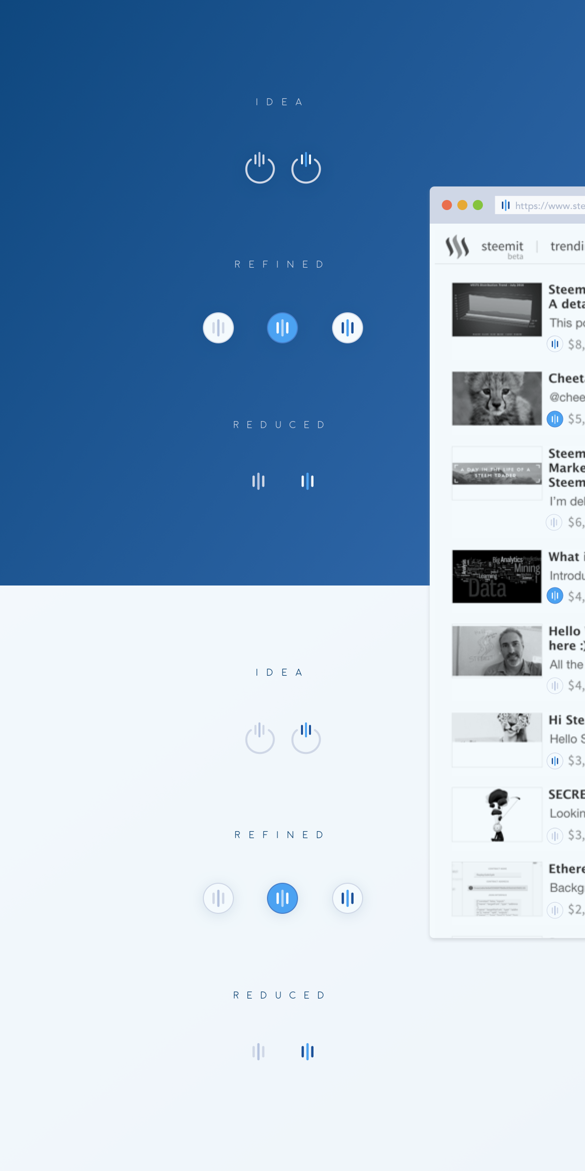
and in presentation format - standalone
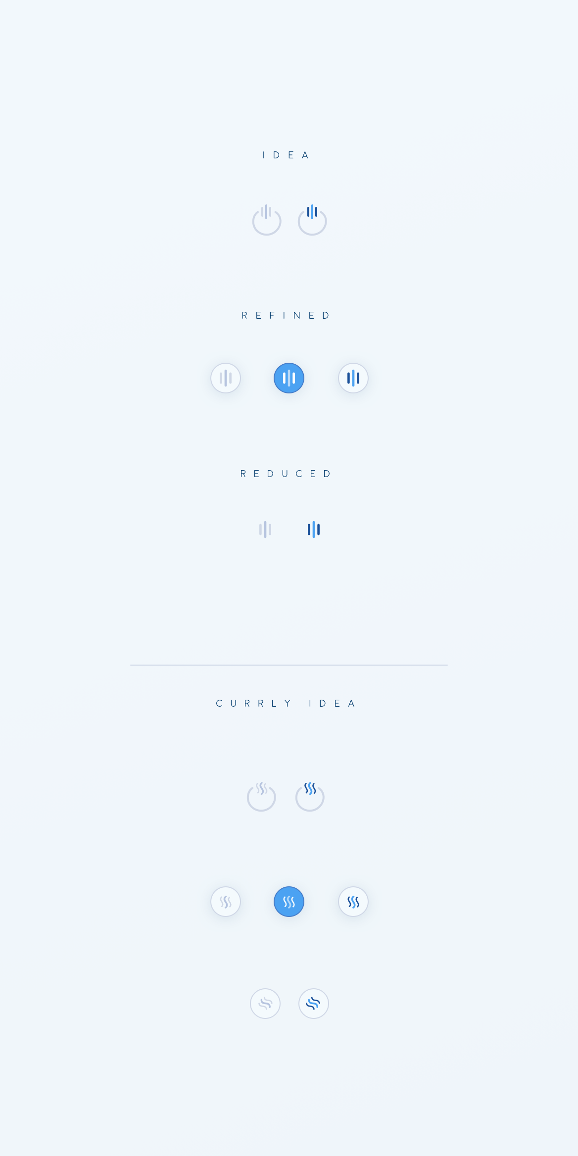
I would love to get feedback from U - the community about and maybe we can polish or tweak things together.
Also i'm happy to be able to have such a transparent way of talking about Ideas, Design approaches and much more.
Feedback well appreciated
I want to encourage everbody with some ideas and thoughts, feedback etc.
please use the comment section for your feedback.
Thanks in advance
Happy Steeming
(Please try to avoid cross posting your articles in comment section!
I won't vote for any NOT directly topic related posted link - Thanks for your understanding)
