Repository.
https://github.com/Minecolonies/minecolonies
Linked Task Request.
This Task Request was open by @raycoms :
@raycoms/letsdevtogether-ldt-logo-task-request
Details.
LDT or Let's Dev Together is an open group for developers independent of their abilities and experiences. Read more here and here.
Logo Idea
The logo is based on a minimalist style, with a responsive touch of logo to be read in all aspects. However, here are the main ideas in this LDT logo. The main idea is:
- BUBLE CHAT.
- LANGUAGE PROGRAMMING.
- PEOPLE.
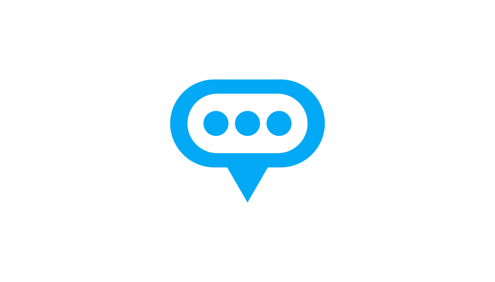
Bubble Chat means a communication between people, also means a group with the term (together). With togetherness must create a solid communication.
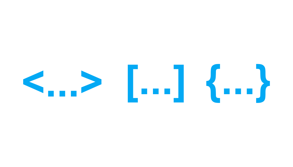
Language type using on programming, this mean to (dev), the language is <...> [...] {...}.
People, this symbolizes togetherness.
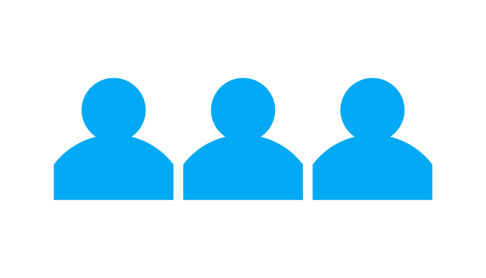
Above is the main idea in making this logo, first I use idea just sign language <...>. But, after getting feedback from the LDT team with their feedback to add {..} and [..] in logo construction, see their feedback here.
Logo Process (contruction)
The construction logo is based on the gridline system and adopts it to be more renposive in use. In the system, GRID LINE based aims to make the logo still has aesthetics of construction. 3 contruction
- contruction with <...>
- contruction with [...]
- contruction with {...}
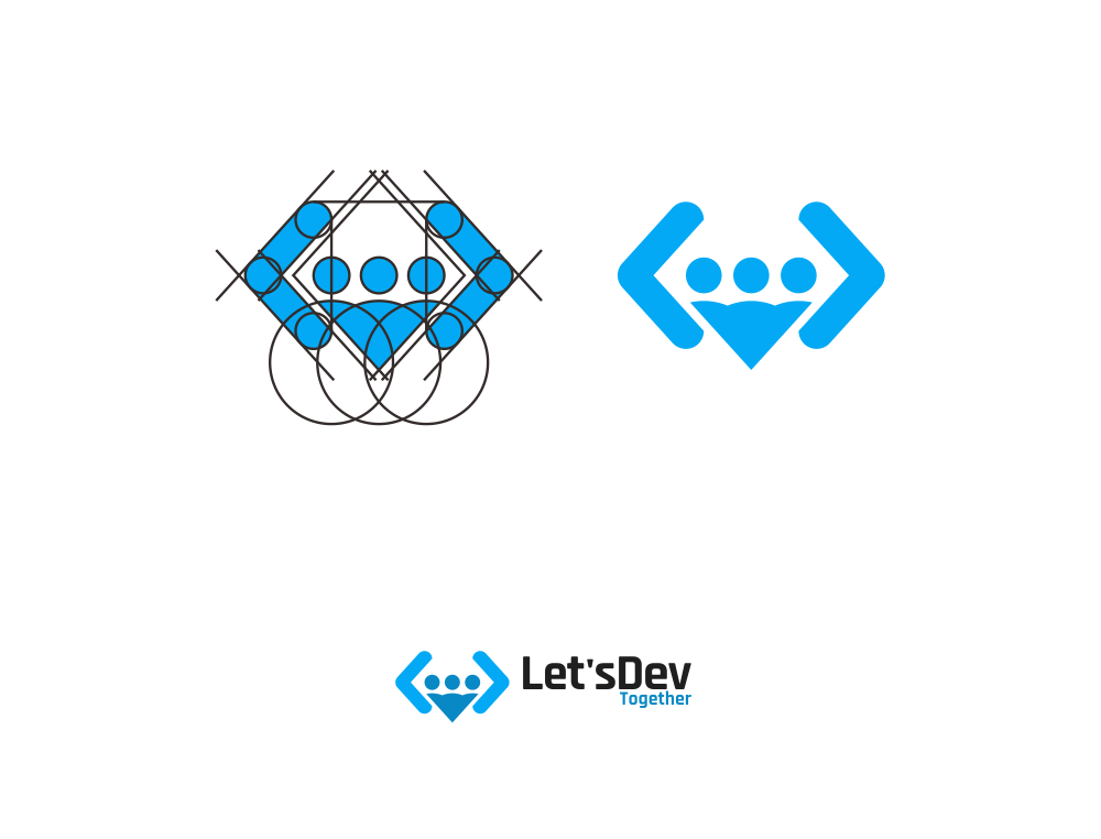
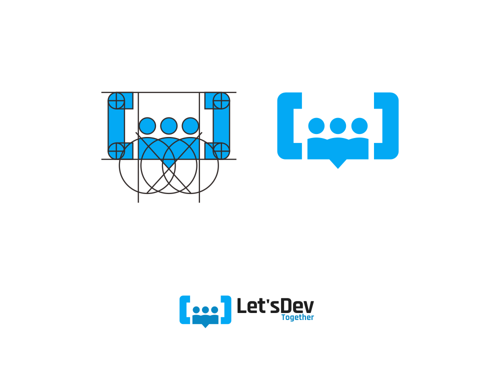
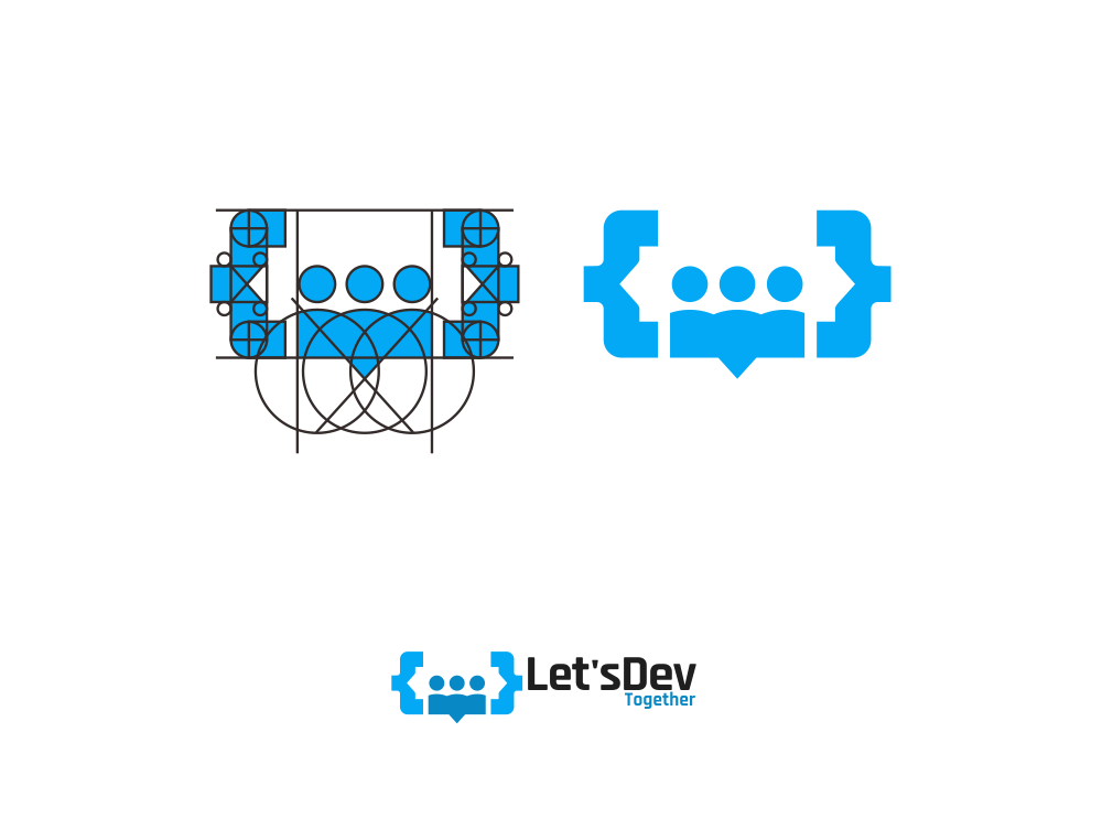
Logo Result
Logo type
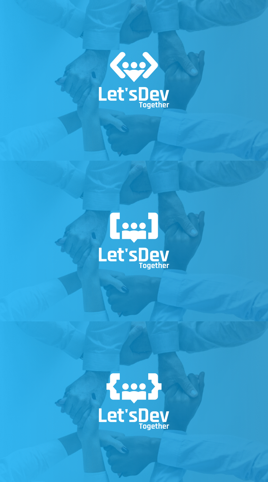
Type 1 <...> LogoMark and Logotype Primary Version ( Horyzontal )
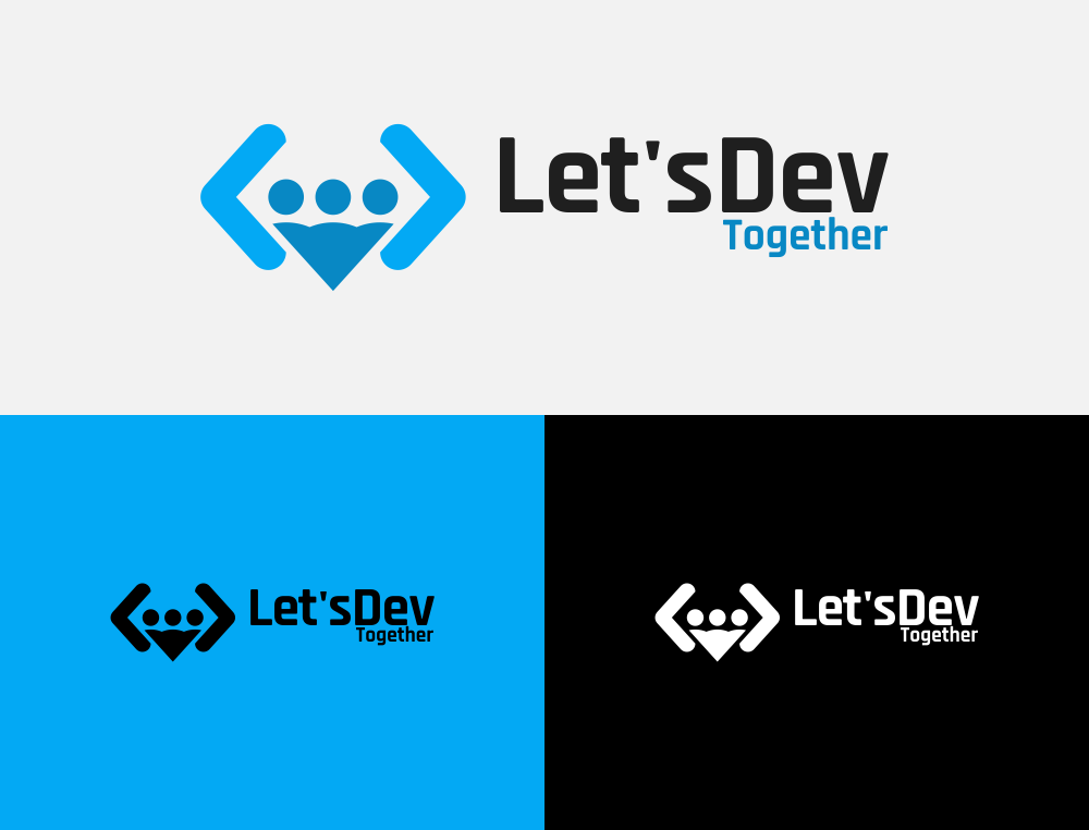
Type 1 <...> LogoMark and Logotype Secondary Version ( Vertical )
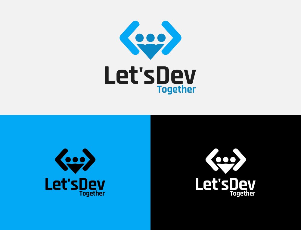
Type 2 [...] LogoMark and Logotype Primary Version ( Horyzontal )
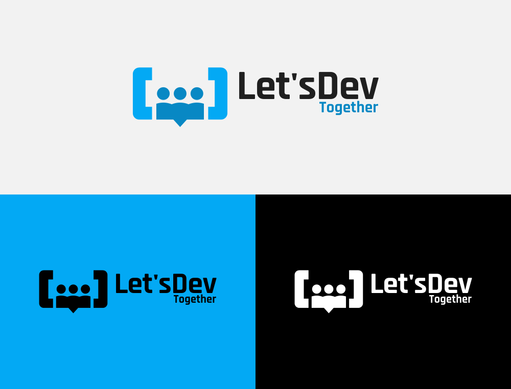
Type 2 [...] LogoMark and Logotype Secondary Version ( Vertical )
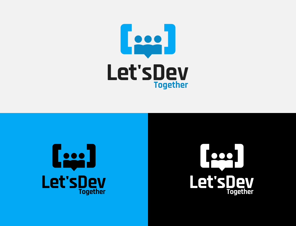
Type 3 {...} LogoMark and Logotype Primary Version ( Horyzontal )
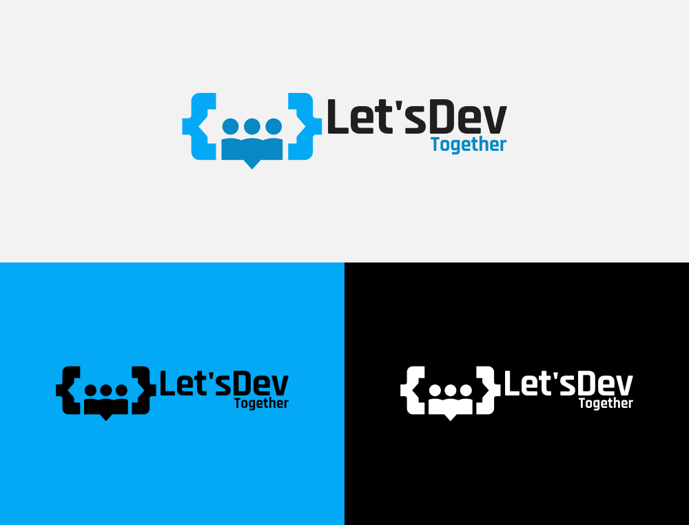
Type 3 {...} LogoMark and Logotype Secondary Version ( Vertical )
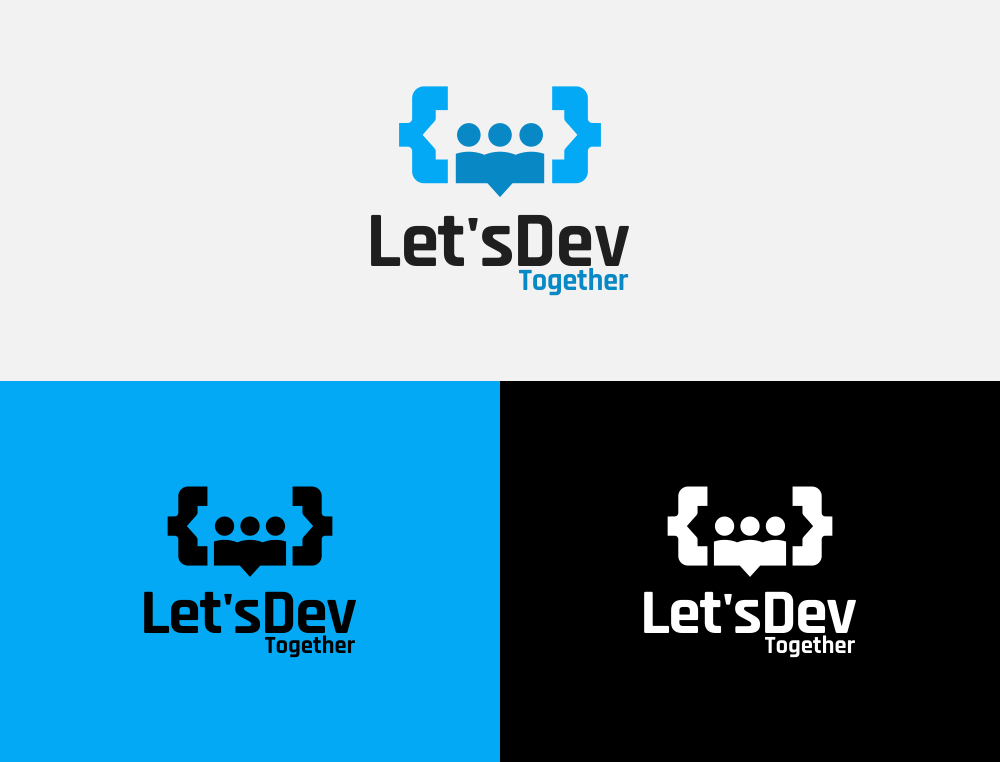
Icons (logomark)
type 1 <...> , type 2 [...] , type 3 {...} .
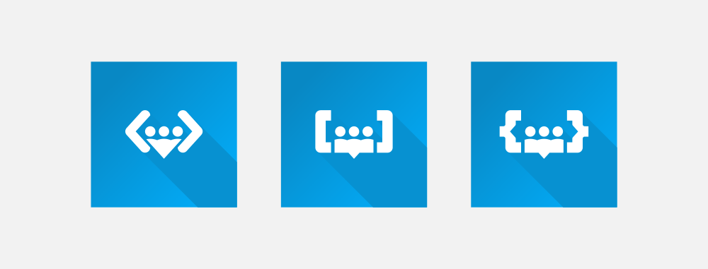
Favicons
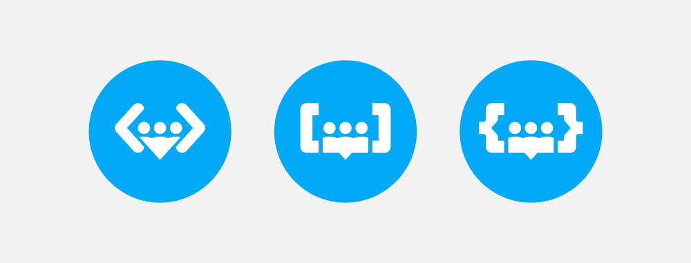
Banner


Font Used in logo : RAJDHANI OFL
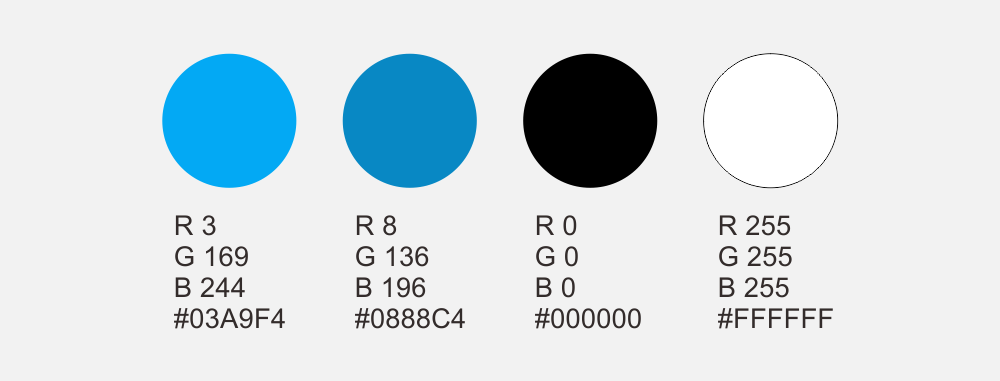
Color Used in logo :
Benefit
Benefits / Improvements
For the benefit of LDT logo are:
visual logo that is easy to understand.
logo created in a gridline-based context. aim for proportional.
Logo created with responsive concept and very context. here symbolizes that a branding should create aesthetic design and have an understanding in different contexts so that the design can be applied into posters, business cards and more.
Fun logo, in this design, the fun in the form of bright colors and characters that fit the design aesthetics, that is (visual).
Simple and modern logo. This is the most important, so that the logo can be applied next to another logo, such as being in the line of footers or as a sponsorship of the sponsor.
Some examples in applying.
On line with another logo. this logo much working on one color logo.

On profile picture. this is example on discord profile

On github readme, logo vertical version view.

On website, primary type much work with singgle color.
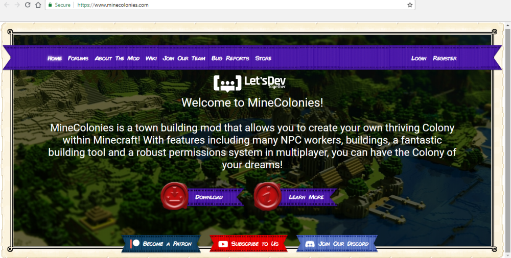
On favicons, the favicons much work with one color and readable.

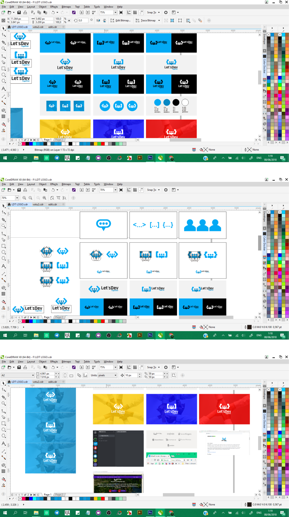
Proof of authorship.
Tools.
I created the Steeditor Logo using CDRx8. And I provide a vector file ( SVG and PDF ) for flexibility and scalability, as well as .PNG file format for immediate use of the designs.
Original files.
- Image :
- Font Radjani :
- Logo File PNG, SVG, PDF :
License.

This work is licensed under a Creative Commons Attribution 4.0 International License.
