So, there is this guy, Matthew Workman. I first saw him on Youtube where he runs a channel called Cinematography Database. There, before getting banned, he analysed music videos and films. More precisely, the lighting, composition, colours etc. Now sometimes I catch myself pressing a space bar to stop and to look at some shots. No, I am not doing this when I am with someone, I am not that rude! :-) But I love to do that and the more I do so the better videographer, I think, I become.
I finished watching Mr Robot S02 recently. And I loved it. Not necessarily the second season but the series generally due to the character development and lighting, or LACK of lighting and composition.
Cinematographers, who worked on the series so far are Tod Campbell and Tim Ives. Tod is really well known from the films such as Boyhood (which I didn't enjoy as much as many many people did) and Stranger Things (which one member from Steemit has recommended me to watch!). Creators of Mr Robot took the best people they could for sure, so I am not surprised about its success. Tim Ives, for instance, worked on House of Cards. Maaaan, I was fanatic about the show and loved everything about it!
To sum up the introduction, Mr Robot is a work of art and everything there happens for a reason! Those people cannot work in a different way!
I gathered a list of the shots I really liked and wanted to comment on. There will be more in the future, but let me start with a few. There will be no spoilers!
Gideon
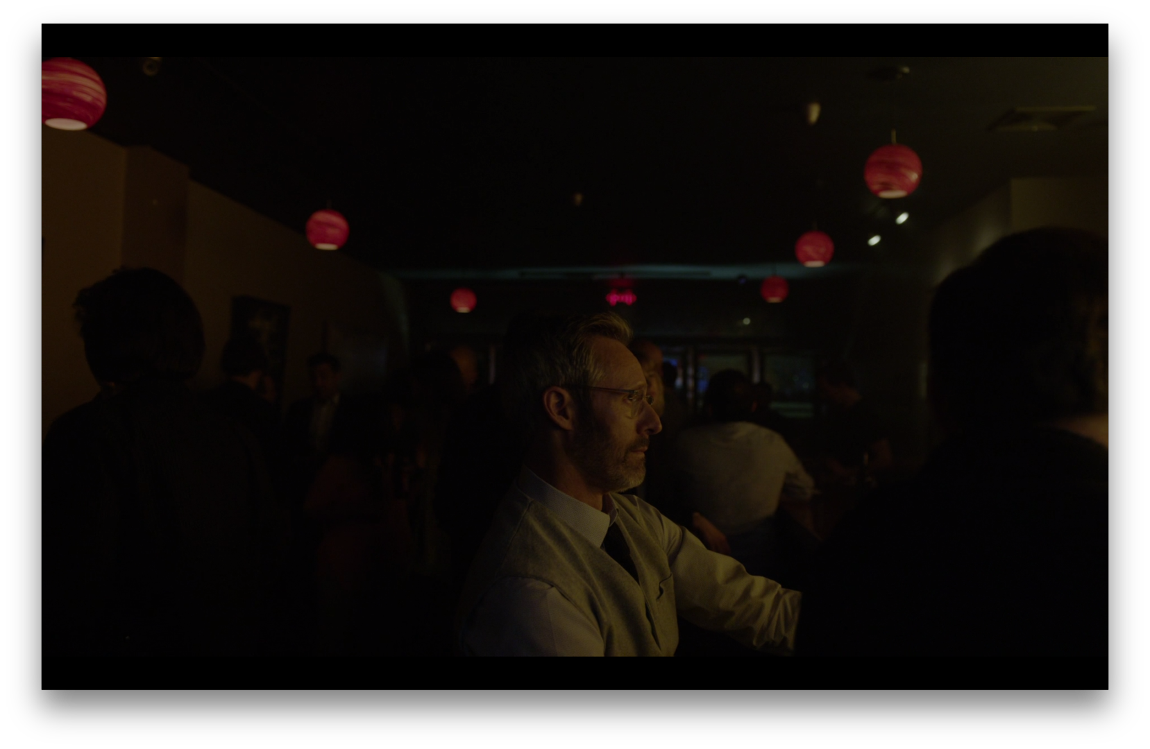
When I stopped to look at this shot there were a couple of things I thought to myself. First, it's so dark! Second, I love those round lights! Then I asked myself WHY. So, here's Gideon. He is sitting in a bar. Worried about his life/career/love/sexuality. He is in the darkness, lit from the front, there's no backlight to separate him. I take it as a symbol of some deep worries and anxiety. Such an undefined object surrounded by nothing but black. But there are some lights, so it should seem that there is hope. Hope in colour RED. Not sure if that's a very positive thing. :-) I found this shot very interesting because it's not the only one in the series where characters are placed in similar places.
Darlene
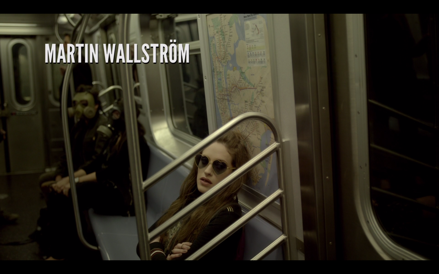
She is Darlene. Every time she is on the train, we see her face from between steel handrails. At first, that was just an accidental shot or a shot of convenience. But it kept repeating and it got me thinking. She is a strong character who seems not to give a **** to anything and is quite aggressive at some points. Some things are not revealed about her and this kind of composition suggests to me that she is trapped and the authors do not explain enough about her yet. Sometimes it seems to me that Darlene is a catalyst, who is very useful for the plot, but mysterious enough to keep her character interesting and not noticed as a fifth leg.
Elliot
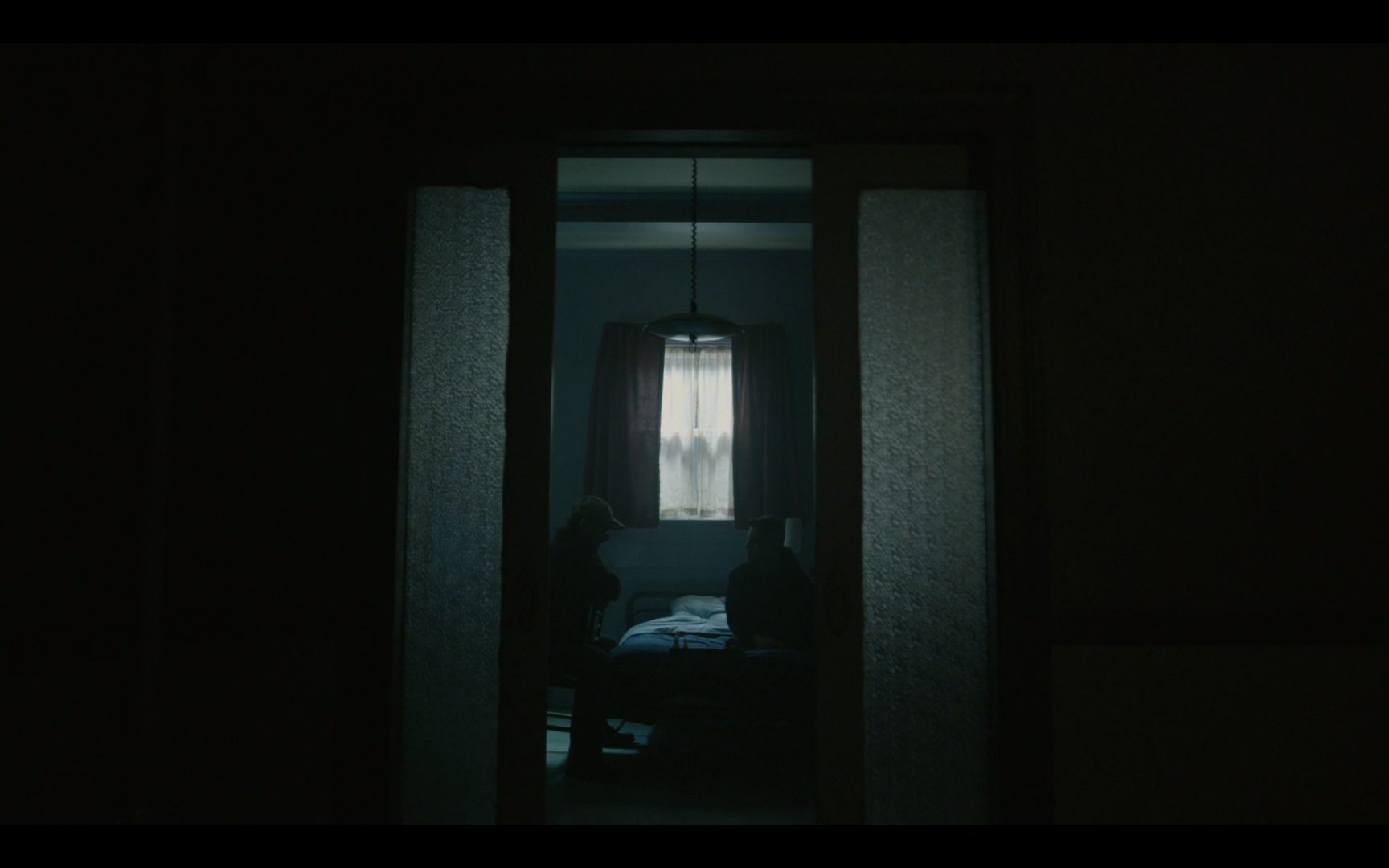
Symmetry is not a new thing and it doesn't surprise anyone. Many directors use it as a tool to create a visually pleasant image and they succeed. Because look at this! Again, super under-lit, very dark, moody shot. Even scary I'd say. We've got beautiful production design (look at the texture of the glass). Someone who adjusted the lamp, who what he/she was doing - the height is perfect - if it wasn't, the shot would look messy and chaotic. And the room needs to be tidy, because Elliot himself has lost the order. It looks like only light through the window is used and works as a backlight resulting in silhouettes. From the meaning perspective, we as viewers should assume that we know nothing about those characters. Their faces are not to be analysed therefore we cannot look into their 'souls'. This is a mystery of the entire series and so very often we can see that we can't see.
Phillip
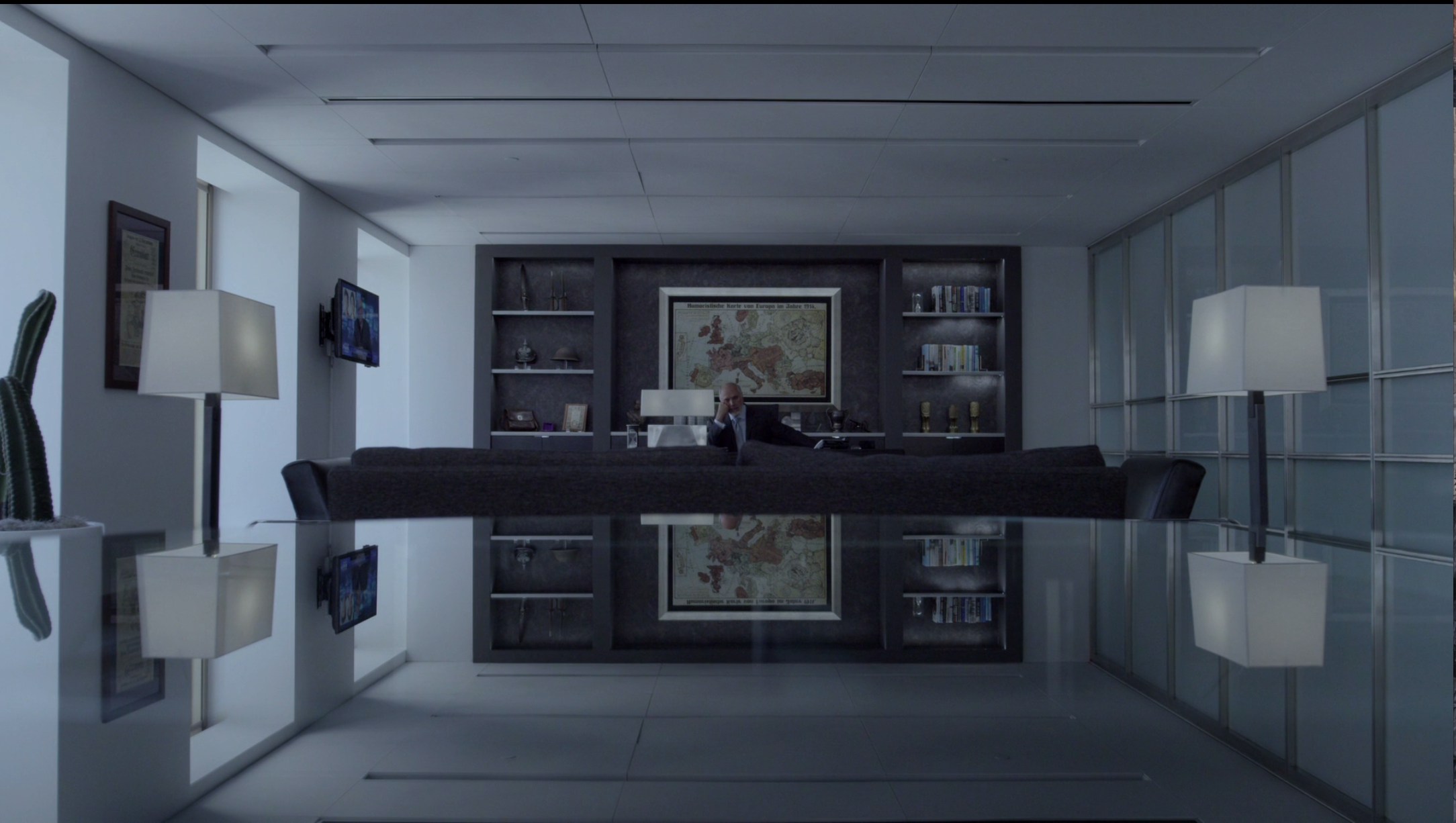
Phillip works for the corporation which is guilty of many things and is in danger. This man is powerful, but little. At least this is what the scenes in his office tell me. Often the establishing shots of him in his office are centralised. He is placed in the centre as the centre of the world. :-) However, when he speaks with people, for instance, with another character Angela, he is placed in corners of the shots. I don't have those with me now but I will do another post on dialogues in these series. Philip is an interesting character, he is mostly softly lit, I'd say similarly to Angela, as she, when not in distress looks so beautifully and softly lit. But that's for another essay, I guess.
The usage of props is very important here too. I am wondering why the lamps which are standing on each side of the frame don't emit much light (look at the shadows on the ceiling) - is it because it just makes a nicer shot or is it because he is not a type of character who enjoys much light? Also, Europe's map. It's from the times when it was still to be divided and I wonder if that was chosen on purpose or was put there just for me to guess! :-)
And finally, the use of a glass table to reflect Philip and the lights. That's stunning! Such a great idea to create the sense of space.
Whiterose
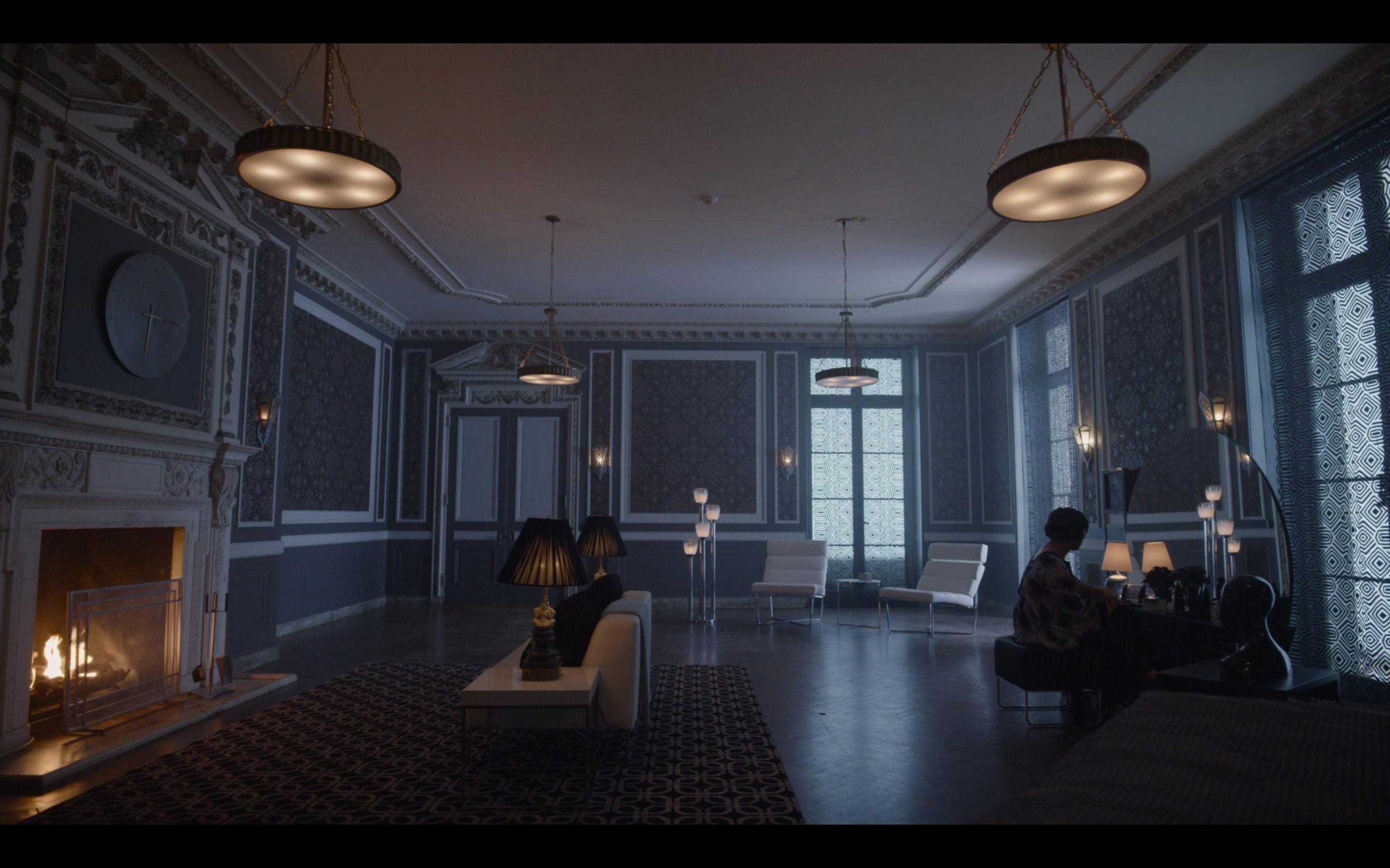
Well, this is just beautiful, I can't say anything else! Actually, I can add something - there's a fireplace on the left sid and as a complete opposite to light and warmth we've got her. Preparing, doing her make-up, trying to fake that warmth. It's just so clever! Yellow/Blue colour choices are very popular in films because they tend to look good. And if you can get the meaning from those colours too, even better.
So here it is, for tonight I'm done. I hope this is not too silly for you as I am trying not to overthink the shots but to look at them as a viewer, who questions. I am not an academic so I will not provide you a reading list. BUT I love films and the art of cinematography so I WILL discuss and compare different styles. If I am too simple for you too, I am sorry! It's just me trying not to pretend to be super bohemian and clever. I will do my best!
Please share your thoughts as I love a good discussion. Have you notices any shots you found interesting? And no, I am not asking this just to get comments I will never read. I do read! :-))))
All the best,
Greta
