Its essence, light, creates a subtle, fluid dance.
In the flickering dust and silver shades it asks:
Which day is this morning? What time is it by chance?
But these questions memory cannot help but lapse
Since this mind's forgotten how to decide. Perhaps.

Hello everyone. As said in my introduceyourself post, I wanted to definitively prove I'm Anya Ehrim before really going at it with this Steemit blog. My only creative idea was to show a layer breakdown of my most recent artwork. I got a reply from Wildflowerjessi (and thank you to much!) to just do it. So I am. :-)
The focus of today's post is Leonardo Lucas Raywick. Lee is the main character of my novel-in-long-long-progress. Summarizing the plot into one word, it's a story about his maturity. Psychologically. He's trying to come to terms with his reality throughout the novel, and to most of the other characters he has some very serious mental issues. I lack such mental issues (and don't know anyone who has them), so I've been spending a lot of time researching illnesses from post-traumatic stress disorder to retrograde amnesia to disassociative personality disorder so to properly write down this poor, poor man into someone real on the page. He's the character I draw most, and he's been through too many style changes to count. I believe I'm finally settling on a style to portray him in. Proper proportions, but relatively innocent (and almost always) sad eyes.
Now that he's introduced (I'll be writing about him a lot), let's get into the meat of this post.
Lineart
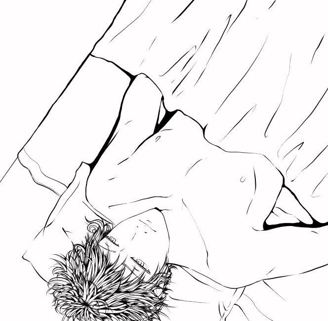
I tend to do my lineart in multiple layers. His hair is a layer all on its own so that when I mess it up (which is a lot) I'm not erasing his face to fix it. His face and body are separate from the bed and pillow. (I tend to trash layers I no longer need to keep layers clean; sketch layers are unfortunate victims. I'll be able to show them in future posts.)
Shading
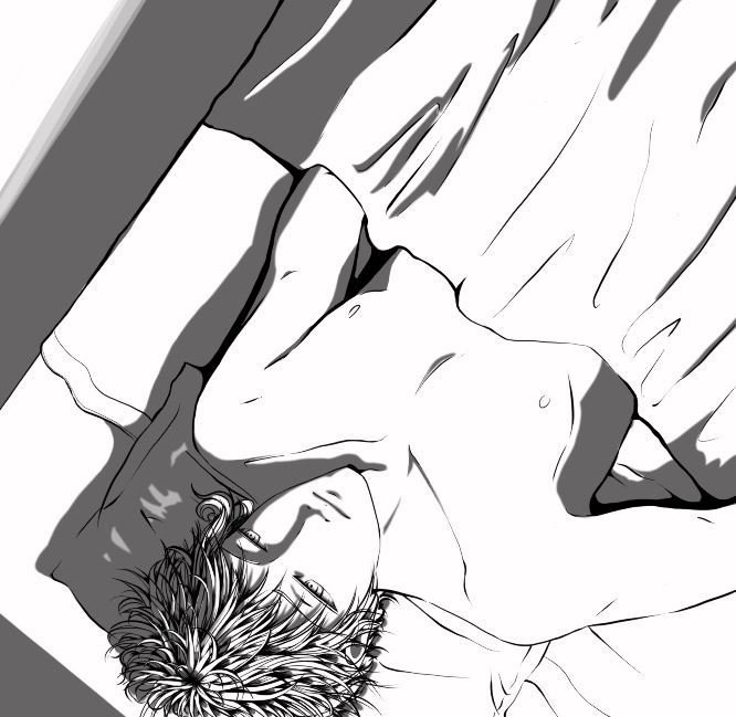
My usual technique (at least in grayscale pieces) is to work in black, and lower the opacity of the entire layer instead. It's easier to do touch-ups this way, and it can be adjusted across a full range to help with the intensity of the light source. The shading here is set at 60%.
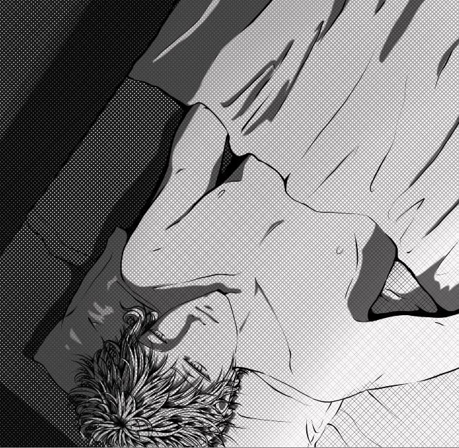
Screentoning

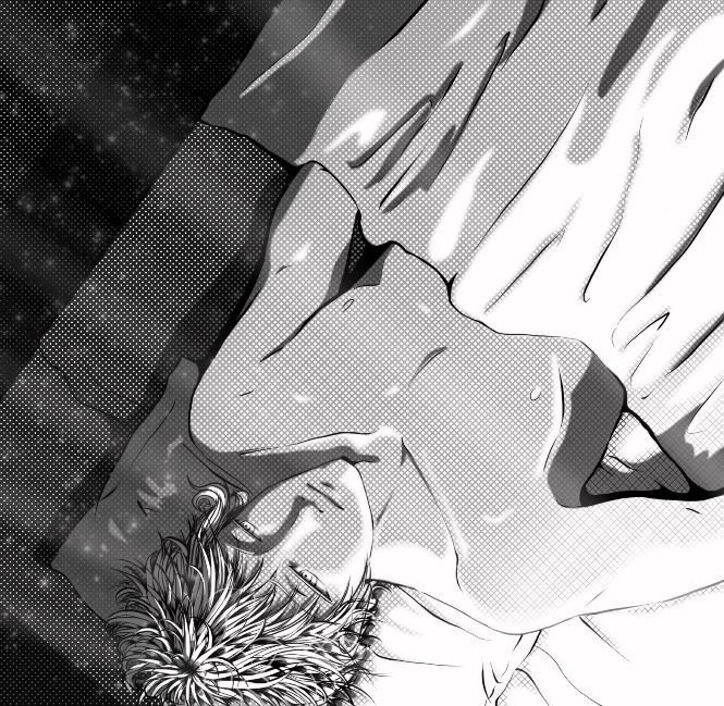
I love screentones so much. They apply uniform texture which doesn't detract from the work. They double as shading and triple as gradient (given the right brush variables). I usually apply multiple screentones, but I felt this piece shouldn't be too busy (I really wanted to screentone the blanket). This layer was set to 90% opacity so that the bed and the floor in the upper left weren't too dark. Yet.
Masking
This layer is just above the screentone to lighten it's effect on his body and the sheets. By creating a 40% transparent mask, the piece now had four different shades. Magic, right? (No way, haha.)
Highlighting
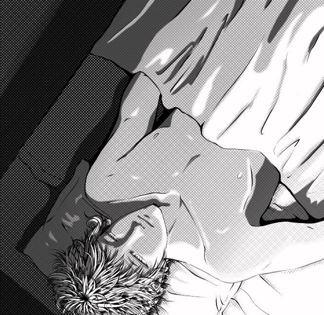
The highlighting is in two layers. One is set just above the screentone at 100% to break up its dominance over the piece. Applying a gaussian blur to it helped to soften the light. The second layer is placed just above the lineart at 50% to help this further by lightening the lineart. My favorite part of highlighting is adding the transparent strands of hair on Lee's head.
Depth

The floorboards. Despite the final layer obscuring it, this is an important aspect of the piece. They really set the perspective, allowing the viewer to feel as if they're looking down on Lee from near the headboard (explaining the upside-down angle). It also gives the viewer a sense of how high the bed is off the floor. It even indicates that he's lying on a bed in a room. There's so much being told just by that single addition.
Final Touches
The god rays (made of two layers for opacity differences) and dust particles both helped to break the balance of the piece's gradient from utterly light to utterly dark. Without it, you get the impression that the piece is split in two, and while that certainly seems to fit Lee's personality complex, he actually wants the light to break into the darkness, as it should. Light should always break through the darkness. These two final additions to the piece are meant to symbolize that wish.
I hope this first (likely long) post turned out helpful in some way for other digital artists. That was my true intent for choosing a creative way to prove who I am. (Holding up a sign is just so meh.) I had fun explaining how the piece came together. I'm not remotely an expert, though. While writing this, I found numerous cringe-worthy mistakes. And, of course, the blanket is the major flaw of this piece, and I'm positive the better artists around noticed. Folds are still something I'm working on. I have lots of reference photos, though, so don't worry about me. Haha.
But yes. What do you guys think overall? Did the poem make sense after you read the post? Is the amount of explanation too much? Want to offer any advice, tips, or tricks? Let me know in the comments. Let me know all the things in the comments. Heck, let me know what you had for dinner. I mean, why not?
Cheers, everyone!
Thanks for reading!
;-)