Hey steemers!
The first part about typography ended at about 1930 and can be found here: Part 1. We’ve seen the development and evolution of scripting in general and how letters became letters. What happened during the last 80 years in the world of typography? A whole lot. We don’t see such a huge leap forward though as we have seen it before simply because the timeframe is too short. And the general development was bascially finished as well. But there was still room for evolution and change.
-/ 1930 – 1990
I’d say it was an era of artists and refinement . Their task was to refine what has been given by their predecessors, the foundation was already laid.
The results speak for themselves: Some of the most beautiful fonts ever have been developed and created.
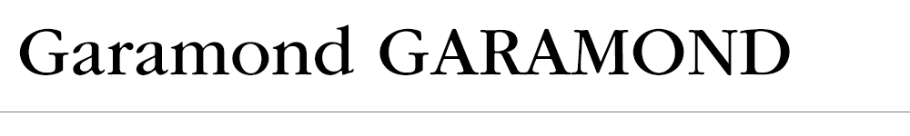
I’d like to list a couple of them including their creators – the most significant fonts of our time. I still use some of them, e.g. the Garamond or the Futura.
Without the claim of completeness, here are some renowned font-names including their creator and date. I’m sure most of you heard about them. I can’t list all the fonts, I picked the ones I believe are essential and influential for our time.
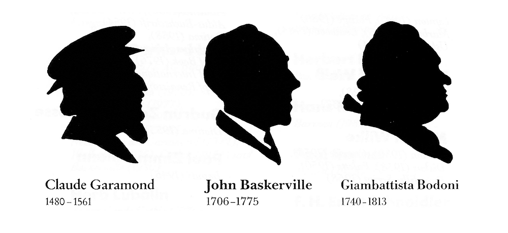
fonts from left to right: Garamond, Baskerville, Bodoni
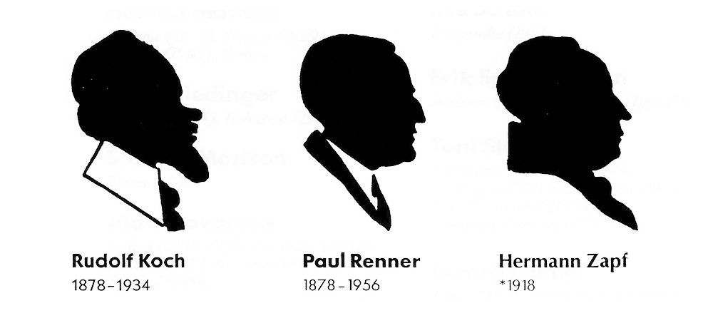
fonts from left to right: Kabel, Futura, Optima
And of course some others which deserve to be mentioned. The list would be endless, just to name a few:
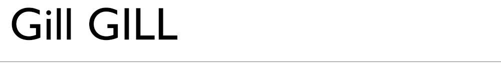
Gill, Erich Gill, 1927
Futura, Paul Renner, 1928

Palatino, Hermann Zapf, 1950

Clarendon, Herrmann Eidenbenz, 1951

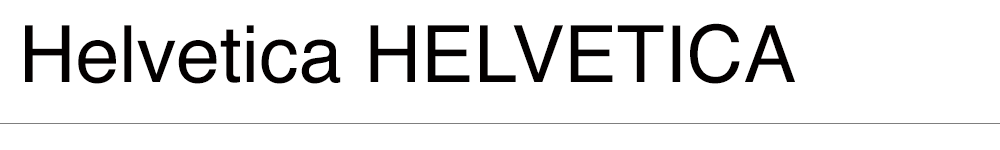
Helvetica, Max Miedinger, 1957
Souvenir, Konrad F. Bauer, Walter Baum, 1952

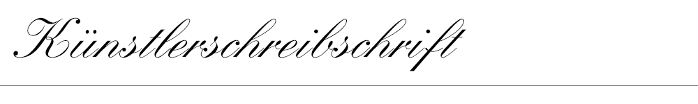
Künstlerschreibschrift, Hans Bohn, 1958
Eurostile, Aldo Novarese, 1962

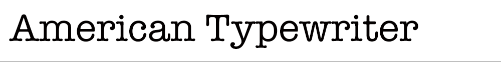
American Typewriter, Toni Stand, 1974
ITC Garamond, Toni Stand, 1975
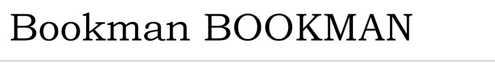
Bookman, Konrad F. Bauer, Walter Baum, 1975
Avant Garde Gothic, Tom Carnese, Herb Lubalin, 1970

Benguiat, Ed Benguiat, 1978

Stanley Morison
England, Font designer, typographer
His most famous creation (and I’m sure everyone knows this font, it has become a standard on every Windows or Apple system):
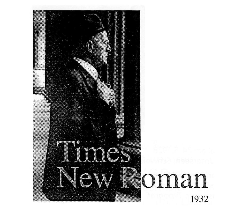
This particular font is more than 80 years old and is still a benchmark.
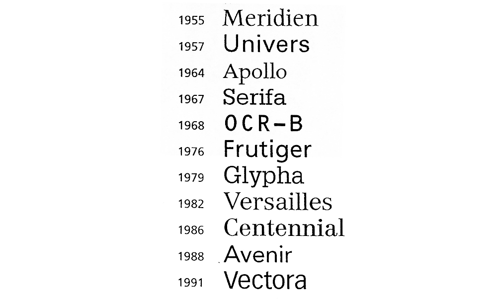
Adrian Frutiger
Switzerland, font designer, teacher, typographer, illustrator
His most famous creations:
Gerhard Lange
Germany, font desinger, typographer, teacher
His most famous creations:

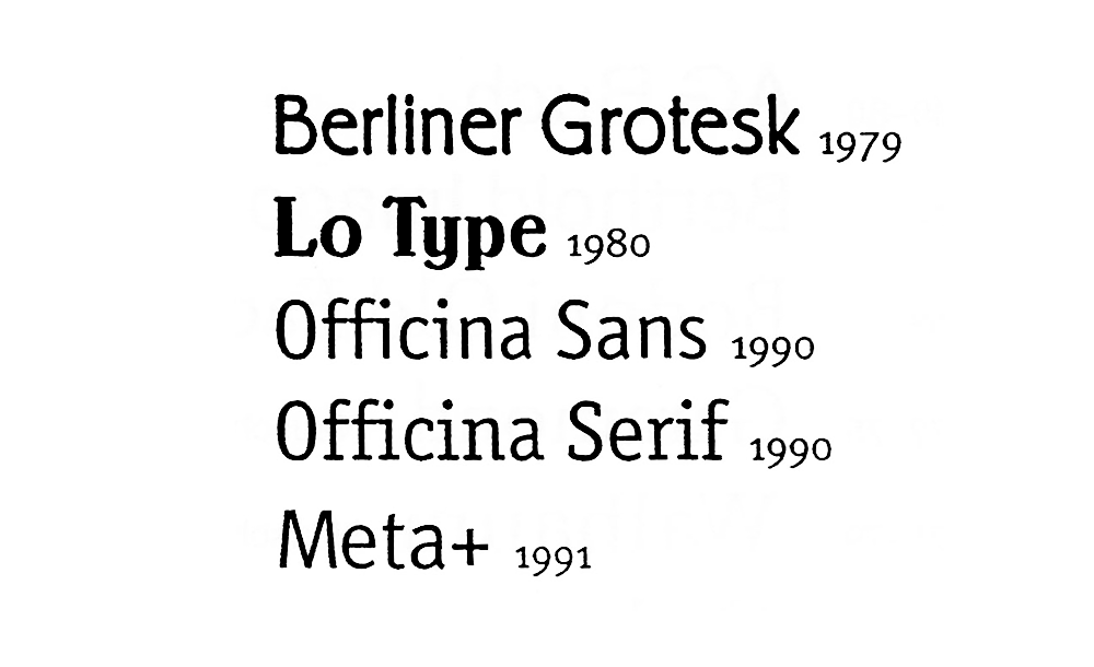
Erik Spiekermann
Germany, typographer, font designer, author
His most famous creations:
As you can see I focused on the time until the early 1990’s. Why? First of all it is a personal collection of fonts which I believe are important to be mentioned.
Secondly I’d like to point to important steps, influential steps and creations in the history of typography and fonts and give credit to the artists who created these, manually. By hand. (except maybe 2 or 3 from 1990/91)
Most important: These are timeless fonts which are used until today and that’s something unique.
-/ 1990 – 2016
I don’t think that any font created after the early 90’s needs to highlighted like the ones above do. The reason is lack of uniqueness and particularities, talking about real evolution. The fonts in use today are just not on the same level. Admittedly, they show a large variety of modifications, yes, but they are all derived from the classics.
And let’s be honest: How can someone ever beat HELVETICA? Maybe some of you will agree: It’s the font of the millenium. (As you can see, this one is my one and only favourite.)
Furthermore …
I think it is very important to know that the era of DTP (Desktop Publishing) started at about 1985. Since then everyone can be a typographer simply by using electronic tools. Typography itself kind of ‘left the paper‘ and became electronic or digital. This is the era we currently live in.
It will be worth looking back at this time – the time we live in – in about 50 years from now to see significant steps in the evolution. Let’s give it some time to evolve.
We have beautiful fonts nowadays, no doubt, I fell in love with many but it needs more time to look at it in detail and make a general statement. It’s just 20 years! It took us about 6000 years to be able to use the fonts we have today. Maybe we’ll talk again in the future to see what happened, that would be crazy :) It remains to be seen if there’s a ‘special & unique touch’ to this time we live in. I believe we can’t judge now.
To be continued....