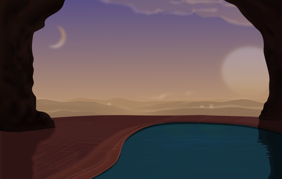
Hello guys, I just finished another illustration based on the landscape theme I've been doing. Lately I've been studying concept art and how it can be used to create worlds and tell stories, I decided to build on one of my previous illustration of the Space colony Landscape.
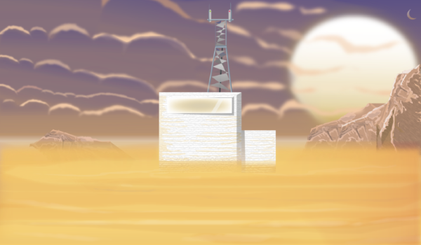
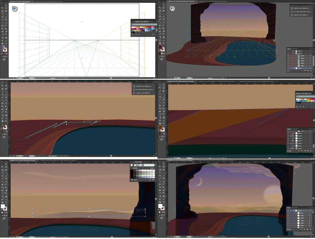
I believe I've made some improvements based on my methods, I decided to use a cooler color temperature on the environment. I also observed that I was so dependent on flat 2d design methods so I adopted a more traditional art method of using my perspective tool as a guideline to illustrate.
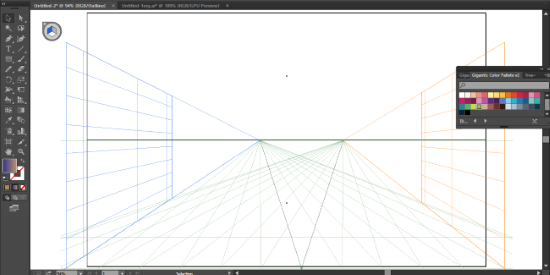
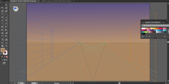
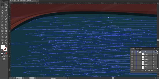
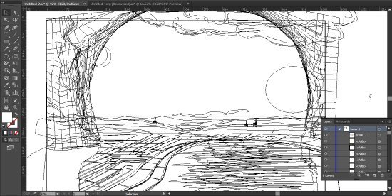
I also noticed that I use to many polygons when using the low poly art method, using to many polygons can either make or break an illustration, on the downside it could cluster the drawing and make the final work looking blurry.
In this episode I choose to use minimal polygons to achieve a more crisp and clear illustration.
SOFTWARE: ADOBE ILLUSTRATOR CC 2015
METHODS
I mostly used low poly art method in this illustration all of the vectors are made by irregular polygons of different colors placed on top of each other.
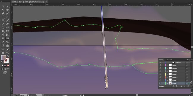
I also used gradient and transparency tool for the weather objects like the clouds and the breeze on the hilltops.
GIF VIDEO PROCESS
Thanks for visiting my blog :-)

Join these awesome communities


#dynamicsteemians powered by @thundercurator @dynamicgreentk
