Hi there my amazing Steemians!! How are you doing!!
As always I'm really grateful for your beautiful words and all your support! I don't know if I told this before, but for an artist it is really important to receive compliments and words of cheer for his/her work. Why? Well.. we artists are very sensitive people. Beings that in every painting, drawing or sculpture create a new child (despite of the level of it).
Yes, we feel we are constantly bringing children to this world.
And I'm talking of it like the whole thing, you know?: the pain of feeling that you are somehow failing. The uncertainty of not really know if it's gonna succeed. And the joy for finally creating a new reality...
...a window to a whole new universe that came out from your hands.

Way Back Home
So this is a painting where, again, I wanted to even abuse from perspective. And luckily enough I had the idea stick into my mind since the beginning.
Spoiler: There's a GIF at the end with the whole process for the lazy ones =D
A whole diagonal composition to make it super dynamic and rule of thirds for placing properly all the subjects into the scene. AND also... If you look closely... Just by coincidence (because I didn't plan it), look who came into the scene...
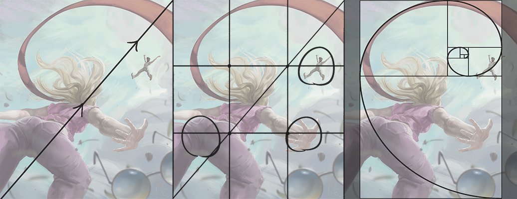
Composite features on the final piece.
...Yes Sr.!! The famous! The only and unique Golden Spiral !!
As you can see there, if we divide the image into two diagonal halves we will spot that the weight of one side is compensated by the other one. For example: the clouds from the bottom corner against those from the top-left one. The softly blurred sunglasses against the red fabric strip. Even the girl against the man there.
When we talk about the rule of thirds here... we can spot three main focus point (very important for the storytelling by the way):
- (1) The man waiting for the girl to take flight with him;
- (2) The hand of the girl dropping her super fashion sunglasses;
- (3) And, well... yes, her butt. Because you know... Biologically if it's fine and well rounded... In most cases it wll call the attention for both genres.
But see also how all those elements work together when we place the Golden Spiral in its place. It's not only armonic but it's actually a guide of the path made by the sight of the spectator.
Look closely and watch how the path starts at the butt of the girl (very fine by the way, I'm proud of myself), follows the red fabric and so runs all along the cloudy sky with tons of values and color (mostly hue contrast), and arrives into the man, fulfilling the story telling.
And also a little secret: those sunglasses are kinda hid. So by the time that the spectator spots them, they just restart the sequence. But come on, you want to see her posteriors once again... so the whole composition cycle restarts.
Said This, Let's Get Started!

I didn't lose much time by doing a prolix lineart (I didn't have time for such things actually!). So I just made a sketch base and since I perceived it was pretty solid, I decided it was time to add some colors to the background and then add the main features!
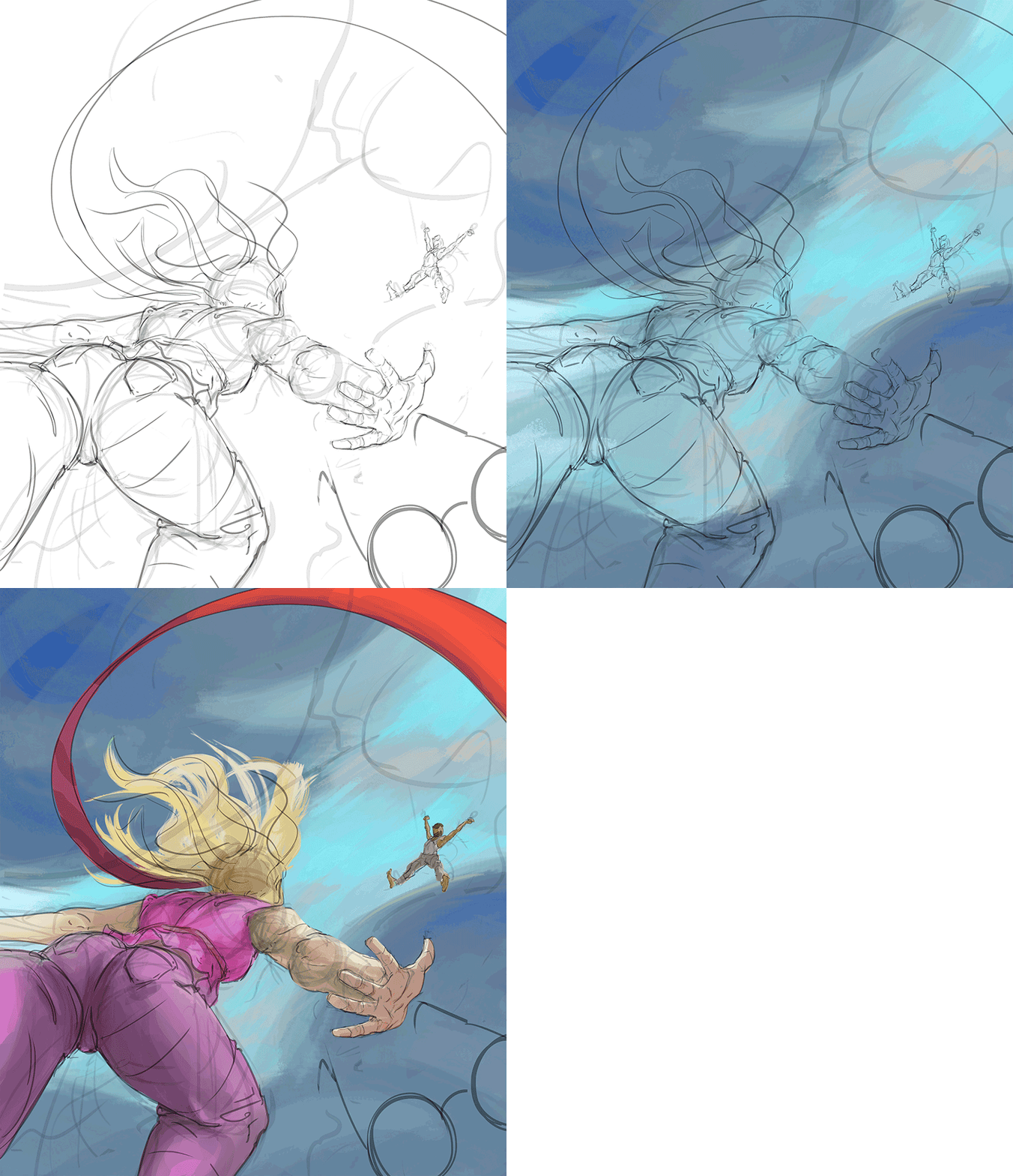
Well that seemed pretty well done since the beginning! So this time I felt really proud of my efforts.
I couldn't stop thinking about that sky in te background tho, and also the position of the male character, something was wrong with it. Could you spot what was the trouble for both cases?
Yes, in the case of the background, the weight was much more heavy at the top-left corner than at the other half. And what about the man? Well, if you compare with the composition rules I shown you before (mostly with the rule of thirds' one) you will see I placed it wrongly since the beginning... because I didn't really plan where to put that character at the lineart stage. So this is a good example of how things can get spotted (and solved) when you get into further stages.
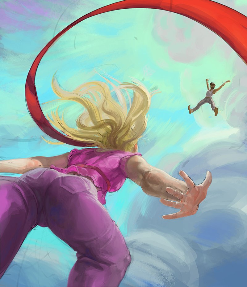
I did many things here such as adding more detail, make a mask with a (gamma)level-correction for the characters, re-placing the male character into one intersection of the RoT (Rule of Thirds... yes I'm so nerd) and add much more hue contrast in the background (Which I explain in a previous post and I shall go deeper in a near future, because you are worth of it!)
So few touches here, few touches there. Adding a better quality sunglasses (Bought in IKEA of course), taking off all the remmant lines and the painting is almost done!
BUT!...
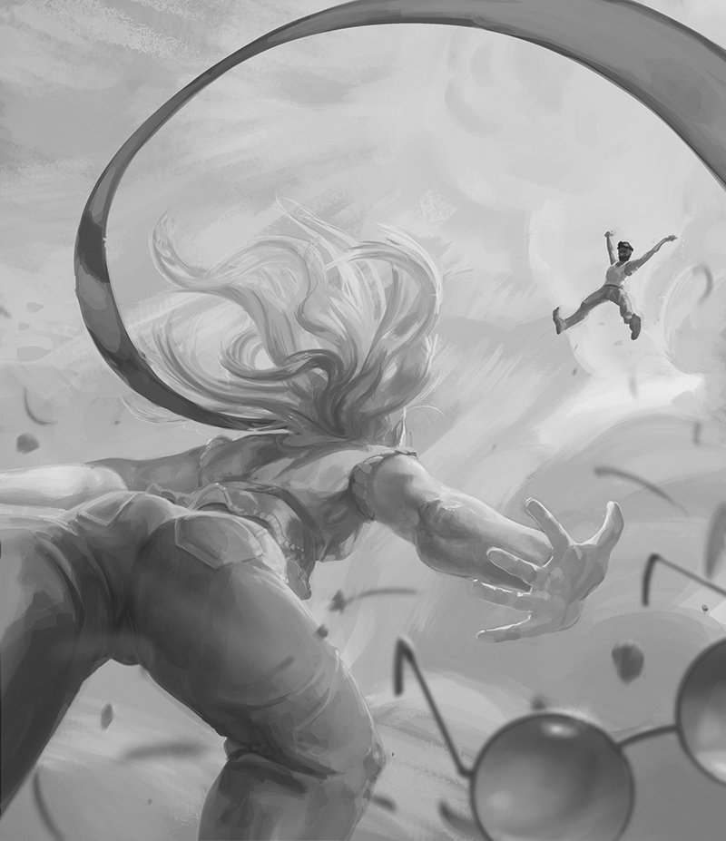
...A Great Tip Before Finishing it.
Add a hue/saturation filter when you think your work is finished (or even during the process) to check if everything also works in grayscale. Think about the hue and saturation as the dust over a mountain. Sometimes it makes a landscape look beautiful. But sometimes it just cover it all and make from it a total mess. So, just to make sure if you are doing right with the color thing, take all that information out and see the base. If it works in grayscale, then it's highly probable it will also work with any color on it.
And so there you go! The finished pieced looked like this!

So as final quote for this painting is the contrast between characters-background. Both are deeply divided because of their gamma and contrast. When the saturation actually stays almost the same.
Now you start to see through my eyes... how contrast takes part of your creations and suddently BOOM! They are alive.
Not to mention... buuuuuuuuuuuuut... 
...ohh Indeed.
I really hope that all this theory behind my paintings and this tiny stories which I certainly had a lot of fun writing made your technique and your day a little bit better, that was the whole point after all!
Don't forget that if you have any doubt or question, you can ask to me and I will try to be as specific and useful as I can. After all... the world is too big, but we are too few. So let's help each other =)
Ohhh and for my lazy and curious fellows, here is the promised GIF!

