Hi everybody!
I don't plan to make a very long post this time, but a fast one straight to the point, so I hope you like it! =)
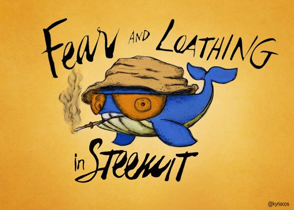
Last week when I submited a story showing the whole process of an illustration with Blizzard's World of Warcraft style and the @randowhale was just warming up for what would be a completely success, @kyriacos (the creator and designer of RW) dropped me a message on that post congratulating me and I told him that I would love to give a little bit more of love to his design.
(All the images are my own creation and so I own the rights of them. Only @randowhale and the team around it have my permission for using them)
I decided not only to make a re-design it, but also to proof myself that I could be able to do an animation with it! (even if it would be super-extra-duper-wubalubadubdub-simple). Here you man ! :
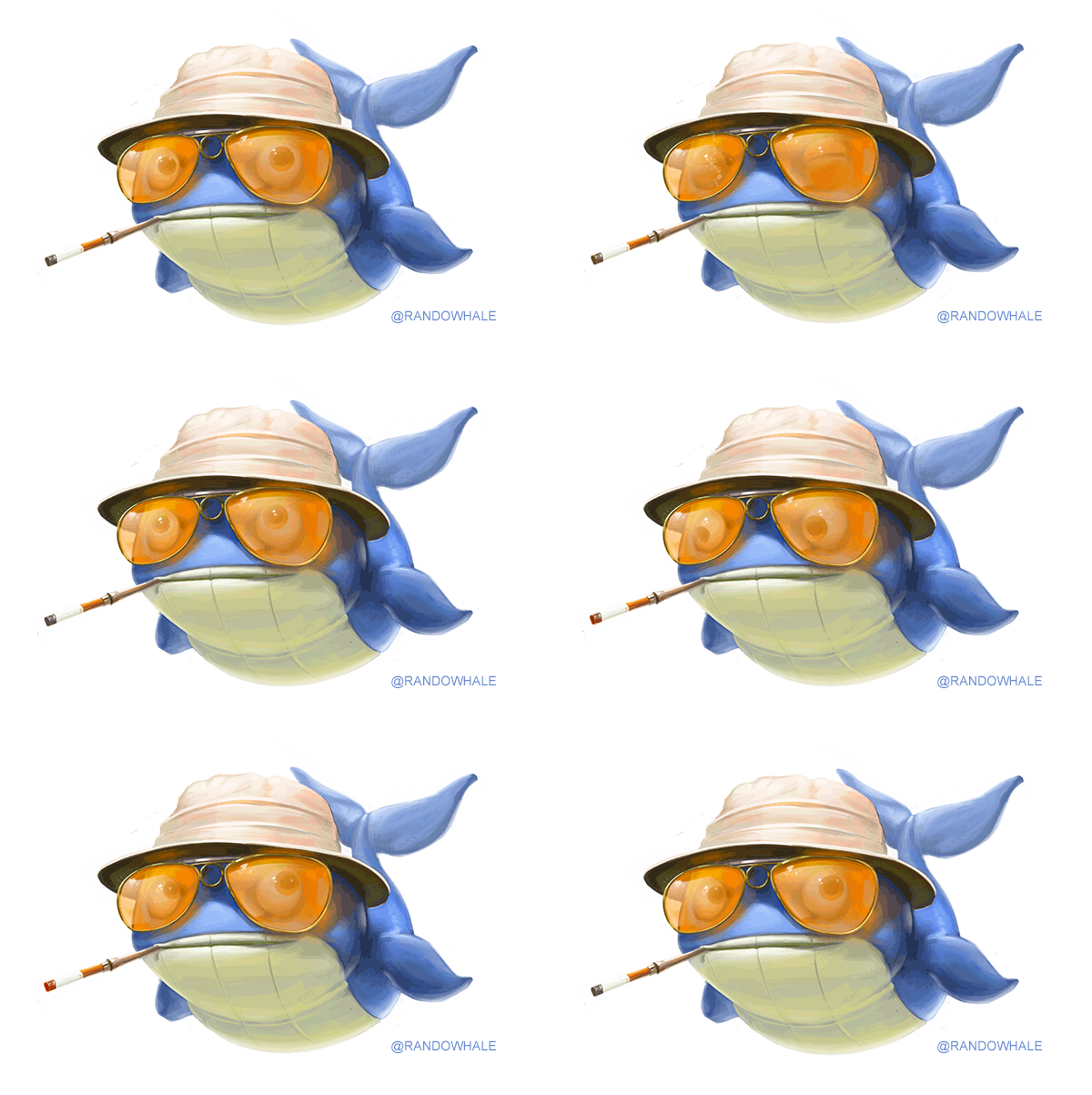
Hope you like it! I also made few different static shots in case that needed or the animation is too sh!%ty heavy for normal browsers (which I doubt because I optimized it. But still, here we go!:
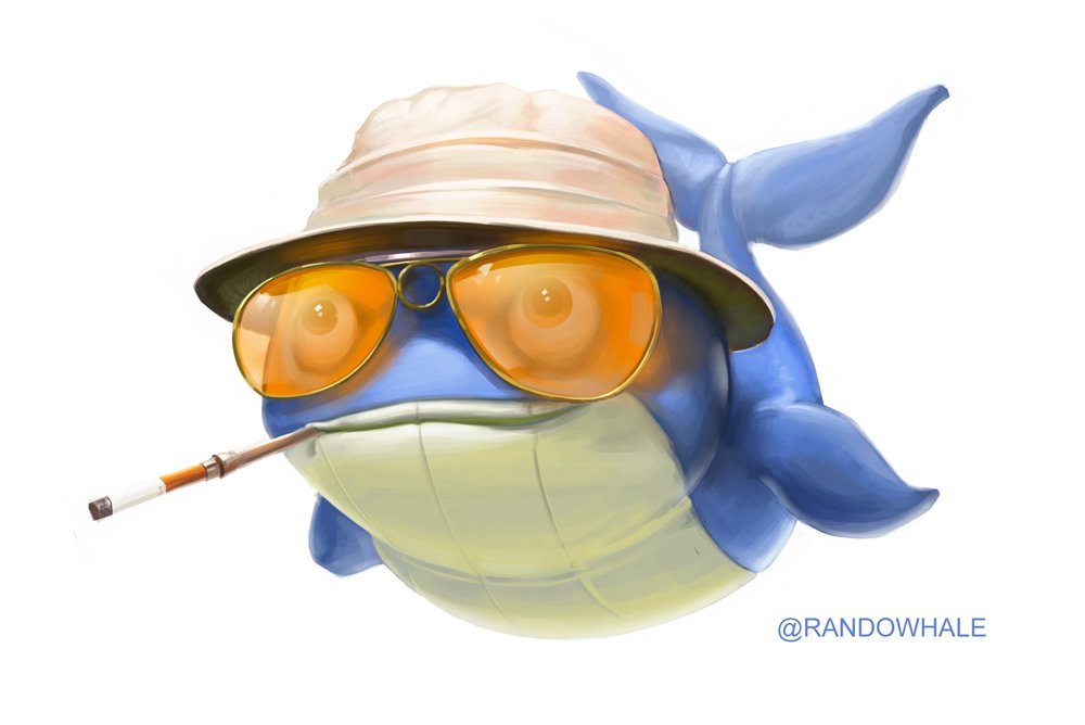
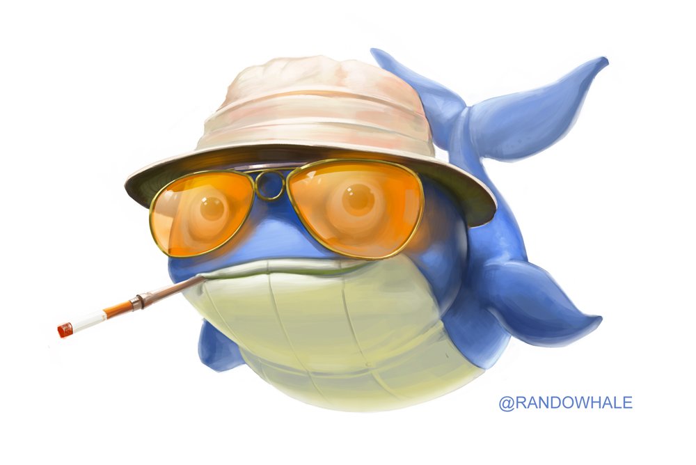
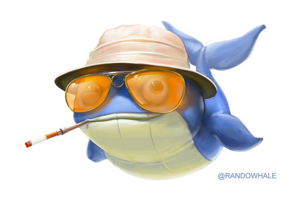
And that's all! Except for the process that I prepared for you if you are curious guys ;)

Not much to analyze, everything was already solved. I just added a little bit more of rendering to the original design and made it a little bit more chubby <3 ! If you don't believe me, check it on Kyriacos' blog!:
