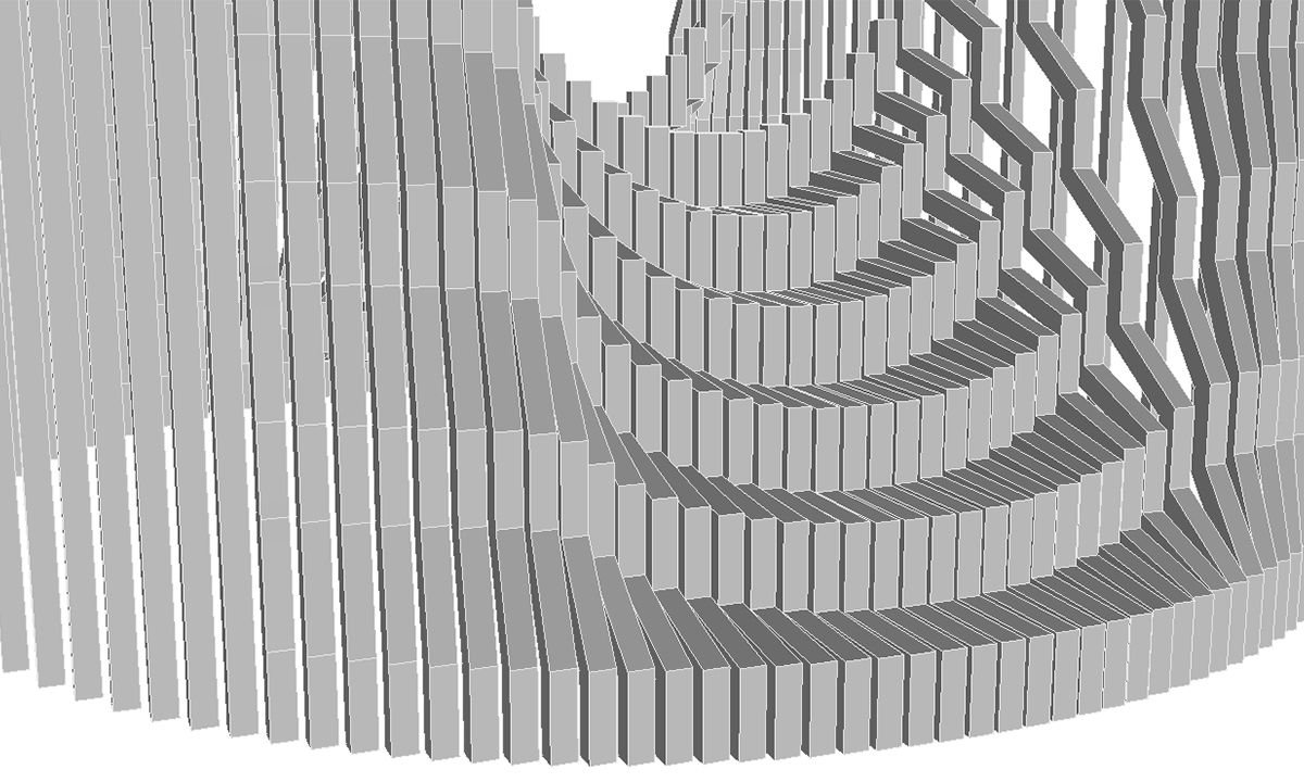
The Search for the Gut Feeling
Oftentimes I have an idea that sits in limbo for months because I can't figure out how to finish it. I have a tendency to require myself to search for near-perfection for each design before considering it complete and sharing it with the public. Unfortunately, this can lead to the loss of the work altogether, because in fact there is no such thing as perfection, and I can end up searching for it for far too long. What I'm really looking for, more than the absolute perfect solution to every problem, is a gut feeling. Usually there are many different versions of a design that could produce a beautiful or eye-catching or interesting result, but unless it gives me that gut feeling, I have a hard time accepting that it's finished.
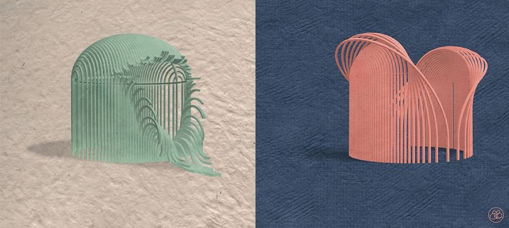
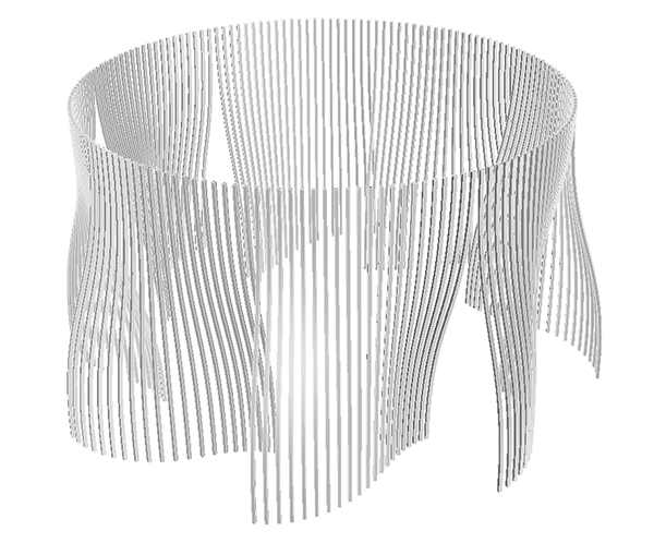
Over the last couple weeks I've introduced my new series of public art installations which reimagine the typical gazebo as a more sculptural and interactive structure for public parks. For both Gazebo 001 and Gazebo 002, the designs came to me as fully-formed ideas right from the beginning, which made it easy to build them and send them off into the world knowing they were (more-or-less) resolved. More commonly, however, I have an idea for how to handle one part of the gazebo and I have a hard time figuring out how to resolve the rest. For example, for months and months I've been sitting on some concepts which only address the vertical pillars of the gazebo and have left me stumped to figure out how to find a solution for the dome. Since the ideas remain incomplete, I'll give them the temporary titles of Gazebo 00x, 00y, and 00z:
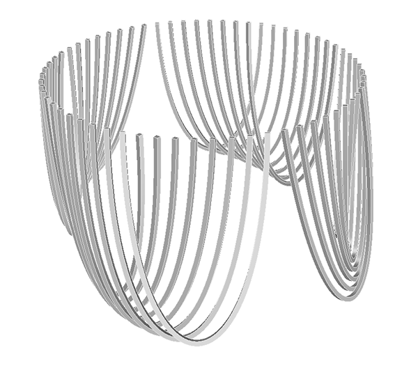
Not Quite Right
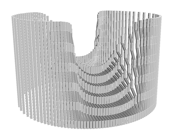
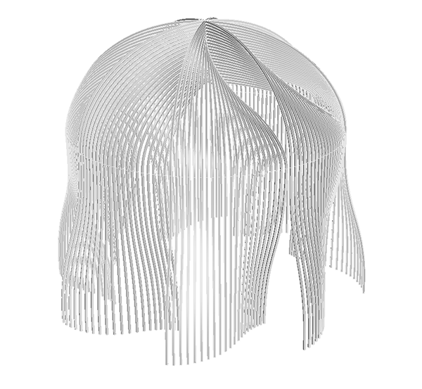
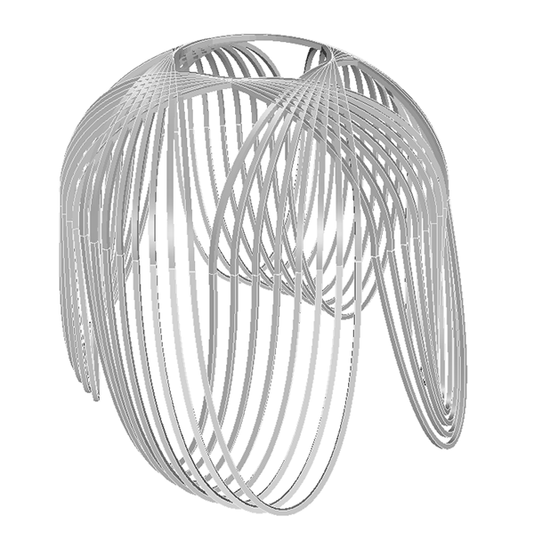
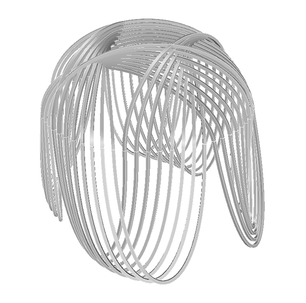
For all three of the above designs I've come up with multiple different solutions for the domes, none of which feel fully correct to me. One of my main goals for these gazebo designs is that the whole object should feel cohesive in the ways the form is manipulated. In other words, the verticals and the dome should feel as if they're part of a single form, not two separate elements. In Gazebo 00x, for example, the verticals are scrunched into zig-zags which come together to form a staircase. I could simply place a complete dome on top of the verticals and call it a day, but I think the dome should also be scrunched and compressed so its form is visually connected to the verticals beneath it. The same thing goes for Gazebos 00y and 00z - the dome should somehow connect to the verticals while continuing the same manipulations of form that they started. Below you'll find some screenshots of what I've come up with so far, after which I'll get into the discussion of why these ideas don't really do it for me.
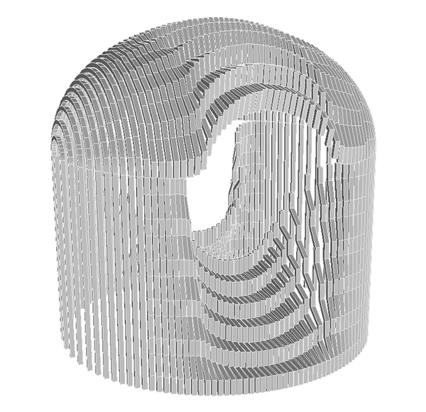
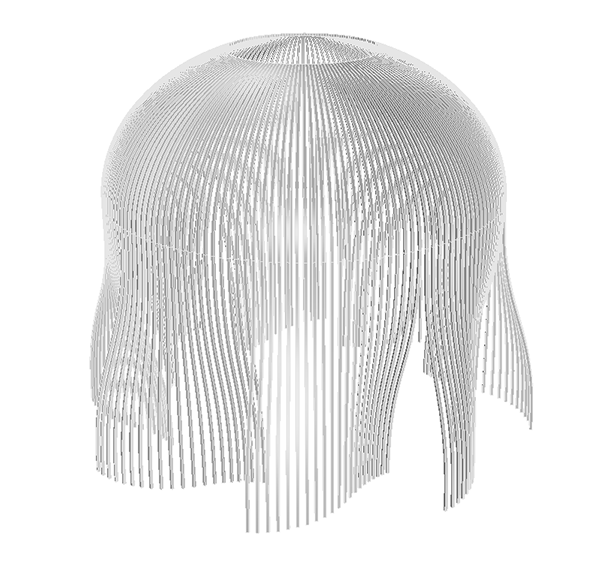
None of these forms give me the gut feeling I'm searching for. Why? A lot of reasons, not all of which can be easily articulated in words. Let's take Gazebo 00x for example (the one with the stairs) - why doesn't this scrunched up dome work well enough? For me, the dome detracts from the beauty of the initial idea. The fact that the zig-zaggy pieces in the dome take your eye away from those at the base does the entire design a disservice. When there was no dome at all, the gradual transformation from perfectly-straight to kinked-step was beautiful in it's clarity. But as soon as the dome was added, the form became overwhelming and overpowering. What was once gradual and delicate became loud and over-the-top. (Not to mention the entire gazebo's unsettling resemblance to an open mouth.)
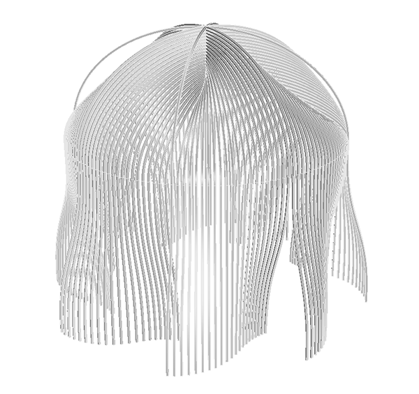
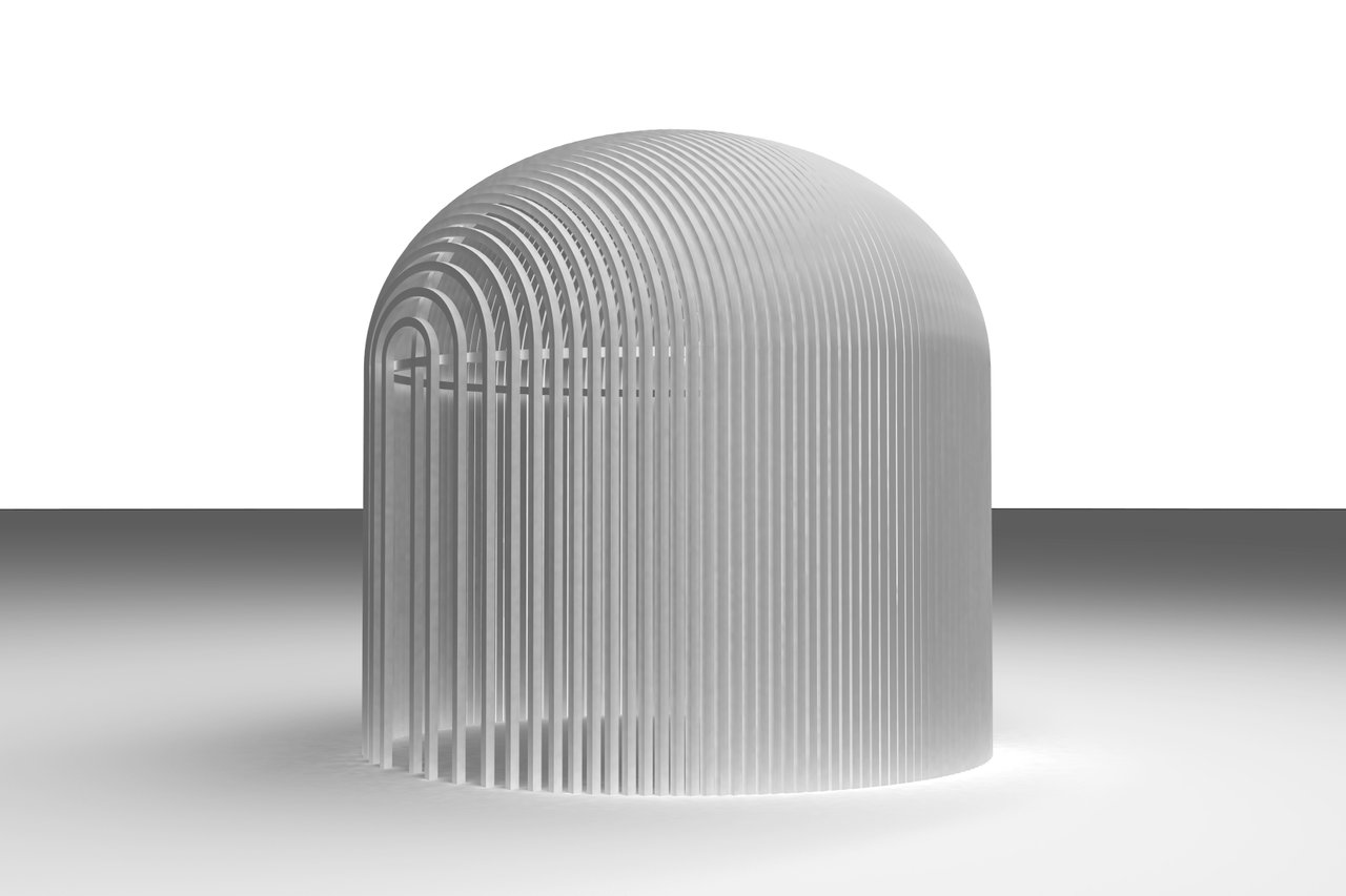
Similar reasons make me not so enamored of the roof solutions for Gazebos 00y and 00z. The forms were elegant and pleasing to the eye without the domes, but as soon as the domes were added, they became chaotic and hard to process. The perfect domes must somehow continue the concepts of the base, but remain subtle and understated so as to not draw too much attention away from the elegance of what's below them. I think it's important that the domes also retain a form that is visually connected to the hemispherical shape of the baseline dome, that way the entire form of the gazebo can remain visually connected to the other gazebos in this series. All manipulations start with the same baseline form of the gazebo, and as the manipulations take the designs further and further from the initial form, I think there's a line that should never be crossed. When the form is completely unrecognizable from its starting point, then the object becomes less accessible as an architectural form.
Details

A lot of times I come up with a dome design that I like visually, but I can't follow through with it because it's not feasible for construction. For example, the first version of the dome for Gazebo 00z (above left) is actually quite nice in my opinion. I like the way it continues the flow of the verticals and still retains the shape of the baseline dome. The problem is, it's almost impossible to construct this.
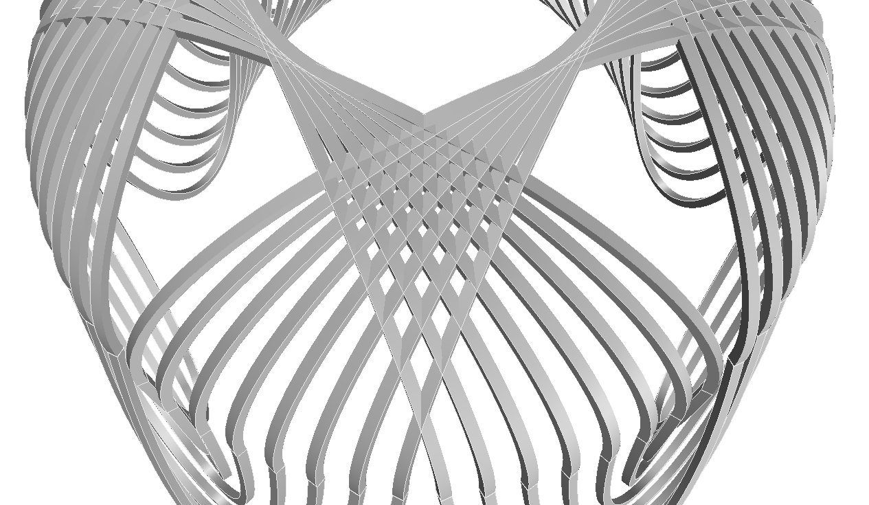
Look at the way all the square tubes intersect. To cut and weld all those intersecting pieces would be an inconceivable and impractical feat, and to make it look as clean and nice as this digital model is surely impossible. For that reason, in Version 2 I attempted to adjust the tubing so each line runs at a different height. Therefore, we have fewer intersections and construction would be considerably easier than Version 1:
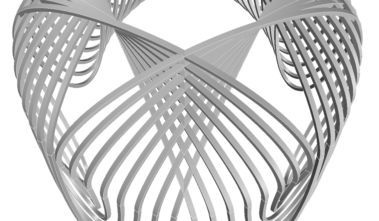
After I went through the process of building Version 2, I thought for sure it would be the winning design, but alas, I was still not wholly satisfied. The way Version 1 continues the flow of the vertical pillars while still maintaining the form of a dome - this gets lost in Version 2. The form of the dome almost disappears in the action of adjusting the heights and avoiding the intersections. I think Version 2 is close to the correct answer, but not quite right. Follow along to see how I end up completing these three gazebos in future posts!
Let me know which designs you like and dislike in the comments below.
All feedback is welcome!

